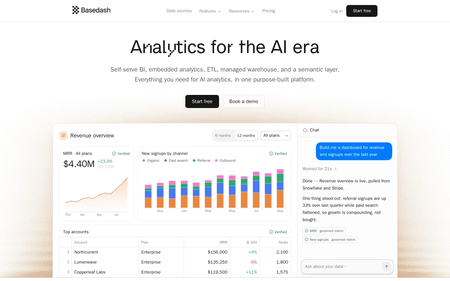
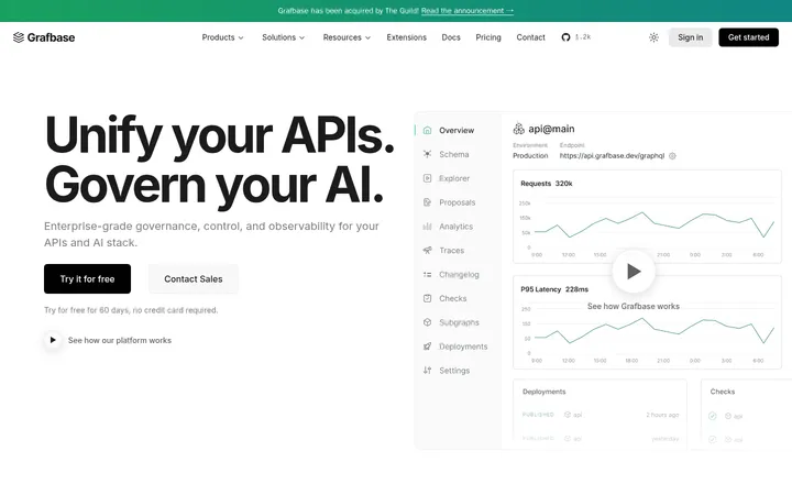
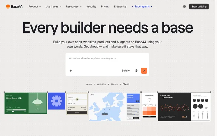
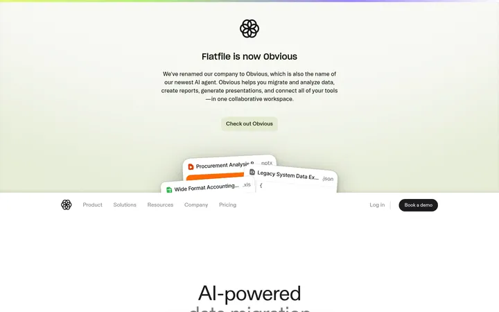
Basedash以克制的字体和充足留白,搭配细节丰富的数据分析界面展示产品能力。浅淡的暖色纹理与少量语义色点缀,让长页面保持轻盈而不显冷硬。
North star · Keep the page quiet and spacious, letting precise product-interface previews—not decorative color—carry the story.
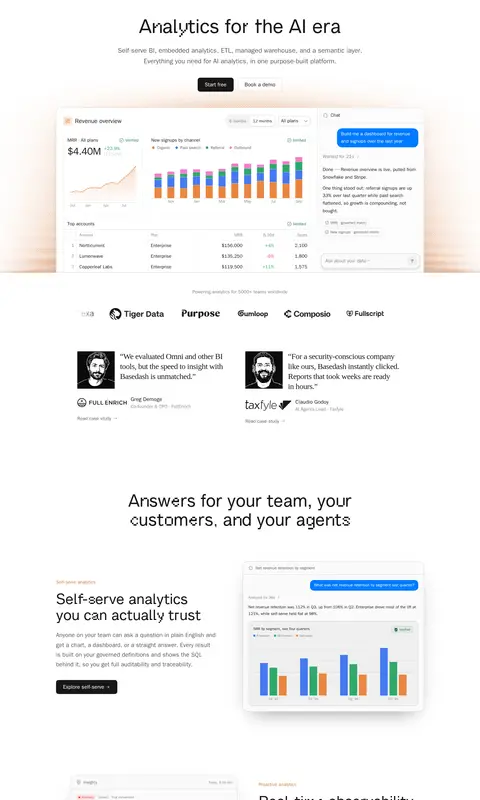
The page is built on a white canvas with near-black headings, soft gray supporting copy, and fine neutral borders. Its main brand impression is monochrome and editorial; warm orange appears as a restrained accent and as a subtle textured glow behind the hero product preview, rather than as a broad section fill. Inter handles navigation, body copy, and controls, while the distinctive Basedash Glitch face gives display headings a lightly irregular character. A centered hero leads into a wide analytics interface mockup, then the long page alternates aligned text-and-product-image feature blocks. Customer marks and testimonials add social proof without changing the calm palette. Product illustrations are large, crisp UI compositions with small chart colors used to explain data. Generous vertical gaps separate sections, and cards rely on hairline borders, softly rounded corners, and restrained shadows instead of heavy decoration.
配色 点色块复制色值。用途说明来自对页面的实测位置(背景、文字、描边、按钮)与截图判读。
品牌色
Carbon Ink
#171717
Primary headings, body text, links, and dark filled primary calls to action.
强调色
Burnished Orange
#d67a3b
Sparse brand accent in small labels and warm hero texture, not broad section fills.
Signal Blue
#007aff
Occasional blue chart or interface highlight, primarily within product previews.
表层色
Gallery White
#ffffff
Primary page canvas, navigation background, and open space surrounding feature sections.
Cool Haze
#f5faff
Very subtle cool-tinted text or interface detail; not a defining page background.
中性色
Soft Graphite
#585858
Muted explanatory copy, secondary headings, and restrained supporting text.
Quiet Gray
#808080
Tertiary text, footer links, and less prominent navigation or control labels.
Paper Line
#e3e3e3
Fine borders and hairlines around product cards, buttons, badges, and footer divisions.
Mist Border
#eaeaea
Secondary pale borders and subtle interface separators.
Soft Steel
#cccccc
Input and interface outlines where a softer edge than the main border is needed.
功能色
Verified Green
#23764b
Verified status labels and success cues inside the product UI.
Chart Green
#2fa86b
Green data-series and small chart details inside product illustrations.
文字 背景 对比度 WCAG #171717 Carbon Ink#ffffff Gallery White17.93:1 AAA #585858 Soft Graphite#ffffff Gallery White7.11:1 AAA #808080 Quiet Gray#ffffff Gallery White3.95:1 AA-large #d67a3b Burnished Orange#ffffff Gallery White3.13:1 AA-large
字体 字号阶梯:Perfect Fourth(比例约 1.304,正文 18px)。示例用免费替代字体渲染,数值为实测。
Aa 设计
Inter 系统字体 · 字重 400 / 500 / 600 / 700 · 占比 78%
免费替代:Inter
Navigation, body copy, captions, buttons, links, and most interface text.
Aa 设计
Basedash Glitch 网络字体 · 字重 400 · 占比 10%
免费替代:Space Grotesk
Large display headings, including the hero and major section titles.
Aa 设计
ui-monospace 系统字体 · 字重 400 · 占比 6%
免费替代:Roboto Mono
Compact code and technical snippets within product interface previews.
Aa 设计
Iowan Old Style 系统字体 · 字重 300 · 占比 5%
免费替代:Cormorant Garamond
Occasional editorial-style subheading or quote treatment.
角色 示例 字号 字重 行高 字距 一级标题 Centered hero headline in the distinctive display face.
Basedash
52px 400 1.1 0 二级标题 Major section headings introducing broad product themes.
Basedash
48px 400 1 0 三级标题 Feature titles and secondary content headings.
Basedash
44px 400 1.1 0 四级标题 Occasional light serif subheading or editorial accent.
The quick brown fox 敏捷的狐狸
24px 300 1.25 -0.025em 正文 Feature explanations, hero supporting copy, and testimonial text.
The quick brown fox 敏捷的狐狸
18px 400 1.63 0 辅助文字 Small labels and supporting descriptions around product previews.
The quick brown fox 敏捷的狐狸
14px 400 1.43 0 按钮 Primary and secondary CTA labels.
The quick brown fox 敏捷的狐狸
16px 600 1.5 0 导航 Top navigation and compact menu labels.
The quick brown fox 敏捷的狐狸
14px 500 1.43 0 链接 Text links in content and footer navigation.
The quick brown fox 敏捷的狐狸
14px 400 1.43 0 代码 Monospaced code snippets inside product illustrations.
const style = 1;
11px 400 1.75 0
间距与布局 基准单位 4px · 密度:宽松
96px 版块间距
12px 元素间距
— 卡片内边距
896px 内容最大宽度
2px
4px
6px
8px
10px
12px
14px
16px
20px
24px
32px
44px
64px
96px
Use a centered content frame with a measured page max width of 896px, while letting product media and hero artwork feel visually broad. The hero is centered; later feature sections alternate text and interface previews in split compositions. Maintain a spacious vertical rhythm, with measured section gaps reaching 96px and smaller element gaps around 12px. Keep the page density low: separate proof points, features, and CTA content instead of compressing them into a dense grid. Finish with a multi-column footer.
圆角与层次 inset · text
inset · text, other
xl · card
lg · card
The visual system is mostly flat: cards use fine borders and softly rounded corners, with subtle shadows reserved for larger interface previews and layered mockups. Avoid strong drop shadows on ordinary content. Use thin inset separators and pale outlines to define controls and card edges, keeping depth legible but understated.
组件 下面的预览按实测的按钮、输入框、徽标、卡片样式重建(字体用替代字体)。
Primary CTA Near-black filled button with white Inter semibold text, a 10px radius, and measured 8px 20px padding; used for Start free.
Secondary CTA White or transparent button with a 1px #e3e3e3 border, near-black text, and the same rounded, compact treatment; used for Book a demo.
Product preview cards Light #fafafa interface surfaces with pale borders and rounded corners; combine charts, tables, badges, and chat content into dashboard mockups.
Status badge Small compact label with a restrained outline; use Verified Green for success status within interface previews.
Feature split Alternating text and product preview, with short warm-toned eyebrow text, clear heading, concise body copy, and a compact dark CTA.
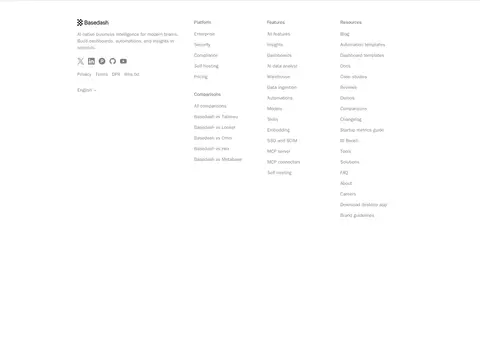
Footer navigation Quiet, multi-column link directory on white, using small muted text and generous separation from the preceding CTA.
Imagery · Use crisp, light-background product UI mockups as the principal imagery: dashboards, charts, assistant conversations, tables, and code views. Frame them as complete interface windows or layered cards, with enough scale to read as product proof. The hero mockup sits over a faint warm textured glow. Small brand marks, customer logos, and monochrome testimonial portraits provide supporting variety; avoid lifestyle photography or ornamental illustration.
页面版块 共 2 个版块,按页面从上到下排列,每个都标了类型、布局和交互套路。
该做与不该做 ✓ 该做 Keep the canvas white and the overall palette quiet. Use Carbon Ink for major headings and primary actions. Let detailed interface previews demonstrate product value. Alternate feature text and mockup placement down the page. Use warm orange sparingly for small accents and hero atmosphere. Separate major content blocks with generous vertical breathing room. ✕ 不该做 Do not turn accent colors into large section backgrounds. Do not crowd the hero with navigation, copy, and media. Do not use heavy shadows on every card or control. Do not substitute generic stock photography for product UI. Do not make muted supporting text compete with headlines. Do not pack every feature into a dense uniform grid. 给 AI 的提示词 想快速出一个同风格的新页面,把这段话连同 DESIGN.md 一起发给 AI。
复制 Build a new SaaS page in Basedash’s calm, product-led visual style. Use Gallery White (#ffffff) as the dominant canvas, Carbon Ink (#171717) for headings and primary buttons, Soft Graphite (#585858) for secondary copy, and Paper Line (#e3e3e3) for fine outlines. Reserve Burnished Orange (#d67a3b) for tiny accents or a faint warm hero texture; keep Verified Green (#23764b) and Signal Blue (#007aff) mostly inside charts and interface previews. Use Inter for interface and body text, with a distinctive glitch-like display face for large headings. Center the opening message, then alternate spacious text-and-product-preview sections. Build previews from legible dashboard cards, charts, tables, and chat UI; use delicate borders, rounded corners, and restrained shadows. Keep CTA styling compact and high contrast.
DESIGN.md Tailwind v4 CSS 变量 Design Tokens
---
title: "Basedash design system"
variant: extended
source: https://www.basedash.com/
captured_at: 2026-10-12
theme: light
industry: saas
generator: Design DNA (https://four.wiralomi.com/style/basedash-com)
ai_generated: true
ai_label: "本文件由 AI 辅助生成:数值取自公开网页的实测样式,命名、用途说明与建议为模型解读。商标归原所有者。 / AI-assisted content"
---
# Basedash · Design System
> Quiet monochrome, made tangible through product UI
**Theme:** light · **Industry:** saas · **Source:** https://www.basedash.com/ · **Captured:** 2026-10-12 (1440×900 desktop)
_AI-assisted content: values are measured from the public page at capture time; names, roles and guidance are model-written interpretations. Trademarks belong to their owners._
Basedash pairs restrained typography and generous white space with detailed analytics interface previews. Warm, barely-there texture and small semantic color accents keep the long SaaS homepage from feeling sterile.
## North star
Keep the page quiet and spacious, letting precise product-interface previews—not decorative color—carry the story.
## Overview
The page is built on a white canvas with near-black headings, soft gray supporting copy, and fine neutral borders. Its main brand impression is monochrome and editorial; warm orange appears as a restrained accent and as a subtle textured glow behind the hero product preview, rather than as a broad section fill. Inter handles navigation, body copy, and controls, while the distinctive Basedash Glitch face gives display headings a lightly irregular character. A centered hero leads into a wide analytics interface mockup, then the long page alternates aligned text-and-product-image feature blocks. Customer marks and testimonials add social proof without changing the calm palette. Product illustrations are large, crisp UI compositions with small chart colors used to explain data. Generous vertical gaps separate sections, and cards rely on hairline borders, softly rounded corners, and restrained shadows instead of heavy decoration.
## Colors
| Name | Hex | Token | Group | Role |
|---|---|---|---|---|
| Gallery White | ` | `--color-gallery-white` | surface | Primary page canvas, navigation background, and open space surrounding feature sections. |
| Soft Graphite | ` | `--color-soft-graphite` | neutral | Muted explanatory copy, secondary headings, and restrained supporting text. |
| Carbon Ink | ` | `--color-carbon-ink` | brand | Primary headings, body text, links, and dark filled primary calls to action. |
| Quiet Gray | ` | `--color-quiet-gray` | neutral | Tertiary text, footer links, and less prominent navigation or control labels. |
| Paper Line | ` | `--color-paper-line` | neutral | Fine borders and hairlines around product cards, buttons, badges, and footer divisions. |
| Verified Green | ` | `--color-verified-green` | semantic | Verified status labels and success cues inside the product UI. |
| Mist Border | ` | `--color-mist-border` | neutral | Secondary pale borders and subtle interface separators. |
| Cool Haze | ` | `--color-cool-haze` | surface | Very subtle cool-tinted text or interface detail; not a defining page background. |
| Burnished Orange | ` | `--color-burnished-orange` | accent | Sparse brand accent in small labels and warm hero texture, not broad section fills. |
| Soft Steel | ` | `--color-soft-steel` | neutral | Input and interface outlines where a softer edge than the main border is needed. |
| Chart Green | ` | `--color-chart-green` | semantic | Green data-series and small chart details inside product illustrations. |
| Signal Blue | ` | `--color-signal-blue` | accent | Occasional blue chart or interface highlight, primarily within product previews. |
### Semantic aliases
`--color-canvas` → ` (Gallery White) · `--color-text` → ` (Carbon Ink) · `--color-text-muted` → ` (Soft Graphite) · `--color-text-subtle` → ` (Quiet Gray) · `--color-border` → ` (Paper Line) · `--color-accent` → ` (Burnished Orange) · `--color-accent-2` → ` (Chart Green) · `--color-accent-3` → ` (Signal Blue)
### Contrast (WCAG 2.x)
| Text | Background | Ratio | Level |
|---|---|---|---|
| ` | ` | 17.93:1 | AAA |
| ` | ` | 7.11:1 | AAA |
| ` | ` | 3.95:1 | AA-large |
| ` | ` | 3.13:1 | AA-large |
## Typography
| Family | Token | Source | Weights | Role | Free substitute |
|---|---|---|---|---|---|
| Inter | `--font-body` | system | 400, 500, 600, 700 | Navigation, body copy, captions, buttons, links, and most interface text. | Inter |
| Basedash Glitch | `--font-display` | webfont | 400 | Large display headings, including the hero and major section titles. | Space Grotesk |
| ui-monospace | `--font-mono` | system | 400 | Compact code and technical snippets within product interface previews. | Roboto Mono |
| Iowan Old Style | `--font-iowan-old-style` | system | 300 | Occasional editorial-style subheading or quote treatment. | Cormorant Garamond |
- **Inter:** Use measured regular through bold weights; keep case natural and tracking neutral.
- **Basedash Glitch:** Distinctive irregular display face; regular weight with clean, unforced casing.
- **ui-monospace:** Use monospace sparingly for code-like details, not general page copy.
- **Iowan Old Style:** Light serif weight and subtly tight tracking; reserve for contrast against sans text.
### Type scale — Perfect Fourth (ratio ≈ 1.304, base 18px)
| Role | Size | Weight | Line height | Letter spacing | Case | Family | Used for |
|---|---|---|---|---|---|---|---|
| h1 | 52px | 400 | 1.1 | 0 | — | Basedash Glitch | Centered hero headline in the distinctive display face. |
| h2 | 48px | 400 | 1 | 0 | — | Basedash Glitch | Major section headings introducing broad product themes. |
| h3 | 44px | 400 | 1.1 | 0 | — | Basedash Glitch | Feature titles and secondary content headings. |
| h4 | 24px | 300 | 1.25 | -0.025em | — | Iowan Old Style | Occasional light serif subheading or editorial accent. |
| body | 18px | 400 | 1.63 | 0 | — | Inter | Feature explanations, hero supporting copy, and testimonial text. |
| caption | 14px | 400 | 1.43 | 0 | — | Inter | Small labels and supporting descriptions around product previews. |
| button | 16px | 600 | 1.5 | 0 | — | Inter | Primary and secondary CTA labels. |
| nav | 14px | 500 | 1.43 | 0 | — | Inter | Top navigation and compact menu labels. |
| link | 14px | 400 | 1.43 | 0 | — | Inter | Text links in content and footer navigation. |
| code | 11px | 400 | 1.75 | 0 | — | ui-monospace | Monospaced code snippets inside product illustrations. |
OpenType features in use: `"ss01"` , `"ss02"` .
## Spacing & layout
- Base unit **4px**, density **spacious**.
- Scale (most used values): 2, 4, 6, 8, 10, 12, 14, 16, 20, 24, 32, 44, 64, 96 px.
- Section rhythm 96px · element gap 12px · card padding — · max content width 896px.
Use a centered content frame with a measured page max width of 896px, while letting product media and hero artwork feel visually broad. The hero is centered; later feature sections alternate text and interface previews in split compositions. Maintain a spacious vertical rhythm, with measured section gaps reaching 96px and smaller element gaps around 12px. Keep the page density low: separate proof points, features, and CTA content instead of compressing them into a dense grid. Finish with a multi-column footer.
## Shape & elevation
- Radius: button `10px` · input `10px` · card `15px` · badge `9999px` · link `8px` · xs `2px` · sm `5px` · md `8px` · lg `10px` · xl `15px` · 2xl `20px` · pill `9999px`
- Shadow `inset` (text): `rgba(0, 0, 0, 0) 0px 0px 0px 0px, rgba(0, 0, 0, 0) 0px 0px 0px 0px, rgba(0, 0, 0, 0) 0px 0px 0px 0px, rgba(0, 0, 0, 0) 0px 0px 0px 0px, rgb(232, 232, 232) -1px 0px 0px 0px inset`
- Shadow `inset-2` (text, other): `rgba(0, 0, 0, 0) 0px 0px 0px 0px, rgba(0, 0, 0, 0) 0px 0px 0px 0px, rgba(0, 0, 0, 0) 0px 0px 0px 0px, rgba(0, 0, 0, 0) 0px 0px 0px 0px, rgb(232, 232, 232) -1px 0px 0px 0px inset, rgb(232, 232, 232) 0p`
- Shadow `xl` (card): `rgba(0, 0, 0, 0) 0px 0px 0px 0px, rgba(0, 0, 0, 0) 0px 0px 0px 0px, rgba(0, 0, 0, 0) 0px 0px 0px 0px, rgba(0, 0, 0, 0) 0px 0px 0px 0px, rgba(0, 0, 0, 0.55) 0px 24px 60px -32px`
- Shadow `lg` (card): `rgba(0, 0, 0, 0) 0px 0px 0px 0px, rgba(0, 0, 0, 0) 0px 0px 0px 0px, rgba(0, 0, 0, 0) 0px 0px 0px 0px, rgba(0, 0, 0, 0) 0px 0px 0px 0px, rgba(0, 0, 0, 0.6) 0px 18px 40px -22px`
- Shadow `xl-2` (card): `rgba(0, 0, 0, 0) 0px 0px 0px 0px, rgba(0, 0, 0, 0) 0px 0px 0px 0px, rgba(0, 0, 0, 0) 0px 0px 0px 0px, rgba(0, 0, 0, 0) 0px 0px 0px 0px, rgba(51, 33, 19, 0.04) 0px 1px 3px 0px, rgba(17, 17, 17, 0.18) 0`
- Shadow `hairline` (button): `rgba(17, 17, 17, 0.08) 0px 1px 2px 0px`
- Motion: standard transition `0.15s cubic-bezier(0.22, 1, 0.36, 1)` on interactive elements.
The visual system is mostly flat: cards use fine borders and softly rounded corners, with subtle shadows reserved for larger interface previews and layered mockups. Avoid strong drop shadows on ordinary content. Use thin inset separators and pale outlines to define controls and card edges, keeping depth legible but understated.
## Imagery
Use crisp, light-background product UI mockups as the principal imagery: dashboards, charts, assistant conversations, tables, and code views. Frame them as complete interface windows or layered cards, with enough scale to read as product proof. The hero mockup sits over a faint warm textured glow. Small brand marks, customer logos, and monochrome testimonial portraits provide supporting variety; avoid lifestyle photography or ornamental illustration.
## Components
### Primary CTA
Near-black filled button with white Inter semibold text, a 10px radius, and measured 8px 20px padding; used for Start free.
### Secondary CTA
White or transparent button with a 1px ### Product preview cards
Light ### Status badge
Small compact label with a restrained outline; use Verified Green for success status within interface previews.
### Feature split
Alternating text and product preview, with short warm-toned eyebrow text, clear heading, concise body copy, and a compact dark CTA.
### Footer navigation
Quiet, multi-column link directory on white, using small muted text and generous separation from the preceding CTA.
### Measured component styles
- **Primary button** (“Start free”): background ## Do
- Keep the canvas white and the overall palette quiet.
- Use Carbon Ink for major headings and primary actions.
- Let detailed interface previews demonstrate product value.
- Alternate feature text and mockup placement down the page.
- Use warm orange sparingly for small accents and hero atmosphere.
- Separate major content blocks with generous vertical breathing room.
## Don't
- Do not turn accent colors into large section backgrounds.
- Do not crowd the hero with navigation, copy, and media.
- Do not use heavy shadows on every card or control.
- Do not substitute generic stock photography for product UI.
- Do not make muted supporting text compete with headlines.
- Do not pack every feature into a dense uniform grid.
## Agent prompt
Build a new SaaS page in Basedash’s calm, product-led visual style. Use Gallery White (## Page sections (top to bottom)
| # | Type | Layout | UX patterns | UI patterns |
|---|---|---|---|---|
| 1 | hero | Long, spacious main-content sequence opening with a centered hero and dashboard preview, followed by alternating feature blocks and proof points. | hero CTA pair, product walkthrough by feature, customer proof | centered display heading, dashboard mockup, alternating split sections, dark CTA buttons |
| 2 | footer | Four-column footer directory with an introductory brand block and grouped navigation links. | grouped site navigation, legal links, language selection | small muted links, column headings, brand summary |
## Source CSS custom properties (selected)
```css
--hero-demo-shadow: 0 1px 2px #11111108, 0 8px 24px #1111110a;
--hero-table-surface: #fff;
--color-background-1: #fff;
--color-neutral-1: