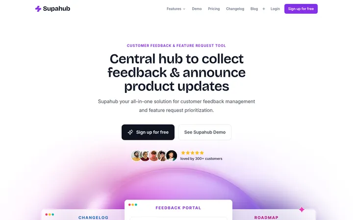
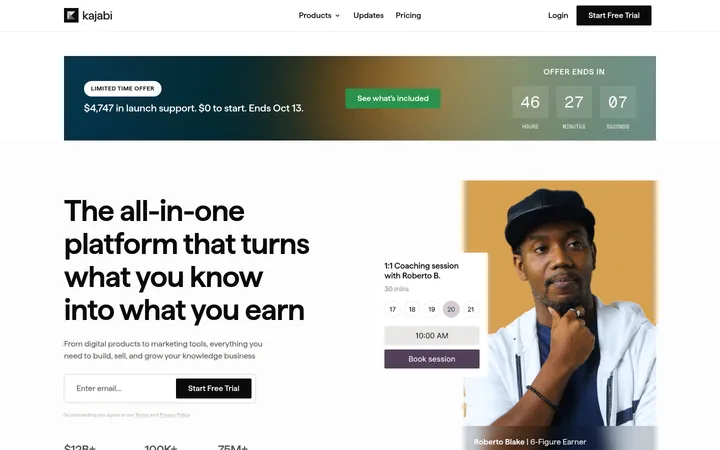
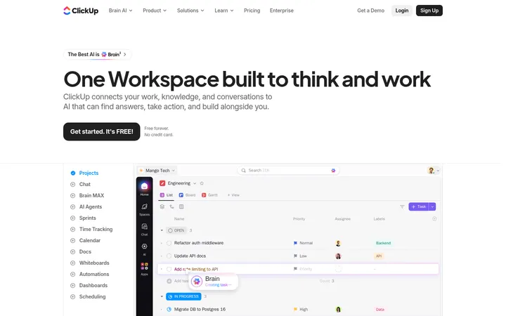
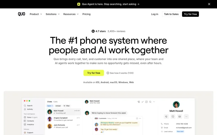
North star · Keep the interface quiet and spacious, letting clear product examples and selective hand-drawn color carry the personality.
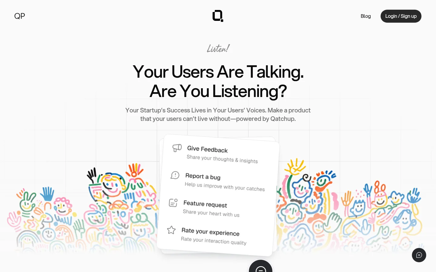
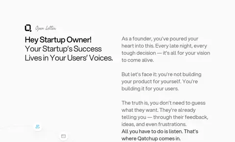
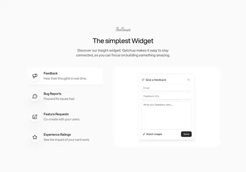
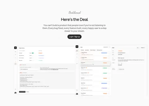
The page uses a near-white canvas (#fafafa) from the hero through the pricing and waitlist sections, so the full-length page feels continuous rather than divided into many color bands. Dark charcoal (#292929) anchors the navigation CTA, headings, and two large inverse panels; lighter gray text keeps explanatory copy quiet. Aspekta is the dominant sans-serif: large, closely tracked headings are centered in the hero and selected section intros, while feature and letter content shifts to left-aligned columns. Small Fasthand labels provide a handwritten editorial cue above some headings. The layout alternates two-column story and feature areas with centered product, pricing, and signup moments, using generous vertical gaps. Interface screenshots and mockups demonstrate the widget and dashboard; colorful hand-drawn people are deliberately used as illustration, not as the brand palette. Rounded pills, soft card corners, and subtle shadows keep controls and product previews approachable.
Primary interface and marketing type, including headings, body copy, links, and buttons.
Aa 设计
Fasthand
网络字体 · 字重 400 · 占比 2%
免费替代:Caveat
Small handwritten section labels such as “Listen!” and “Pricing.”
角色
示例
字号
字重
行高
字距
特大标题
Prominent hero and campaign display headlines.
Qatchup
56px
500
1.14
-0.03em
一级标题
Primary hero headline and key page-level titles.
Qatchup
48px
400
1.17
-0.03em
二级标题
Major section headings, including story and pricing introductions.
Qatchup
40px
400
1.2
-0.02em
三级标题
Feature and insight card headings.
Qatchup
32px
400
1.38
0
四级标题
Smaller subheads and product-preview titles.
The quick brown fox 敏捷的狐狸
24px
500
1.33
-0.01em
正文
Explanatory paragraphs, descriptions, and supporting copy.
The quick brown fox 敏捷的狐狸
18px
400
1.5
0
辅助文字
Compact labels and secondary interface text.
The quick brown fox 敏捷的狐狸
16px
500
1.5
0
链接
Navigation and footer links, plus inline actions.
The quick brown fox 敏捷的狐狸
16px
500
1.5
0
间距与布局
基准单位 4px · 密度:宽松
100px版块间距
10px元素间距
34px卡片内边距
1136px内容最大宽度
1px
4px
8px
10px
12px
15px
16px
20px
24px
32px
34px
40px
48px
64px
100px
Use a centered content frame with a measured maximum width of 1136px and a spacious, low-density rhythm. The hero stacks a small handwritten cue, centered headline and supporting copy above a broad illustrated product scene. Below it, alternate left-aligned two-column narrative and feature content with centered product, pricing, and signup sections. The measured section gap is 100px; use it as the reference for generous separation. Keep content alignment purposeful and preserve broad margins rather than filling every section.
圆角与层次
按钮 · 9999px
卡片 · 32px
图片 · 16px
链接 · 9999px
xl · other
md · other
lg · media
sm · card
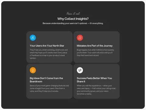
Most page areas are flat on the continuous pale canvas, with subtle borders and minimal card separation. Reserve measured soft shadows for floating product previews and selected light cards. Dark insights cards rely primarily on tonal contrast between #292929 and #3d3d3d, not heavy outlines or dramatic elevation.
组件
下面的预览按实测的按钮、输入框、徽标、卡片样式重建(字体用替代字体)。
Pill CTA
Charcoal rounded pill with light text, using the measured 100px radius and compact horizontal padding; used for Login / Sign up and Get started.
Handwritten eyebrow
Short Fasthand label above a section title, adding a small editorial accent without competing with the Aspekta heading.
Insight card
Rounded card inside a charcoal section, using #3d3d3d against #292929, with concise title, muted copy, and a small colored icon.
Product preview
Light interface mockup or screenshot with a 16px media radius and soft shadow, demonstrating feedback forms or dashboard workflows.
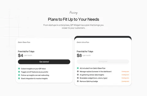
Pricing card
Large rounded white plan card with muted details, clear price, a prominent dark pill action, and compact benefit rows.
Two-column story
Left-aligned title block paired with readable explanatory copy; generous whitespace keeps the narrative from feeling dense.
Imagery · Use product UI screenshots and widget mockups as the main evidence of function, framed as clean, light interface previews with rounded corners and restrained shadow. The hero and waitlist use colorful, hand-drawn people and expressive marks; keep these illustrations lively but visually softened against the pale canvas. Avoid treating illustration colors as a systematic UI palette. No photographic or video-led direction is apparent.
Keep the main canvas near-white and continuous across sections.
Use charcoal for primary text and high-priority actions.
Set large headings in Aspekta or a close sans-serif substitute.
Use handwritten labels sparingly above section titles.
Let product previews show real interface structure.
Keep colorful artwork confined to illustrative moments.
Use generous spacing and soft, rounded components.
✕ 不该做
Do not introduce extra section background colors without a clear purpose.
Do not turn illustration colors into a broad UI accent system.
Do not use heavy borders or dramatic shadows on every card.
Do not crowd the page with dense copy or tightly packed sections.
Do not use handwritten type for paragraphs or controls.
Do not replace the calm layout with a high-density dashboard grid.
给 AI 的提示词
想快速出一个同风格的新页面,把这段话连同 DESIGN.md 一起发给 AI。
Build a new Qatchup-style SaaS page with a continuous Gallery White (#fafafa) canvas, Qatch Charcoal (#292929) headings and pill CTAs, and Soft Graphite (#696969) supporting copy. Use Aspekta-like clean sans-serif typography, close tracking on large headlines, and a rare handwritten eyebrow for section cues. Favor a spacious centered content frame, alternating left-aligned two-column stories with centered product and conversion sections. Present product functionality through light interface mockups with rounded corners and restrained soft shadows. Use Slate Panel (#3d3d3d) only for cards inside a charcoal insight band. Keep Signal Tangerine (#ff7429) sparse; hand-drawn colorful artwork may add warmth but should remain illustration, not UI chrome. Maintain clear hierarchy, calm surfaces, and generous vertical breathing room.