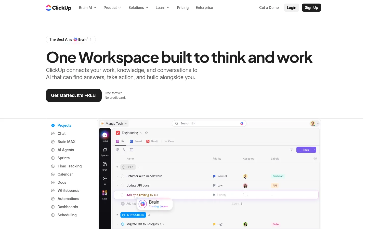
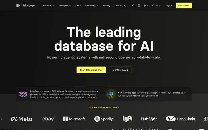
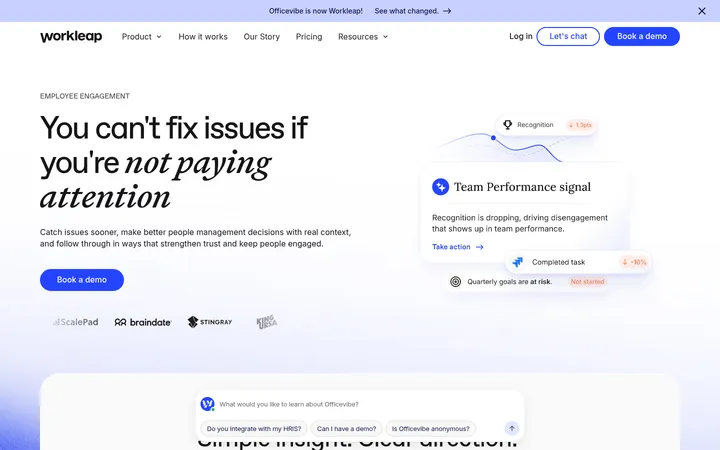
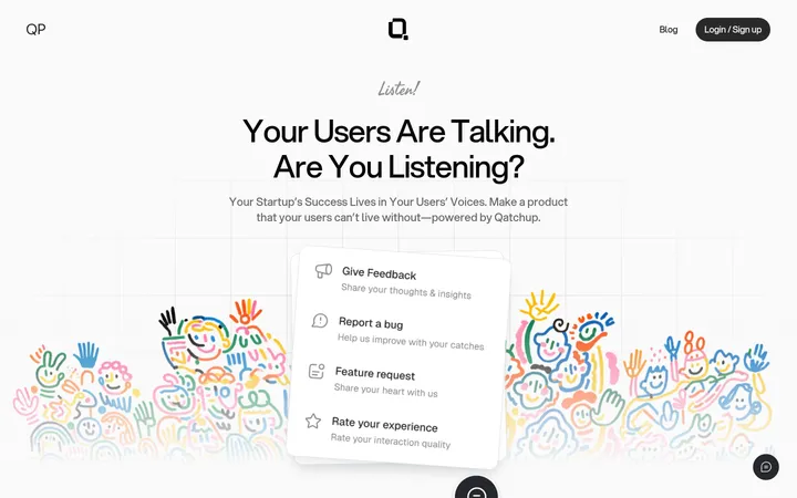
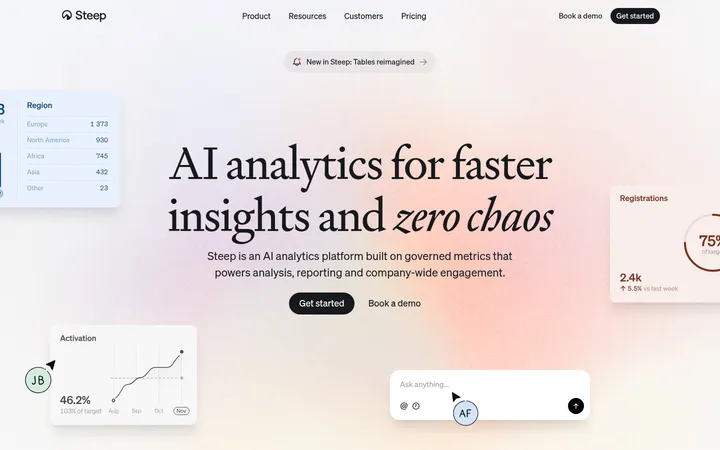
ClickUp 首页以清爽白色画布、醒目文字和细致的产品界面,呈现高效协作工具的直观体验。深色展示区与鲜亮渐变集中突出 AI 功能,同时保持整体实用、清晰。
North star · Keep the page calm and product-led with a white canvas, bold readable type, and vivid color reserved for meaningful AI moments.
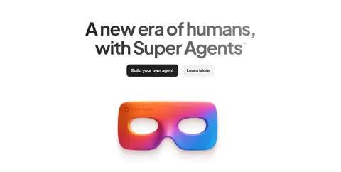
The page is led by a bright white canvas, with dark ink headlines, muted gray supporting copy, and restrained blue and violet accents. Black primary buttons provide a decisive counterpoint to the light background. Most sections retain the same white ground, letting shifts in content and generous whitespace establish rhythm; a large black Brain² feature block and a colorful closing CTA create stronger visual punctuation. Plus Jakarta Sans gives display headlines their compact, rounded authority, while Inter handles navigation and body copy with practical clarity. Product screenshots and interface mosaics are prominent, framed like evidence of the software rather than decorative stock imagery. Colorful 3D-style AI artwork and gradients add expressive moments, especially around agent and closing sections. The overall layout is centered and comfortably constrained, combining broad headline areas with dense product grids, split feature panels, and modular proof points. Borders and subtle shadows separate interface layers without making the marketing page feel heavy.
配色 点色块复制色值。用途说明来自对页面的实测位置(背景、文字、描边、按钮)与截图判读。
品牌色
Ink Button
#202020
Primary CTA fill, main text, and selected button surfaces.
强调色
Action Blue
#0091ff
Interface highlights, links, and blue portions of AI feature gradients.
ClickUp Violet
#6647f0
AI feature accents, violet typography, and luminous gradient details.
Signal Mint
#6ee7b7
Small green interface highlights and accent text within product demonstrations.
表层色
Workspace White
#ffffff
Primary page canvas, light content sections, and text on dark panels.
Brain Black
#000000
Brain² feature-section background, dark product cards, and selected interface rails.
Panel Charcoal
#2a2a2a
Dark card surfaces and subtle outlines inside the Brain² feature area.
Mist Panel
#f8f9fa
Soft card and product-panel backgrounds within otherwise white sections.
Section Gray
#bcbcbc
Measured neutral section surface; use sparingly where a muted band is needed.
中性色
Divider Gray
#e8e8e8
Fine borders and separators around interface panels and cards.
Quiet Gray
#b4b4b4
Low-emphasis interface labels, disabled-like text, and secondary borders.
Muted Copy
#838383
Secondary copy and subdued links against the white canvas.
Slate Copy
#646464
Body text and navigation copy on light sections.
功能色
Badge Blue
#1d4ed8
Blue text within product-interface badges; not a primary page-wide brand color.
Badge Teal
#067a6f
Teal text within backend-style interface badges; appears in product UI.
Badge Violet
#7a3fb0
Small badge accent within interface or illustration details, not a dominant brand field.
Badge Rose
#cb1d63
Minor product-interface badge color; reserve for illustrative UI details.
Badge Umber
#99543a
Minor badge color inside product UI and mockups.
文字 背景 对比度 WCAG #646464 Slate Copy#ffffff Workspace White5.92:1 AA #646464 Slate Copy#000000 Brain Black3.55:1 AA-large #646464 Slate Copy#e8e8e8 Divider Gray4.83:1 AA #646464 Slate Copy#2a2a2a Panel Charcoal2.43:1 不达标 #ffffff Workspace White#000000 Brain Black21:1 AAA #ffffff Workspace White#e8e8e8 Divider Gray1.23:1 不达标
字体 字号阶梯:Perfect Fourth(比例约 1.338,正文 14px)。示例用免费替代字体渲染,数值为实测。
Aa 设计
Inter 网络字体 · 字重 500 / 400 / 600 / 700 / 650 · 占比 49%
免费替代:Inter
Navigation, body copy, and practical interface text.
Aa 设计
Plus Jakarta Sans 网络字体 · 字重 500 / 650 / 700 / 400 / 600 · 占比 20%
免费替代:Plus Jakarta Sans
Display headlines, major headings, and prominent product-feature labels.
Aa 设计
SF Pro 系统字体 · 字重 500 / 590 · 占比 13%
免费替代:Inter
Captions and small supporting labels.
Aa 设计
Sometype Mono 网络字体 · 字重 500 / 400 · 占比 11%
免费替代:IBM Plex Mono
Code-like snippets and technical labels in AI interface content.
Aa 设计
SF Pro Text 系统字体 · 字重 450 / 600 / 500 / 400 / 700 · 占比 9%
免费替代:Inter
Small UI badges and interface text.
角色 示例 字号 字重 行高 字距 特大标题 Oversized homepage hero and campaign headlines.
ClickUp
60px 700 1.1 -0.035em 一级标题 Primary section headlines and high-priority feature statements.
ClickUp
48px 650 1.25 -0.035em 二级标题 Secondary section headings and product-story titles.
ClickUp
40px 650 1.2 -0.04em 三级标题 Feature and content-card headings.
The quick brown fox 敏捷的狐狸
22px 400 1.27 -0.023em 四级标题 Compact subheadings and explanatory panel titles.
The quick brown fox 敏捷的狐狸
20px 400 1.5 -0.02em 正文 Descriptions, supporting marketing copy, and interface-adjacent text.
The quick brown fox 敏捷的狐狸
14px 500 1.43 -0.011em 辅助文字 Small metadata, footnotes, and quiet labels.
The quick brown fox 敏捷的狐狸
12px 500 1.5 0 导航 Top-level navigation and menu labels.
The quick brown fox 敏捷的狐狸
14px 500 1.43 -0.011em 链接 Compact contextual links and supporting actions.
The quick brown fox 敏捷的狐狸
12px 500 1.5 0 代码 Code-like AI examples and technical UI snippets.
const style = 1;
10px 400 2 0
间距与布局 基准单位 2px · 密度:适中
80px 版块间距
8px 元素间距
— 卡片内边距
1080px 内容最大宽度
2px
3px
4px
5px
6px
8px
10px
12px
20px
24px
Use a centered content frame with a measured maximum width of 1080px, but allow selected product imagery and feature bands to spread wider. The page alternates spacious single-column statements with two-column product or agent presentations, dense interface grids, and modular metrics. Keep headlines mostly left-aligned in hero and proof sections; center major campaign and product-story blocks. The measured section rhythm is generous, with comfortable internal gaps and clear separation between major content groups.
圆角与层次 sm · other
md · card
hairline · other, card
xl · card
Keep most sections flat on white, using fine gray borders to define product panels and card divisions. Apply subtle shadows to floating UI elements and selected cards, rather than raising every component. Layer product screenshots, small assistant callouts, and dark AI panels with clear contrast; reserve stronger glow and inset effects for the Brain² showcase.
组件 下面的预览按实测的按钮、输入框、徽标、卡片样式重建(字体用替代字体)。
Primary CTA Dark #202020 button with white text and an 8px radius; use for get-started and other primary actions.
Secondary login button Light gray #f0f0f0 fill, dark text, compact padding, and an 8px radius.
Top navigation Compact text-led navigation on white, with dark labels and small dropdown indicators; actions sit at the right.
Product showcase Large application UI panel with a narrow navigation rail, task content, and restrained borders.
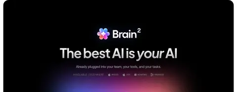
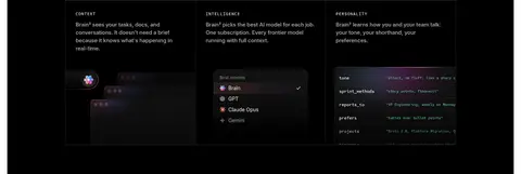
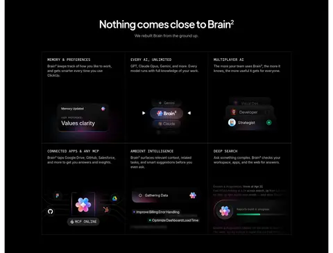
Brain² feature panel Black section with white headings, dark modular cards, fine outlines, and blue-violet light effects.
Badge Small interface label with a 6px radius; use measured blue or teal badge colors sparingly.
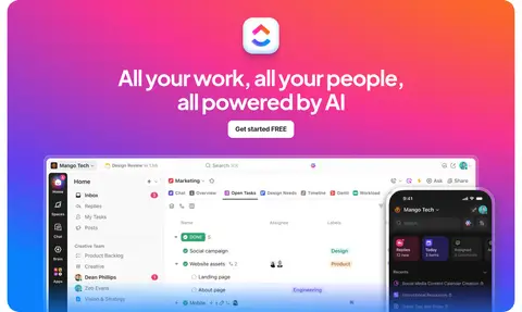
Gradient CTA Closing campaign block with a vivid pink-orange-blue-violet background, centered message, and embedded product imagery.
Imagery · Use authentic-looking product screenshots as the main visual proof: crisp application UI, task lists, dashboards, and device views. Arrange interface imagery in structured mosaics or broad panels, with restrained framing and subtle separation. Colorful AI artwork can add expressive contrast in agent sections; gradients belong to specific campaign moments, not every background. Use customer photos and awards as compact social-proof content.
页面版块 共 12 个版块,按页面从上到下排列,每个都标了类型、布局和交互套路。
该做与不该做 ✓ 该做 Keep the primary canvas white and visually quiet. Use Plus Jakarta Sans for display headlines and Inter for supporting copy. Make screenshots and real interface details the main product proof. Use black primary buttons with clear white labels. Reserve gradients for AI moments and the closing campaign panel. Create section rhythm through whitespace and alignment shifts. Use fine borders to organize dense product UI. ✕ 不该做 Do not turn every section into a gradient or dark panel. Do not replace product screenshots with generic decorative imagery. Do not use loud badge colors as page-wide brand colors. Do not crowd the hero or competing headline areas. Do not add heavy shadows to every card. Do not make all section headings center-aligned. Do not use multiple competing primary button treatments. 给 AI 的提示词 想快速出一个同风格的新页面,把这段话连同 DESIGN.md 一起发给 AI。
复制 Build a new productivity SaaS page in ClickUp’s product-led visual style. Use Workspace White (#ffffff) as the main canvas, Ink Button (#202020) for primary CTAs and text, Slate Copy (#646464) for body and navigation, and Divider Gray (#e8e8e8) for fine panel borders. Set major headlines in Plus Jakarta Sans with compact, bold forms; use Inter for readable supporting copy and UI. Structure content in a centered, comfortable-width frame with spacious white sections, alternating centered campaign statements, split features, product grids, and proof points. Treat realistic application screenshots as the core imagery. Use Brain Black (#000000) sparingly for an AI showcase, with ClickUp Violet (#6647f0) and Action Blue (#0091ff) as restrained highlights. Save vivid gradients for a specific AI campaign or closing CTA, not routine panels.
DESIGN.md Tailwind v4 CSS 变量 Design Tokens
---
title: "ClickUp design system"
variant: extended
source: https://clickup.com/
captured_at: 2026-10-12
theme: light
industry: productivity
generator: Design DNA (https://four.wiralomi.com/style/clickup-com)
ai_generated: true
ai_label: "本文件由 AI 辅助生成:数值取自公开网页的实测样式,命名、用途说明与建议为模型解读。商标归原所有者。 / AI-assisted content"
---
# ClickUp · Design System
> A clear workspace, energized by AI
**Theme:** light · **Industry:** productivity · **Source:** https://clickup.com/ · **Captured:** 2026-10-12 (1440×900 desktop)
_AI-assisted content: values are measured from the public page at capture time; names, roles and guidance are model-written interpretations. Trademarks belong to their owners._
ClickUp’s homepage pairs a clean, white SaaS canvas with confident typography and detailed product UI. Carefully contained dark sections and vivid gradients spotlight AI features without overwhelming the practical, product-first presentation.
## North star
Keep the page calm and product-led with a white canvas, bold readable type, and vivid color reserved for meaningful AI moments.
## Overview
The page is led by a bright white canvas, with dark ink headlines, muted gray supporting copy, and restrained blue and violet accents. Black primary buttons provide a decisive counterpoint to the light background. Most sections retain the same white ground, letting shifts in content and generous whitespace establish rhythm; a large black Brain² feature block and a colorful closing CTA create stronger visual punctuation. Plus Jakarta Sans gives display headlines their compact, rounded authority, while Inter handles navigation and body copy with practical clarity. Product screenshots and interface mosaics are prominent, framed like evidence of the software rather than decorative stock imagery. Colorful 3D-style AI artwork and gradients add expressive moments, especially around agent and closing sections. The overall layout is centered and comfortably constrained, combining broad headline areas with dense product grids, split feature panels, and modular proof points. Borders and subtle shadows separate interface layers without making the marketing page feel heavy.
## Colors
| Name | Hex | Token | Group | Role |
|---|---|---|---|---|
| Workspace White | ` | `--color-workspace-white` | surface | Primary page canvas, light content sections, and text on dark panels. |
| Action Blue | ` | `--color-action-blue` | accent | Interface highlights, links, and blue portions of AI feature gradients. |
| Brain Black | ` | `--color-brain-black` | surface | Brain² feature-section background, dark product cards, and selected interface rails. |
| Divider Gray | ` | `--color-divider-gray` | neutral | Fine borders and separators around interface panels and cards. |
| Badge Blue | ` | `--color-badge-blue` | semantic | Blue text within product-interface badges; not a primary page-wide brand color. |
| Badge Teal | ` | `--color-badge-teal` | semantic | Teal text within backend-style interface badges; appears in product UI. |
| Quiet Gray | ` | `--color-quiet-gray` | neutral | Low-emphasis interface labels, disabled-like text, and secondary borders. |
| Muted Copy | ` | `--color-muted-copy` | neutral | Secondary copy and subdued links against the white canvas. |
| Slate Copy | ` | `--color-slate-copy` | neutral | Body text and navigation copy on light sections. |
| Panel Charcoal | ` | `--color-panel-charcoal` | surface | Dark card surfaces and subtle outlines inside the Brain² feature area. |
| Ink Button | ` | `--color-ink-button` | brand | Primary CTA fill, main text, and selected button surfaces. |
| Mist Panel | ` | `--color-mist-panel` | surface | Soft card and product-panel backgrounds within otherwise white sections. |
| Section Gray | ` | `--color-section-gray` | surface | Measured neutral section surface; use sparingly where a muted band is needed. |
| Badge Violet | ` | `--color-badge-violet` | semantic | Small badge accent within interface or illustration details, not a dominant brand field. |
| Badge Rose | ` | `--color-badge-rose` | semantic | Minor product-interface badge color; reserve for illustrative UI details. |
| Badge Umber | ` | `--color-badge-umber` | semantic | Minor badge color inside product UI and mockups. |
| ClickUp Violet | ` | `--color-clickup-violet` | accent | AI feature accents, violet typography, and luminous gradient details. |
| Signal Mint | ` | `--color-signal-mint` | accent | Small green interface highlights and accent text within product demonstrations. |
### Semantic aliases
`--color-canvas` → ` (Workspace White) · `--color-surface` → ` (Brain Black) · `--color-surface-2` → ` (Divider Gray) · `--color-surface-3` → ` (Panel Charcoal) · `--color-surface-4` → ` (Section Gray) · `--color-text` → ` (Slate Copy) · `--color-text-muted` → ` (Workspace White) · `--color-text-subtle` → ` (Muted Copy) · `--color-border` → ` (Divider Gray) · `--color-accent` → ` (Action Blue) · `--color-accent-2` → ` (Signal Mint) · `--color-accent-3` → ` (ClickUp Violet)
### Contrast (WCAG 2.x)
| Text | Background | Ratio | Level |
|---|---|---|---|
| ` | ` | 5.92:1 | AA |
| ` | ` | 3.55:1 | AA-large |
| ` | ` | 4.83:1 | AA |
| ` | ` | 2.43:1 | fail |
| ` | ` | 21:1 | AAA |
| ` | ` | 1.23:1 | fail |
| ` | ` | 14.35:1 | AAA |
| ` | ` | 3.79:1 | AA-large |
| ` | ` | 5.54:1 | AA |
| ` | ` | 3.09:1 | AA-large |
### Gradients
- `radial-gradient(132% 74% at 96% 1%, rgb(252, 109, 45) 23%, rgb(247, 54, 153) 57%, rgb(102, 71, 240) 95%, rgb(11, 136, 253) 115%)`
- `linear-gradient(rgba(246, 233, 232, 0), rgba(255, 91, 54, 0.23))`
- `conic-gradient(rgb(0, 145, 255), rgb(255, 2, 240), rgb(247, 104, 8), rgb(102, 71, 240), rgb(0, 145, 255) 360deg)`
- `conic-gradient(rgb(252, 109, 123) 0deg, rgb(253, 154, 70) 7deg, rgb(246, 135, 198) 16deg, rgba(79, 185, 250, 0) 36deg, rgba(0, 0, 0, 0) 324deg, rgba(0, 145, 255, 0) 330deg, rgb(0, 145, 255) 340deg, rgb(250, 36, 206) 352d`
## Typography
| Family | Token | Source | Weights | Role | Free substitute |
|---|---|---|---|---|---|
| Inter | `--font-body` | webfont | 500, 400, 600, 700, 650 | Navigation, body copy, and practical interface text. | Inter |
| Plus Jakarta Sans | `--font-display` | webfont | 500, 650, 700, 400, 600 | Display headlines, major headings, and prominent product-feature labels. | Plus Jakarta Sans |
| SF Pro | `--font-sf-pro` | system | 500, 590 | Captions and small supporting labels. | Inter |
| Sometype Mono | `--font-mono` | webfont | 500, 400 | Code-like snippets and technical labels in AI interface content. | IBM Plex Mono |
| SF Pro Text | `--font-sf-pro-text` | system | 450, 600, 500, 400, 700 | Small UI badges and interface text. | Inter |
- **Inter:** Use medium weights for compact copy; keep sentence case and slightly tight tracking.
- **Plus Jakarta Sans:** Heavy display weights, rounded forms, tight negative tracking; headline case remains natural.
- **SF Pro:** Compact, medium-weight captions with neutral tracking.
- **Sometype Mono:** Use monospace sparingly for compact technical text; regular weight.
- **SF Pro Text:** Small, legible interface labels in regular or medium weights.
### Type scale — Perfect Fourth (ratio ≈ 1.338, base 14px)
| Role | Size | Weight | Line height | Letter spacing | Case | Family | Used for |
|---|---|---|---|---|---|---|---|
| display | 60px | 700 | 1.1 | -0.035em | — | Plus Jakarta Sans | Oversized homepage hero and campaign headlines. |
| h1 | 48px | 650 | 1.25 | -0.035em | — | Plus Jakarta Sans | Primary section headlines and high-priority feature statements. |
| h2 | 40px | 650 | 1.2 | -0.04em | — | Plus Jakarta Sans | Secondary section headings and product-story titles. |
| h3 | 22px | 400 | 1.27 | -0.023em | — | Inter | Feature and content-card headings. |
| h4 | 20px | 400 | 1.5 | -0.02em | — | Inter | Compact subheadings and explanatory panel titles. |
| body | 14px | 500 | 1.43 | -0.011em | — | Inter | Descriptions, supporting marketing copy, and interface-adjacent text. |
| caption | 12px | 500 | 1.5 | 0 | — | SF Pro | Small metadata, footnotes, and quiet labels. |
| nav | 14px | 500 | 1.43 | -0.011em | — | Inter | Top-level navigation and menu labels. |
| link | 12px | 500 | 1.5 | 0 | — | Inter | Compact contextual links and supporting actions. |
| code | 10px | 400 | 2 | 0 | — | Sometype Mono | Code-like AI examples and technical UI snippets. |
OpenType features in use: `"calt" 0` , `"calt" 0, "clig" 0, "liga" 0` .
## Spacing & layout
- Base unit **2px**, density **comfortable**.
- Scale (most used values): 2, 3, 4, 5, 6, 8, 10, 12, 20, 24 px.
- Section rhythm 80px · element gap 8px · card padding — · max content width 1080px.
Use a centered content frame with a measured maximum width of 1080px, but allow selected product imagery and feature bands to spread wider. The page alternates spacious single-column statements with two-column product or agent presentations, dense interface grids, and modular metrics. Keep headlines mostly left-aligned in hero and proof sections; center major campaign and product-story blocks. The measured section rhythm is generous, with comfortable internal gaps and clear separation between major content groups.
## Shape & elevation
- Radius: button `8px` · card `12px` · media `50%` · badge `6px` · nav `8px` · link `12px` · xs `1px` · sm `3px` · md `4px` · lg `6px` · xl `8px` · 2xl `12px` · pill `9999px`
- Shadow `sm` (other): `rgba(0, 0, 0, 0.1) 0px 1px 3px 0px, rgba(0, 0, 0, 0.1) 0px 1px 2px -1px`
- Shadow `md` (card): `rgba(18, 43, 165, 0.04) 0px 1px 1px -0.5px, rgba(18, 43, 165, 0.04) 0px 3px 3px -1.5px, rgba(18, 43, 165, 0.04) 0px 6px 6px -3px, rgba(18, 43, 165, 0.04) 0px 12px 12px -6px`
- Shadow `hairline` (other, card): `rgba(0, 0, 0, 0.08) 0px 1px 2px 0px`
- Shadow `xl` (card): `rgba(0, 0, 0, 0.17) -34px -13px 37px 0px, rgba(0, 0, 0, 0.2) -9px -3px 20px 0px`
- Shadow `inset` (other): `rgba(226, 232, 255, 0.12) 0px -22.5px 67.4px -19.3px inset`
- Shadow `lg` (card): `rgba(0, 0, 0, 0.15) 0px 12px 48px 0px`
- Motion: standard transition `0.25s cubic-bezier(0.5, 0, 0.5, 1)` on interactive elements.
Keep most sections flat on white, using fine gray borders to define product panels and card divisions. Apply subtle shadows to floating UI elements and selected cards, rather than raising every component. Layer product screenshots, small assistant callouts, and dark AI panels with clear contrast; reserve stronger glow and inset effects for the Brain² showcase.
## Imagery
Use authentic-looking product screenshots as the main visual proof: crisp application UI, task lists, dashboards, and device views. Arrange interface imagery in structured mosaics or broad panels, with restrained framing and subtle separation. Colorful AI artwork can add expressive contrast in agent sections; gradients belong to specific campaign moments, not every background. Use customer photos and awards as compact social-proof content.
## Components
### Primary CTA
Dark ### Secondary login button
Light gray ### Top navigation
Compact text-led navigation on white, with dark labels and small dropdown indicators; actions sit at the right.
### Product showcase
Large application UI panel with a narrow navigation rail, task content, and restrained borders.
### Brain² feature panel
Black section with white headings, dark modular cards, fine outlines, and blue-violet light effects.
### Badge
Small interface label with a 6px radius; use measured blue or teal badge colors sparingly.
### Gradient CTA
Closing campaign block with a vivid pink-orange-blue-violet background, centered message, and embedded product imagery.
### Measured component styles
- **Primary button** (“Dependencies”): background ## Do
- Keep the primary canvas white and visually quiet.
- Use Plus Jakarta Sans for display headlines and Inter for supporting copy.
- Make screenshots and real interface details the main product proof.
- Use black primary buttons with clear white labels.
- Reserve gradients for AI moments and the closing campaign panel.
- Create section rhythm through whitespace and alignment shifts.
- Use fine borders to organize dense product UI.
## Don't
- Do not turn every section into a gradient or dark panel.
- Do not replace product screenshots with generic decorative imagery.
- Do not use loud badge colors as page-wide brand colors.
- Do not crowd the hero or competing headline areas.
- Do not add heavy shadows to every card.
- Do not make all section headings center-aligned.
- Do not use multiple competing primary button treatments.
## Agent prompt
Build a new productivity SaaS page in ClickUp’s product-led visual style. Use Workspace White (## Page sections (top to bottom)
| # | Type | Layout | UX patterns | UI patterns |
|---|---|---|---|---|
| 1 | hero | Large left-aligned headline and copy above a product UI preview. | Free-start CTA, Supporting reassurance | Oversized headline, Dark primary button, Product screenshot |
| 2 | product-showcase | Wide application preview with a sidebar and task workspace. | Task navigation, Search, Create task | Application chrome, List view, Floating AI assistant |
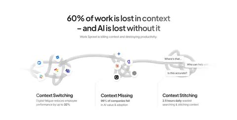
| 3 | feature-split | Centered headline followed by a broad illustrative diagram and three explanatory columns. | Problem framing, Play video prompt | Centered title, Illustrated workflow, Three text columns |
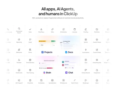
| 4 | product-grid | Centered introduction above a dense multi-column product and feature mosaic. | Browse capabilities, Explore product areas | Feature tiles, Product screenshots, Icon grid |
| 5 | feature-split | Centered feature heading and actions paired with a colorful agent visual. | Build an agent, Learn more | Large headline, Paired actions, 3D-style artwork |
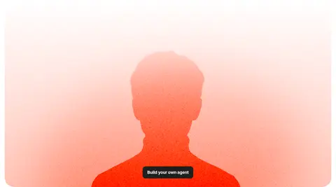
| 6 | product-showcase | Full-width campaign image with a centered embedded action. | Build your own agent | Warm gradient backdrop, Human silhouette, Dark button |
| 7 | feature-grid | Centered title and availability details inside a full-width black section. | Platform availability, Get started | Dark background, Brand mark, Gradient glow |
| 8 | feature-grid | Three side-by-side dark cards within the continuing AI section. | Feature comparison, Scan key benefits | Three-column cards, Fine borders, Embedded UI snippets |
| 9 | feature-grid | Centered headline above a multi-row grid of dark feature cards. | Explore AI capabilities, Review examples | Card grid, Dark panels, Small UI previews |
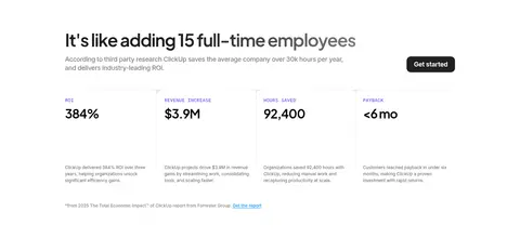
| 10 | stats | Left-aligned proof headline with a row of four business metrics. | Review ROI, Start free | Metric columns, Compact notes, Primary CTA |
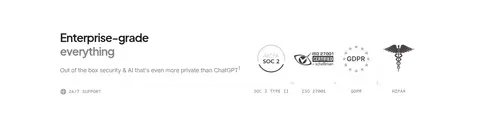
| 11 | logo-cloud | Heading and reassurance copy aligned alongside certification marks. | Build trust, Review standards | Certification logos, Compact labels, White background |
| 12 | cta | Rounded, colorful full-width panel with centered message and product devices below. | Get started free | Multicolor gradient, Centered CTA, Desktop and phone mockups |
## Source CSS custom properties (selected)
```css
--color-button-other-background: 0,0,0,0.15;
--color-shadow: 16,30,54,0.1;
--color-shadow-1: 16,30,54,0.06;
--color-pink-shadow-1: 253,113,175,0.1;
--color-pink-shadow-2: 253,113,175,0.2;
--color-blue-shadow-1: 73,204,249,0.1;
--color-blue-shadow-2: 73,204,249,0.2;
--color-green-shadow-1: 0,184,132,0.1;
--color-green-shadow-2: 0,184,132,0.2;
--color-purple-shadow-1: 123,104,238,0.1;
--color-purple-shadow-2: 123,104,238,0.2;
--color-purple-shadow-4: 123,104,238,0.4;
--color-purple-shadow-5: 123,104,238,0.5;
--color-violet-shadow-1: 155,81,224,0.1;
--color-violet-shadow-2: 155,81,224,0.2;
--color-yellow-shadow-1: 255,200,0,0.1;
--color-yellow-shadow-2: 255,200,0,0.1;
--color-gradient-cyan-accent-light-1: 255,255,255,0.1;
--color-gradient-cyan-accent-lightest-1: linear-gradient(45deg,