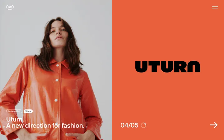
North star · Let oversized warm-white typography and generous dark space carry the story; keep every other visual device quiet.
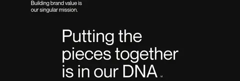
The page is built around a continuous near-black canvas (#101010), with warm off-white (#fffdf9) carrying nearly all visible text, from large statements to small navigation labels and footer links. The palette stays deliberately narrow; muted slate (#4a5765) and charcoal gray (#40403f) are measured as minor border or detail colours, not broad background bands. Neue Montreal is used throughout in regular weight. Large, naturally cased headlines dominate the editorial rhythm, while smaller uppercase labels identify services, clients, and sections. A single-column narrative alternates oversized statements with compact supporting copy and service or advisor lists; thin horizontal rules quietly organize rows. Wide vertical gaps create a spacious pace across the long page. Team portraits appear as framed, rounded-corner photographs among otherwise text-led sections, while client and publication marks remain small. Avoid adding decorative colour, gradients, heavy shadows, or dense card treatments.
Site-wide display, headings, body copy, labels, navigation, and links.
角色
示例
字号
字重
行高
字距
特大标题
Oversized lead statements and prominent editorial moments.
Vivid+Co
136px
400
1
-0.02em
一级标题
Primary section headlines and major page statements.
Vivid+Co
105.5px
400
1.01
0
二级标题
Large supporting section headings.
Vivid+Co
56px
400
1.13
0
三级标题
Service and link titles with editorial emphasis.
Vivid+Co
33.5px
400
1.2
-0.01em
四级标题
Uppercase service or category labels.
Vivid+Co
32px
400
1.01
0
正文
Compact descriptive copy and supporting paragraphs.
The quick brown fox 敏捷的狐狸
15px
400
1.2
0.01em
辅助文字
Small uppercase section labels and metadata.
The quick brown fox 敏捷的狐狸
14px
400
1.5
0
链接
Prominent text links and project labels.
Vivid+Co
33.5px
400
1.2
-0.01em
间距与布局
基准单位 1px · 密度:宽松
109px版块间距
38px元素间距
—卡片内边距
1070px内容最大宽度
1px
5px
7px
11px
15px
20px
30px
38px
40px
53px
56px
60px
64px
72px
A long, mostly single-column editorial page sits within a measured 1070px maximum width. Content aligns to a consistent left edge, with select supporting copy offset toward the right and team content arranged across columns. Large headline sections alternate with compact service lists, case-study rows, logo groups, and team profiles. Measured section gaps are generous; preserve the visible pauses rather than compressing the page. Use thin horizontal rules to separate repeated rows, and keep overall density low.
圆角与层次
没有测到阴影:页面是扁平的,层次靠底色和描边区分。
The interface reads as flat: there are no measured shadows or gradients. Sections share the same canvas rather than sitting on raised cards. Fine horizontal rules distinguish repeated rows and list items; image framing provides the main localized change in depth without adding general card elevation.
组件
下面的预览按实测的按钮、输入框、徽标、卡片样式重建(字体用替代字体)。
Editorial headline
Large regular-weight Neue Montreal statement in warm white, left aligned, with natural casing and ample surrounding dark space.
Service columns
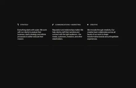
Three compact service groups with uppercase labels, small supporting copy, simple marks, and understated bottom rules.
Case-study rows
Stacked uppercase client or project labels separated by thin horizontal rules rather than boxed cards.
Client and press marks
Small logo marks arranged in compact groups beside uppercase section labels; preserve their supplied artwork.
Team profiles
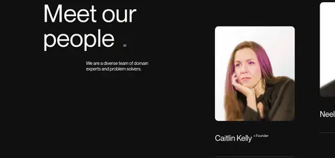
Portrait-led profile items with rounded image corners, name and role text, and subtle separators.
Text navigation and links
Unfilled, unshadowed text controls in warm white; labels are often uppercase and links remain visually restrained.
Footer details
Small email, social, copyright, and policy links placed directly on the dark canvas.
Imagery · The page is primarily typography and text, not image-led. Team portraits are the main human imagery, shown as individual rounded-corner photographs against the dark page. Client and publication logos appear small within their own compact grouping; treat them as supplied marks rather than sources for a broader colour palette. Avoid inventing illustration, 3D, or decorative media treatments.
Use Neue Montreal or a close neutral sans-serif substitute.
Give major statements generous room to breathe.
Separate repeated rows with fine, quiet rules.
Keep labels and supporting copy visually subordinate.
Use portraits and logos sparingly within the editorial flow.
✕ 不该做
Do not introduce bright accent colours or gradients.
Do not place every content group inside a card.
Do not add shadows or ornamental elevation.
Do not make supporting copy compete with the headlines.
Do not compress the large vertical pauses.
Do not recolour client or publication logos as brand accents.
给 AI 的提示词
想快速出一个同风格的新页面,把这段话连同 DESIGN.md 一起发给 AI。
Build a new Vivid+Co-style agency page as a restrained editorial narrative. Use Ink Canvas (#101010) across the page and Warm Porcelain (#fffdf9) for headings, body text, labels, navigation, and links. Use Neue Montreal where available, otherwise a neutral sans such as Inter, in regular weight. Create a clear scale contrast between oversized, naturally cased statements and compact supporting copy. Keep content aligned to a broad, consistent column, but allow secondary copy to sit offset where appropriate. Organize service groups, case studies, and advisors with thin horizontal rules rather than cards. Preserve generous vertical breathing room between blocks. Keep imagery limited to carefully framed team portraits and small supplied logos. Avoid gradients, shadows, bright accents, and decorative surfaces.