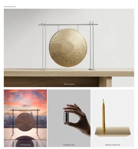
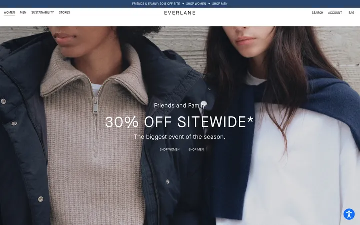
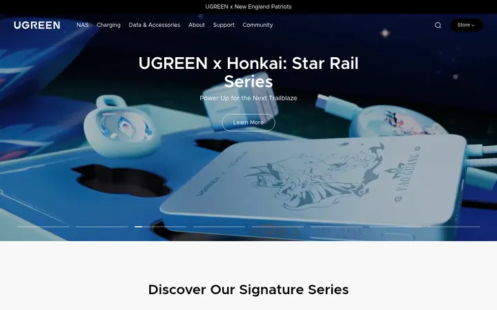
North star · Let immersive, natural product photography lead, while the interface stays quiet, white, and typographically restrained.
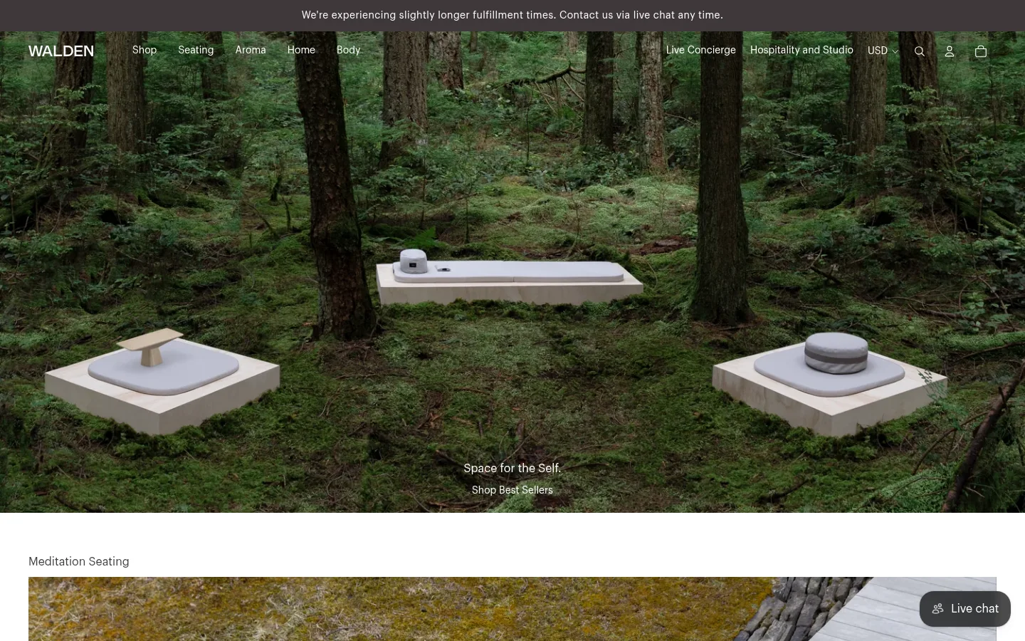
Walden’s visual strategy balances a quiet storefront interface with highly atmospheric product imagery. The measured palette is led by pure white (#ffffff), used for the page canvas and the broad space between category displays; near-black (#030302) and black (#000000) carry most interface text, while warm stone (#d3cec5) appears in fine borders. The homepage hero overlays its forest scene with small, centered white copy and a transparent navigation layer. Below, generous image-led bands and compact three-image groupings behave like editorial product galleries rather than conventional boxed cards. Graphik is the single measured typeface, set at regular weight with modest line heights and no conspicuous tracking or uppercase treatment. Product imagery supplies the page’s richer greens, muted blues, charcoal, and warm neutrals; these belong to the photographs, not the measured interface palette. Spacing separates categories clearly, while hairline rules and simple controls keep the merchandising understated.
配色
点色块复制色值。用途说明来自对页面的实测位置(背景、文字、描边、按钮)与截图判读。
品牌色
表层色
中性色
功能色
页面底色 · Gallery White主文字 · Pure Black次要文字 · Gallery White弱文字 · Soft Ink描边 · Warm Stone
Measured site-wide sans serif for navigation, headings, body copy, links, and captions.
角色
示例
字号
字重
行高
字距
一级标题
Hero statement and prominent section heading text.
The quick brown fox 敏捷的狐狸
18px
400
1.1
0
正文
Supporting copy and general storefront content.
The quick brown fox 敏捷的狐狸
14px
400
1.1
0
辅助文字
Small labels over product and category images.
The quick brown fox 敏捷的狐狸
10px
400
1
0
导航
Header navigation and utility links.
The quick brown fox 敏捷的狐狸
14px
400
1
0
链接
Product names and calls to action.
The quick brown fox 敏捷的狐狸
14px
400
1.4
0
间距与布局
基准单位 2px · 密度:适中
60px版块间距
5px元素间距
—卡片内边距
1360px内容最大宽度
4px
5px
6px
10px
11px
12px
16px
20px
24px
30px
40px
60px
A comfortable, image-led storefront sits within a measured maximum page width of 1360px. The full-bleed hero contrasts with the aligned content sections below, where large category photographs alternate with compact three-column image groupings. Sections follow a clear vertical rhythm, with a measured 60px section gap and restrained space around labels. Most content is left-aligned; hero copy is centered over the image. The page feels spacious without adding decorative framing or dense interface panels.
圆角与层次
按钮 · 2px
导航 · 9999px
inset · nav, link
inset · button
hairline · input
The page is mostly flat: white canvas, broad photographs, and very little card framing. Warm Stone (#d3cec5) appears in fine rules, including the understated input divider. Measured inset shadows are limited to controls and links; avoid adding prominent drop shadows or layered panels.
组件
下面的预览按实测的按钮、输入框、徽标、卡片样式重建(字体用替代字体)。
Overlay storefront navigation
Compact Graphik navigation over the hero image, with the wordmark, category links, service links, currency, and utility icons.
Announcement strip
A narrow, dark notice band above the navigation with a single centered fulfillment message in small, light text.
Hero image and copy
Full-bleed forest photography with a centered short statement and shop link near the lower part of the image.
Image-led category feature
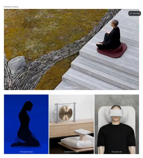
A small category label precedes a wide lifestyle image, followed by a compact row of three product-category images with captions.
Product image gallery
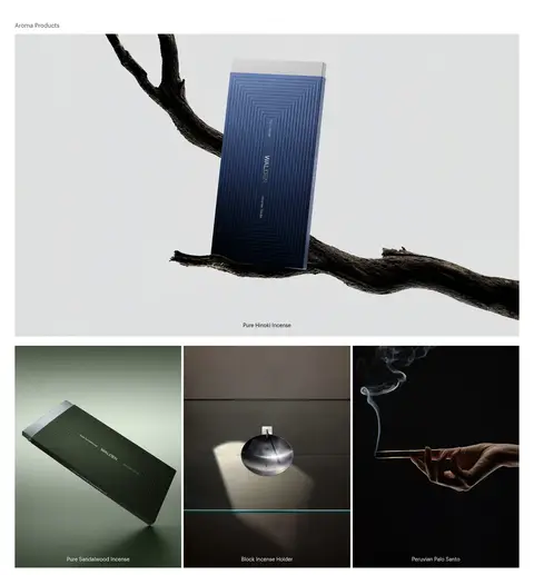
Large rectangular product photographs alternate with three-image groupings; image captions remain small and unobtrusive.
Newsletter and footer
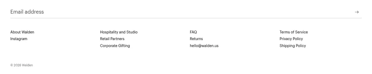
A simple email entry row with a hairline divider, followed by compact columns of store, support, and policy links.
Imagery · Large photographic scenes carry the brand: a forest-set hero, a meditating person, and carefully staged incense, cushions, benches, and gongs. Images use broad, rectangular crops and natural or studio lighting, with small captions placed over or beneath the photography. The forest greens and other vivid tones are photographic content, not additional measured interface colors.
Use Gallery White (#ffffff) as the primary page canvas.
Give category photography the visual emphasis.
Keep navigation and captions compact and understated.
Use Soft Ink (#030302) for prominent interface text and filled CTAs.
Separate product categories with generous white space.
Use Warm Stone (#d3cec5) for quiet hairlines.
✕ 不该做
Do not treat photographic greens as interface palette colors.
Do not add gradients or decorative color bands.
Do not wrap every image in a card.
Do not use heavy shadows or raised panels.
Do not introduce bold, oversized typography.
Do not crowd the image-led category sections.
给 AI 的提示词
想快速出一个同风格的新页面,把这段话连同 DESIGN.md 一起发给 AI。
Build a calm, image-led ecommerce page in Walden’s visual style. Use Gallery White (#ffffff) as the canvas, Soft Ink (#030302) for primary text and filled actions, and Warm Stone (#d3cec5) only for subtle dividers and borders. Set a restrained Graphik-like sans serif in regular weight; keep navigation, captions, and labels compact. Organize the page into broad photographic category features with generous white space and occasional three-image product groupings. Make photography feel natural, tactile, and editorial, with wide crops and small unobtrusive captions. Keep the header quiet and overlay it on a full-bleed hero where appropriate. Favor flat layouts, hairlines, and simple controls; avoid decorative panels, prominent shadows, bright interface accents, and dense copy.