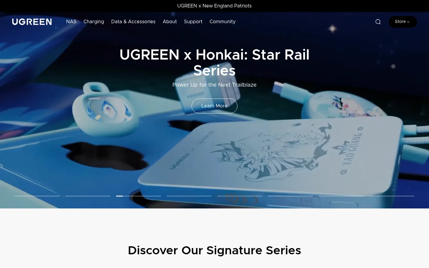
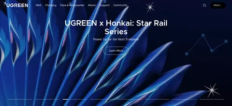
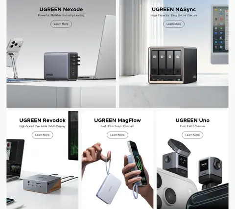
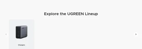
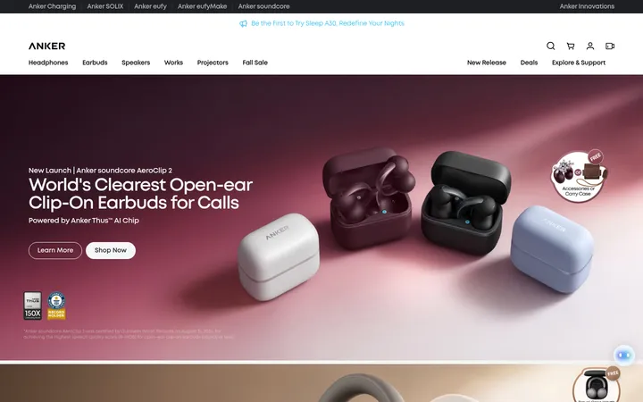
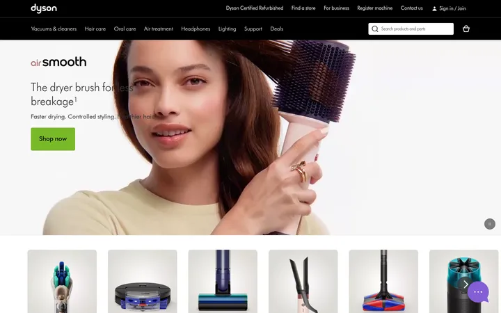
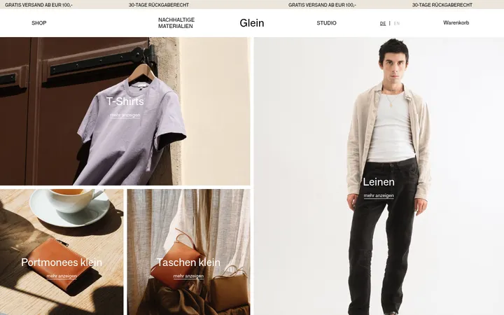
North star · Keep the interface quiet and spacious so richly detailed product and lifestyle imagery—not decorative UI—sets the visual tone.
The page is built on a restrained monochrome foundation: white canvas, pale gray section bands, black typography, and occasional darker areas in the footer. The measured green, blue, red, and yellow appear as small badges rather than a dominant brand palette; campaign imagery supplies the stronger color. Metropolis is used throughout, with centered, weighty headings and straightforward body copy. The 48px hero heading and 40px section heading establish clear hierarchy without decorative type effects. Layout alternates full-bleed campaign media with spacious product grids, category browsing, lifestyle imagery, proof points, and editorial content. Product tiles sit on light surfaces and rely on photography rather than visible card borders or shadows. Rounded outline actions recur over both light and dark media. Generous section spacing gives the long homepage room to breathe, while compact partner marks, review cards, and news modules create denser moments lower down.
Site-wide headings, navigation, body copy, captions, buttons, and links.
角色
示例
字号
字重
行高
字距
一级标题
Primary campaign headline, centered over the full-bleed hero.
UGREEN
48px
600
1.1
0
二级标题
Major centered section titles and editorial headings.
UGREEN
40px
600
1.1
0
三级标题
Product names and prominent card headings.
UGREEN
32px
700
1.2
0
四级标题
Supporting subheads within content sections.
UGREEN
28px
600
1.3
0
正文
Product descriptions, supporting copy, and general page text.
The quick brown fox 敏捷的狐狸
16px
400
1.5
0
辅助文字
Product labels, dates, metadata, and small supporting details.
The quick brown fox 敏捷的狐狸
14px
400
1.5
0
按钮
Short action labels inside rounded outline controls.
The quick brown fox 敏捷的狐狸
16px
400
1.5
0
导航
Top-level site navigation and footer navigation links.
The quick brown fox 敏捷的狐狸
16px
400
1.67
0
链接
Emphasized linked text, including product and newsroom actions.
The quick brown fox 敏捷的狐狸
18px
600
1.4
0
间距与布局
基准单位 4px · 密度:宽松
120px版块间距
12px元素间距
34px卡片内边距
1360px内容最大宽度
2px
4px
6px
8px
10px
11px
12px
16px
20px
22px
24px
28px
32px
36px
40px
120px
A spacious, long-form homepage uses full-width section bands and a content maximum of 1360px. The hero is full-bleed; product storytelling shifts between large image tiles and a multi-column grid, followed by a centered category carousel and lifestyle feature. Most section headings are centered, while partner, review, and newsroom content align to the left. The measured section gap is 120px, with a 4px spacing base and 12px typical element gap. Density rises in the lower editorial and footer areas.
圆角与层次
按钮 · 9999px
导航 · 9999px
链接 · 12px
inset · link
inset · button
The interface is largely flat: product and quote cards sit directly on pale surfaces, without prominent shadows. Separation comes from background bands, image composition, and whitespace. Outlined pill-shaped actions provide the clearest component edge. Keep dark footer regions visually distinct from the light content rather than adding depth through heavy shadow.
组件
下面的预览按实测的按钮、输入框、徽标、卡片样式重建(字体用替代字体)。
Campaign carousel
Full-bleed image or video slide with centered white heading and supporting line, a rounded white-outline Learn More action, and slim progress indicators.
Product showcase tiles
Large product-photo panels on pale backgrounds with centered Metropolis titles, concise benefit copy, and compact outlined Learn More actions.
Category carousel
Centered lineup heading above image-led category links; keep each item quiet and use simple previous and next controls.
Outline action
Rounded pill with a thin black or white border and matching text; the measured Learn More labels use regular 16px Metropolis.
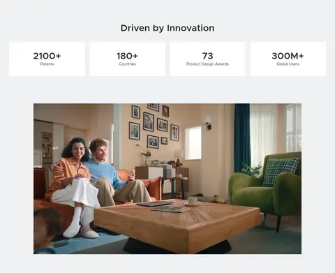
Proof-point cards
Four concise innovation metrics on a cool-gray band, with prominent figures and restrained labels on light card surfaces.
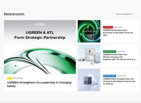
Editorial cards
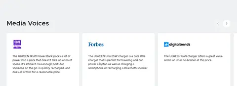
Media quotes and newsroom entries combine thumbnails or logos with compact text, dates, and occasional small colored category badges.
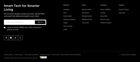
Footer navigation
Black footer area with white icon-led utility links, grouped navigation, newsletter signup, and subtle dividers.
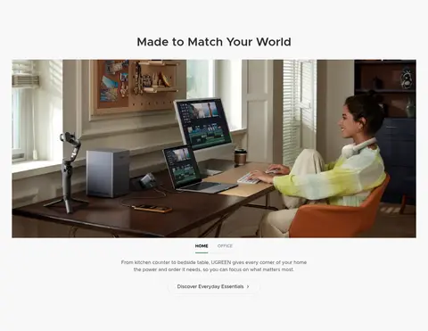
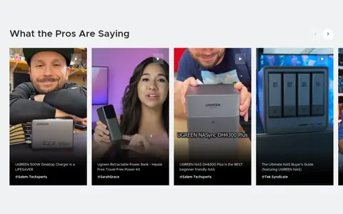
Imagery · Photography and video do the expressive work: full-bleed campaign frames lead, followed by crisp product arrangements, home-office and living-room lifestyle scenes, and creator testimonials. Product images are generally large and cleanly framed against pale backgrounds. Campaign media can be dark, colorful, and cinematic, with white text and outlined actions layered over it. Partner marks and newsroom thumbnails provide smaller editorial image moments.
Use campaign media as the primary source of color and mood.
Keep headings crisp, centered, and clearly subordinate to the hero.
Use pale section bands to organize the long page.
Prefer product photography over decorative illustration.
Use rounded outline actions with restrained labels.
Keep editorial cards readable and visually quiet.
✕ 不该做
Do not introduce a bright accent palette across the interface.
Do not add heavy shadows to product tiles or quote cards.
Do not crowd the spacious transitions between major sections.
Do not use decorative typefaces or uppercase-heavy headings.
Do not treat badge colors as broad brand surfaces.
Do not place dense text over busy photography without contrast.
给 AI 的提示词
想快速出一个同风格的新页面,把这段话连同 DESIGN.md 一起发给 AI。
Build a new UGREEN-style page with a clean consumer-tech storefront feel. Use Gallery White (#ffffff) as the canvas, Soft Porcelain (#f8f8f8) and Cool Mist (#f0f1f2) as alternating section surfaces, and Carbon Ink (#000000) for primary text and the dark footer. Use Metropolis or a close sans-serif substitute, with strong but restrained headings and readable regular-weight copy. Let large product and lifestyle photos carry the color; avoid turning badge green, blue, red, or gold into broad UI accents. Keep the layout spacious, with clear section bands, image-led grids, and centered headings where appropriate. Use thin rounded outline actions, flat cards, minimal borders, and a visually distinct black footer. Make the page feel calm, polished, and product-focused.