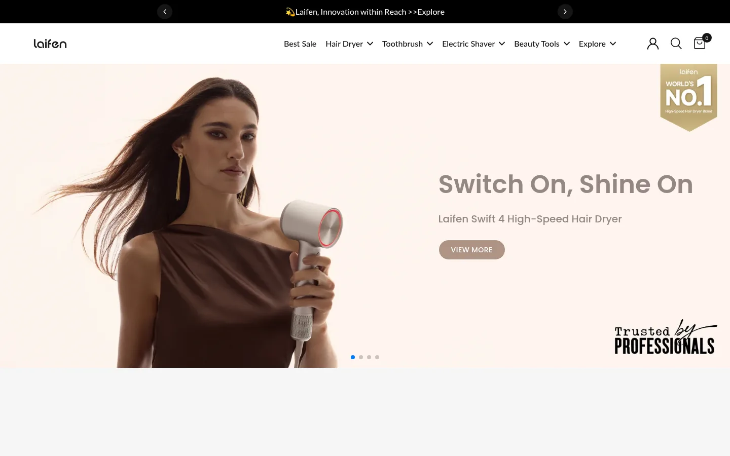
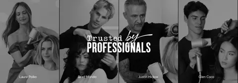
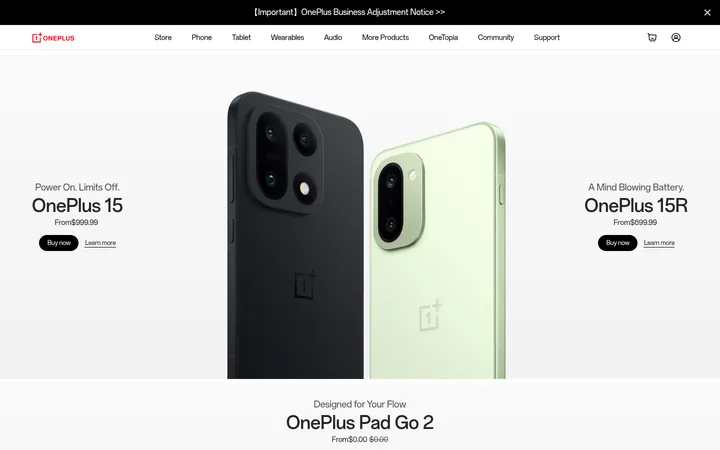
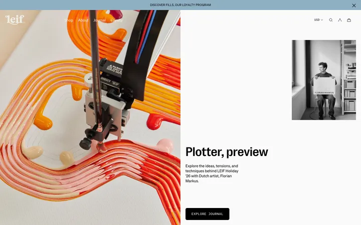
North star · Keep the commerce UI quiet and monochrome so large, warm product photography carries the emotional impact.
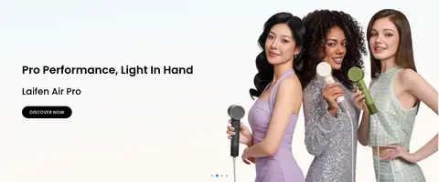
The page uses white as its primary canvas, with pale gray category bands and large black sections reserved for expert and customer stories. Black carries the navigation announcement, headings, and primary shopping buttons; muted gray supports secondary copy, while the warm beige hero button is a localized image-led accent rather than a sitewide color system. Typography mixes Poppins for prominent display messaging with Lato for navigation, product details, and controls; headings are bold and compact, while body copy stays small and readable. Product and lifestyle photography dominates, often spanning the full viewport or sitting in clean, rounded cards. The layout alternates broad promotional panels, category tiles, product carousels, trust marks, and editorial cards. Generous section breaks keep the long homepage breathable, while repeated pill-shaped buttons and restrained hairlines make its commerce interactions feel consistent.
Navigation, body copy, product details, buttons, and captions.
Aa 设计
Poppins
网络字体 · 字重 700 / 500 / 600 / 520 / 400 · 占比 19%
免费替代:Poppins
Hero messaging, selected section headings, links, and eyebrow labels.
Aa 设计
Mulish
系统字体 · 字重 400 · 占比 15%
免费替代:Mulish
Supporting body text and secondary interface copy.
Aa 设计
MiSans Latin
系统字体 · 字重 500 / 700 · 占比 4%
免费替代:Inter
Selected prominent section headings.
角色
示例
字号
字重
行高
字距
一级标题
Main hero campaign heading.
Laifen
40px
520
1.2
0
二级标题
Major section headings, including category and testimonial sections.
Laifen
34px
700
1.2
0
三级标题
Product and secondary section titles.
Laifen
28px
600
1.2
0
四级标题
Compact promotional and supporting headings.
The quick brown fox 敏捷的狐狸
20px
500
1.5
0
正文
Product descriptions, reviews, and explanatory copy.
The quick brown fox 敏捷的狐狸
13px
400
1.5
0
辅助文字
Small labels, metadata, and supporting card text.
The quick brown fox 敏捷的狐狸
12px
600
1.6
0.042em
按钮
Short uppercase shopping and navigation actions.
The quick brown fox 敏捷的狐狸
12px
600
1.6
0.042em
导航
Primary header category navigation.
The quick brown fox 敏捷的狐狸
16px
500
1.2
0
链接
Prominent editorial and product links.
The quick brown fox 敏捷的狐狸
19px
600
1.3
0
眉题
Uppercase section or promotional labels.
The quick brown fox 敏捷的狐狸
14px
500
1.6
0.036em
间距与布局
基准单位 4px · 密度:适中
72px版块间距
8px元素间距
—卡片内边距
1270px内容最大宽度
2px
3px
5px
8px
10px
12px
14px
15px
16px
18px
20px
22px
24px
26px
28px
30px
The page is organized around a centered content area capped at the measured 1270px maximum, interrupted by full-bleed campaign imagery and dark storytelling bands. Sections alternate between broad hero panels, category tiles, two-column promotion cards, product grids, and compact trust or editorial rows. Headings generally align to the start of their content group. The measured density is comfortable: generous gaps separate major blocks, while product cards and navigation remain compact. At smaller widths, preserve the clear hierarchy and allow multi-column content to collapse naturally.
圆角与层次
按钮 · 9999px
卡片 · 12px
图片 · 8px
徽标 · 9999px
导航 · 50%
链接 · 12px
md · other
The interface is mostly flat, with section backgrounds and photography doing the separation work. Product cards use rounded corners without prominent shadows; subtle gray hairlines distinguish selected controls and boundaries. Layering is clearest in the black expert-and-review section, where image cards and text sit directly against the dark surface. Keep shadows understated and reserve them for occasional floating elements.
组件
下面的预览按实测的按钮、输入框、徽标、卡片样式重建(字体用替代字体)。
Announcement and header
A narrow black announcement strip sits above a white navigation row, with dark Lato menu text and compact utility icons.
Primary shopping button
Black pill-shaped CTA with white uppercase Lato text; measured button styling uses a full pill radius.
Hero campaign
Full-bleed lifestyle banner pairing product imagery with a large Poppins headline, supporting line, and warm muted CTA.
Category tiles
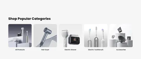
A pale gray category band contains product-image links arranged in a compact multi-column row.
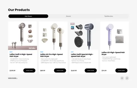
Product cards
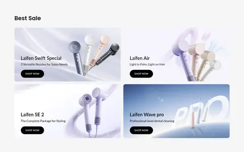
White cards pair isolated product photos with concise Lato titles, specifications, prices, and black pill CTAs.
Editorial cards
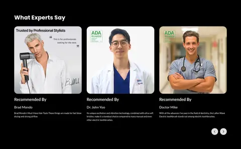
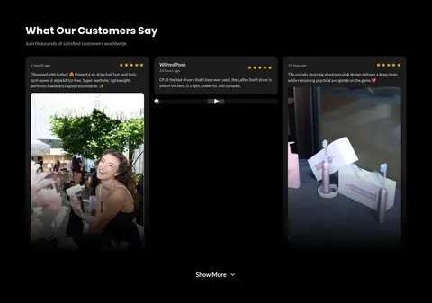
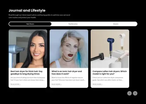
Rounded image cards and small text blocks present customer stories, expert recommendations, and journal content.
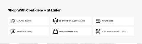
Trust strip
Compact assurance items combine small icons with short labels for delivery, returns, payment, help, rewards, and warranty.
Imagery · High-quality product photography and lifestyle campaign images define the page. Hero imagery uses expansive compositions with people and devices, while shopping sections use isolated products against pale, neutral backgrounds. Expert portraits and customer media appear within the dark editorial area. Keep photography crisp and softly lit; the warm cream, taupe, and beige tones belong primarily to the imagery rather than the interface palette.
Use white and pale gray as the default shopping surfaces.
Reserve black for primary actions, key text, and story-led dark sections.
Let product and lifestyle photography provide most of the visual warmth.
Use Poppins selectively for campaign headings and Lato for commerce UI.
Keep shopping actions short, high-contrast, and pill-shaped.
Separate long-page content with clear, generous section breaks.
✕ 不该做
Do not turn the hero’s warm beige tones into a global accent system.
Do not add bright interface colors absent from the measured palette.
Do not rely on heavy shadows to distinguish cards.
Do not crowd product cards with oversized decorative text.
Do not apply one display typeface to every page element.
Do not treat image colors as interface palette tokens.
给 AI 的提示词
想快速出一个同风格的新页面,把这段话连同 DESIGN.md 一起发给 AI。
Build a new Laifen-style commerce page with a quiet, premium personal-care aesthetic. Use Gallery White (#ffffff) as the primary canvas, Soft Mist (#f5f5f5) for selected section bands, and Carbon Black (#000000) for primary CTAs, navigation accents, and dark editorial sections. Use Deep Ink (#151515) for body and product text and Fine Silver (#e8e8e8) for restrained hairlines. Set campaign headings in Poppins and navigation, product details, and controls in Lato. Feature large, warm lifestyle photography and crisp product imagery; keep their colors inside the media, not as new UI accents. Organize the page into spacious, clearly separated sections with category tiles, product grids, and rounded image cards. Keep buttons pill-shaped, cards mostly flat, and copy concise.