North star · Use editorial serif headlines and restrained purple controls on a bright, spacious canvas, saving vivid gradients for deliberate proof and product moments.
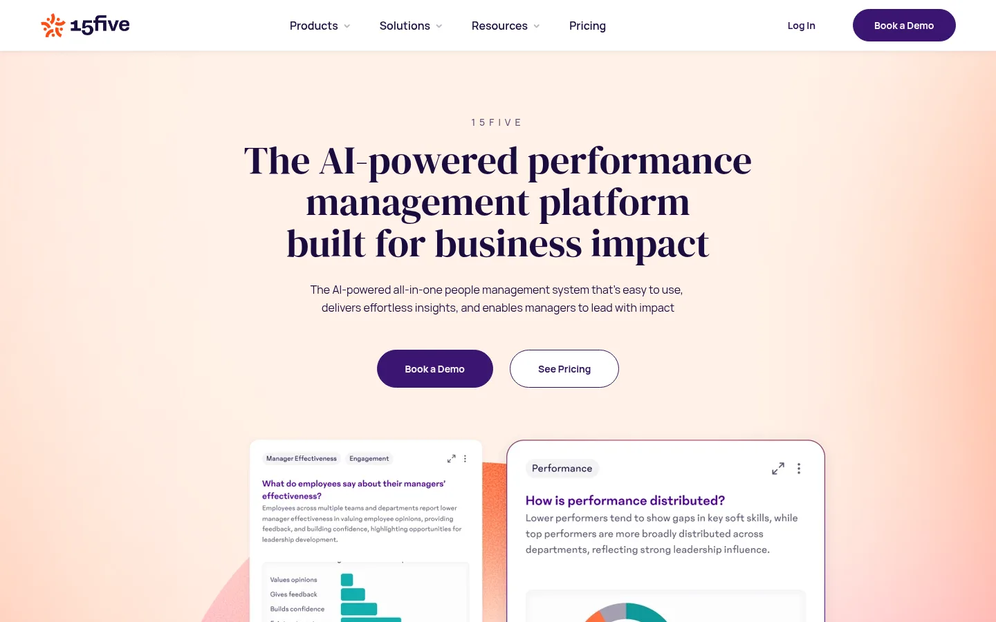
The homepage uses a predominantly white canvas, with pale peach bands and vivid coral-to-purple gradient artwork reserved for hero and proof moments. Deep aubergine anchors display headlines, navigation details, and primary actions; muted purple-gray carries body copy, while thin neutral borders keep controls and cards legible without adding visual weight. DM Serif Display gives large headlines a confident editorial voice, balanced by Manrope for navigation, paragraphs, labels, and buttons. The opening composition centers a short eyebrow, a stacked headline, concise support copy, paired pill actions, and layered product-dashboard cards. Further down, broad white intervals separate customer logos, testimonials, product tabs, split feature panels, solution cards, integrations, reviews, FAQs, and a dark footer. Imagery mixes software screenshots with people photography and softly colored graphic backdrops. Keep the hierarchy calm and spacious; use gradients as occasional emphasis, not as the page’s default surface.
Navigation, body copy, labels, captions, buttons, and most interface text.
Aa 设计
DM Serif Display
网络字体 · 字重 400 · 占比 7%
免费替代:Bodoni Moda
Display headlines and section headings.
角色
示例
字号
字重
行高
字距
特大标题
Large editorial hero headline.
15Five
56px
400
1.07
0
一级标题
Primary hero title and prominent page heading.
15Five
44px
400
1.14
0
二级标题
Major section headlines.
15Five
30px
400
1.27
0
三级标题
Feature-card and product-panel headings.
The quick brown fox 敏捷的狐狸
20px
400
1.5
0
正文
Paragraphs, descriptions, testimonial copy, and FAQ text.
The quick brown fox 敏捷的狐狸
16px
400
1.63
0
辅助文字
Eyebrows, small labels, and compact metadata.
The quick brown fox 敏捷的狐狸
12px
500
1.5
0.002em
按钮
Bold CTA text on pill-shaped actions.
The quick brown fox 敏捷的狐狸
14px
700
1.5
0
导航
Compact navigation labels and menu items.
The quick brown fox 敏捷的狐狸
12px
500
1.5
0.002em
间距与布局
基准单位 4px · 密度:适中
70px版块间距
20px元素间距
45px卡片内边距
1323px内容最大宽度
5px
10px
12px
14px
15px
16px
20px
24px
30px
32px
34px
40px
50px
100px
Use a centered, comfortable-width content frame with broad vertical pauses between major homepage sections. The measured maximum content width is 1323px; maintain the screenshot’s centered hero and largely two-column feature layouts within it. Align section headings centrally for proof and product showcases, then switch to start-aligned copy in feature splits. The page mixes wide bands, card grids, and image-text pairs rather than a rigid repeated grid. Spacing follows a measured 4px base scale and comfortable density, with clear separation between sections and tighter grouping inside components.
圆角与层次
按钮 · 9999px
卡片 · 16px
导航 · 9999px
链接 · 10px
lg · link
sm · nav
Most sections are flat white or softly tinted, with thin neutral outlines defining buttons, FAQ rows, and product cards. Use restrained shadows for floating navigation or selected link/card elements. Create depth mainly through overlapping dashboard mockups and layered image panels, not heavy drop shadows or dense borders.
组件
下面的预览按实测的按钮、输入框、徽标、卡片样式重建(字体用替代字体)。
Primary CTA
Filled #3b1572 pill button with white bold Manrope text; used for Book a Demo in the header and hero.
Secondary CTA
White or transparent pill with a thin #2f115b outline and bold purple text, as in See Pricing.
Hero product mockups
Overlapping white dashboard cards over a peach-to-coral backdrop, pairing small UI labels, copy, and chart-like product visuals.
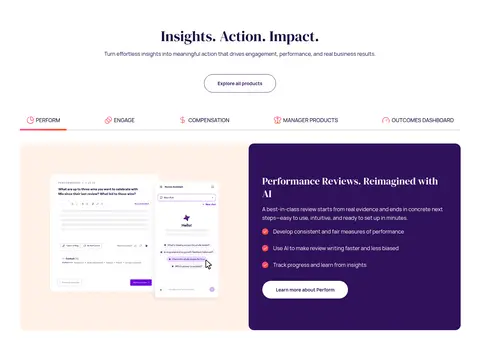
Product showcase
Tabbed product navigation above a two-part panel: product interface imagery alongside a deep purple feature card.
Solution cards
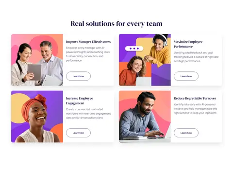
Compact image-and-copy cards combine workplace photography, short serif headings, concise text, and outlined Learn how actions.
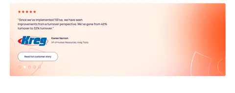
Review and testimonial panels
Customer proof sits in warm gradient bands with white cards, star ratings, attribution, and concise testimonial text.
FAQ rows
Simple question rows on white with fine horizontal separators and a trailing plus indicator.
Footer
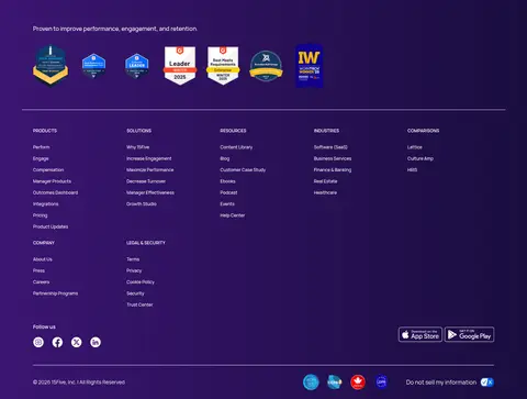
Full-width deep purple footer with proof badges, grouped small navigation links, social icons, and a fine divider.
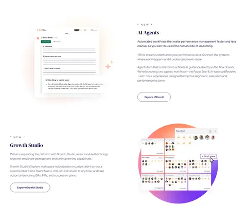
Imagery · Combine interface screenshots and dashboard mockups with customer logos, review panels, and authentic workplace photography. Hero product cards overlap softly colored abstract gradient forms; keep screenshots in clean white containers with readable UI detail. People imagery appears in modular solution cards, often against vivid coral, peach, or purple backdrops. Use gradients as decorative framing rather than a substitute for the actual product visuals.
Lead with a centered serif headline and brief supporting copy.
Use #1a0d3f for primary text and #5e5777 for secondary copy.
Keep primary actions filled in #3b1572 with white text.
Reserve #fff2e8 and gradients for selected emphasis bands.
Show product UI in clean, layered white cards.
Leave broad white intervals between major content groups.
✕ 不该做
Do not make every section a colored panel.
Do not use sans-serif for the main display headlines.
Do not replace measured colors with approximate palette variants.
Do not crowd the hero with extra controls or copy.
Do not apply heavy shadows to every card.
Do not treat illustration-only colors as core interface colors.
给 AI 的提示词
想快速出一个同风格的新页面,把这段话连同 DESIGN.md 一起发给 AI。
Build a new 15Five-style SaaS page with a bright white canvas and a calm, editorial hierarchy. Use DM Serif Display for prominent headings and Manrope for navigation, body, labels, and actions. Set primary text in Midnight Plum (#1a0d3f), secondary copy in Muted Iris (#5e5777), and main CTAs in Velvet Purple (#3b1572) with white text. Use Apricot Veil (#fff2e8) for selected warm section surfaces; keep vivid gradients occasional and decorative. Create a centered, spacious opening with a short eyebrow, confident headline, concise copy, paired pill actions, and layered product UI. Build lower sections from clean feature splits, customer proof, image-and-copy cards, and simple FAQ rows. Favor fine borders and restrained elevation over heavy shadows; preserve generous whitespace and readable content grouping.