Mailchimp以富有表现力的衬线标题和克制的暖调中性色建立品牌气质,再用醒目的黄色引导关键操作。首页依次呈现沉浸式主视觉、功能卡片、数据与客户背书、套餐、集成入口和金色页脚。
North star · Use editorial serif headlines and warm neutrals as the foundation, then reserve bright yellow for unmistakable actions and emphasis.
The visual system balances a clean white canvas with deep brown-black text and occasional pale-gray content bands. A saturated yellow is reserved for the primary trial CTA, selected headline emphasis, and small action markers, so it reads as a clear signal rather than a broad background. Means Web gives major headings an editorial, human character; Graphik Web keeps navigation, body copy, controls, and dense utility content crisp. The hero centers large serif messaging over darkened photographic video, while later sections alternate centered introductions, modular cards, customer proof, and compact integration rows. Cards are generously rounded and mostly white against light gray, with subtle separation rather than heavy outlines. The lower page shifts to warm gold for related links and the multi-column footer, creating a distinctive close. Spacing feels comfortable and sections have ample breathing room, even when individual cards contain dense feature details.
配色 点色块复制色值。用途说明来自对页面的实测位置(背景、文字、描边、按钮)与截图判读。
品牌色
Roasted Ink
#231e15
Core warm near-black for headings, footer links, inverse sections, and primary CTA text.
Harvest Gold
#e7b75f
Warm gold background across related links and the multi-column footer.
强调色
Deep Teal
#004e56
Occasional feature and content links; use sparingly against the neutral system.
Campaign Yellow
#ffe01b
Primary trial buttons, highlighted hero phrase, stars, and small directional action markers.
表层色
Gallery White
#ffffff
Main page canvas, white cards, and clean content areas.
Soft Fog
#f5f5f5
Broad feature and disclaimer bands that distinguish content from the white canvas.
Night Umber
#1a1610
Deep inverse section background, including the centered trust-building CTA.
功能色
True Black
#000000
Measured heading, navigation, and body text; visually close to the warmer core ink.
Quiet Stone
#bcbab6
Measured card, control, and component hairline borders.
Muted Ash
#706d67
Low-emphasis text captured in the measured palette; use for secondary copy only where needed.
Pale Divider
#dedede
Secondary fine separator captured in component details.
Smoky Charcoal
#403b3b
Occasional control text and button hairline treatment.
Weathered Silver
#b6b4b1
Minor measured border color; keep to understated component separation.
文字 背景 对比度 WCAG #000000 True Black#ffffff Gallery White21:1 AAA #000000 True Black#231e15 Roasted Ink1.27:1 不达标 #000000 True Black#f5f5f5 Soft Fog19.26:1 AAA #000000 True Black#e7b75f Harvest Gold11.34:1 AAA #231e15 Roasted Ink#ffffff Gallery White16.56:1 AAA #231e15 Roasted Ink#f5f5f5 Soft Fog15.19:1 AAA
字体 字号阶梯:Perfect Fourth(比例约 1.361,正文 14px)。示例用免费替代字体渲染,数值为实测。
Aa 设计
Graphik Web 网络字体 · 字重 400 / 500 / 700 / 600 · 占比 87%
免费替代:Inter
Navigation, body copy, links, buttons, captions, and utility text.
Aa 设计
Means Web 网络字体 · 字重 400 · 占比 13%
免费替代:DM Serif Display
Display and section headings, including the large hero message and editorial feature titles.
角色 示例 字号 字重 行高 字距 一级标题 Centered hero headline over the photographic background.
Mailchimp
48px 400 1 -0.021em 二级标题 Major section headings and prominent customer proof statements.
Mailchimp
40px 400 1.13 0 三级标题 Feature-card and supporting content headings.
Mailchimp
32px 400 1.25 0 四级标题 Smaller subsection headings in pricing and feature areas.
The quick brown fox 敏捷的狐狸
23px 400 1.3 0 正文 Feature descriptions, explanatory copy, and general page content.
The quick brown fox 敏捷的狐狸
14px 400 1.44 0 辅助文字 Rating qualifications, footnotes, and compact helper text.
The quick brown fox 敏捷的狐狸
11px 400 1.45 0 按钮 Primary trial actions and other compact calls to action.
The quick brown fox 敏捷的狐狸
13px 500 1.5 0 导航 Header navigation and utility controls.
The quick brown fox 敏捷的狐狸
13px 500 1.1 0 链接 Text links, feature-card actions, and integration links.
The quick brown fox 敏捷的狐狸
16px 400 2 0
间距与布局 基准单位 8px · 密度:适中
80px 版块间距
16px 元素间距
— 卡片内边距
1280px 内容最大宽度
5px
6px
8px
10px
12px
16px
24px
40px
48px
Use a centered content frame with a measured page maximum of 1280px, while allowing the hero and major section bands to span the viewport. Alternate full-width white, pale-gray, dark, and gold areas with comfortable vertical breathing room and a measured section gap of 80px. Keep the hero message centered; align feature, proof, pricing, and footer content to clear columns. The feature area uses a two-column card grid, while integration entries form compact multi-column rows. Preserve varied density: spacious storytelling sections, tighter utility lists.
圆角与层次 lg · link
hairline · button, nav, link
xl · other, card
md · other
Favor clean surfaces and gentle separation over heavy shadows. Feature cards sit on pale gray with white, generously rounded faces; use restrained soft shadowing where cards need lift. Fine borders and hairlines are subtle. The hero image is visually layered by its dark overlay, while inverse sections rely on solid dark backgrounds rather than card elevation.
组件 下面的预览按实测的按钮、输入框、徽标、卡片样式重建(字体用替代字体)。
Primary CTA Bright yellow pill-shaped trial button with warm dark text and a fine dark outline or hairline; keep the label concise and prominent.
Hero Full-width darkened lifestyle media behind a centered Means Web headline, with one italic yellow phrase, supporting copy, trial CTA, and review proof.
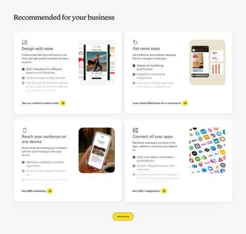
Feature cards White, generously rounded cards on a pale-gray band; pair concise feature copy and bullet details with product imagery and a small link action.
Proof section Use a deep warm-dark band for a prominent customer result, with a serif statement, selected yellow emphasis, footnote, and understated report link.
Integration tiles Compact white tiles in multi-column rows, with partner mark, short tool name, and a brief integration benefit.
Gold footer Warm harvest-gold closing area with grouped text links, related resources, brand-family marks, social links, and language selection.
Imagery · The hero uses full-bleed lifestyle footage or photography under a dark overlay, leaving the centered headline and yellow CTA legible. Feature cards mix concise copy with product and campaign imagery, while customer logos and integration marks act as supporting proof. Keep image crops deliberate and media contained within generously rounded card frames. Bright, colorful app artwork can appear inside illustrations, but it should not redefine the brand palette.
页面版块 共 28 个版块,按页面从上到下排列,每个都标了类型、布局和交互套路。
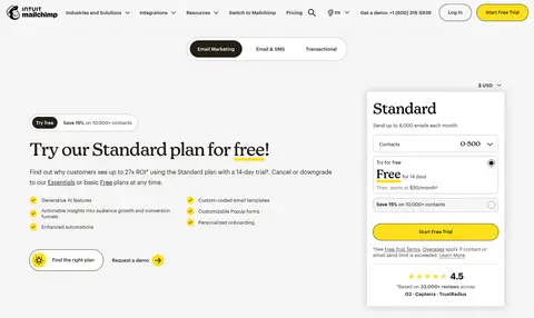
价格方案 标准版定价
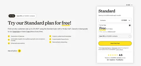
Two-column hero: plan pitch and benefits on the left, interactive Standard plan selector card on the right; product tabs sit above.
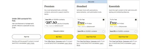
价格方案 方案选择
A dark contact-count control strip and yellow recommendation prompt lead into a four-column layout with a free option and three paid plan cards.
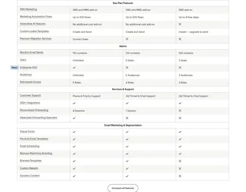
对比表 功能对比表
Wide four-column matrix with feature names in a left label column and plan values across the remaining columns, grouped by category.
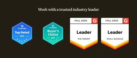
品牌墙 行业认可
Dark full-width band with a centered heading above four award badges arranged in an evenly spaced row.
图文交替 个性化导览
Two-column section with explanatory copy and link on the left and a large workplace photo on the right.
功能网格 灵活付费
Two side-by-side text panels, each with a heading, explanatory paragraph, and a small action link or button.
行动号召 小型企业方案
Centered content on a light gray band, with a heading, concise plan guidance, and two compact buttons.
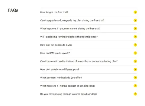
常见问题 常见问题
Two-column FAQ area with the section heading on the left and a vertical list of expandable questions on the right.
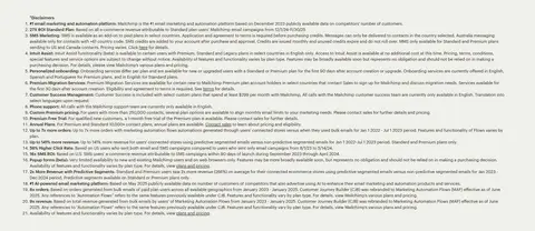
其他 脚注说明
Single-column, muted-background block containing a dense numbered list of disclosures.
其他 试用条款
Single-column light-gray strip with a compact block of fine print and one linked reference.
其他 相关链接
Short, full-width gold block with a heading and a vertical list of related resources.
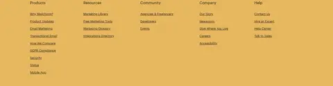
页脚 网站导航
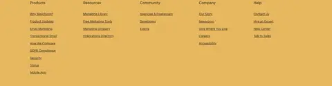
Gold footer navigation with five link columns for Products, Resources, Community, Company, and Help.
页脚 页脚信息
Gold legal and utility footer split into brand/app links and a lower language selector with copyright and legal text.
该做与不该做 ✓ 该做 Reserve Campaign Yellow (#ffe01b) for primary actions and selective emphasis. Use Means Web-style serif headlines to establish editorial hierarchy. Keep body copy and controls crisp and sans-serif. Set feature cards against pale-gray bands with generous rounding. Use dark overlays to protect text over hero photography. Give major content sections ample vertical breathing room. ✕ 不该做 Do not turn the whole page yellow; keep it as a focused accent. Do not replace the warm near-black with a cold blue-black. Do not place dense sans-serif copy in display headline roles. Do not add heavy outlines or strong shadows to every card. Do not let colorful illustration details become the core palette. Do not compress the hero and section transitions into a dense layout. 给 AI 的提示词 想快速出一个同风格的新页面,把这段话连同 DESIGN.md 一起发给 AI。
复制 Build a new marketing page in Mailchimp’s visual style. Use Gallery White (#ffffff) as the main canvas, Roasted Ink (#231e15) for warm dark text and inverse areas, and Soft Fog (#f5f5f5) for selected section bands. Reserve Campaign Yellow (#ffe01b) for the primary pill CTA and a few meaningful highlights; use Harvest Gold (#e7b75f) only for a distinctive closing or footer band. Set display headings in a Means Web-like editorial serif and supporting copy, navigation, and controls in a Graphik Web-like sans serif. Create a media-led hero with a dark overlay, centered headline, concise copy, and a clear CTA. Follow with rounded white feature cards, proof points, practical tiles, and an organized footer. Keep the spacing comfortable and shadows restrained.
DESIGN.md Tailwind v4 CSS 变量 Design Tokens
---
title: "Mailchimp design system"
variant: extended
source: https://mailchimp.com/
captured_at: 2026-10-12
theme: light
industry: saas
generator: Design DNA (https://four.wiralomi.com/style/mailchimp-com)
ai_generated: true
ai_label: "本文件由 AI 辅助生成:数值取自公开网页的实测样式,命名、用途说明与建议为模型解读。商标归原所有者。 / AI-assisted content"
---
# Mailchimp · Design System
> Warm editorial storytelling with a bright yellow signal.
**Theme:** light · **Industry:** saas · **Source:** https://mailchimp.com/ · **Captured:** 2026-10-12 (1440×900 desktop)
_AI-assisted content: values are measured from the public page at capture time; names, roles and guidance are model-written interpretations. Trademarks belong to their owners._
Mailchimp pairs expressive serif headlines and warm, restrained neutrals with unmistakable yellow calls to action. Its homepage moves between a cinematic hero, practical feature cards, proof points, pricing, integrations, and a warm gold footer.
## North star
Use editorial serif headlines and warm neutrals as the foundation, then reserve bright yellow for unmistakable actions and emphasis.
## Overview
The visual system balances a clean white canvas with deep brown-black text and occasional pale-gray content bands. A saturated yellow is reserved for the primary trial CTA, selected headline emphasis, and small action markers, so it reads as a clear signal rather than a broad background. Means Web gives major headings an editorial, human character; Graphik Web keeps navigation, body copy, controls, and dense utility content crisp. The hero centers large serif messaging over darkened photographic video, while later sections alternate centered introductions, modular cards, customer proof, and compact integration rows. Cards are generously rounded and mostly white against light gray, with subtle separation rather than heavy outlines. The lower page shifts to warm gold for related links and the multi-column footer, creating a distinctive close. Spacing feels comfortable and sections have ample breathing room, even when individual cards contain dense feature details.
## Colors
| Name | Hex | Token | Group | Role |
|---|---|---|---|---|
| Roasted Ink | ` | `--color-roasted-ink` | brand | Core warm near-black for headings, footer links, inverse sections, and primary CTA text. |
| Gallery White | ` | `--color-gallery-white` | surface | Main page canvas, white cards, and clean content areas. |
| Deep Teal | ` | `--color-deep-teal` | accent | Occasional feature and content links; use sparingly against the neutral system. |
| Campaign Yellow | ` | `--color-campaign-yellow` | accent | Primary trial buttons, highlighted hero phrase, stars, and small directional action markers. |
| True Black | ` | `--color-true-black` | semantic | Measured heading, navigation, and body text; visually close to the warmer core ink. |
| Soft Fog | ` | `--color-soft-fog` | surface | Broad feature and disclaimer bands that distinguish content from the white canvas. |
| Quiet Stone | ` | `--color-quiet-stone` | semantic | Measured card, control, and component hairline borders. |
| Harvest Gold | ` | `--color-harvest-gold` | brand | Warm gold background across related links and the multi-column footer. |
| Night Umber | ` | `--color-night-umber` | surface | Deep inverse section background, including the centered trust-building CTA. |
| Muted Ash | ` | `--color-muted-ash` | semantic | Low-emphasis text captured in the measured palette; use for secondary copy only where needed. |
| Pale Divider | ` | `--color-pale-divider` | semantic | Secondary fine separator captured in component details. |
| Smoky Charcoal | ` | `--color-smoky-charcoal` | semantic | Occasional control text and button hairline treatment. |
| Weathered Silver | ` | `--color-weathered-silver` | semantic | Minor measured border color; keep to understated component separation. |
### Semantic aliases
`--color-canvas` → ` (Gallery White) · `--color-surface` → ` (Roasted Ink) · `--color-surface-2` → ` (Soft Fog) · `--color-surface-3` → ` (Harvest Gold) · `--color-surface-4` → ` (Night Umber) · `--color-text` → ` (True Black) · `--color-text-muted` → ` (Roasted Ink) · `--color-text-subtle` → ` (Gallery White) · `--color-border` → ` (Quiet Stone) · `--color-accent` → ` (Deep Teal) · `--color-accent-2` → ` (Campaign Yellow) · `--color-accent-3` → ` (Harvest Gold) · `--color-on-accent` → ` (Roasted Ink)
### Contrast (WCAG 2.x)
| Text | Background | Ratio | Level |
|---|---|---|---|
| ` | ` | 21:1 | AAA |
| ` | ` | 1.27:1 | fail |
| ` | ` | 19.26:1 | AAA |
| ` | ` | 11.34:1 | AAA |
| ` | ` | 16.56:1 | AAA |
| ` | ` | 15.19:1 | AAA |
| ` | ` | 8.94:1 | AAA |
| ` | ` | 16.56:1 | AAA |
| ` | ` | 1.09:1 | fail |
| ` | ` | 1.85:1 | fail |
### Gradients
- `linear-gradient(rgba(35, 30, 21, 0) 0%, rgba(35, 30, 21, 0.55) 45%, rgba(35, 30, 21, 0.82) 100%)`
## Typography
| Family | Token | Source | Weights | Role | Free substitute |
|---|---|---|---|---|---|
| Graphik Web | `--font-body` | webfont | 400, 500, 700, 600 | Navigation, body copy, links, buttons, captions, and utility text. | Inter |
| Means Web | `--font-display` | webfont | 400 | Display and section headings, including the large hero message and editorial feature titles. | DM Serif Display |
- **Graphik Web:** Use clean sans-serif shapes, mostly regular weight; controls and navigation are medium, with natural sentence case.
- **Means Web:** Regular-weight serif headlines; the main display uses tight negative tracking, with selective italic yellow emphasis.
### Type scale — Perfect Fourth (ratio ≈ 1.361, base 14px)
| Role | Size | Weight | Line height | Letter spacing | Case | Family | Used for |
|---|---|---|---|---|---|---|---|
| h1 | 48px | 400 | 1 | -0.021em | — | Means Web | Centered hero headline over the photographic background. |
| h2 | 40px | 400 | 1.13 | 0 | — | Means Web | Major section headings and prominent customer proof statements. |
| h3 | 32px | 400 | 1.25 | 0 | — | Means Web | Feature-card and supporting content headings. |
| h4 | 23px | 400 | 1.3 | 0 | — | Graphik Web | Smaller subsection headings in pricing and feature areas. |
| body | 14px | 400 | 1.44 | 0 | — | Graphik Web | Feature descriptions, explanatory copy, and general page content. |
| caption | 11px | 400 | 1.45 | 0 | — | Graphik Web | Rating qualifications, footnotes, and compact helper text. |
| button | 13px | 500 | 1.5 | 0 | — | Graphik Web | Primary trial actions and other compact calls to action. |
| nav | 13px | 500 | 1.1 | 0 | — | Graphik Web | Header navigation and utility controls. |
| link | 16px | 400 | 2 | 0 | — | Graphik Web | Text links, feature-card actions, and integration links. |
## Spacing & layout
- Base unit **8px**, density **comfortable**.
- Scale (most used values): 5, 6, 8, 10, 12, 16, 24, 40, 48 px.
- Section rhythm 80px · element gap 16px · card padding — · max content width 1280px.
Use a centered content frame with a measured page maximum of 1280px, while allowing the hero and major section bands to span the viewport. Alternate full-width white, pale-gray, dark, and gold areas with comfortable vertical breathing room and a measured section gap of 80px. Keep the hero message centered; align feature, proof, pricing, and footer content to clear columns. The feature area uses a two-column card grid, while integration entries form compact multi-column rows. Preserve varied density: spacious storytelling sections, tighter utility lists.
## Shape & elevation
- Radius: button `9999px` · card `24px` · media `26px` · nav `3px` · link `16px` · xs `3px` · sm `4px` · md `10px` · lg `16px` · xl `24px` · 2xl `26px` · pill `9999px`
- Shadow `lg` (link): `rgba(0, 0, 0, 0.086) 0px 15.547px 44px 0px`
- Shadow `hairline` (button, nav, link): `rgb(35, 30, 21) 0px 0px 0px 1px`
- Shadow `xl` (other, card): `rgba(35, 30, 21, 0.06) 0px 8px 64px 0px, rgba(35, 30, 21, 0.04) 0px 4px 8px 0px`
- Shadow `md` (other): `rgba(0, 0, 0, 0.06) 0px 4px 16px 0px`
- Shadow `hairline-2` (button): `rgb(64, 59, 59) 0px 0px 0px 1px`
- Shadow `md-2` (card): `rgba(35, 30, 21, 0.15) 0px 0px 20px 3px`
- Motion: standard transition `0.2s ease` on interactive elements.
Favor clean surfaces and gentle separation over heavy shadows. Feature cards sit on pale gray with white, generously rounded faces; use restrained soft shadowing where cards need lift. Fine borders and hairlines are subtle. The hero image is visually layered by its dark overlay, while inverse sections rely on solid dark backgrounds rather than card elevation.
## Imagery
The hero uses full-bleed lifestyle footage or photography under a dark overlay, leaving the centered headline and yellow CTA legible. Feature cards mix concise copy with product and campaign imagery, while customer logos and integration marks act as supporting proof. Keep image crops deliberate and media contained within generously rounded card frames. Bright, colorful app artwork can appear inside illustrations, but it should not redefine the brand palette.
## Components
### Primary CTA
Bright yellow pill-shaped trial button with warm dark text and a fine dark outline or hairline; keep the label concise and prominent.
### Hero
Full-width darkened lifestyle media behind a centered Means Web headline, with one italic yellow phrase, supporting copy, trial CTA, and review proof.
### Feature cards
White, generously rounded cards on a pale-gray band; pair concise feature copy and bullet details with product imagery and a small link action.
### Proof section
Use a deep warm-dark band for a prominent customer result, with a serif statement, selected yellow emphasis, footnote, and understated report link.
### Integration tiles
Compact white tiles in multi-column rows, with partner mark, short tool name, and a brief integration benefit.
### Gold footer
Warm harvest-gold closing area with grouped text links, related resources, brand-family marks, social links, and language selection.
### Measured component styles
- **Primary button** (“Start Free Trial”): background ## Do
- Reserve Campaign Yellow (## Don't
- Do not turn the whole page yellow; keep it as a focused accent.
- Do not replace the warm near-black with a cold blue-black.
- Do not place dense sans-serif copy in display headline roles.
- Do not add heavy outlines or strong shadows to every card.
- Do not let colorful illustration details become the core palette.
- Do not compress the hero and section transitions into a dense layout.
## Agent prompt
Build a new marketing page in Mailchimp’s visual style. Use Gallery White (## Page sections (top to bottom)
| # | Type | Layout | UX patterns | UI patterns |
|---|---|---|---|---|
| 1 | hero | Full-width photographic hero with centered headline, supporting text, CTA, and review proof. | primary trial CTA, rating reassurance | dark media overlay, serif display headline, yellow emphasis |
| 2 | feature-grid | Pale-gray section with a two-column grid of rounded feature cards and a centered pricing action. | feature discovery, card-level links, pricing shortcut | white cards, product imagery, compact benefit lists, yellow action markers |
| 3 | logo-cloud | Shallow full-width white strip with a single horizontal row of customer marks. | social proof | monochrome logos, horizontal alignment |
| 4 | stats | White content area with multiple proof points arranged in a three-column structure. | quantified proof, report link | large serif statements, compact footnotes, yellow highlight |
| 5 | testimonials | Spacious white case-study section with an introductory heading and horizontally organized content. | case-study browsing, testimonial proof | rounded content cards, editorial heading, simple carousel controls |
| 6 | pricing | Pale-gray pricing region with explanatory copy, plan details, and a prominent pricing card. | plan comparison, trial offer, contact-range selection | white pricing panel, yellow CTA, compact plan details |
| 7 | integrations | Centered heading and short description introducing a broad integration directory. | integration discovery, directory link | serif section heading, centered alignment, yellow link marker |
| 8 | integrations | First compact row of integration tiles in a multi-column white grid. | partner discovery, integration browsing | partner logo, short benefit copy, white tile |
| 9 | integrations | Second compact row of integration tiles aligned to the directory grid. | partner discovery, integration browsing | partner logo, short benefit copy, white tile |
| 10 | integrations | Final multi-column row of integration tiles before the dark trust CTA. | partner discovery, integration browsing | partner logo, short benefit copy, white tile |
| 11 | cta | Full-width dark band with a centered trust message and yellow trial button. | trust reassurance, trial conversion | inverse background, centered serif heading, yellow pill CTA |
| 12 | content-feed | Shallow pale-gray area containing compact numbered disclosures. | feature qualification, legal disclosure | small sans-serif text, numbered list, subtle surface |
| 13 | other | Gold band with a left-aligned heading and a short list of related links. | related-content navigation | gold background, underlined text links, simple vertical list |
| 14 | footer | Gold footer arranged into several columns of grouped navigation links. | site navigation, resource discovery | multi-column link groups, simple text headings, warm background |
| 15 | footer | Lower footer area with brand-family marks, social links, language selector, and legal copy. | language selection, social navigation, legal information | brand logos, compact utility links, gold background |
## Source CSS custom properties (selected)
```css
--elevation-shadow-color: rgba(35,30,21,.15);
--spacing-1: calc(4*.0625rem);
--spacing-2: calc(8*.0625rem);
--spacing-3: calc(16*.0625rem);
--spacing-4: calc(24*.0625rem);
--spacing-5: calc(40*.0625rem);
--spacing-6: calc(64*.0625rem);
--spacing-7: calc(80*.0625rem);
--spacing-8: calc(96*.0625rem);
--cta-background-color: