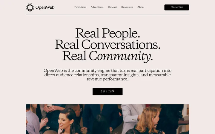
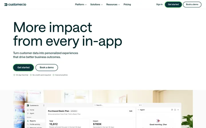
North star · Use editorial serif messaging and expressive human illustrations on an airy white canvas, with teal reserved for clear actions.
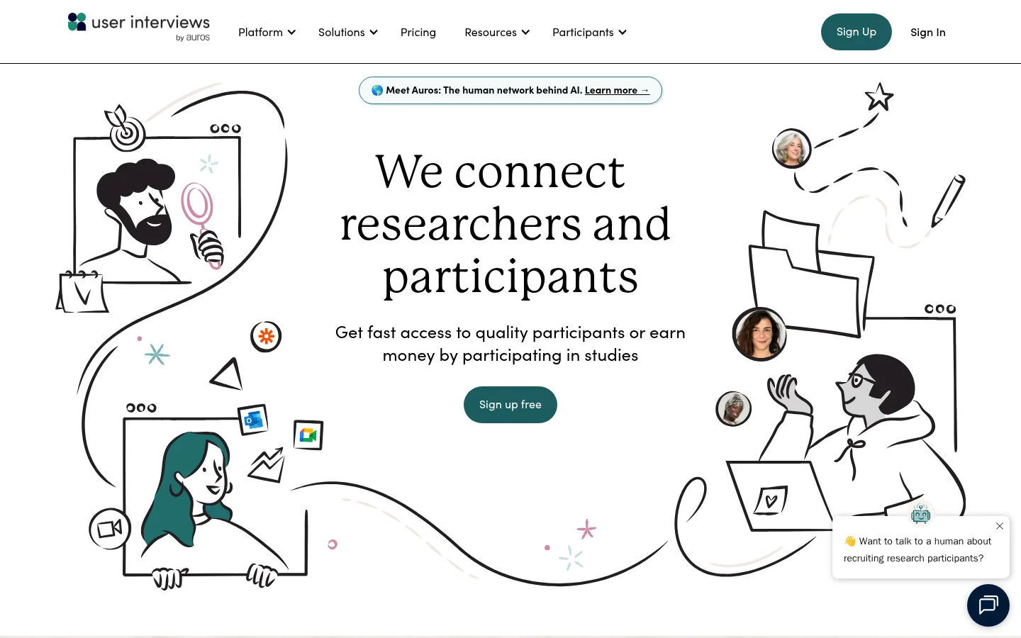
The page uses white as its dominant canvas, letting generous open space and black line-art illustrations establish a calm, approachable first impression. Teal is reserved for high-intent controls and small illustrative accents, while pale blue-green surfaces distinguish cards without creating heavy panels. A deep berry band marks the participant-focused callout; the closing footer shifts to a dark navy image treatment. Large P22 Mackinac serif headlines give the page an editorial voice, contrasted with Sofia Pro for navigation, body copy, and buttons. IBM Plex Mono appears in compact uppercase eyebrow labels. The hero centers its message between expansive hand-drawn scenes, while later content alternates broad sections, card groups, and proof points. Rounded pill CTAs, restrained hairlines, and mostly flat surfaces keep the interface light. Decorative illustration should remain supporting texture, not compete with the headline or conversion path.
Navigation, body copy, buttons, links, and compact supporting text.
Aa 设计
IBM Plex Mono
网络字体 · 字重 400 / 500 / 600 · 占比 14%
免费替代:IBM Plex Mono
Uppercase eyebrow labels and occasional compact technical-style metadata.
Aa 设计
p22-mackinac-pro
网络字体 · 字重 400 / 500 · 占比 11%
免费替代:Lora
Display, H1, H2, and editorial section headlines.
Aa 设计
P 22 Mackinac italic
网络字体 · 字重 700 · 占比 1%
免费替代:Lora
Expressive italic emphasis in selected section headings.
角色
示例
字号
字重
行高
字距
特大标题
Large editorial hero headline and prominent brand statement.
User Interviews
64px
400
1.16
0
一级标题
Primary hero title or page-level headline.
User Interviews
50px
400
1.2
0
二级标题
Major section titles across platform and proof-point content.
User Interviews
44px
400
1.32
0
三级标题
Emphasized feature headings, sometimes with expressive italic treatment.
User Interviews
36px
700
1.17
0
四级标题
Subsection and card-level titles.
User Interviews
30px
500
1.33
0
正文
Standard explanatory copy and supporting paragraphs.
The quick brown fox 敏捷的狐狸
13px
400
1.46
0
辅助文字
Small testimonial, attribution, and supporting card text.
The quick brown fox 敏捷的狐狸
12px
400
1.5
0
按钮
Primary and secondary CTA labels.
The quick brown fox 敏捷的狐狸
16px
400
1.38
0
导航
Top-level header navigation links.
The quick brown fox 敏捷的狐狸
16px
400
1.5
0
链接
Inline content links and feature destinations.
The quick brown fox 敏捷的狐狸
13px
400
1.46
0
眉题
Compact uppercase section labels with monospaced character.
The quick brown fox 敏捷的狐狸
17px
600
2.24
0.059em
代码
Mono-styled technical snippets if required; not prominent in this homepage.
const style = 1;
14px
400
1.57
0
间距与布局
基准单位 8px · 密度:适中
88px版块间距
16px元素间距
32px卡片内边距
1300px内容最大宽度
4px
6px
8px
12px
14px
16px
20px
22px
24px
32px
40px
48px
56px
88px
Use a broad centered content area with a measured maximum width of 1300px. The hero is vertically spacious, placing a centered text-and-CTA stack between large hand-drawn scenes. Subsequent white sections mix centered headings with split or multi-column content, including three-column proof points and a four-column footer. Preserve the comfortable density and clear section breaks; measured section rhythm is generous, with repeated 16px element gaps and 32px card padding. Align long-form content cleanly and let illustrations extend around, not over, the central message.
圆角与层次
按钮 · 9999px
导航 · 9999px
hairline · other
The interface is mostly flat: cards use pale fills rather than pronounced shadows, and content sections rely on whitespace instead of stacked containers. Buttons are pill-shaped, with little or no visible elevation. Keep borders and hairlines restrained; the measured shadow is a subtle teal-tinted detail, not a general card treatment.
组件
下面的预览按实测的按钮、输入框、徽标、卡片样式重建(字体用替代字体)。
Header navigation
White horizontal header with black Sofia Pro links, a compact brand mark, and a teal pill-shaped Sign Up action.
Announcement link
Slim outlined pill centered above the hero title, with a small icon, compact copy, and inline learn-more link.
Hero CTA
Centered supporting copy followed by a Harbor Teal (#1c5d5f) pill button with white Sofia Pro text.
Feature cards
Flat, square-corner cards using Mist Mint (#f2f8f7) or Tide Glass (#e4f0f1), black copy, and generous internal padding.
Participant callout
Full-width Berry Ink (#662344) band with white headline and supporting copy, accompanied by a celebratory illustration.
Testimonial proof
Quote-led social proof on cool pale surfaces, with compact Sofia Pro copy and surrounding company or platform marks.
Dark footer
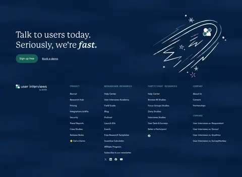
Deep navy image-led footer with white headings and compact multi-column navigation links.
Imagery · The hero relies on distinctive black hand-drawn scenes of researchers, participants, documents, and research tools, with selective teal and rose accents. Keep the line art loose, human, and expansive against white; pair it with occasional participant portraits or company marks in later proof sections. The participant callout uses an illustrated figure, while the footer uses a dark, graphic image treatment. Avoid glossy product mockups or dense photographic backgrounds.
Keep the main page canvas white and visually open.
Use Mackinac-style serif headlines for editorial emphasis.
Reserve Harbor Teal for clear primary actions.
Use hand-drawn human scenes as the signature visual motif.
Keep feature cards flat with pale blue-green fills.
Use monospaced uppercase labels sparingly.
Maintain a strong distinction between the berry callout and white sections.
✕ 不该做
Do not replace the line-art identity with glossy product renders.
Do not make every section teal or dark.
Do not use heavy shadows to separate ordinary cards.
Do not crowd the hero headline with illustration details.
Do not apply monospaced styling to body paragraphs.
Do not round feature cards; reserve pill shapes for navigation and buttons.
给 AI 的提示词
想快速出一个同风格的新页面,把这段话连同 DESIGN.md 一起发给 AI。
Build a new page in the User Interviews visual style. Keep a generous white Gallery White (#ffffff) canvas, black Research Ink (#000000) typography, and editorial Mackinac-style serif headlines. Use friendly Sofia Pro-like sans-serif for navigation, body copy, and controls; reserve IBM Plex Mono for small uppercase labels. Make Harbor Teal (#1c5d5f) the primary CTA color with white text, and use Soft Jade (#65b8a2) only as a restrained accent. Organize content in broad, spacious sections with clear alignment and comfortable gaps. Include loose, human hand-drawn line art as supporting imagery, not as a backdrop to dense copy. Use Mist Mint (#f2f8f7) and Tide Glass (#e4f0f1) for flat cards, and a single Berry Ink (#662344) band for a contrasting callout. Keep borders and shadows subtle; use pill-shaped controls and square-corner content cards.