North star · Use the deep purple canvas to frame crisp, readable content, and reserve lime for the primary action.
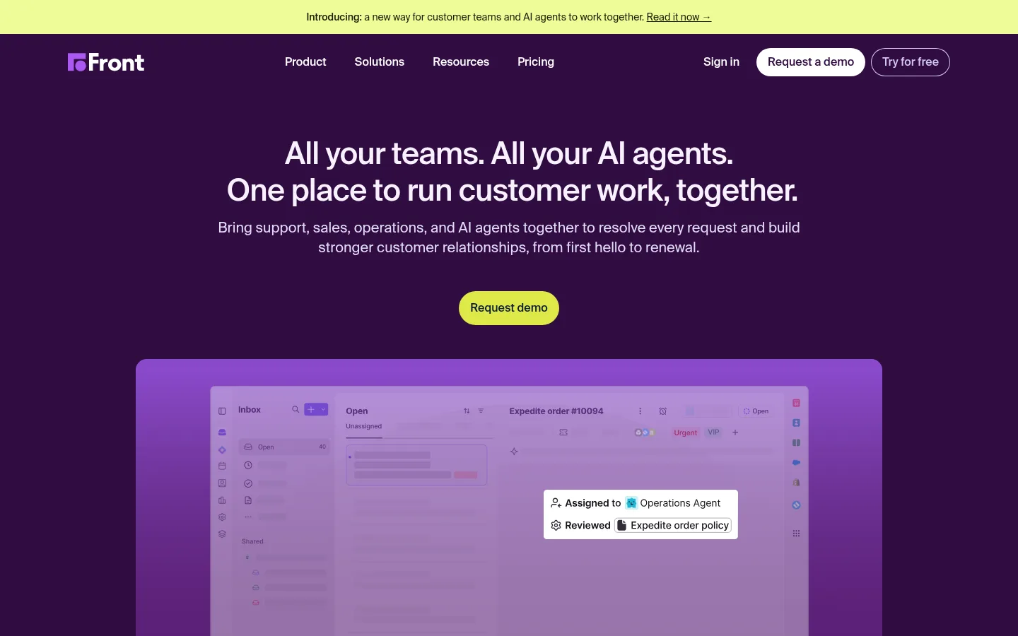
The visual identity hinges on the contrast between a saturated aubergine canvas (#300c41) and clean white content areas. A lime button (#dee948) is the strongest call to action, while pale lavender text (#f8f1fe and #e2dcf6) keeps purple sections readable. The main page alternates between dark, immersive product storytelling and white proof-oriented sections, with a purple footer as a closing brand field. Suisse Intl supplies a restrained, modern sans-serif voice: medium-weight headings use compact tracking, while body and navigation copy stay regular and legible. The hero is centered and spacious; later sections use columns, testimonial cards, and long product demonstrations. Product UI imagery sits within softly rounded frames and often glows with purple light, so treat that vividness as media styling rather than a replacement for the core palette. Keep controls pill-shaped and cards subtly rounded; let whitespace and contrast do more work than decoration.
Headings, body copy, navigation, buttons, captions, and links throughout.
角色
示例
字号
字重
行高
字距
一级标题
Centered hero statement in two compact lines.
Front
43px
500
1.21
-0.017em
二级标题
Major section headings and prominent customer-work claims.
Front
36px
500
1.17
-0.018em
三级标题
Feature, testimonial, and card headings.
Front
30px
500
1.2
-0.015em
四级标题
Smaller subsection and product-story headings.
The quick brown fox 敏捷的狐狸
25px
500
1.2
-0.01em
正文
Explanatory paragraphs and standard supporting copy.
The quick brown fox 敏捷的狐狸
16px
400
1.5
0
辅助文字
Compact customer, attribution, and supporting details.
The quick brown fox 敏捷的狐狸
14px
400
1.43
0
按钮
Primary demo action and prominent controls.
The quick brown fox 敏捷的狐狸
16px
500
1.5
0
导航
Top navigation links and menu items.
The quick brown fox 敏捷的狐狸
15px
400
1.27
0
链接
Inline actions and footer destinations.
The quick brown fox 敏捷的狐狸
14px
400
1.43
0
眉题
Uppercase category labels above section headings.
The quick brown fox 敏捷的狐狸
15px
400
1.4
0.067em
间距与布局
基准单位 8px · 密度:适中
48px版块间距
8px元素间距
1px卡片内边距
840px内容最大宽度
1px
2px
4px
6px
8px
12px
16px
24px
32px
48px
The hero uses a centered single-column composition, while later proof and feature areas shift into multi-column grids and long product-story panels. The measured page max width is 840px; preserve generous outer whitespace and centered headings where shown. White and purple bands alternate to distinguish evidence from immersive product content. Spacing follows an 8px base rhythm with comfortable density and pronounced section gaps. Keep body copy aligned to its card or column rather than stretching it across the page.
圆角与层次
按钮 · 9999px
卡片 · 8px
图片 · 8px
导航 · 9999px
链接 · 12px
inset · button
xl · nav
inset · section
inset · button
Most sections and cards feel flat, with pale hairlines and subtle corner rounding defining the boundaries. Product screenshots gain depth from vivid purple backplates and soft glow, not heavy card shadows. The floating navigation has the clearest measured elevation; keep any shadow treatment restrained and preserve contrast between layered media and the page canvas.
组件
下面的预览按实测的按钮、输入框、徽标、卡片样式重建(字体用替代字体)。
Announcement strip
A slim signal-lime banner above the dark navigation, with centered compact copy and an inline link.
Pill CTA
Primary Request demo control uses a lime fill, midnight ink text, medium-weight Suisse Intl, and a fully rounded silhouette.
Centered hero
Large two-line heading, concise supporting copy, and a centered CTA sit above a wide product preview on aubergine.
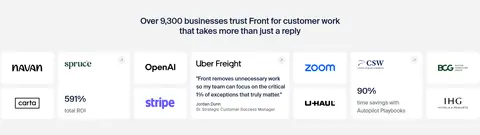
Proof cards
Customer logos, ROI figures, and quotations appear in a tight multi-column white area with pale borders.
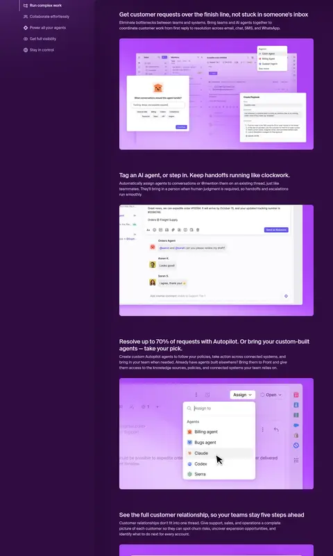
Product story panel
A dark purple feature band pairs a left-side capability list with stacked product demonstrations and concise explanatory copy.
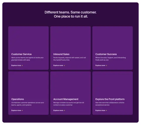
Category cards
A rounded purple container holds a three-column grid of team-use-case cards, each with a short description and Explore more link.
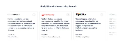
Testimonial cards
White quote cards use light separators, restrained text hierarchy, and small company or author identifiers.
Link-rich footer
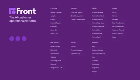
A plum brand field organizes many compact destinations into columns, then transitions to a darker purple resource strip.
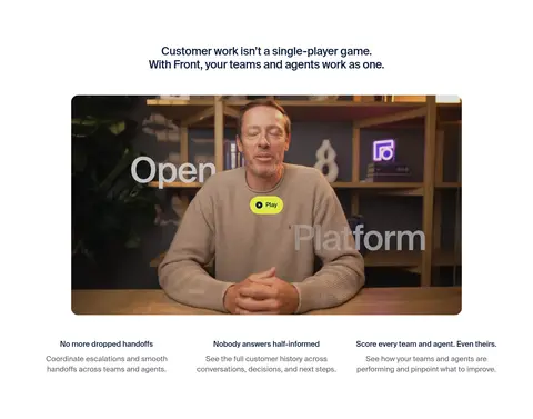
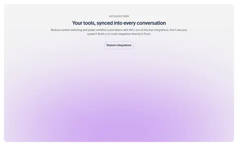
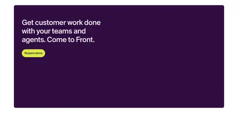
Imagery · The visual storytelling is led by product-interface screenshots and a large video still, not decorative illustration. Frame product UI in broad rounded rectangles with purple or lavender glow treatments; these brighter hues belong to the media rather than the core palette. Customer logos and testimonial marks remain compact within light cards. The integration area uses a soft lavender bloom, while the closing CTA pairs a dark purple panel with open negative space.
Use aubergine (#300c41) for immersive brand sections.
Reserve signal lime (#dee948) for the clearest primary action.
Keep hero messaging centered and concise.
Alternate dark storytelling with white evidence sections.
Use Suisse Intl or a close, restrained sans-serif substitute.
Frame product imagery with rounded corners and purple glow.
Keep cards and dividers subtle.
✕ 不该做
Do not turn product-media colors into the site-wide palette.
Do not use lime for large background areas.
Do not crowd the hero with multiple competing actions.
Do not replace the alternating section rhythm with one continuous surface.
Do not add heavy shadows to ordinary cards.
Do not use decorative display typography or all-caps body copy.
给 AI 的提示词
想快速出一个同风格的新页面,把这段话连同 DESIGN.md 一起发给 AI。
Build a polished SaaS page in Front’s visual language. Use Aubergine Canvas (#300c41) for immersive hero and product-story bands, Gallery White (#ffffff) for proof and content sections, and Plum Footer (#5b1f76) for the link-rich close. Set headings in Porcelain Lilac (#f8f1fe) on dark surfaces and dark ink on light ones. Use Signal Lime (#dee948) sparingly for the primary pill CTA with Midnight Ink (#0d1d39) text. Use Suisse Intl when available, otherwise Inter; keep typography clean and medium-weight for headings. Create generous centered hero spacing, alternating section bands, compact evidence grids, and rounded product previews with purple media glow. Keep cards mostly flat with restrained borders, readable copy, and clear section hierarchy.