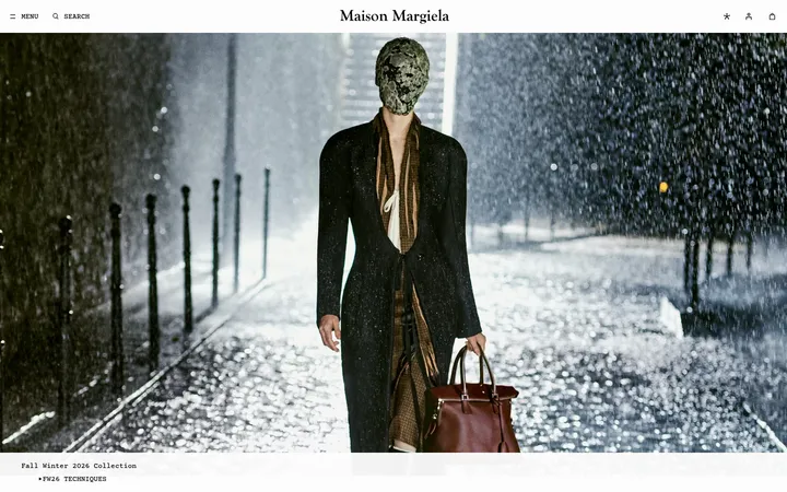
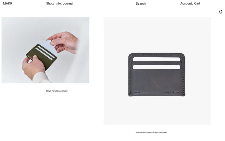
North star · Keep interface elements monochrome and restrained so full-width material imagery carries the visual emphasis.
The visual strategy makes the material imagery the main event while the interface stays nearly monochrome. White (#ffffff) forms the page canvas and language bar; black (#000000) supplies navigation and editorial text, while off-black (#1e1e1e) anchors the footer and thin outlined controls. Do not promote the screenshot’s stone, sand, or charcoal image tones into interface colours: they belong to photographed materials. Matter is used for larger reading text and links; Matter Mono gives compact uppercase labels and navigation a technical, catalog-like voice. The layout is a long, mostly single-column sequence with generous white intervals and occasional full-bleed imagery or paired image panels. Small text overlays sit directly on photographs, keeping the imagery uninterrupted. Borders are fine and controls are modestly rounded; the overall treatment is flat, with no measured shadows or gradients. The result feels architectural and editorial rather than like a conventional product catalog.
Navigation, captions, eyebrow labels, and compact utility text.
角色
示例
字号
字重
行高
字距
正文
Editorial descriptions and prominent text links.
The quick brown fox 敏捷的狐狸
20px
400
1.2
0
辅助文字
Small uppercase labels and image captions.
The quick brown fox 敏捷的狐狸
12px
400
1.3
0.02em
导航
Compact uppercase header and language navigation.
The quick brown fox 敏捷的狐狸
12px
400
1.3
0.02em
眉题
Tiny uppercase section identifiers.
The quick brown fox 敏捷的狐狸
10px
400
1.2
0.04em
代码
Compact uppercase utility-style text.
const style = 1;
12px
400
1.3
0.02em
间距与布局
基准单位 8px · 密度:适中
48px版块间距
8px元素间距
—卡片内边距
1424px内容最大宽度
3px
4px
8px
12px
24px
48px
100px
180px
Build a long vertical page on a white canvas, with a compact language strip above the image-led opening. The measured page max width is 1424px; imagery can run edge to edge, while copy and lower content sit in more contained arrangements. The sequence is predominantly one column, interrupted by two-image panels and a three-column lower feature area. Keep the rhythm comfortable: large visual sections alternate with concise copy and open white space. Align small labels to image edges or content starts rather than centering every block.
圆角与层次
按钮 · 3px
没有测到阴影:页面是扁平的,层次靠底色和描边区分。
The interface is essentially flat: no measured shadows or gradients. Use white space and full-bleed imagery for depth and hierarchy rather than raised cards. Controls use thin charcoal or white outlines with a subtle measured 3px button radius; the footer creates the strongest tonal layer.
组件
下面的预览按实测的按钮、输入框、徽标、卡片样式重建(字体用替代字体)。
Language selector
A slim white top band with compact uppercase mono prompt, outlined language controls, and a close glyph.
Image-led header navigation
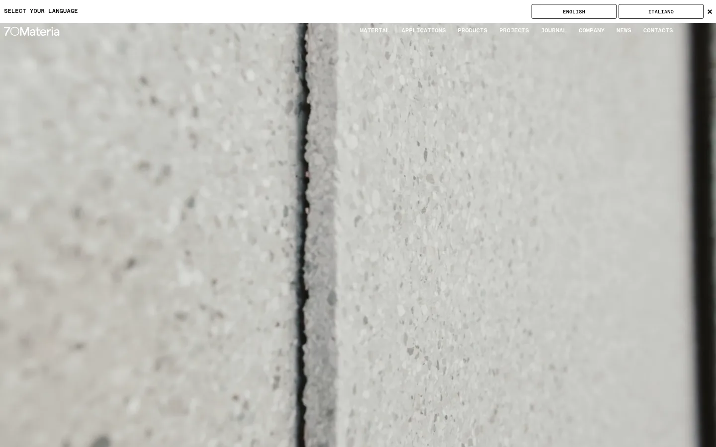
Brand mark and small uppercase navigation sit over the opening material photograph with light text for contrast.
Immersive image feature
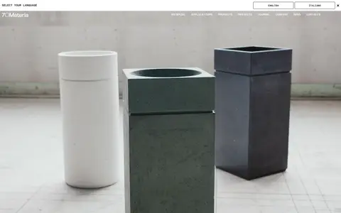
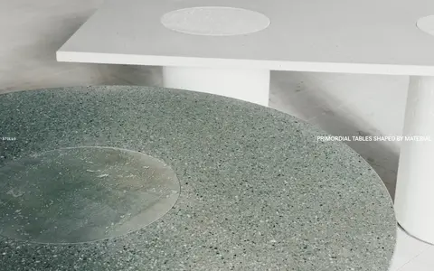
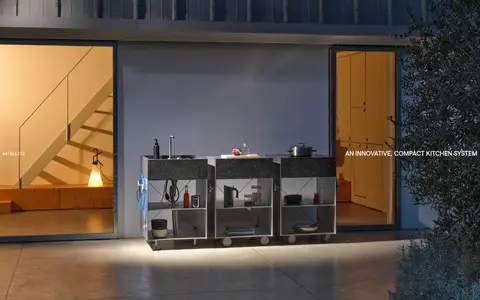
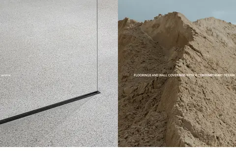
Large edge-to-edge product or architectural photograph with small, uppercase labels placed near image edges.
Editorial image pair
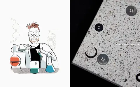
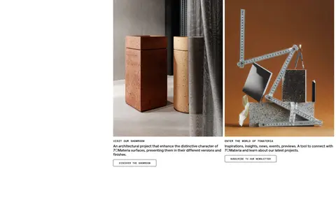
Two adjacent image panels combine a journal illustration and close material photography, with a concise linked story label.
Outlined action
Compact uppercase Matter Mono text inside an unfilled control with a thin border and measured 3px radius.
Dark footer
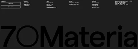
A #1e1e1e footer groups language, company, information, legal, and social links in small white uppercase text.
Imagery · Use large photographic views of surfaces, architectural settings, and finished products, often cropped edge to edge. Favor tactile close-ups and calm, natural material tones; the opening image is an extreme surface detail, followed by product and interior scenes. Include editorial illustration only as a distinct journal image, not as a general interface motif. Place small white or dark labels directly over photographs where contrast allows.
Let material photography occupy the largest visual areas.
Keep the interface palette to the measured monochrome colours.
Use Matter for readable copy and Matter Mono for utility labels.
Set navigation and captions in compact uppercase styling.
Alternate immersive images with concise editorial content.
Use thin outlined controls instead of filled promotional buttons.
✕ 不该做
Do not use photographed stone tones as invented interface colours.
Do not add shadows, gradients, or decorative effects.
Do not turn every content block into a card.
Do not crowd the full-bleed image sections with copy.
Do not use oversized or heavy navigation typography.
Do not center all content when the reference favors edge alignment.
给 AI 的提示词
想快速出一个同风格的新页面,把这段话连同 DESIGN.md 一起发给 AI。
Create a new page in 70Materia’s restrained, architectural editorial style. Use Gallery White (#ffffff) as the canvas, Carbon Ink (#000000) for text and navigation, and Workshop Charcoal (#1e1e1e) for dark footer areas and fine control borders. Keep interface colour monochrome; treat stone, sand, and other material hues as photographic content, not brand tokens. Use Matter or a close sans-serif for body copy and Matter Mono or a close monospaced face for compact uppercase labels. Organize the page as a calm vertical sequence with generous white intervals and large full-bleed material photography, then add concise editorial copy and restrained outlined actions. Align labels to image or content edges. Avoid shadows, gradients, dense cards, and unnecessary decoration.