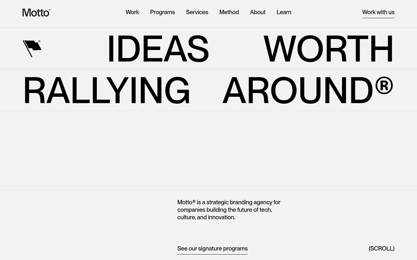
North star · Let oversized black typography and a pale, uninterrupted canvas carry the identity; reserve visual variety for the work itself.
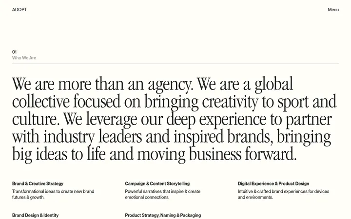
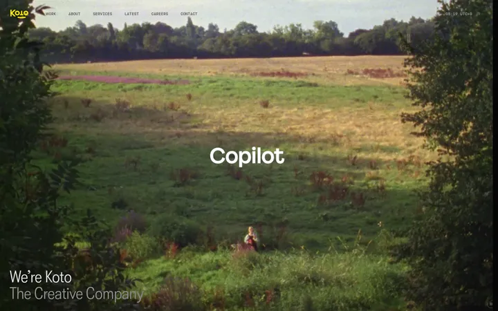
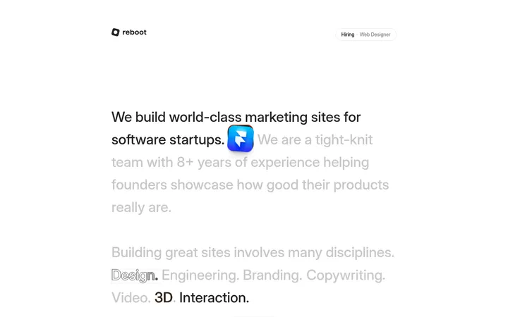
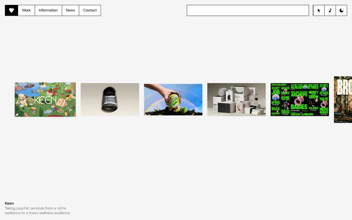
The visual identity is built on a restrained grayscale palette: #f2f2f2 carries nearly the entire page, while black typography and fine gray dividers create sharp, quiet contrast. White testimonial cards and the near-black footer mark the few substantial shifts in surface. Typography does the expressive work: very large uppercase display statements span the layout, balanced by compact, straightforward sans-serif copy and underlined text links. Sections use a wide, consistent content frame with varied one-, two-, and three-column arrangements; their alignment stays mostly flush left, with generous open space between major content blocks. Imagery is intentionally diverse because the page is a branding portfolio: client identities, abstract visuals, photographs, and video thumbnails supply color and texture within project media rather than changing the core palette. Cards stay flat and crisp, with subtle corners only where measured. Overall, the page feels spacious, confident, and editorial rather than decorative.
Main interface type: headings, body copy, navigation, links, buttons, and captions.
Aa 设计
disp
网络字体 · 字重 500 · 占比 3%
免费替代:Manrope
Distinctive display font for select oversized statements and repeated method lettering.
角色
示例
字号
字重
行高
字距
特大标题
Oversized uppercase hero and campaign statements.
Motto®
153.5px
500
1
0
一级标题
Primary page or section headline, set in uppercase.
Motto®
139px
500
1.1
0
二级标题
Large uppercase section titles such as selected work.
Motto®
125px
500
1
0
三级标题
Uppercase display headings and prominent repeated lettering.
Motto®
99px
500
1
0
四级标题
Smaller uppercase display labels and section accents.
Motto®
61.5px
500
1
0
正文
Introductory paragraphs, editorial copy, and service descriptions.
The quick brown fox 敏捷的狐狸
20px
500
1.38
0
辅助文字
Project labels, category markers, and compact supporting text.
The quick brown fox 敏捷的狐狸
15.5px
500
1.38
0
按钮
Text actions styled as understated links rather than filled buttons.
The quick brown fox 敏捷的狐狸
20px
500
1.38
0
导航
Header navigation and primary site links.
The quick brown fox 敏捷的狐狸
20px
500
1.38
0
链接
Underlined inline and standalone text links.
The quick brown fox 敏捷的狐狸
20px
500
1.38
0
间距与布局
基准单位 1px · 密度:宽松
288px版块间距
23px元素间距
77px卡片内边距
1284px内容最大宽度
8px
15px
19px
21px
23px
24px
29px
38px
48px
58px
67px
77px
96px
158px
Use a broad content frame measured at 1284px maximum, with largely left-aligned content and a spacious, low-density composition. The page alternates between single-column headline moments and two- or three-column content layouts, with a denser multi-column footer. Major sections have pronounced vertical separation; smaller groups use more compact gaps. Keep grid edges clean and consistent, and let oversized type approach the frame edges where the design calls for impact rather than adding decorative containers.
圆角与层次
按钮 · 9999px
卡片 · 9px
没有测到阴影:页面是扁平的,层次靠底色和描边区分。
The page is mostly flat: no measured shadows or gradients. Separate content through whitespace, thin subtle rules, and clear changes between the pale canvas, white cards, and charcoal footer. Testimonial cards use white surfaces with a small measured corner radius; most other blocks remain square-edged and unboxed.
组件
下面的预览按实测的按钮、输入框、徽标、卡片样式重建(字体用替代字体)。
Header navigation
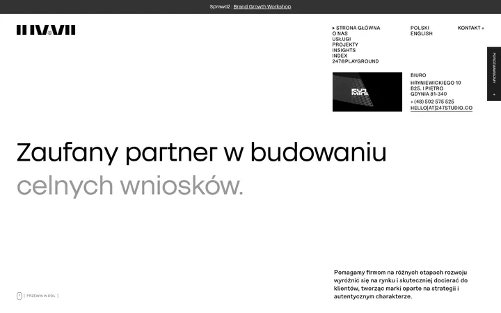
Compact brand mark at left, centered text links, and a right-aligned contact action; keep the header visually light on the pale canvas.
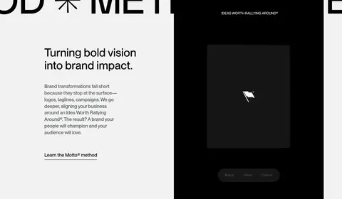
Display hero
Large uppercase black statement split across lines, with ample surrounding space and a restrained supporting intro below.
Text link action
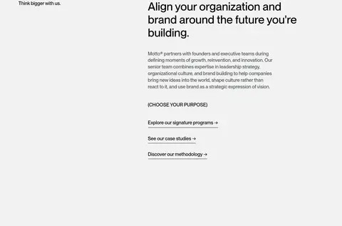
Use black, medium-weight sans text with a fine underline; actions remain unfilled and visually quiet.
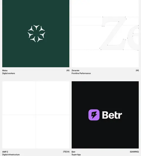
Case-study grid
Two-column project media with labels and category captions; artwork supplies project-specific colors while the surrounding page remains neutral.
Editorial cards
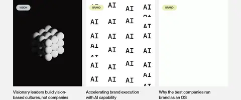
Three-column article previews pairing image or graphic media with compact category labels and concise headlines.
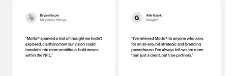
Testimonial cards
White quote cards on the pale canvas, with client identity and compact supporting text; measured card corners are subtly rounded.
Footer
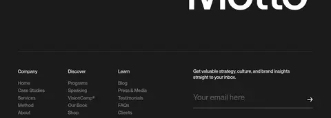
Near-black full-width closing area with grouped link lists, muted copy, and a simple email signup field.
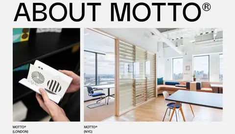
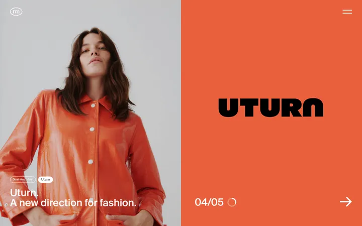
Imagery · Use portfolio media as the main source of color and visual texture: client identity artwork, atmospheric photographs, abstract visuals, and video stills. Keep images cleanly framed within the project grid and editorial cards. The screenshot’s green and purple tones belong to individual project artwork, not the core brand palette. Include occasional studio photography, with straightforward cropping and no heavy decorative treatment.
Set major statements in very large uppercase black type.
Preserve generous whitespace between major sections.
Keep navigation and actions understated and text-led.
Use grids for work, articles, and testimonials.
Reserve white cards and the charcoal footer for clear surface contrast.
✕ 不该做
Do not introduce unmeasured brand colors to the interface.
Do not treat project artwork colors as global brand colors.
Do not add gradients or decorative shadows.
Do not turn text links into prominent filled buttons.
Do not crowd oversized headings with nearby content.
Do not apply rounded card styling throughout the page.
给 AI 的提示词
想快速出一个同风格的新页面,把这段话连同 DESIGN.md 一起发给 AI。
Build a new page in Motto’s editorial branding-agency style. Use Gallery Mist (#f2f2f2) as the dominant canvas, Pure Ink (#000000) for expressive uppercase headlines and core text, and Quiet Silver (#c8cacd) only for understated rules or borders. Set a broad, consistent content frame and alternate oversized single-column statements with clean two- or three-column grids. Keep typography medium-weight and direct: display type should feel monumental, while body copy and navigation stay compact and readable. Make actions underlined text links, not filled buttons. Use project photography, graphics, and video as the intentional source of color, keeping that color contained within media. Keep cards flat, reserve Paper White (#ffffff) for select card surfaces, and finish with a distinct Footer Charcoal (#1b1b1c) band. Favor whitespace over ornament.