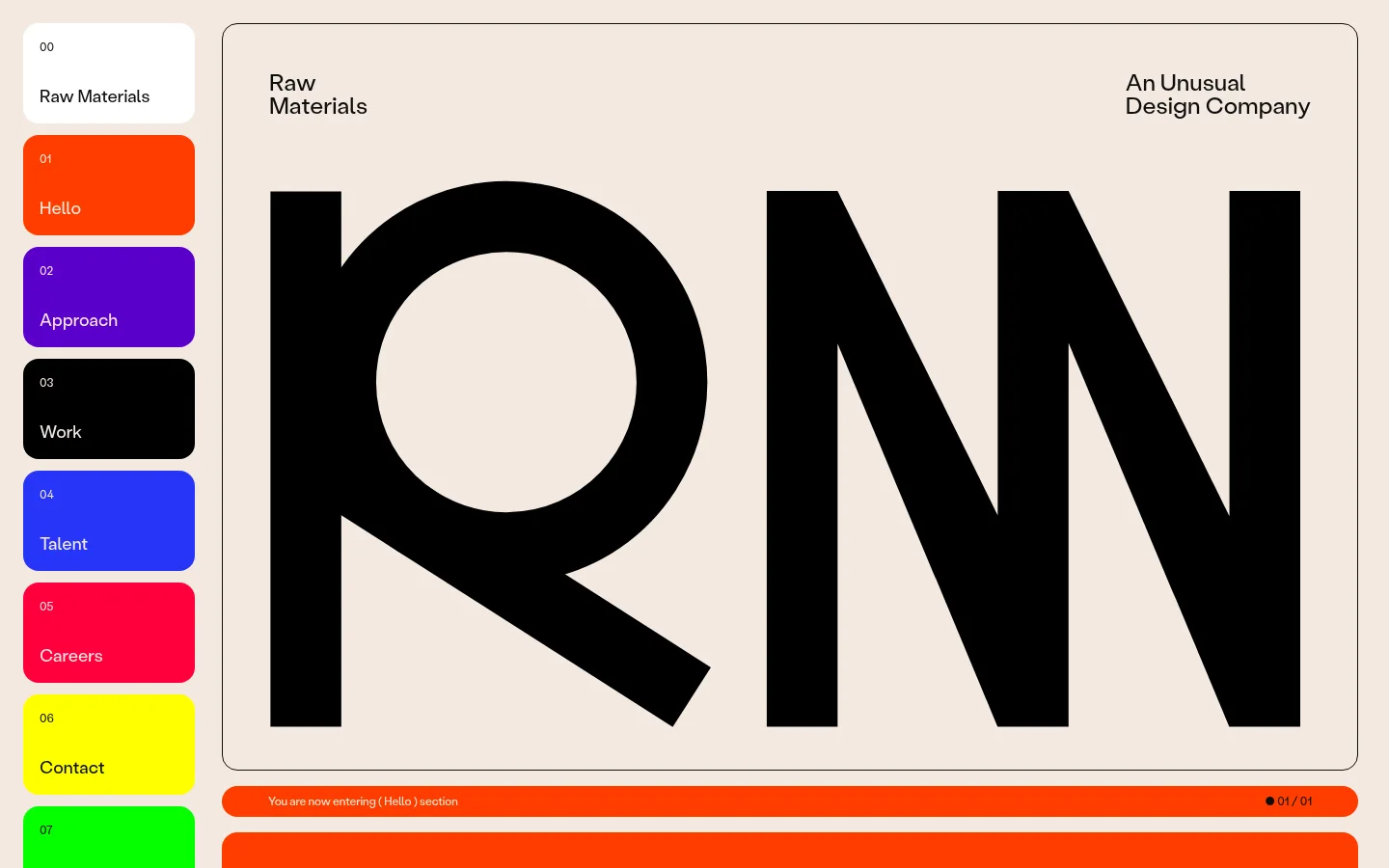
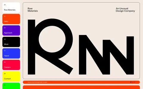
Raw Materials 用克制的暖色底、超大黑色字形和鲜明的编号色块,呈现设计公司的首页。页面像一本编辑风格封面与可交互目录的结合,简洁却极具辨识度。
North star · Keep the canvas quiet and let oversized typography, precise outlines, and the numbered color-block navigation provide the drama.
The page builds its identity from a warm, pale beige canvas (#f4e9e1), near-black typography (#0e0e0e), and a narrow rail of saturated, individually colored navigation blocks. A large outlined hero panel frames the initials as a dramatic typographic image; small brand and descriptor labels sit at its upper corners, keeping the composition editorial rather than promotional. StabilGrotesk is used consistently at regular weight, with scale and placement—not elaborate styling—creating hierarchy. The navigation alternates vivid orange, purple, black, blue, red, yellow, and green, while the main canvas stays calm. Rounded corners soften the otherwise stark geometric treatment. Fine dark outlines define the hero and content card without shadows. Generous open space around the oversized letterforms contrasts with compact labels and closely stacked navigation, making the first screen feel considered, legible, and unusually bold.
配色
点色块复制色值。用途说明来自对页面的实测位置(背景、文字、描边、按钮)与截图判读。
品牌色
强调色
表层色
中性色
功能色
页面底色 · Warm Paper表层 · Clean White表层 2 · Pure Black主文字 · Soft Ink次要文字 · Warm Paper描边 · Soft Ink强调 · Signal Orange强调 2 · Vivid Violet强调 3 · Electric Blue
Shared display, body, navigation, and caption typeface
角色
示例
字号
字重
行高
字距
一级标题
Brand and section headings, including the oversized initials in the hero.
The quick brown fox 敏捷的狐狸
24.5px
400
1
0
正文
Section introductions and supporting copy.
The quick brown fox 敏捷的狐狸
18px
400
normal
0
辅助文字
Compact index labels and small utility details.
The quick brown fox 敏捷的狐狸
12px
400
1
-0.01em
导航
Numbered section navigation and its small labels.
The quick brown fox 敏捷的狐狸
12px
400
normal
0
间距与布局
基准单位 8px · 密度:适中
48px版块间距
12px元素间距
—卡片内边距
—内容最大宽度
8px
12px
16px
24px
36px
48px
112px
A narrow, vertically stacked section index anchors the left side, beside a broad main content area. The hero sits in a large rounded, hairline-outlined panel, with small labels aligned to its upper corners and oversized initials occupying most of the interior. A slim orange section-status strip follows below. The measured page uses a six-column grid, comfortable density, and recurring open space; preserve the sidebar-to-canvas relationship rather than inventing a fixed maximum width.
圆角与层次
按钮 · 16px
卡片 · 16px
没有测到阴影:页面是扁平的,层次靠底色和描边区分。
The design is essentially flat: no measured shadows or gradients. Thin near-black outlines separate the hero panel from the canvas, while filled, rounded navigation tiles provide contrast through color rather than depth. Maintain clean layering and avoid faux elevation.
组件
下面的预览按实测的按钮、输入框、徽标、卡片样式重建(字体用替代字体)。
Section index
A vertical series of numbered, rounded navigation tiles. Use warm-paper text on saturated blocks, dark text on the pale or yellow tiles, and black for the Work tile.
Outlined hero panel
A large rounded rectangle with a thin near-black outline and warm-paper interior; position small brand labels at the top and oversized black initials below.
Section status strip
A slim orange rounded band beneath the hero, carrying a small section-entry message and a compact progress indicator.
Editorial labels
Small, regular-weight StabilGrotesk labels identify the company and its unusual design positioning, aligned to opposite sides of the hero.
Rounded content card
Use a warm, flat surface and a thin near-black outline where a card needs separation; avoid shadow-based elevation.
Imagery · The opening view is led by typography rather than photography: giant black initials become the central graphic, set directly against the warm canvas. Brand and descriptor labels remain small and peripheral. The measured page contains many image, video, and SVG elements, but they are not the defining visual in this first viewport; treat other media as supporting content, not as a replacement for the typographic hero.
Set primary text and hero letterforms in near-black.
Make the hero typography oversized and compositionally dominant.
Keep section navigation numbered, vertical, and color-coded.
Use thin outlines and rounded corners to define major panels.
Set the interface in a consistent regular-weight grotesque sans.
✕ 不该做
Do not replace the warm canvas with stark white.
Do not add gradients, shadows, or glossy surface effects.
Do not turn every accent color into a large background band.
Do not crowd the hero with supporting copy or decorative imagery.
Do not use heavy type weights where scale already creates emphasis.
Do not introduce unmeasured spacing, sizing, or radius values.
给 AI 的提示词
想快速出一个同风格的新页面,把这段话连同 DESIGN.md 一起发给 AI。
Build a new page in the Raw Materials visual style. Use Warm Paper (#f4e9e1) as the calm canvas and Soft Ink (#0e0e0e) for type and thin panel outlines. Create a broad, rounded outlined hero with a small brand label, a short descriptor, and one dominant typographic graphic. Pair it with a vertical numbered section index using Signal Orange (#ff3d00), Vivid Violet (#5900cc), Electric Blue (#2835f8), Punch Red (#ff003d), Neon Yellow (#ffff00), and Acid Green (#05ff00) selectively. Use StabilGrotesk, or Inter as a free substitute, at regular weight; create hierarchy through scale and alignment. Keep surfaces flat, omit shadows and gradients, and use open space around the hero while keeping navigation compact. Follow measured proportions and do not invent dimensions.