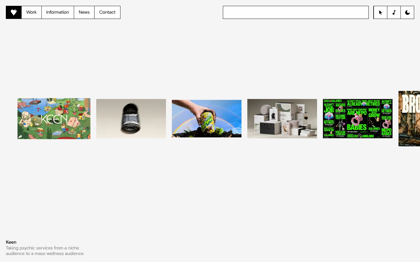
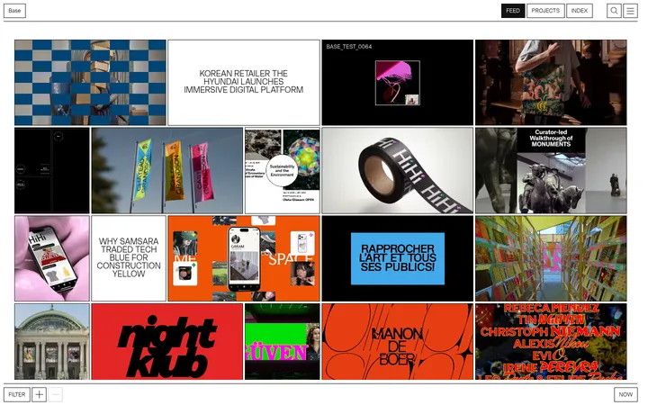
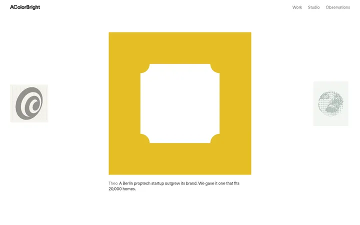
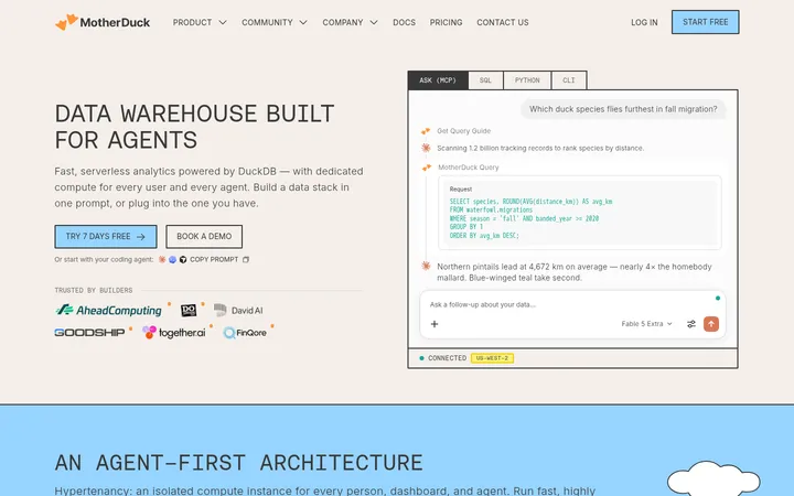
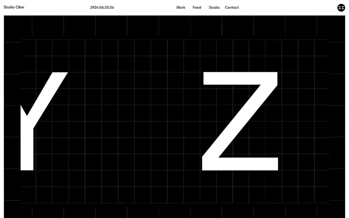
North star · Keep the interface almost entirely black, white, and pale gray, using oversized Basis typography, open space, and project imagery as the visual punctuation.
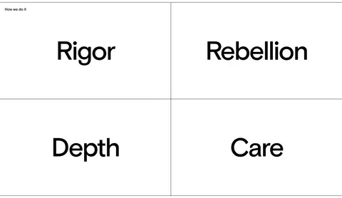
The page is built on a quiet white canvas, with a pale gray opening portfolio band and generous uninterrupted white sections. Black is the primary text and rule color; muted gray recedes for secondary copy, while the measured green accent appears sparingly and should not be mistaken for the site’s overall brand palette. Basis carries nearly all typography, shifting from compact navigation and small supporting copy to exceptionally large, tightly tracked headings and footer wordmarks. Basis Mono is reserved for uppercase, letter-spaced eyebrow labels. Layout alternates between expansive single-column statements, a ruled two-by-two principles grid, and asymmetric capability and contact arrangements. Portfolio thumbnails and a full-width project image supply most of the color and texture; their vivid hues belong to the work rather than the interface. Spacing feels deliberately open, while thin black borders and dividers provide structure without shadows, rounded cards, or ornamental chrome.
配色
点色块复制色值。用途说明来自对页面的实测位置(背景、文字、描边、按钮)与截图判读。
品牌色
强调色
表层色
中性色
页面底色 · Paper White表层 · Gallery Mist主文字 · Studio Ink次要文字 · Quiet Gray描边 · Studio Ink强调 · Project Green
文字
背景
对比度
WCAG
#000000 Studio Ink
#ffffff Paper White
21:1
AAA
#000000 Studio Ink
#f4f4f4 Gallery Mist
19.09:1
AAA
#808080 Quiet Gray
#ffffff Paper White
3.95:1
AA-large
#808080 Quiet Gray
#f4f4f4 Gallery Mist
3.59:1
AA-large
#306f09 Project Green
#ffffff Paper White
6.17:1
AA
#306f09 Project Green
#f4f4f4 Gallery Mist
5.61:1
AA
字体
字号阶梯:Custom(比例约 2.006,正文 14px)。示例用免费替代字体渲染,数值为实测。
Aa 设计
Basis
网络字体 · 字重 400 / 600 · 占比 97%
免费替代:Inter
Main display, headings, body copy, navigation, and controls.
Aa 设计
Basis Mono
网络字体 · 字重 400 · 占比 3%
免费替代:Space Mono
Uppercase eyebrow and code-like section labels.
角色
示例
字号
字重
行高
字距
特大标题
Oversized Mother Design wordmark and marquee-like display text.
Mother Design
226.5px
600
1.2
-0.04em
一级标题
Large primary section statements and standout principles.
Mother Design
110px
600
1
-0.04em
二级标题
Section-level headlines and prominent supporting statements.
Mother Design
60px
400
1
-0.04em
三级标题
Subsection titles and editorial content headings.
Mother Design
48px
400
1.1
-0.04em
正文
Project descriptions, explanatory copy, and contact details.
The quick brown fox 敏捷的狐狸
14px
400
1.2
-0.01em
辅助文字
Small project captions, credits, and supporting metadata.
The quick brown fox 敏捷的狐狸
10px
400
1.2
0
按钮
Large typographic button treatment where present; avoid conventional filled buttons.
Mother Design
226.5px
600
1.2
-0.04em
导航
Header navigation and inline links.
The quick brown fox 敏捷的狐狸
16px
400
1.2
-0.02em
眉题
Small uppercase section labels.
The quick brown fox 敏捷的狐狸
14px
400
1.2
0.06em
代码
Mono uppercase metadata or compact informational labels.
const style = 1;
14px
400
1.2
0.06em
间距与布局
基准单位 4px · 密度:宽松
200px版块间距
20px元素间距
—卡片内边距
1400px内容最大宽度
1px
2px
3px
4px
8px
10px
12px
14px
16px
20px
60px
64px
200px
The page uses a spacious, responsive editorial composition within a measured maximum width of 1400px. The opening portfolio strip runs horizontally across a pale band, followed by a full-width statement. A two-column ruled principles grid contrasts with more asymmetric capability and client sections; the large project image spans the page. Contact information and newsletter content form a denser multi-column footer. Section spacing is deliberately generous, while local alignment shifts from left-aligned copy to centered grid labels.
圆角与层次
没有测到阴影:页面是扁平的,层次靠底色和描边区分。
The interface is flat: measured shadows are absent, and components have no rounded corners. Thin black borders divide navigation items and the principles grid, with subtle hairlines structuring lower content. Use whitespace and alignment for hierarchy rather than cards, raised surfaces, or layered effects. Images sit directly in the page flow and retain their own colors.
组件
下面的预览按实测的按钮、输入框、徽标、卡片样式重建(字体用替代字体)。
Segmented header navigation
A compact horizontal group of outlined cells at the upper left, with a black home cell and white icon; navigation labels use black text.
Project thumbnail strip
A horizontally arranged row of varied portfolio images on the #f4f4f4 opening band, with concise project title and description near the lower edge.
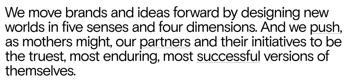
Editorial statement
A large left-aligned sentence on white, set as continuous text with tight leading and minimal surrounding interface decoration.
Principles grid
Four oversized labels arranged in a two-by-two grid; fine black rules define the cells without card fills or shadows.
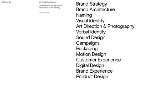
Capabilities list
A large, simple list of design disciplines sits beside a compact section label and short introduction.
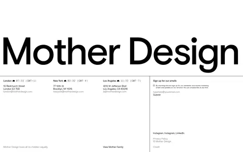
Studio contact footer
Large brand wordmark above a divided multi-column area with office details, newsletter signup, social links, and small utility copy.
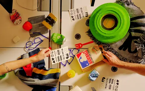
Imagery · Project thumbnails appear as a horizontal gallery in the opening section, each retaining its own crop and visual identity. A later full-width photograph of a collaborative design workspace adds a tactile, colorful counterpoint to the largely monochrome interface. Client marks are presented small and widely spaced. Treat project imagery as portfolio content, not as a source for interface colors; avoid decorative gradients or generic stock imagery.
Let portfolio images supply most of the visual color.
Use oversized, tightly tracked Basis for key statements.
Preserve generous whitespace between major sections.
✕ 不该做
Do not add shadows or rounded card treatments.
Do not turn #306f09 into a dominant site-wide color.
Do not fill every open area with content.
Do not apply a uniform color treatment to project imagery.
Do not use heavy dividers or decorative gradients.
Do not style every text element at display scale.
给 AI 的提示词
想快速出一个同风格的新页面,把这段话连同 DESIGN.md 一起发给 AI。
Build a new agency page using Mother Design’s restrained editorial system. Use #ffffff Paper White as the main canvas, #000000 Studio Ink for typography and fine rules, #f4f4f4 Gallery Mist for occasional section bands, and #808080 Quiet Gray for supporting copy. Keep #306f09 Project Green rare and only where the content calls for an accent. Set most text in Basis or a close sans-serif substitute, with a Basis Mono-style uppercase eyebrow. Combine generous whitespace, oversized tightly tracked statements, simple grids, and asymmetrical content columns. Use project photography as the main source of color and texture. Keep controls and cards flat, square, and minimally decorated; organize information with alignment and hairlines, not shadows. Make the page responsive while preserving its editorial rhythm and image-led portfolio character.