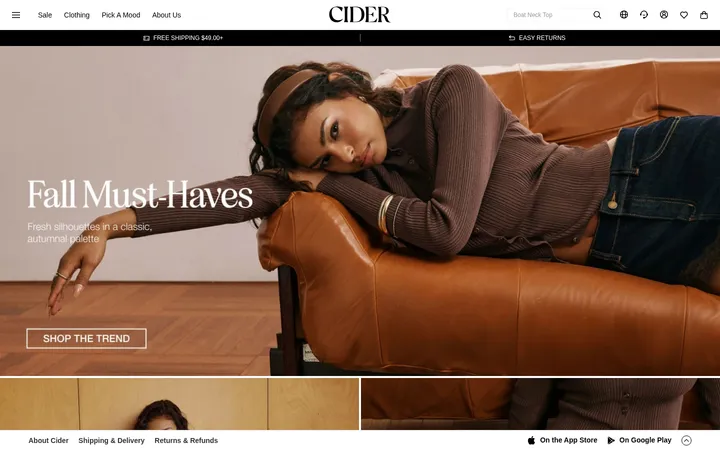
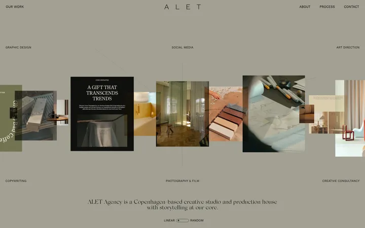
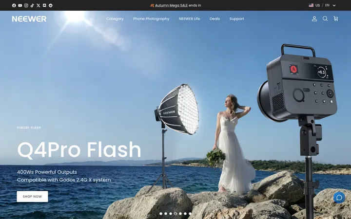
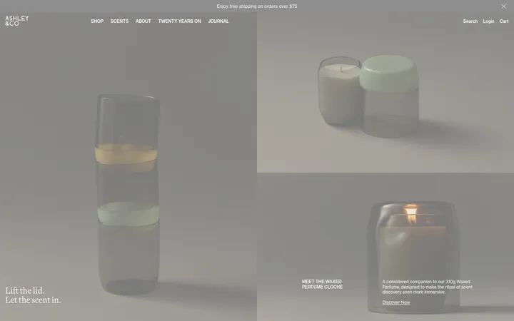
North star · Let quiet typography, open white space and tactile photography carry the story; keep interface decoration nearly invisible.
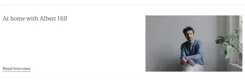
The page uses Gallery White (#ffffff) as its dominant canvas, letting product and lifestyle photography provide most of the colour and atmosphere. Ink (#000000) carries navigation, headings, body copy and links; Pale Line (#e6e6e6) appears in subtle dividers, while Soft Fog (#f7f7f7) is reserved for a quiet card surface. The muted Sand (#dec39d) creates a distinct brand moment in the people-together story section, and Ash Text (#7f7f7f) softens secondary footer details. Gestura’s fine serif styles give the hero and editorial copy an understated, literary character; Untitled Sans supplies navigation, labels and supporting hierarchy. The composition moves between full-width photography, sparse product placements, offset two-column editorial sections and an image strip. Comfortable spacing and restrained rules keep the page airy rather than card-heavy. Product shots remain small and calm, while larger photographs establish mood and material texture.
配色
点色块复制色值。用途说明来自对页面的实测位置(背景、文字、描边、按钮)与截图判读。
品牌色
强调色
表层色
中性色
功能色
页面底色 · Gallery White表层 · Soft Fog表层 2 · Warm Sand主文字 · Ink次要文字 · Ash Text描边 · Pale Line
Large editorial body copy and product or story links
Aa 设计
Untitled Sans Light
网络字体 · 字重 100 / 200 · 占比 28%
免费替代:Inter
Navigation, section headings, large links and captions
Aa 设计
Gestura Text Thin
网络字体 · 字重 200 · 占比 9%
免费替代:Cormorant Garamond
Primary hero heading
Aa 设计
Untitled Sans Regular
网络字体 · 字重 400 / 200 · 占比 5%
免费替代:Inter
Small utility labels and button text
Aa 设计
Gestura Text Light
网络字体 · 字重 200 · 占比 3%
免费替代:Cormorant Garamond
Occasional lighter serif heading or editorial text
角色
示例
字号
字重
行高
字距
一级标题
Thin serif hero statement over the opening photograph.
AATHER
35px
200
1.2
0
二级标题
Light sans headings introducing editorial and product sections.
The quick brown fox 敏捷的狐狸
24px
200
1.35
0
正文
Fine serif copy for brand storytelling and product links.
The quick brown fox 敏捷的狐狸
20px
100
1.35
0
辅助文字
Small sans labels, supporting notes and footer details.
The quick brown fox 敏捷的狐狸
13px
100
1.35
0
按钮
Compact understated sans text for utility controls.
The quick brown fox 敏捷的狐狸
11px
200
1.2
0
导航
Light sans navigation labels in the header.
The quick brown fox 敏捷的狐狸
18px
200
1.39
0
链接
Prominent light sans links such as About Aather.
The quick brown fox 敏捷的狐狸
24px
200
1.35
0
眉题
Tiny uppercase sans labels with subtle tracking.
The quick brown fox 敏捷的狐狸
9px
100
0.78
0.056em
间距与布局
基准单位 1px · 密度:适中
40px版块间距
—元素间距
23px卡片内边距
700px内容最大宽度
1px
5px
6px
7px
15px
18px
20px
25px
30px
35px
40px
45px
55px
60px
80px
100px
A long, vertically paced storefront begins with a slim announcement strip and a compact navigation row, then moves through full-width hero imagery, product browsing and editorial content. Sections mostly sit on a white canvas, with a single sand-toned story band. Product and story content alternate between open single-column compositions and offset two-column layouts. The measured content max width is 700px; keep alignment intentional and copy blocks narrow. Density is comfortable, with broad visual pauses between sections and minimal enclosing UI.
圆角与层次
输入框 · 2px
没有测到阴影:页面是扁平的,层次靠底色和描边区分。
The interface is predominantly flat: no measured shadows or gradient treatments. Use white space and photography to separate sections, with only discreet pale hairlines where needed. Avoid rounded, elevated cards; the measured input radius is 2px, while the displayed buttons and links are square-edged and visually light.
组件
下面的预览按实测的按钮、输入框、徽标、卡片样式重建(字体用替代字体)。
Announcement strip
A narrow pale header row repeats the free-shipping message, set in small, quiet serif text.
Header navigation
Minimal white navigation with Menu and Shop at the left, centered AATHER wordmark, and a small utility icon at the right.
Hero overlay
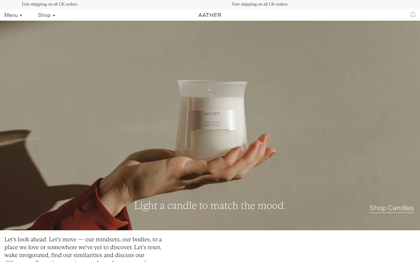
Wide lifestyle photograph with a delicate serif statement near the bottom and an underlined Shop Candles link aligned toward the right.
Product presentation
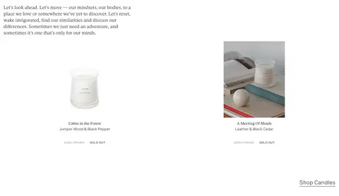
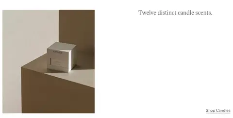
Sparse product imagery and brief scent naming sit in open white space; shop links remain text-led rather than button-led.
Story band
Warm Sand (#dec39d) section pairs a short serif heading with concise brand-purpose copy and an understated About Aather link.
Social image strip
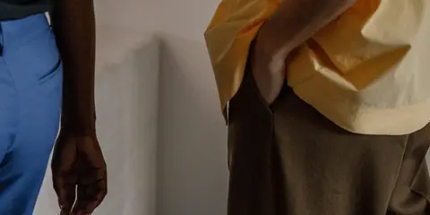
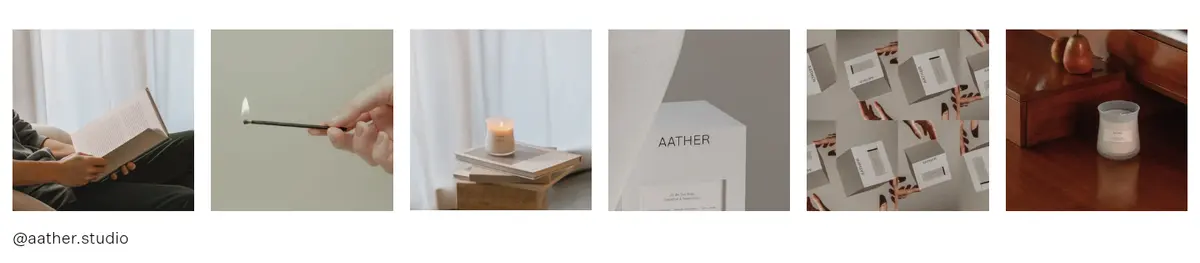
A single horizontal sequence of small, closely related lifestyle and product photographs precedes the minimal account label.
Footer
Quiet multi-column lists of store, help and account links sit alongside currency and newsletter utilities.
Imagery · Use atmospheric, natural-light photography rather than illustration or 3D. The hero is a wide lifestyle image focused on a candle held in a hand, with the headline and shop link placed over the lower area. Supporting photos show people, interiors, packaging and product details. Keep product imagery tactile, softly toned and uncrowded; the image strip acts as a quiet social gallery.
Pair fine serif storytelling with light sans navigation.
Let photography supply the strongest colour and texture.
Keep shop links understated and text-led.
Use Warm Sand for the story section only.
Leave generous visual breathing room between content groups.
✕ 不该做
Do not add saturated interface colours.
Do not turn text links into heavy filled buttons.
Do not crowd product photos with dense card chrome.
Do not use heavy bold headings or all-caps navigation.
Do not apply shadows or gradients absent from the measured design.
Do not treat colours sampled from photographs as interface palette.
给 AI 的提示词
想快速出一个同风格的新页面,把这段话连同 DESIGN.md 一起发给 AI。
Build a new AATHER page as a quiet, editorial candle storefront. Use Gallery White (#ffffff) for the main canvas and Ink (#000000) for navigation, headings and links; reserve Warm Sand (#dec39d) for a deliberate story band. Set editorial statements in a thin, graceful serif, with light sans typography for navigation, labels and supporting headings. Keep copy narrow, compositions open and section spacing generous. Lead with tactile natural-light photography, then vary sparse product moments with offset editorial image-and-copy sections. Prefer plain text links and subtle hairlines in Pale Line (#e6e6e6); Soft Fog (#f7f7f7) may support a restrained surface and Ash Text (#7f7f7f) muted details. Keep the page flat, avoid bold controls, shadows, gradients and decorative card framing.