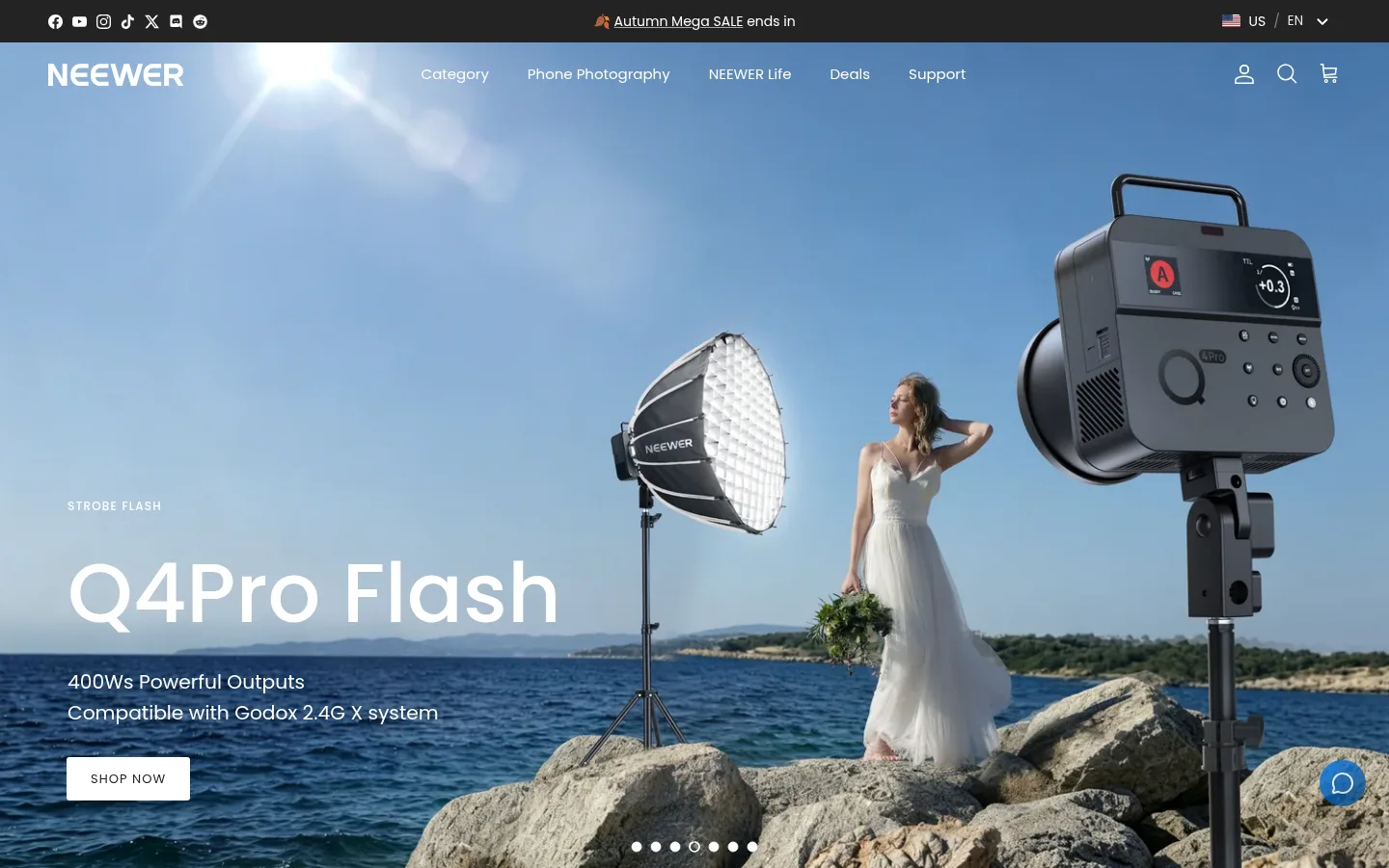
NEEWER 首页以沉浸式宣传摄影展示器材,也通过清晰的商品区块呈现丰富的摄影与视频产品。页面以白色为主,搭配深色导航和蓝色点缀,让产品与使用场景始终醒目。
North star · Let authentic product photography lead, and keep every shopping section on a calm, legible white canvas.
The page balances large, cinematic campaign imagery with a clean, predominantly white shopping canvas. Its dark announcement strip and overlaid navigation establish a compact, high-contrast frame; white headings and controls sit directly over photographic hero scenes. Poppins is used throughout, giving product labels and navigation a consistent geometric voice, while larger campaign headlines provide emphasis without ornate display styling. The homepage alternates wide editorial image blocks with centered product carousels, category links, and asymmetrical feature tiles. Product cards remain visually light, letting isolated gear photography, compact descriptions, prices, review cues, and discount labels do the selling. #007ffa and #0b457b form a measured blue gradient accent, while the blue service icons are visually prominent against pale benefit cards. Warm beige borders are sparse; #f4f4f4 distinguishes the peace-of-mind section, and #171717 anchors the footer. Keep the layout comfortable and modular, with clear spacing between very different shopping tasks.
配色 点色块复制色值。用途说明来自对页面的实测位置(背景、文字、描边、按钮)与截图判读。
强调色
Electric Blue
#007ffa
Bright end of the measured blue gradient accent, also used sparingly for link and button details.
Studio Blue
#0b457b
Deep end of the blue gradient accent; keep it concentrated in calls to action and highlights.
Terracotta Signal
#c16452
Sparse link accent; do not extend it into a dominant page-wide color.
表层色
Gallery White
#ffffff
Main page canvas, product-card backgrounds, and high-contrast text over dark imagery.
Footer Black
#171717
Dark footer, navigation text, and inverse text and link areas.
Soft Fog
#f4f4f4
Pale section background, notably the shopping-assurance benefits band.
中性色
Carbon Text
#272b2b
Primary body copy and product information on light backgrounds.
Slate Muted
#69717c
Secondary, lower-emphasis text.
Mist Divider
#dfe3e8
Low-key navigation and text detail captured in measured styles.
Graphite Link
#383939
Category and standard link text on light surfaces.
Near Black
#050505
Occasional strong product-card heading or high-contrast label.
功能色
Warm Parchment
#efdfc7
Measured section hairline and border color; a subtle warm divider, not a broad background.
Button Charcoal
#232323
Dark filled Learn More button surface with matching border.
Input Gray
#c9caca
Thin newsletter input border.
文字 背景 对比度 WCAG #272b2b Carbon Text#ffffff Gallery White14.32:1 AAA #272b2b Carbon Text#f4f4f4 Soft Fog13.02:1 AAA #272b2b Carbon Text#171717 Footer Black1.25:1 不达标 #ffffff Gallery White#f4f4f4 Soft Fog1.1:1 不达标 #ffffff Gallery White#171717 Footer Black17.93:1 AAA #69717c Slate Muted#ffffff Gallery White4.94:1 AA
字体 字号阶梯:Perfect Fourth(比例约 1.3,正文 14px)。示例用免费替代字体渲染,数值为实测。
Aa 设计
Poppins 网络字体 · 字重 400 / 500 / 800 / 700 · 占比 100%
免费替代:Montserrat
Site-wide headings, navigation, product details, controls, and body copy.
角色 示例 字号 字重 行高 字距 一级标题 Large campaign headline over the homepage hero photography.
NEEWER
40px 500 1.1 0 二级标题 Section titles, including product and shopping-assurance headings.
The quick brown fox 敏捷的狐狸
24px 800 1.15 0 三级标题 Feature tile and product-story titles.
The quick brown fox 敏捷的狐狸
22px 500 1.2 0 四级标题 Supporting editorial and promotional copy.
The quick brown fox 敏捷的狐狸
20.5px 400 1.6 0 正文 Product details, descriptions, and general shopping copy.
The quick brown fox 敏捷的狐狸
14px 400 1.6 0 辅助文字 Small supporting labels, ratings, and compact metadata.
The quick brown fox 敏捷的狐狸
11px 400 1.7 0 按钮 Uppercase calls to action such as Learn More and Shop Now.
The quick brown fox 敏捷的狐狸
13px 400 1 0.08em 导航 Primary navigation and category links.
The quick brown fox 敏捷的狐狸
15px 400 1.6 0 链接 Product names, category destinations, and footer links.
The quick brown fox 敏捷的狐狸
15px 400 1.6 0 眉题 Compact uppercase campaign labels above hero headlines.
The quick brown fox 敏捷的狐狸
12px 500 1.3 0.1em
间距与布局 基准单位 2px · 密度:适中
70px 版块间距
8px 元素间距
22px 卡片内边距
1300px 内容最大宽度
3px
5px
6px
8px
10px
12px
14px
15px
16px
18px
19px
20px
22px
25px
30px
50px
The page uses a wide, comfortable desktop canvas with content measured to a 1300px maximum width. A full-bleed hero gives way to a horizontal category strip, then a mix of two-column editorial tiles and centered product carousels. Product grids vary in column count to suit each collection. Large section gaps separate shopping themes, while card content stays compact. Most collection headings are centered; editorial copy and benefit content use start alignment. Keep the footer dark and clearly detached from the white content above.
圆角与层次 Most sections and cards sit flat on white with minimal framing, allowing product photos to carry visual weight. Product cards use a restrained soft shadow where measured; cards have rounded corners, while feature photography reads as a clean image tile. Keep borders understated, using warm section hairlines or pale input outlines rather than heavy card outlines. Reserve dark layering for the header and footer.
组件 下面的预览按实测的按钮、输入框、徽标、卡片样式重建(字体用替代字体)。
Campaign hero Full-bleed photographic carousel with a compact uppercase eyebrow, large white headline, supporting copy, white CTA, and discreet slide indicators.
Category navigation Horizontal strip of image-led category links; labels use graphite text on a white background.
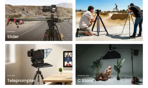
Editorial feature tiles Large lifestyle photographs in a modular grid with short white overlay labels and minimal decoration.
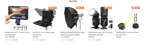
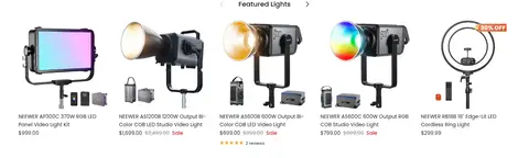
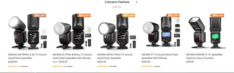
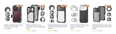
Product carousel Centered collection title above compact product cards with gear imagery, product names, prices, reviews, and occasional sale labels.
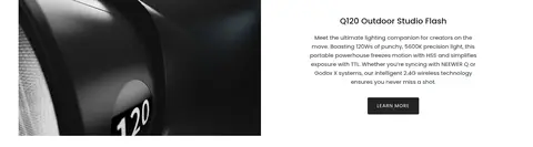
Product story split Wide product image paired with centered descriptive copy and a charcoal Learn More button.
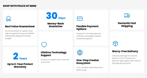
Assurance benefits Pale gray band of white benefit cards with blue line icons, bold titles, and short supporting text.
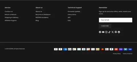
Newsletter footer Near-black footer with grouped service links, an outlined email field, a white subscribe button, social icons, and payment marks.
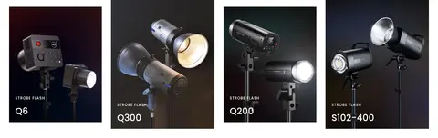
Imagery · Use high-quality photography of real lighting, camera, and phone-rig equipment, shown both in creator setups and as isolated product images. Hero campaigns are full-bleed, cinematic scenes with text overlaid on open image space. Editorial tiles crop photography to emphasize use cases; product carousels use clear, tightly framed gear imagery. A few testimonial tiles use creator portraits and video stills. Colorful RGB product light is photography content, not a signal to recolor the site interface.
页面版块 共 14 个版块,按页面从上到下排列,每个都标了类型、布局和交互套路。
该做与不该做 ✓ 该做 Use white as the default content canvas. Let real gear and creator photography lead the campaign sections. Use Poppins consistently across navigation, headings, and product information. Keep product titles, prices, reviews, and sale cues easy to scan. Use dark surfaces for the compact header strip and footer. Apply blue accents selectively to calls to action and benefit icons. ✕ 不该做 Do not turn colorful product photography into a site-wide interface palette. Do not crowd the product grids with oversized copy or decorative controls. Do not use heavy outlines around every card. Do not replace the photographic hero with a flat-color banner. Do not make accent colors compete with the product imagery. Do not use decorative display typography in place of Poppins. 给 AI 的提示词 想快速出一个同风格的新页面,把这段话连同 DESIGN.md 一起发给 AI。
复制 Build a new NEEWER-style ecommerce page for photography and video equipment. Use Gallery White (#ffffff) as the main canvas, Carbon Text (#272b2b) for core copy, and Poppins throughout. Open with a dark compact announcement bar and a transparent or dark-over-image navigation, then make the hero a full-bleed campaign photograph with readable white text and a clear CTA. Follow it with image-led category links, editorial product-use tiles, and tidy product grids. Keep cards light and product-first; reserve Electric Blue (#007ffa) and Studio Blue (#0b457b) for restrained accents. Use Soft Fog (#f4f4f4) for a distinct service-benefits band and Footer Black (#171717) for the footer. Maintain generous section separation, simple alignment, concise product metadata, and minimal borders. Treat colorful gear photography as content, not UI color direction.
DESIGN.md Tailwind v4 CSS 变量 Design Tokens
---
title: "NEEWER design system"
variant: extended
source: https://neewer.com/
captured_at: 2026-10-12
theme: light
industry: ecommerce
generator: Design DNA (https://four.wiralomi.com/style/neewer-com)
ai_generated: true
ai_label: "本文件由 AI 辅助生成:数值取自公开网页的实测样式,命名、用途说明与建议为模型解读。商标归原所有者。 / AI-assisted content"
---
# NEEWER · Design System
> Professional gear, presented through vivid creator-focused imagery.
**Theme:** light · **Industry:** ecommerce · **Source:** https://neewer.com/ · **Captured:** 2026-10-12 (1440×900 desktop)
_AI-assisted content: values are measured from the public page at capture time; names, roles and guidance are model-written interpretations. Trademarks belong to their owners._
NEEWER’s homepage pairs immersive campaign photography with a broad, easy-to-scan catalog of photography and video equipment. A mostly white shopping canvas, restrained dark navigation, and sharp blue accents keep the products and their use cases in focus.
## North star
Let authentic product photography lead, and keep every shopping section on a calm, legible white canvas.
## Overview
The page balances large, cinematic campaign imagery with a clean, predominantly white shopping canvas. Its dark announcement strip and overlaid navigation establish a compact, high-contrast frame; white headings and controls sit directly over photographic hero scenes. Poppins is used throughout, giving product labels and navigation a consistent geometric voice, while larger campaign headlines provide emphasis without ornate display styling. The homepage alternates wide editorial image blocks with centered product carousels, category links, and asymmetrical feature tiles. Product cards remain visually light, letting isolated gear photography, compact descriptions, prices, review cues, and discount labels do the selling. ## Colors
| Name | Hex | Token | Group | Role |
|---|---|---|---|---|
| Gallery White | ` | `--color-gallery-white` | surface | Main page canvas, product-card backgrounds, and high-contrast text over dark imagery. |
| Carbon Text | ` | `--color-carbon-text` | neutral | Primary body copy and product information on light backgrounds. |
| Electric Blue | ` | `--color-electric-blue` | accent | Bright end of the measured blue gradient accent, also used sparingly for link and button details. |
| Studio Blue | ` | `--color-studio-blue` | accent | Deep end of the blue gradient accent; keep it concentrated in calls to action and highlights. |
| Warm Parchment | ` | `--color-warm-parchment` | semantic | Measured section hairline and border color; a subtle warm divider, not a broad background. |
| Footer Black | ` | `--color-footer-black` | surface | Dark footer, navigation text, and inverse text and link areas. |
| Soft Fog | ` | `--color-soft-fog` | surface | Pale section background, notably the shopping-assurance benefits band. |
| Terracotta Signal | ` | `--color-terracotta-signal` | accent | Sparse link accent; do not extend it into a dominant page-wide color. |
| Button Charcoal | ` | `--color-button-charcoal` | semantic | Dark filled Learn More button surface with matching border. |
| Slate Muted | ` | `--color-slate-muted` | neutral | Secondary, lower-emphasis text. |
| Input Gray | ` | `--color-input-gray` | semantic | Thin newsletter input border. |
| Mist Divider | ` | `--color-mist-divider` | neutral | Low-key navigation and text detail captured in measured styles. |
| Graphite Link | ` | `--color-graphite-link` | neutral | Category and standard link text on light surfaces. |
| Near Black | ` | `--color-near-black` | neutral | Occasional strong product-card heading or high-contrast label. |
### Semantic aliases
`--color-canvas` → ` (Gallery White) · `--color-surface` → ` (Soft Fog) · `--color-surface-2` → ` (Footer Black) · `--color-text` → ` (Carbon Text) · `--color-text-muted` → ` (Gallery White) · `--color-text-subtle` → ` (Slate Muted) · `--color-border` → ` (Warm Parchment) · `--color-accent` → ` (Electric Blue) · `--color-accent-2` → ` (Studio Blue) · `--color-accent-3` → ` (Terracotta Signal)
### Contrast (WCAG 2.x)
| Text | Background | Ratio | Level |
|---|---|---|---|
| ` | ` | 14.32:1 | AAA |
| ` | ` | 13.02:1 | AAA |
| ` | ` | 1.25:1 | fail |
| ` | ` | 1.1:1 | fail |
| ` | ` | 17.93:1 | AAA |
| ` | ` | 4.94:1 | AA |
| ` | ` | 4.49:1 | AA-large |
| ` | ` | 3.63:1 | AA-large |
| ` | ` | 3.88:1 | AA-large |
| ` | ` | 3.53:1 | AA-large |
### Gradients
- `linear-gradient(135deg, rgb(0, 127, 250), rgb(11, 69, 123))`
## Typography
| Family | Token | Source | Weights | Role | Free substitute |
|---|---|---|---|---|---|
| Poppins | `--font-body` | webfont | 400, 500, 800, 700 | Site-wide headings, navigation, product details, controls, and body copy. | Montserrat |
- **Poppins:** Use measured Poppins weights from regular through 800; buttons are uppercase with spaced lettering, while navigation and product copy stay sentence case.
### Type scale — Perfect Fourth (ratio ≈ 1.3, base 14px)
| Role | Size | Weight | Line height | Letter spacing | Case | Family | Used for |
|---|---|---|---|---|---|---|---|
| h1 | 40px | 500 | 1.1 | 0 | — | Poppins | Large campaign headline over the homepage hero photography. |
| h2 | 24px | 800 | 1.15 | 0 | — | Poppins | Section titles, including product and shopping-assurance headings. |
| h3 | 22px | 500 | 1.2 | 0 | — | Poppins | Feature tile and product-story titles. |
| h4 | 20.5px | 400 | 1.6 | 0 | — | Poppins | Supporting editorial and promotional copy. |
| body | 14px | 400 | 1.6 | 0 | — | Poppins | Product details, descriptions, and general shopping copy. |
| caption | 11px | 400 | 1.7 | 0 | — | Poppins | Small supporting labels, ratings, and compact metadata. |
| button | 13px | 400 | 1 | 0.08em | uppercase | Poppins | Uppercase calls to action such as Learn More and Shop Now. |
| nav | 15px | 400 | 1.6 | 0 | — | Poppins | Primary navigation and category links. |
| link | 15px | 400 | 1.6 | 0 | — | Poppins | Product names, category destinations, and footer links. |
| eyebrow | 12px | 500 | 1.3 | 0.1em | uppercase | Poppins | Compact uppercase campaign labels above hero headlines. |
## Spacing & layout
- Base unit **2px**, density **comfortable**.
- Scale (most used values): 3, 5, 6, 8, 10, 12, 14, 15, 16, 18, 19, 20, 22, 25, 30, 50 px.
- Section rhythm 70px · element gap 8px · card padding 22px · max content width 1300px.
The page uses a wide, comfortable desktop canvas with content measured to a 1300px maximum width. A full-bleed hero gives way to a horizontal category strip, then a mix of two-column editorial tiles and centered product carousels. Product grids vary in column count to suit each collection. Large section gaps separate shopping themes, while card content stays compact. Most collection headings are centered; editorial copy and benefit content use start alignment. Keep the footer dark and clearly detached from the white content above.
## Shape & elevation
- Radius: button `3px` · input `3px` · card `10px` · nav `6px` · link `8px` · xs `3px` · sm `6px` · md `8px` · lg `10px`
- Shadow `sm` (card): `rgba(0, 0, 0, 0.15) 0px 2px 8px 0px`
- Shadow `xl` (button): `rgba(128, 71, 225, 0.35) 0px 24px 60px -20px`
- Motion: standard transition `0.1s ease` on interactive elements.
Most sections and cards sit flat on white with minimal framing, allowing product photos to carry visual weight. Product cards use a restrained soft shadow where measured; cards have rounded corners, while feature photography reads as a clean image tile. Keep borders understated, using warm section hairlines or pale input outlines rather than heavy card outlines. Reserve dark layering for the header and footer.
## Imagery
Use high-quality photography of real lighting, camera, and phone-rig equipment, shown both in creator setups and as isolated product images. Hero campaigns are full-bleed, cinematic scenes with text overlaid on open image space. Editorial tiles crop photography to emphasize use cases; product carousels use clear, tightly framed gear imagery. A few testimonial tiles use creator portraits and video stills. Colorful RGB product light is photography content, not a signal to recolor the site interface.
## Components
### Campaign hero
Full-bleed photographic carousel with a compact uppercase eyebrow, large white headline, supporting copy, white CTA, and discreet slide indicators.
### Category navigation
Horizontal strip of image-led category links; labels use graphite text on a white background.
### Editorial feature tiles
Large lifestyle photographs in a modular grid with short white overlay labels and minimal decoration.
### Product carousel
Centered collection title above compact product cards with gear imagery, product names, prices, reviews, and occasional sale labels.
### Product story split
Wide product image paired with centered descriptive copy and a charcoal Learn More button.
### Assurance benefits
Pale gray band of white benefit cards with blue line icons, bold titles, and short supporting text.
### Newsletter footer
Near-black footer with grouped service links, an outlined email field, a white subscribe button, social icons, and payment marks.
### Measured component styles
- **Primary button** (“LEARN MORE”): background ## Do
- Use white as the default content canvas.
- Let real gear and creator photography lead the campaign sections.
- Use Poppins consistently across navigation, headings, and product information.
- Keep product titles, prices, reviews, and sale cues easy to scan.
- Use dark surfaces for the compact header strip and footer.
- Apply blue accents selectively to calls to action and benefit icons.
## Don't
- Do not turn colorful product photography into a site-wide interface palette.
- Do not crowd the product grids with oversized copy or decorative controls.
- Do not use heavy outlines around every card.
- Do not replace the photographic hero with a flat-color banner.
- Do not make accent colors compete with the product imagery.
- Do not use decorative display typography in place of Poppins.
## Agent prompt
Build a new NEEWER-style ecommerce page for photography and video equipment. Use Gallery White (## Page sections (top to bottom)
| # | Type | Layout | UX patterns | UI patterns |
|---|---|---|---|---|
| 1 | hero | Full-bleed campaign carousel below the compact announcement strip and overlaid site navigation. | slide indicators, Shop Now CTA | cinematic product photography, white overlay copy, uppercase eyebrow |
| 2 | category-nav | Single horizontal strip of evenly distributed image-led category links. | browse by category | category thumbnails, compact dark labels |
| 3 | feature-grid | Introductory centered copy followed by a two-column editorial image grid. | shop by use case | large lifestyle tiles, white image-overlay labels |
| 4 | product-grid | Centered collection heading above a multi-column product carousel. | carousel navigation, sale discovery | isolated product imagery, price and review metadata |
| 5 | product-grid | Centered heading over a multi-column lighting product carousel. | carousel navigation, browse lighting | product cutouts, sale labels |
| 6 | feature-split | Wide product video or image paired with centered product copy and CTA. | learn more | media-and-copy split, charcoal button |
| 7 | feature-grid | Two-column arrangement of large photographic product-category tiles. | browse product family | dark product imagery, short white labels |
| 8 | product-grid | Centered collection title above a wide multi-column carousel. | carousel navigation, view all | product cutouts, compact ratings and prices |
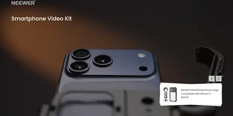
| 9 | hero | Full-bleed dark product feature with a floating product card and carousel controls. | carousel controls, featured item link | large phone-rig image, floating white product card |
| 10 | product-grid | Centered category introduction above a multi-column product carousel. | carousel navigation, compare models | product cutouts, sale and review details |
| 11 | feature-grid | Pale gray section with a modular grid of white service-benefit cards. | review purchase benefits | blue line icons, bold card headings |
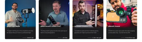
| 12 | testimonials | Four-column row of creator portrait and video testimonial cards. | creator reviews | portrait thumbnails, dark caption overlays |
| 13 | logo-cloud | Centered heading above a horizontal row of publication logos. | social proof | monochrome logo strip |
| 14 | footer | Dark footer with four link and newsletter columns, followed by a separate payment and legal row. | newsletter signup, footer navigation | near-black surface, outlined email field, payment marks |
## Source CSS custom properties (selected)
```css
--aos-animate-duration: 0.6s;
--base-font-family: Poppins, sans-serif;
--base-font-weight: 400;
--base-font-style: normal;
--heading-font-family: Poppins, sans-serif;
--heading-font-weight: 500;
--heading-font-style: normal;
--heading-font-letter-spacing: normal;
--logo-font-family: Poppins, sans-serif;
--logo-font-weight: 400;
--logo-font-style: normal;
--nav-font-family: Poppins, sans-serif;
--nav-font-weight: 400;
--nav-font-style: normal;
--base-text-size: 15px;
--input-text-size: 16px;
--smaller-text-size-1: 12px;
--smaller-text-size-2: 14px;
--smaller-text-size-3: 12px;
--smaller-text-size-4: 11px;
--larger-text-size: 22px;
--super-large-text-size: 39px;
--super-large-mobile-text-size: 18px;
--larger-mobile-text-size: 18px;
--logo-text-size: 19px;
--btn-letter-spacing: 0.08em;
--btn-text-transform: uppercase;
--button-text-size: 13px;
--quickbuy-button-text-size: 13;
--small-feature-link-font-size: 0.75em;
--heading-text-transform: none;
--nav-text-size: 15px;
--mobile-menu-font-weight: 600;
--body-bg-color: 255 255 255;
--bg-color: 255 255 255;
--body-text-color: 39 43 43;
--text-color: 39 43 43;
--header-text-col: