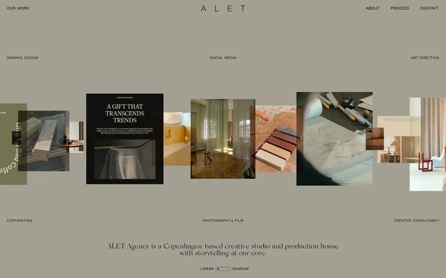
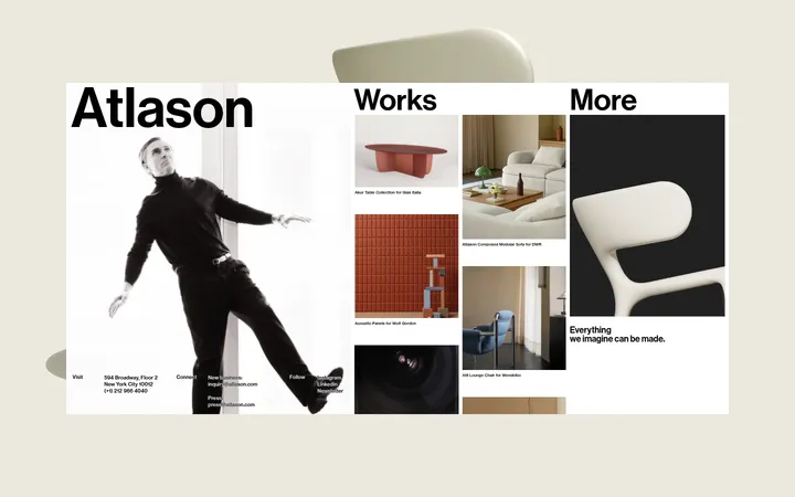
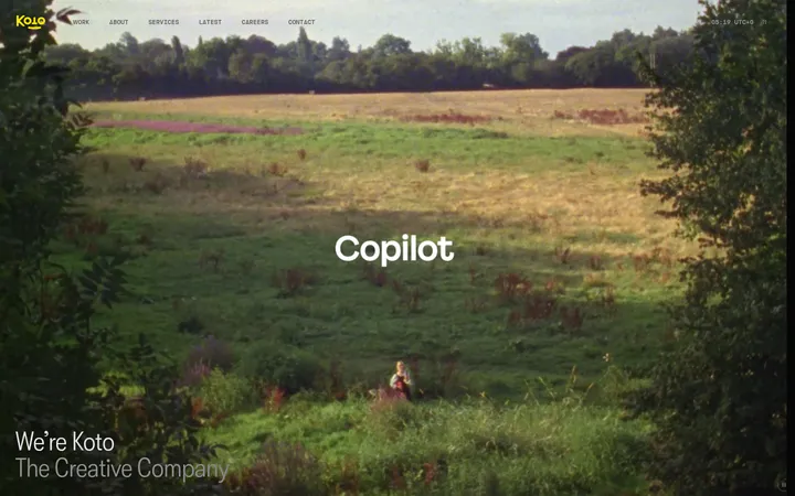
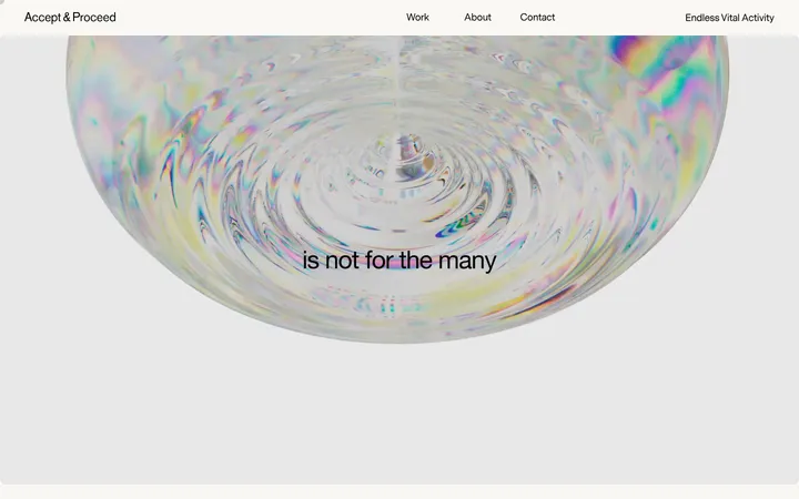
North star · Keep the canvas quiet and spacious so the overlapping portfolio imagery, not interface chrome, carries the visual energy.
The page is built around a muted warm-gray canvas (#a2a093) that covers most of the visible area, giving the portfolio a calm, tactile backdrop. A pale parchment surface (#e5ddc4) provides a lighter supporting field where needed; the project images themselves bring most of the stronger colour and tonal variation. Typography creates the key contrast: SilkSerif-Light carries the spaced ALET wordmark and the centered studio statement, while WorkSans-Regular handles the compact, uppercase navigation and service labels. The composition is unusually open: navigation sits at the top edge, service names are distributed across the canvas, and overlapping rectangular project images run in a horizontal band through the center. The statement sits below the imagery with generous separation. Avoid adding conventional cards or prominent CTA buttons; this page treats the portfolio as an editorial collage, with restrained ink text and delicate borders rather than heavy interface chrome.
配色
点色块复制色值。用途说明来自对页面的实测位置(背景、文字、描边、按钮)与截图判读。
品牌色
表层色
中性色
功能色
页面底色 · Warm Stone表层 · Parchment主文字 · Deep Ink次要文字 · Soft Ink弱文字 · Charcoal Label描边 · Graphite Line
文字
背景
对比度
WCAG
#000000 Deep Ink
#a2a093 Warm Stone
7.99:1
AAA
#000000 Deep Ink
#e5ddc4 Parchment
15.47:1
AAA
#101010 Soft Ink
#a2a093 Warm Stone
7.24:1
AAA
#101010 Soft Ink
#e5ddc4 Parchment
14.02:1
AAA
#252525 Charcoal Label
#a2a093 Warm Stone
5.83:1
AA
#252525 Charcoal Label
#e5ddc4 Parchment
11.29:1
AAA
字体
字号阶梯:Custom(比例约 1.917,正文 12px)。示例用免费替代字体渲染,数值为实测。
Aa 设计
WorkSans-Regular
网络字体 · 字重 400 · 占比 61%
免费替代:Work Sans
Navigation, service labels, and compact uppercase interface text.
Aa 设计
SilkSerif-Light
网络字体 · 字重 400 · 占比 39%
免费替代:Cormorant Garamond
ALET wordmark and the centered studio introduction.
角色
示例
字号
字重
行高
字距
一级标题
Centered studio introduction beneath the portfolio imagery.
The quick brown fox 敏捷的狐狸
23px
400
0.94
0
正文
Small uppercase service labels distributed around the collage.
The quick brown fox 敏捷的狐狸
12px
400
1.1
0
导航
Compact uppercase navigation links at the top of the page.
The quick brown fox 敏捷的狐狸
13px
400
1.1
0
间距与布局
基准单位 1px · 密度:宽松
180px版块间距
—元素间距
—卡片内边距
—内容最大宽度
7px
11px
22px
23px
66px
72px
101px
180px
A full-width, open canvas places navigation along the top edge, with the ALET wordmark centered and secondary links aligned to the right. Service labels are spread across the upper and lower areas around a central horizontal strip of overlapping project images. The studio statement is centered below the strip, with a small linear/random control beneath it. The measured spacing is spacious; preserve the broad gaps and avoid imposing a conventional card grid or narrow content container.
圆角与层次
sm · other
The page reads as largely flat: the canvas has no evident gradient, and interface elements rely on spacing rather than raised surfaces. Thin, restrained borders may use #454545. Visual depth comes mainly from overlapping portfolio images and tonal variation within the project work, not prominent shadows or rounded cards.
组件
下面的预览按实测的按钮、输入框、徽标、卡片样式重建(字体用替代字体)。
Top navigation
Small uppercase WorkSans links sit at the top edges, with the ALET wordmark centered; navigation text uses #252525.
Service labels
Compact uppercase labels such as graphic design, social media, and art direction are distributed around the portfolio collage.
Portfolio collage
A wide horizontal run of project images overlaps at varied sizes and crops, forming the central visual band.
Studio statement
A centered SilkSerif-Light introduction sits beneath the imagery in dark text, split across two short lines.
Display control
A small Linear/Random selector appears below the statement, with a simple outlined pill-like control rather than a prominent CTA.
Imagery · The central feature is a horizontal collage of rectangular project photographs and design samples, layered at different sizes and partly overlapping. Content ranges from interiors and materials to print and campaign work. Preserve varied crops and image proportions; the richer project colours should contrast naturally with the subdued, uniform canvas. Avoid decorative illustration or extra imagery that competes with the portfolio strip.
该做与不该做
✓ 该做
Use #a2a093 as the dominant, uninterrupted canvas.
Set the wordmark and studio statement in a light editorial serif.
Keep navigation and service labels small, uppercase, and restrained.
Build the portfolio as an overlapping horizontal image collage.
Use project imagery to supply most of the page’s colour variation.
Preserve generous open space around the collage and statement.
✕ 不该做
Do not introduce bright accent colours outside the supplied palette.
Do not turn every project image into a uniform card.
Do not crowd the edges with extra controls or promotional copy.
Do not use heavy shadows, gradients, or rounded interface panels.
Do not enlarge utility labels until they compete with the work.
Do not replace the quiet canvas with a dark or high-contrast background.
给 AI 的提示词
想快速出一个同风格的新页面,把这段话连同 DESIGN.md 一起发给 AI。
Create a new ALET-style creative studio page with a calm editorial portfolio feel. Use Warm Stone (#a2a093) as the main canvas, Deep Ink (#000000) for the principal statement, and Charcoal Label (#252525) for compact navigation. Set the wordmark and headline in a light serif similar to Cormorant Garamond; use Work Sans for small uppercase labels and navigation. Keep the header minimal, distribute service or category labels around a wide, overlapping horizontal collage, and place a centered studio introduction beneath it. Let the photographs supply visual variety rather than adding decorative colour or effects. Use open spacing, flat surfaces, and at most delicate Graphite Line (#454545) separators. Avoid standard card grids, large buttons, heavy shadows, gradients, and dense copy.