North star · Let calm warm space and considered product photography lead; keep interface text quiet, compact, and editorial.
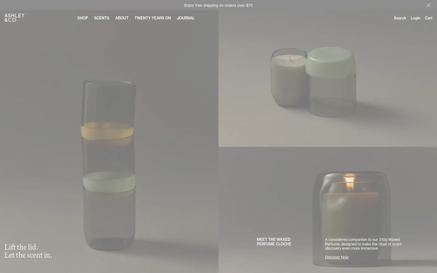
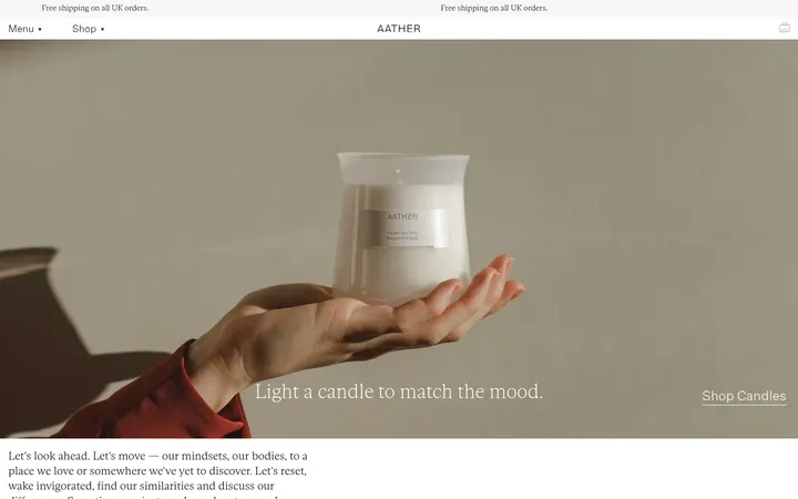
The page is anchored by Gallery Sand (#f6f3f0), an uninterrupted warm canvas that lets product photography establish most of the mood. A pale butter surface (#faf9ea) distinguishes the scent-selector band, while Charcoal Gray (#3c3c3c) carries most navigation and supporting copy. Black (#000000) appears in selected text and interface details; fine gray borders separate quiet areas rather than framing every card. Neue Haas Grotesk Text handles compact navigation, captions, and controls, while Martina Plant brings a softer editorial voice to prominent headlines and selected body copy. The opening hero uses a large, asymmetrical photographic composition with small text blocks placed directly over the image. Further down, category imagery, product collections, journal stories, and ethos content alternate through broad, spacious sections. The layout feels like a curated magazine, with varied column counts and oversized photography rather than repeated boxed modules.
配色
点色块复制色值。用途说明来自对页面的实测位置(背景、文字、描边、按钮)与截图判读。
品牌色
表层色
中性色
功能色
页面底色 · Gallery Sand表层 · Butter Mist主文字 · Editorial Black次要文字 · Soft Charcoal弱文字 · Pure White描边 · Quiet Line
Navigation, captions, compact links, buttons, and utility text.
Aa 设计
Martina Plant
网络字体 · 字重 400 / 500 · 占比 6%
免费替代:Cormorant Garamond
Editorial display headings and some larger descriptive copy.
角色
示例
字号
字重
行高
字距
一级标题
Large serif headline introducing the hero story.
Ashley & Co.
42px
500
1.1
-0.005em
二级标题
Serif section titles and editorial subheadings.
The quick brown fox 敏捷的狐狸
24px
500
1.1
-0.005em
正文
Serif descriptive copy for selected feature and editorial text.
The quick brown fox 敏捷的狐狸
20px
400
1.1
0.014em
辅助文字
Compact sans-serif product labels and supporting metadata.
The quick brown fox 敏捷的狐狸
12px
500
1.2
0
按钮
Small medium-weight sans-serif action labels.
The quick brown fox 敏捷的狐狸
12px
500
1.2
0
导航
Small regular sans-serif primary and utility navigation.
The quick brown fox 敏捷的狐狸
12px
400
1.2
0
链接
Compact medium-weight sans-serif links and calls to action.
The quick brown fox 敏捷的狐狸
12px
500
1.2
0
间距与布局
基准单位 2px · 密度:宽松
120px版块间距
15px元素间距
—卡片内边距
1410px内容最大宽度
5px
10px
15px
20px
30px
80px
120px
The measured page max width is 1410px, but the visual system frequently lets photography approach the viewport edges. Sections vary from two-column editorial splits to broad category strips, four-column product areas, and a pale multi-column scent selector. Most content aligns to a clear left edge, while text beside images stays compact. The spacing scale is spacious, with a measured 120px section gap and 15px element gap; preserve that long-form rhythm instead of compressing sections into a dense catalog.
圆角与层次
没有测到阴影:页面是扁平的,层次靠底色和描边区分。
The interface is predominantly flat: no measured shadows or gradients, and cards are not given prominent rounded containers. Use thin, quiet separators where needed, including footer boundaries and understated slider rules. Product imagery provides the depth and tonal contrast; avoid adding raised panels or decorative framing.
组件
下面的预览按实测的按钮、输入框、徽标、卡片样式重建(字体用替代字体)。
Overlay hero story
A large asymmetric photographic opening with a serif headline at lower left and compact supporting copy and link over the image.
Category image navigation
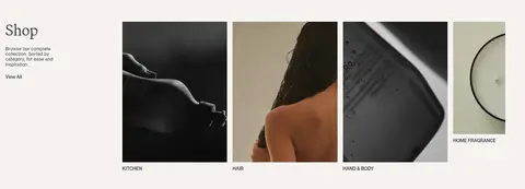
A row of category photographs paired with small uppercase or compact labels, plus a short introductory text area.
Featured product tiles
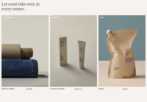
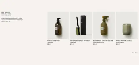
Product imagery in multi-column groupings with concise labels, scent names, and understated shop links.
Tabbed best sellers
Compact uppercase collection tabs introduce a horizontal product selection, with restrained descriptions and small product details.
Scent selector
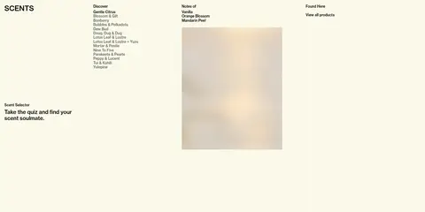
A pale Butter Mist (#faf9ea) multi-column area combining a quiz prompt, scent links, notes, and a related image.
Editorial journal feed
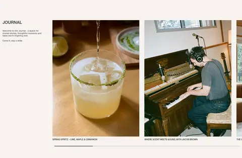
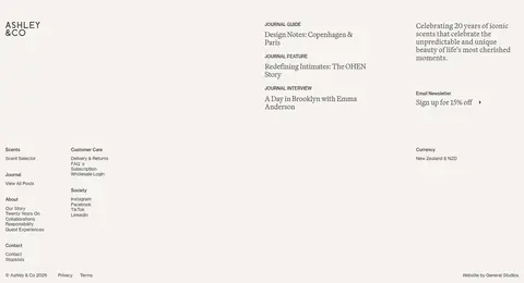
A short introductory text block sits beside large story images, with compact article captions and subtle horizontal rules.
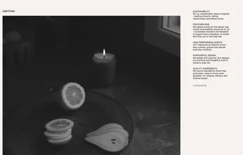
Ethos feature
A large lifestyle image shares a two-column section with a compact list of principles and supporting copy.
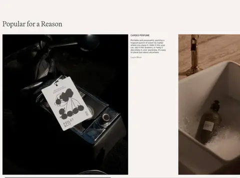
Imagery · Use tactile lifestyle and product photography as the main visual material: bottles, packaging, scent rituals, interiors, and people. Images are large, often cropped into asymmetric compositions or narrow product tiles, with subdued natural color and soft contrast. The hero photography fills much of the opening viewport and supports discreet overlay copy. The dominant gray tones in the screenshot come from imagery and should not be mistaken for the page palette.
Use Gallery Sand (#f6f3f0) as the dominant page canvas.
Reserve Butter Mist (#faf9ea) for a clearly distinct scent or discovery section.
Use large, tactile photography to carry the visual emphasis.
Pair delicate serif editorial headings with compact sans-serif interface text.
Vary column structure to suit each content story.
Keep separators thin and the overall interface flat.
✕ 不该做
Do not turn every section into a boxed card grid.
Do not introduce bright accent colors absent from the measured palette.
Do not use heavy shadows, gradients, or raised surfaces.
Do not make navigation or captions large and dominant.
Do not mistake photographic gray tones for the brand canvas color.
Do not compress the generous section rhythm into a dense storefront.
给 AI 的提示词
想快速出一个同风格的新页面,把这段话连同 DESIGN.md 一起发给 AI。
Build a new Ashley & Co. page as a calm, image-led editorial storefront. Use Gallery Sand (#f6f3f0) for the main canvas and Soft Charcoal (#3c3c3c) for most navigation and supporting copy; use Editorial Black (#000000) selectively, Pure White (#ffffff) only where text overlays dark imagery, and Quiet Line (#dedfdb) for subtle dividers. A pale Butter Mist (#faf9ea) area can distinguish scent discovery. Set large editorial headings in a Martina Plant-like serif and compact navigation, captions, and controls in a Neue Haas Grotesk-like sans serif. Organize content in varied, spacious columns with broad photography, asymmetrical feature splits, and restrained product tiles. Keep controls visually quiet, avoid prominent card borders and shadows, and let tactile product and lifestyle images provide contrast and depth.