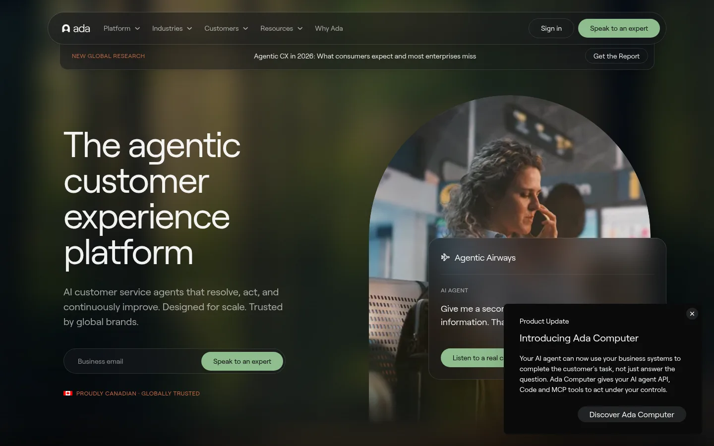
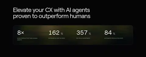
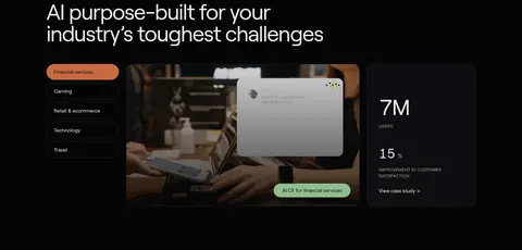
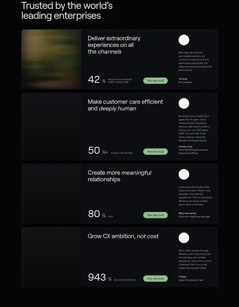
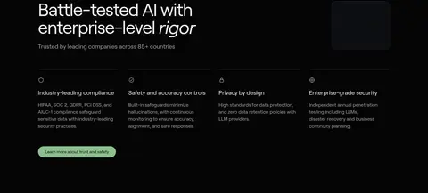
Ada 首页以近黑色画布和克制的大字排版为主,搭配柔和绿色按钮与沉浸式客户服务场景。页面依次展示成效数据、客户案例、产品能力与安全信任信息,最后以简洁的行动号召收尾。
North star · Keep the page grounded in near-black simplicity, and use spacious editorial structure and restrained sage actions to make enterprise proof feel human.
The page is anchored by a near-black canvas (#050506), with only slight shifts to charcoal surfaces for cards and content panels. Soft sage green (#8fbe8e) marks the main conversion actions; warm terracotta (#c96a42) appears sparingly as a secondary signal, including small announcement and industry accents. Roobert’s geometric sans-serif shapes give the oversized, regular-weight headlines a calm editorial quality, while muted gray copy keeps dense supporting information legible without competing. Layout uses a centered, wide content frame, left-aligned headings, and broad breathing room between long sections. The hero overlays product UI on a cinematic customer-service photograph, while later sections combine case-study cards, metrics, interface imagery, and trust features. Fine dark borders, rounded panels, and pill-shaped controls establish hierarchy in place of strong shadows. Color variation inside hero photography and mockups is supporting media, not the brand palette.
Site-wide display, headings, body copy, navigation, labels, and controls.
角色
示例
字号
字重
行高
字距
特大标题
Oversized hero or campaign headline when used.
Ada
72px
400
1
-0.03em
一级标题
Primary hero headline and major page title.
Ada
60px
400
1
-0.03em
二级标题
Section headings introducing proof, capability, and trust.
Ada
36px
400
1.11
-0.02em
三级标题
Subsection titles and feature-card headings.
The quick brown fox 敏捷的狐狸
20px
400
1.5
0
正文
Explanatory paragraphs and case-study descriptions.
The quick brown fox 敏捷的狐狸
16px
400
1.5
0
辅助文字
Small supporting details and compact media copy.
The quick brown fox 敏捷的狐狸
14px
400
1.5
0
按钮
Primary CTA and compact action labels.
The quick brown fox 敏捷的狐狸
14px
400
1
0
导航
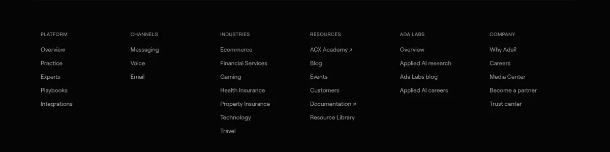
Main navigation links and footer navigation items.
The quick brown fox 敏捷的狐狸
14px
400
1
0
链接
Case-study links and secondary inline actions.
The quick brown fox 敏捷的狐狸
14px
400
1.43
0
眉题
Uppercase section labels and small category markers.
The quick brown fox 敏捷的狐狸
12px
400
1.38
0.04em
间距与布局
基准单位 8px · 密度:适中
56px版块间距
12px元素间距
—卡片内边距
1184px内容最大宽度
4px
8px
12px
16px
20px
24px
32px
40px
56px
64px
Use a centered content frame capped at the measured 1184px, with left-aligned section headings and responsive multi-column arrangements for proof cards, industries, and trust features. The hero is a wide, media-led split composition; subsequent sections retain the same dark canvas, alternating spacious editorial blocks with denser card grids. The measured spacing system uses an 8px base, 12px element gaps, and a 56px section gap, with generous vertical breathing room in the full-page flow. Keep card interiors comfortable and avoid crowding data or interface imagery.
圆角与层次
按钮 · 9999px
输入框 · 9999px
卡片 · 16px
图片 · 50%
徽标 · 9999px
导航 · 9999px
链接 · 16px
xl · card, media
md · media
inset · card
lg · nav, other
The design is mostly flat: the near-black canvas does most of the separation work. Cards use charcoal fills, thin graphite borders, and rounded corners rather than prominent shadows. Layered hero UI and occasional media panels create depth; reserve shadows for those overlapping media elements and keep navigation and text sections visually quiet.
组件
下面的预览按实测的按钮、输入框、徽标、卡片样式重建(字体用替代字体)。
Primary CTA
Sage pill button (#8fbe8e) with dark text (#0a0b0c), regular Roobert at 14px, and measured 12px vertical by 24px horizontal padding.
Secondary pill
Transparent dark button with white text, a thin #242424 outline, and pill-shaped corners.
Case-study card
Dark #0d0e11 card with a fine dark border, rounded 16px corners, white copy, and a concise outcome-led link.
Metric panel
A horizontal row of large figures and compact uppercase explanations inside a dark, lightly bordered panel.
Announcement strip
Slim dark banner beneath navigation, pairing a small terracotta eyebrow with a centered research message and outlined action.
Industry selector
A vertical industry list with a terracotta or sage filled selected pill and dark media-led content beside it.
Product UI overlay
Dark interface cards layered over photography, using fine borders, restrained labels, and one bright action control.
Imagery · Lead with cinematic customer-service photography in a large circular crop, layered with realistic dark product-interface panels. Across the page, use interface mockups, customer logos, and case-study media as evidence rather than decoration. The measured screenshot includes olive and warm hues in the hero and card imagery; treat these as photographic content, not brand colors. Keep media darkened or naturally low-key so white type and sage controls remain clear.
Set large headings in regular-weight, tightly tracked sans-serif.
Separate cards with subtle borders and charcoal fills.
Let customer and product imagery carry its own color.
Use generous vertical rhythm between major content blocks.
✕ 不该做
Do not introduce bright section backgrounds.
Do not use terracotta as the primary CTA color.
Do not add heavy shadows to ordinary cards.
Do not crowd the page with dense copy or tight grids.
Do not treat colors sampled from photos as brand tokens.
Do not use bold, all-caps display headlines.
给 AI 的提示词
想快速出一个同风格的新页面,把这段话连同 DESIGN.md 一起发给 AI。
Build a new enterprise AI SaaS page in Ada’s visual style. Use Midnight Canvas (#050506) for the page foundation, Charcoal Panel (#0d0e11) for cards, and Slate Edge (#15171b) for subtle separation. Set headings and copy in Roobert or a close Manrope substitute, with large regular-weight headlines, tight tracking, and muted supporting text in Soft Ash (#a0a0a0). Make Sage Signal (#8fbe8e) the primary CTA, with Button Ink (#0a0b0c) text; reserve Terracotta Signal (#c96a42) for rare secondary accents. Build an editorial flow with a media-led hero, measurable proof, case-study panels, product UI imagery, trust content, and a closing CTA. Keep cards rounded and lightly bordered, use wide breathing room, and let photography provide secondary color.