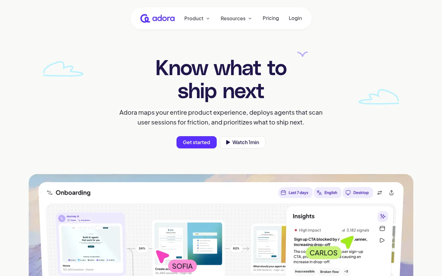
North star · Keep the page calm and legible, then use saturated purple and soft pastel panels to direct attention toward product evidence.
The page is grounded in a warm off-white canvas (#f9f9f7), with dark plum-ink headings (#21164c) and softer charcoal copy (#353241). A vivid purple (#592eff) marks the primary action and selected links, while cyan, pink, and lime appear as generous feature-panel fills and illustrated accents rather than competing interface chrome. PolySans gives display and heading text a compact, confident presence; Plus Jakarta Sans carries navigation, body copy, and controls with a rounded, approachable feel. The composition alternates centered hero storytelling with left-aligned product explanations, large interface demonstrations, logo proof, and colorful testimonial panels. A comfortable, wide content frame and substantial section breathing room keep the long page readable. Rounded cards, fine neutral borders, and restrained shadows soften the product UI without making the whole page feel elevated or glossy.
Navigation, body copy, captions, buttons, and links.
Aa 设计
PolySans
网络字体 · 字重 600 / 700 · 占比 25%
免费替代:Inter
Display headlines and the main heading hierarchy.
角色
示例
字号
字重
行高
字距
特大标题
Oversized platform headline and prominent promotional display copy.
Adora
68px
600
1.1
-0.02em
一级标题
Primary hero headline.
Adora
58px
600
1.1
-0.02em
二级标题
Major section headings and testimonial statements.
Adora
38px
600
1.2
-0.02em
三级标题
Feature and product-card headings.
Adora
32px
500
1.1
-0.02em
四级标题
Smaller feature titles and integration step headings.
Adora
28px
600
1.1
-0.02em
正文
Section descriptions, testimonial copy, and product explanations.
The quick brown fox 敏捷的狐狸
18px
500
1.6
0
辅助文字
Small labels, metadata, and supporting interface details.
The quick brown fox 敏捷的狐狸
14px
500
1.6
0
按钮
Primary and secondary CTA labels.
The quick brown fox 敏捷的狐狸
18px
500
1.6
0
导航
Top navigation links and menu labels.
The quick brown fox 敏捷的狐狸
16px
500
1
0
链接
Inline actions such as privacy and product-detail links.
The quick brown fox 敏捷的狐狸
18px
500
1.6
0
间距与布局
基准单位 2px · 密度:适中
60px版块间距
5px元素间距
—卡片内边距
1192px内容最大宽度
5px
6px
8px
10px
12px
16px
20px
24px
30px
32px
40px
48px
50px
60px
70px
100px
Use a centered content frame with a measured maximum width of 1192px and a comfortable, spacious density. The hero is centered and two-column in content, with a large, nearly full-width product demonstration below. Alternate centered logo proof and feature introductions with left-aligned copy and product previews. Product showcases and cards create the denser passages; testimonial panels and large headings restore visual breathing room. Keep section gaps generous and maintain clear separation between content bands even when the canvas color stays consistent.
圆角与层次
按钮 · 12px
卡片 · 40px
图片 · 26px
导航 · 9999px
md · other, card
sm · nav
The overall page is mostly flat, with thin #e0e0db borders separating cards and controls. Use the measured restrained card shadow sparingly, and apply a subtle shadow to the white navigation capsule. Product previews gain depth mainly through layered screenshots, tinted frames, and rounded clipping rather than heavy shadows.
组件
下面的预览按实测的按钮、输入框、徽标、卡片样式重建(字体用替代字体)。
Floating navigation
A compact white capsule centered near the top, with Adora branding, navigation links, and a subtle shadow.
Hero CTA pair
Purple filled Get started button beside a white bordered Watch 1min button; both use rounded corners and clear labels.
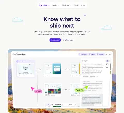
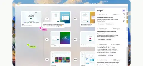
Product demonstration frame
Large rounded product screenshot or video, layered over softly colored framing and annotated with interface details.
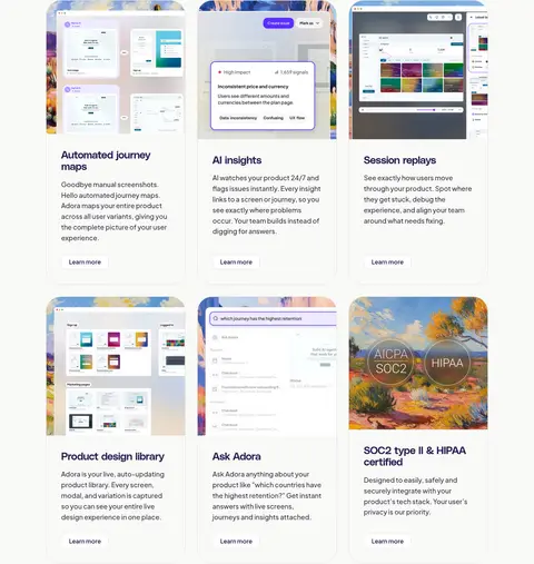
Feature cards
Rounded cards with fine neutral borders, product imagery, concise headings, explanatory copy, and small Learn more links.
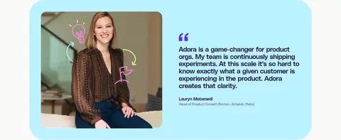
Pastel testimonial panel
Wide rounded quote block using a bright lime, pink, or cyan fill, with a customer portrait and compact attribution.
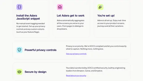
Integration steps
Three concise setup cards followed by horizontal privacy and security information rows with small icons and links.
Footer link groups
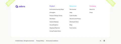
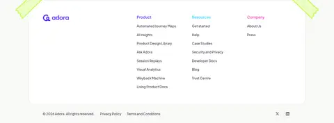
A white, rounded footer surface with grouped product, resource, and company links plus a compact legal row.
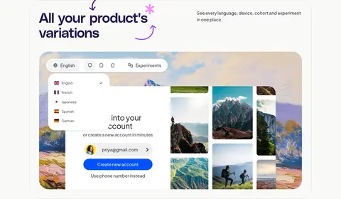
Imagery · Product-interface screenshots and animated or video-led demonstrations are the primary visual evidence, often shown large inside rounded frames. Supplement them with customer portraits, customer logos, and light hand-drawn cloud marks. Bright landscape-like artwork and colorful annotation details occur inside product mockups and testimonial imagery; treat those as illustrative content, not as the page’s core palette.
Set major headings in PolySans with deep #21164c ink.
Reserve #592eff for the primary action and important links.
Show real product-interface previews prominently.
Use pastel colors selectively for feature and testimonial panels.
Keep borders thin, neutral, and visually quiet.
✕ 不该做
Do not make the whole page dark or high-contrast.
Do not use bright pink or lime as the primary CTA color.
Do not replace product screenshots with generic abstract art.
Do not crowd the spacious section rhythm with dense text.
Do not apply heavy shadows to every card.
Do not use all caps for ordinary headings or navigation.
给 AI 的提示词
想快速出一个同风格的新页面,把这段话连同 DESIGN.md 一起发给 AI。
Build a new Adora-style SaaS page on a warm #f9f9f7 canvas. Use deep #21164c PolySans headlines and #353241 Plus Jakarta Sans interface copy; keep headings compact and confident, body text readable, and alignment intentional. Use #592eff for the primary CTA and links, with white secondary controls and thin #e0e0db borders. Make product-interface imagery the centerpiece: frame it with soft rounded corners and occasional pastel #bcf2ff, #ffaae6, or #dfff9d panels. Keep these brighter hues to feature storytelling and testimonials, not general page chrome. Establish a spacious, centered content frame, alternate centered hero moments with left-aligned feature explanations, and organize content into clear, generous bands. Prefer restrained shadows, layered product previews, and straightforward navigation.