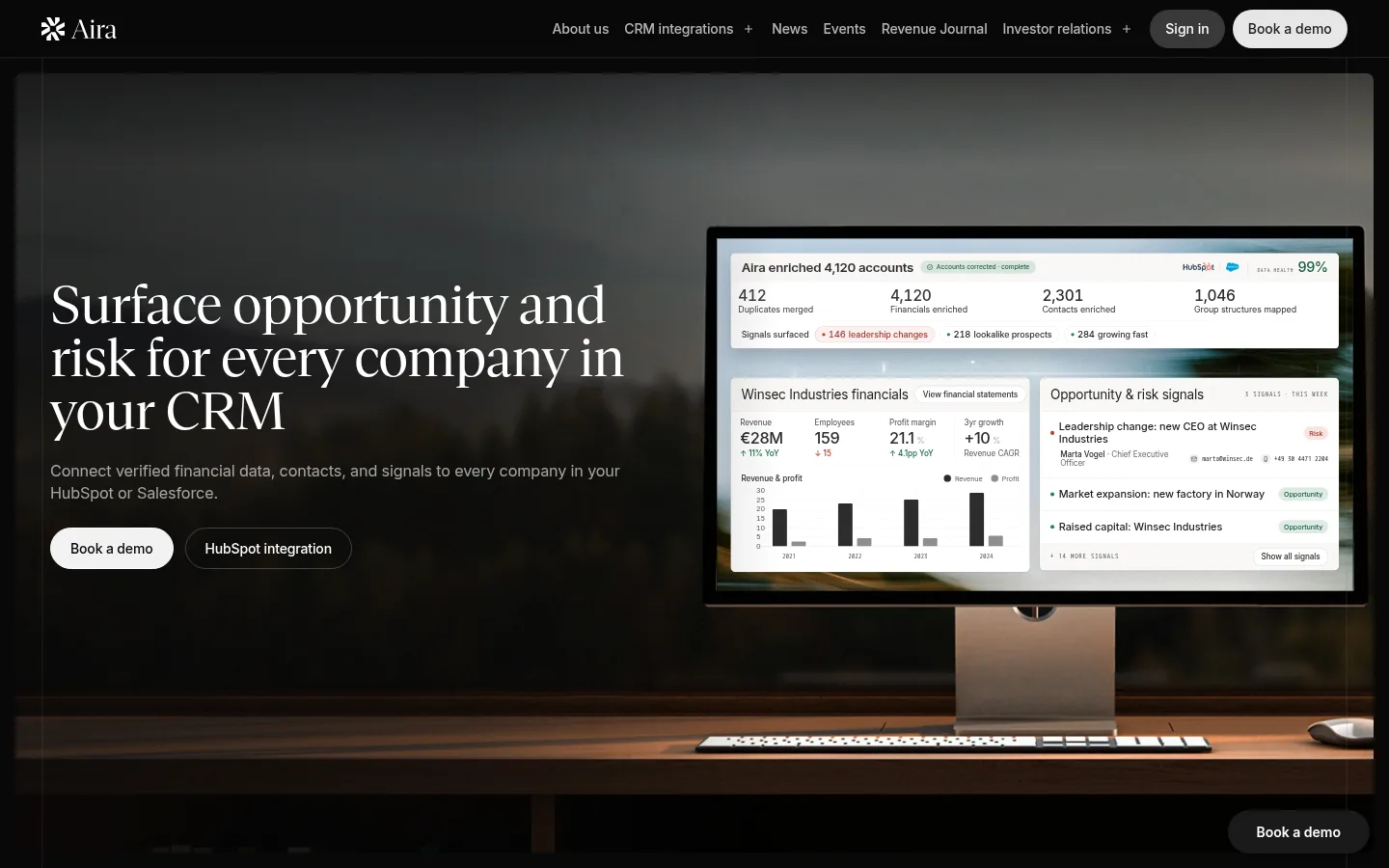
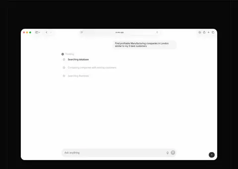
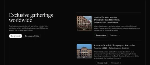
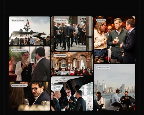
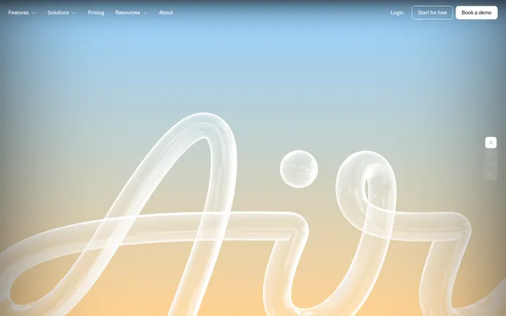
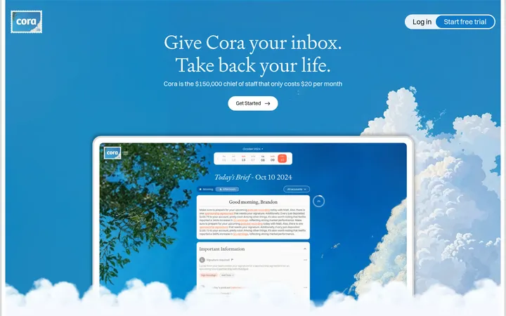
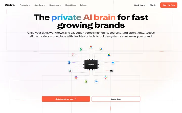
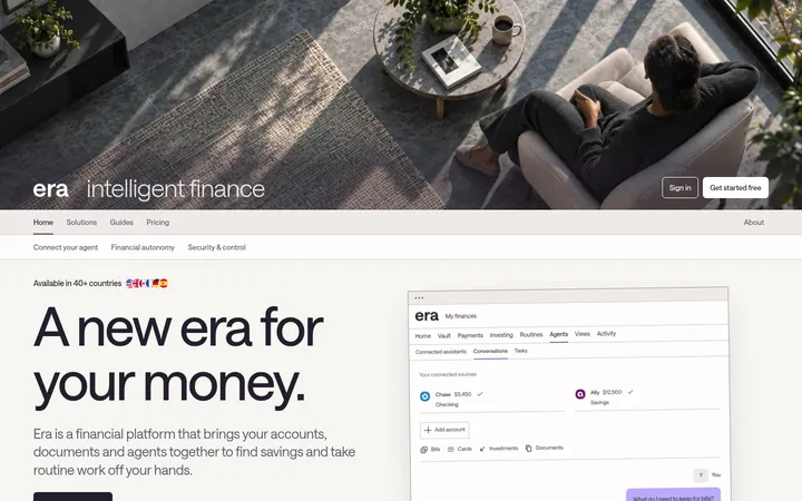
Aira 首页以舒展的编辑式排版和克制的浅色区块,串联起以深色为主的产品叙事。CRM 界面、商务摄影和圆角按钮让 AI 与企业财务数据服务更直观。
North star · Pair refined editorial headlines with tangible product evidence, using near-black storytelling bands and warm, quiet light surfaces.
The page alternates between warm, pale surfaces and long near-black sections, with the dark canvas carrying most of the product story. White and cream CTA pills stand out clearly against those dark bands, while dark charcoal text and subtle gray rules keep the light sections composed. Gestura’s high-contrast editorial serif gives major headlines a distinctive, calm voice; Inter handles navigation, explanatory copy, and interface-like details. The opening hero overlays white serif type and muted supporting copy on a cinematic workspace image with a monitor showing Aira’s product. Below, pale CRM and data sections use large interface screenshots, followed by dark feature stories, device mockups, news, events, and a photographic gallery. Layouts shift between centered statements, two-column feature splits, and dense image or UI groupings. Rounded pill buttons and cards soften the otherwise crisp, restrained system.
Navigation, body copy, buttons, captions, and product-interface text.
Aa 设计
Gesturaheadline
网络字体 · 字重 400 / 600 · 占比 8%
免费替代:Cormorant Garamond
Primary large editorial headlines, especially hero and feature statements.
Aa 设计
Gestura Headline
网络字体 · 字重 400 · 占比 7%
免费替代:Cormorant Garamond
Editorial article and link headlines.
Aa 设计
Haffer Mono
系统字体 · 字重 400 · 占比 4%
免费替代:Space Mono
Uppercase eyebrow labels and section identifiers.
Aa 设计
SF Mono
系统字体 · 字重 400 / 500 · 占比 3%
免费替代:IBM Plex Mono
Code-like and technical interface details.
角色
示例
字号
字重
行高
字距
一级标题
Hero headline and leading brand statement.
Aira
48px
400
1
-0.02em
二级标题
Major section headlines and feature statements.
Aira
36px
400
1
-0.02em
三级标题
Inter subheads and supporting feature titles.
Aira
32px
500
1.2
-0.004em
四级标题
Smaller editorial serif headlines and card titles.
The quick brown fox 敏捷的狐狸
27px
400
1.08
-0.025em
正文
Supporting descriptions and explanatory copy.
The quick brown fox 敏捷的狐狸
14.5px
400
1.4
-0.01em
辅助文字
Compact supporting details, news summaries, and UI labels.
The quick brown fox 敏捷的狐狸
14px
400
1.55
-0.01em
按钮
Pill CTA labels, set in medium-weight Inter.
The quick brown fox 敏捷的狐狸
14px
500
1
0
导航
Header navigation links in compact Inter.
The quick brown fox 敏捷的狐狸
14px
500
1
0
链接
Editorial news and content links in serif type.
The quick brown fox 敏捷的狐狸
20px
400
1.2
-0.01em
眉题
Uppercase mono labels and numbered section markers.
The quick brown fox 敏捷的狐狸
20px
400
1
0.12em
代码
Technical snippets and code-like interface text.
const style = 1;
11.5px
400
1.6
-0.013em
间距与布局
基准单位 4px · 密度:适中
43px版块间距
8px元素间距
—卡片内边距
1354px内容最大宽度
1px
4px
5px
7px
8px
9px
10px
11px
12px
13px
14px
16px
17px
18px
20px
22px
The measured content max width is 1354px, with full-bleed media and section backgrounds. Use a comfortable density and a 4px-based spacing system; the measured section gap is 43px and element gap is 8px. The page rhythm alternates wide, image-led hero and product sections with compact editorial content. Align feature splits to a strong two-column structure, use four-column groupings for selected product content, and let cards or gallery tiles form denser grids. Headlines align left in most sections, with occasional centered statements and stats.
圆角与层次
按钮 · 9999px
卡片 · 16px
图片 · 8px
徽标 · 9999px
导航 · 9999px
链接 · 9999px
hairline · other, card
lg · other
xl · card
md · other
The visual system is mostly flat, with contrast between large light and dark section bands doing the structural work. Cards use subtle measured gray borders and restrained shadows; product media can sit above the canvas with more pronounced depth. Rounded cards and pill controls soften the crisp sections without excessive layered panels.
组件
下面的预览按实测的按钮、输入框、徽标、卡片样式重建(字体用替代字体)。
Navigation
Dark top bar with white Aira identity and compact Inter links; sign-in and demo actions appear as rounded pills.
Hero CTA pair
A light primary Book a demo pill and a dark outlined HubSpot integration action sit beneath the hero copy.
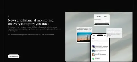
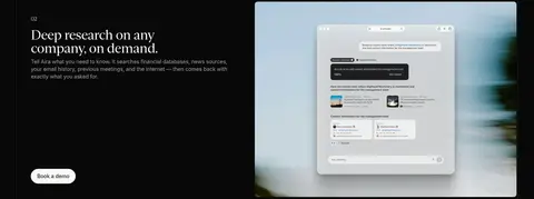
Product feature split
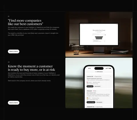
Dark section, left-aligned serif feature copy and CTA, paired with a large product or device image.
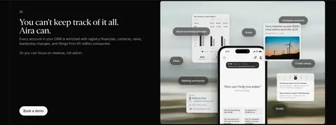
Light product panel
Warm or stone-colored section containing crisp CRM screenshots, dashboards, or integration details.
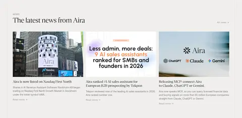
News cards
Light-background editorial feed with image-led cards, serif story titles, and subdued supporting copy.
Event gallery
Dark-background photo collage with rounded image tiles and small pale pill labels.
Footer
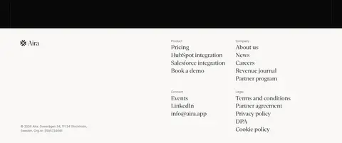
Warm pale surface with Aira identity, grouped link columns, and understated legal details.
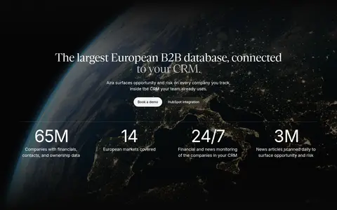
Imagery · Use cinematic workplace photography and realistic product-interface imagery: monitor and phone mockups, CRM dashboards, research screens, and event photography. Hero and feature images are broad, darkened or naturally moody, with text layered where contrast allows. Product screenshots remain crisp and bright against dark surroundings. The gallery uses a varied masonry-like arrangement of business gatherings; avoid adding illustrative brand colors not established by the measured palette.
Alternate near-black storytelling bands with warm pale information sections.
Use serif display type for major editorial headlines.
Keep body copy and controls in Inter.
Place real product UI or business imagery beside feature explanations.
Use rounded pill styling for primary actions and event labels.
Keep borders and shadows restrained against strong section contrast.
✕ 不该做
Do not introduce bright accent colors absent from the measured palette.
Do not make every section a card grid.
Do not replace editorial headlines with generic heavy sans-serif typography.
Do not overuse shadows or decorative gradients.
Do not crowd supporting copy around large product imagery.
Do not use bright white backgrounds where the warm pale surfaces are shown.
给 AI 的提示词
想快速出一个同风格的新页面,把这段话连同 DESIGN.md 一起发给 AI。
Build a new Aira-style page with a clear editorial/product balance. Use Aira Black (#080808) for cinematic storytelling sections, Warm Paper (#f9f8f6) and Soft Stone (#f0efed) for calm content bands, and Clean White (#ffffff) for contrast in navigation and product media. Set major headlines in a Gestura-like serif, with Inter for body text, navigation, and buttons; reserve Haffer Mono-style uppercase text for sparse eyebrow labels. Structure content in full-width bands with a centered content frame, alternating two-column feature splits and product-image groupings. Show credible CRM screens, monitor or phone mockups, and workplace photography rather than abstract decoration. Use pill-shaped CTAs, fine neutral borders, and minimal shadows. Keep copy concise and the layouts spacious.