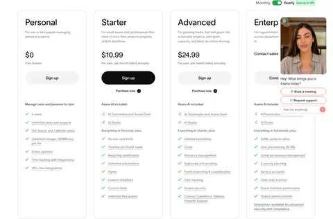
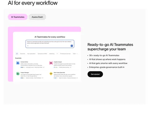
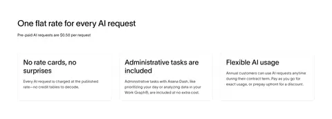
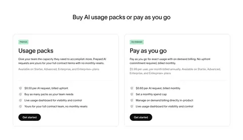
North star · Keep the page airy and editorial on white, using black for structure, gradient only for emphasis, and product visuals as the main source of complexity.
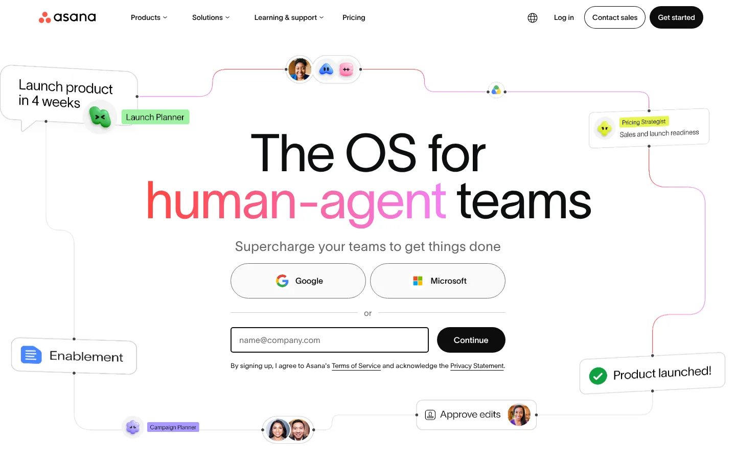
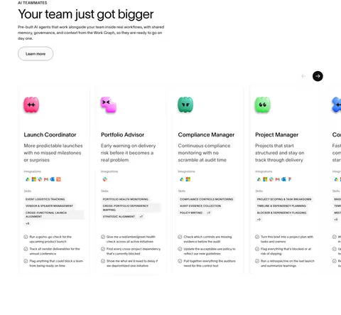
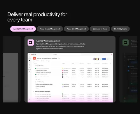
The page is led by a white canvas, with black text and selective dark bands providing strong contrast rather than a consistently dark theme. Coral and pink hues form a linear gradient for the hero’s “human-agent” message and appear as small accents; many other bright colors belong to workflow cards and product illustrations, not the core page palette. TWK Lausanne’s light sans-serif weights create large, open headlines, balanced by small, tightly functional labels and navigation. The opening hero centers a sign-up form inside a full-width network illustration. Below, sections alternate between two-column explanatory layouts, horizontal AI teammate cards, testimonial proof, and award graphics. Generous vertical gaps separate these blocks, while product UI screenshots and illustrations supply detail. The later black showcase and footer are deliberate contrast points, with white copy, bright interface previews, and sparse CTA styling.
Shared typeface for display headlines, body copy, navigation, labels, buttons, and links.
角色
示例
字号
字重
行高
字距
特大标题
Oversized hero headline and prominent brand statement.
Asana
102px
300
0.9
-0.025em
一级标题
Primary page and major section headlines.
Asana
54px
300
1
-0.02em
二级标题
Section headings such as capability and proof-point titles.
Asana
36px
300
1.3
-0.01em
三级标题
Subsection headings and prominent card titles.
Asana
30px
400
1.2
0
四级标题
Secondary headings within product and content blocks.
The quick brown fox 敏捷的狐狸
26px
300
1.3
0.02em
正文
Explanatory copy, testimonials, and signup supporting text.
The quick brown fox 敏捷的狐狸
16px
300
1.5
0.02em
辅助文字
Footnotes, compact metadata, and fine-print descriptions.
The quick brown fox 敏捷的狐狸
13px
300
1.5
0.02em
按钮
CTA labels and rounded action controls.
The quick brown fox 敏捷的狐狸
13px
500
1.5
0
导航
Primary navigation and menu labels.
The quick brown fox 敏捷的狐狸
14px
500
1.5
0
链接
Inline links and resource actions.
The quick brown fox 敏捷的狐狸
13px
300
1.5
0
眉题
Uppercase section labels such as AI TEAMMATES.
The quick brown fox 敏捷的狐狸
11px
500
1.5
0.04em
间距与布局
基准单位 8px · 密度:宽松
120px版块间距
8px元素间距
22px卡片内边距
1288px内容最大宽度
2px
4px
8px
12px
14px
15px
16px
24px
32px
40px
52px
80px
120px
Use a spacious, vertically stacked page with a measured maximum content width of 1288px and a 120px section rhythm. The hero is full-bleed and center-aligned; most following sections use left-aligned headings and two-column layouts. Wider feature areas support multi-column or horizontally browsable cards. Keep content density low around headings and proof points, with denser detail confined to product UI and the footer. The page shifts between white content bands and a few full-width black bands.
圆角与层次
按钮 · 9999px
输入框 · 4px
卡片 · 20px
图片 · 8px
徽标 · 4px
导航 · 9999px
链接 · 10px
inset · nav
Favor flat surfaces and crisp separation over pronounced shadows. Use thin pale borders and hairlines for inputs, cards, and content dividers; reserve rounded panels for product imagery and feature cards. Product previews layer interface content inside dark frames, while the overall page stays visually light and uncluttered.
组件
下面的预览按实测的按钮、输入框、徽标、卡片样式重建(字体用替代字体)。
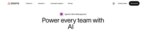
Primary navigation
White, low-profile header with compact menu links, logo, account actions, and pill-shaped CTA controls.
Signup hero
Centered display headline and supporting copy over a connected workflow illustration, followed by Google and Microsoft options, an outlined email input, and a dark pill CTA.
Pill CTA
Rounded actions use dark fills with white text, or pale pink with dark text for a highlighted offering; button typography is medium-weight.
Feature accordion
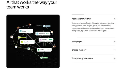
Two-column capability section pairs a visual product graphic with explanatory copy and stacked, hairline-separated topic rows.
AI teammate cards
Horizontal product cards combine colorful agent icons, compact headings, descriptive copy, integration marks, and small capability labels.
Proof-point cards
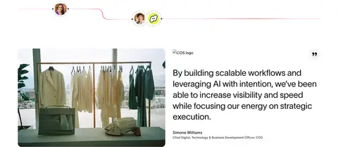
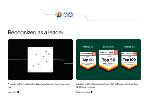
Customer quote, recognition, and award content combines concise text with imagery, logos, and restrained link actions.
Dark product band
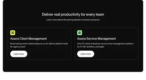
Black section presents a light headline and pill tabs above a framed product interface preview.
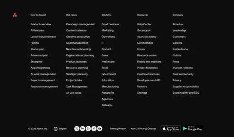
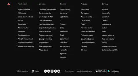
Multi-column footer
Dark footer groups numerous compact navigation links into columns, with a thin divider and small legal and social controls.
Imagery · Mix product-interface screenshots, workflow diagrams, logo marks, award graphics, and occasional customer photography. The hero uses a delicate connected workflow illustration around the centered signup form. Product graphics are often framed in dark rounded panels, while testimonials and logos sit on open white space. Treat colorful icons and badges as illustration content rather than expanding the core brand palette.
Use white as the default canvas for the main narrative.
Set major headlines in a light, clean sans-serif style.
Reserve the coral-to-pink gradient for emphasis and workflow details.
Give sections generous separation and keep copy blocks readable.
Use product interfaces and diagrams to explain capabilities.
Use dark bands selectively for product showcase and footer contrast.
✕ 不该做
Do not make the whole page charcoal because the measured theme label says dark.
Do not apply bright illustration colors as broad section backgrounds.
Do not crowd the hero with additional competing content.
Do not use heavy shadows as the default card treatment.
Do not make every CTA pink; keep most actions dark or outlined.
Do not use dense uppercase styling for general body copy.
给 AI 的提示词
想快速出一个同风格的新页面,把这段话连同 DESIGN.md 一起发给 AI。
Build a new Asana-style productivity page with a predominantly white canvas (#ffffff), Core Ink (#0d0d0d) typography, and restrained Quiet Line (#e7e7e7) dividers. Use TWK Lausanne or a close neutral sans-serif substitute, with light display headings and medium-weight compact controls. Make the layout spacious and editorial: a clear hero, generous section gaps, two-column feature explanations, and product-led cards. Use Signal Coral (#ff453e) and Orchid Glow (#f481f4) as selective gradient accents, not broad fills; Petal Pink (#ffc9ff) may highlight one featured CTA. Include convincing workflow diagrams or product UI previews, framing complex imagery within rounded panels. Keep elevation subtle, use pill-shaped buttons, and reserve Core Ink backgrounds for a focused showcase or footer. Maintain readable contrast and keep product illustration colors distinct from the core palette.