North star · Keep the interface quiet and spacious so product photography leads, while blue Shop buttons provide the clearest functional signal.
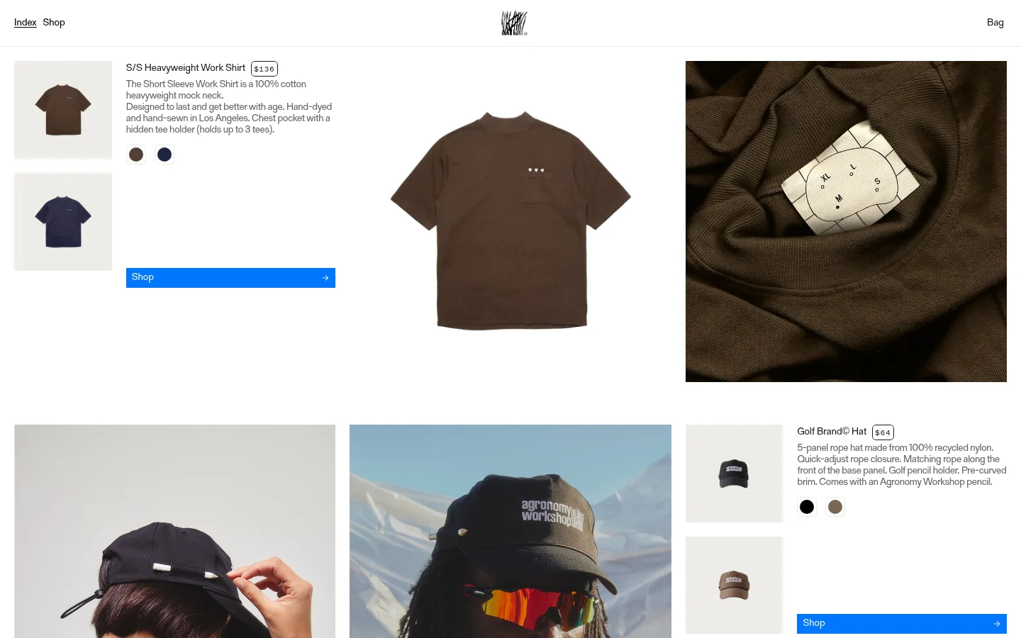
The visual strategy is built around a clean white canvas and abundant open space, letting apparel and campaign photography carry the personality. The measured palette keeps interface text in restrained charcoal and grays, while a vivid blue marks Shop buttons; the warm pale gray appears in product-thumbnail cards. Most imagery contains the page’s richer browns, blues, and outdoor colors, so treat these as photographic content rather than extra interface colors. Compact sans-serif product copy and navigation sit beside oversized, narrow display headings, creating a contrast between practical shopping information and editorial storytelling. Product modules are arranged in an irregular, spacious grid: thumbnails and details occupy one area while larger garment and lifestyle images balance the composition. The page mixes close product views, studio-like cutouts, and candid outdoor portraits. Keep components flat and unornamented, with minimal borders and no visible shadow treatment. Generous gaps and staggered image placement make the store feel like a visual catalog rather than a conventional dense product listing.
Primary body copy, navigation, and product details.
Aa 设计
OT Neue Montreal Medium Semi Squeezed
网络字体 · 字重 500 · 占比 2%
免费替代:Oswald
Large editorial headings and section titles.
Aa 设计
Gerstner Programm FSL
系统字体 · 字重 400 · 占比 2%
免费替代:Inter
System-fallback version of the main sans-serif text face.
角色
示例
字号
字重
行高
字距
一级标题
Oversized condensed editorial titles, including the brand image finale.
Agronomy Workshop
54px
500
0.81
-0.02em
二级标题
Condensed headings introducing editorial or informational sections.
Agronomy Workshop
32px
500
1
-0.02em
正文
Product descriptions and supporting page copy.
The quick brown fox 敏捷的狐狸
14px
400
1.14
0
辅助文字
Small, widely tracked labels or fine-print details.
The quick brown fox 敏捷的狐狸
10px
400
1.2
0.1em
链接
Navigation and concise shopping links.
The quick brown fox 敏捷的狐狸
14px
400
1.14
0
代码
No prominent code content; reserve for compact monospaced labels if needed.
const style = 1;
10px
400
1.2
0.1em
间距与布局
基准单位 4px · 密度:适中
40px版块间距
20px元素间距
16px卡片内边距
—内容最大宽度
4px
6px
8px
10px
12px
16px
20px
Use a broad, responsive canvas with product details, thumbnail stacks, and large images arranged in an asymmetric multi-column grid. Align product text and controls to the edges of their image groups, while allowing lifestyle photography to occupy larger uninterrupted blocks. The measured page has comfortable density, a 40px section gap, and a 20px element gap; maintain generous separation rather than forcing uniform cards. The page maximum width is not measured, so avoid imposing a specific value. Keep the header compact and let content begin close beneath it.
圆角与层次
链接 · 5px
没有测到阴影:页面是扁平的,层次靠底色和描边区分。
The interface reads as flat and open, with no measured shadows or gradients. Separate content through whitespace and image placement rather than elevated panels. Thumbnail cards use a pale warm-gray surface, while the larger page remains white. Keep edges mostly clean and avoid decorative borders or layered card effects.
组件
下面的预览按实测的按钮、输入框、徽标、卡片样式重建(字体用替代字体)。
Shop button
A flat, rectangular bright-blue call to action with a short Shop label and a small directional arrow; repeated alongside product details.
Product information block
Compact title, price, and short descriptive copy aligned beside product imagery, with color swatches where shown.
Product thumbnail
Small product image on a #eeede8 card surface, stacked vertically beside its product description.
Editorial image tile
Large product or lifestyle photograph in an asymmetric grid, without a visible frame or shadow.
Minimal header
Sparse top navigation with Index and Shop at the left, a centered brand mark, and Bag at the right.
Imagery · Photography defines the storefront: clean product views, close fabric and garment details, and outdoor portraits of models in golf apparel. Mix small product thumbnails with larger, often portrait-oriented lifestyle images. Preserve the natural browns, sky blues, and muted outdoor tones in the photographs; these are image content, not additional measured interface palette colors. Use cutout product imagery sparingly alongside candid editorial frames.
Let large product and lifestyle images lead the layout.
Keep product copy concise and compact.
Arrange product modules in an airy, asymmetric grid.
Use warm pale gray only for supporting thumbnail surfaces.
✕ 不该做
Do not add unmeasured interface colors.
Do not turn every product into a uniform boxed card.
Do not crowd photography with excess copy.
Do not introduce shadows or gradients.
Do not use oversized controls that compete with the imagery.
Do not treat photographic colors as interface palette tokens.
给 AI 的提示词
想快速出一个同风格的新页面,把这段话连同 DESIGN.md 一起发给 AI。
Build a new online store page in Agronomy Workshop’s image-led editorial style. Use Gallery White (#ffffff) as the dominant canvas, Workshop Ink (#1e1e1e) for primary text, and the measured gray text colors #888888 and #666666 for supporting copy. Apply Shop Blue (#0076ff) to concise shopping actions, and Warm Chalk (#eeede8) only to quiet product-thumbnail surfaces. Use a compact regular sans serif for product descriptions and navigation, paired with a condensed medium display face for editorial headings. Arrange product details, small thumbnails, and large lifestyle photographs in an open, asymmetric grid. Favor generous whitespace and clear alignment over borders, shadows, or decorative panels. Keep the header sparse, product copy brief, and photography dominant; do not invent additional palette values or measured dimensions.