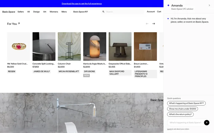
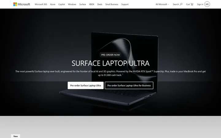
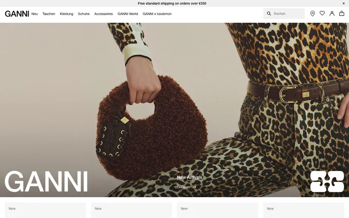
North star · Keep the interface bright and spacious, using bold black type and product imagery as the focus, with violet reserved for clear Shop actions.
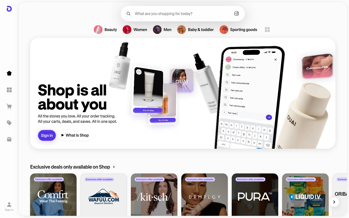
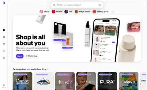
The page is built on a white, softly off-white canvas, keeping attention on products and oversized, high-contrast headlines. Black is the main text color; muted grays handle supporting copy and fine separators, while vivid violet marks the Shop identity and primary sign-in action. Warm browns, olives, and dark gradients appear mainly in promotional product cards and imagery rather than defining the core interface palette. GT Standard Web supplies a compact sans-serif voice for navigation and catalog details, contrasted with very large, heavy display headlines. The composition centers a search-led storefront, followed by horizontal category shortcuts and broad, rounded product and brand carousels. A slim black app announcement band anchors the top; a narrow icon rail sits at the left. Generous whitespace around the hero gives way to denser shopping rows below. Photography and app mockups carry most of the visual variety, while subtle borders and soft shadows keep cards distinct without heavy framing.
All interface and editorial text, from oversized hero headlines to navigation, buttons, and catalog labels.
角色
示例
字号
字重
行高
字距
特大标题
Oversized storefront statement and key promotional headline.
Shop
96px
800
1
-0.01em
一级标题
Primary hero headline.
Shop
95px
800
0.91
0
二级标题
Major section headlines, including brand storytelling.
Shop
64px
800
0.91
-0.016em
三级标题
Collection and category section headings.
The quick brown fox 敏捷的狐狸
24px
600
1.08
-0.042em
四级标题
Compact card or subsection titles.
The quick brown fox 敏捷的狐狸
20px
600
1.1
-0.05em
正文
Search guidance, product descriptions, and supporting copy.
The quick brown fox 敏捷的狐狸
14px
400
1.29
-0.014em
辅助文字
Small ratings, metadata, and auxiliary labels.
The quick brown fox 敏捷的狐狸
10px
600
1.3
-0.02em
按钮
Primary actions and prominent shopping controls.
The quick brown fox 敏捷的狐狸
16px
600
1.25
-0.031em
间距与布局
基准单位 4px · 密度:适中
64px版块间距
2px元素间距
—卡片内边距
—内容最大宽度
2px
4px
6px
8px
10px
12px
16px
20px
24px
A centered storefront sits beside a slim left icon rail, with a narrow announcement strip across the top. The hero aligns around a search field and category shortcuts, then opens into full-width rounded feature cards and horizontal merchandise carousels. Sections follow a clear top-to-bottom shopping journey, with generous whitespace around the opening hero and tighter catalog density in later rows. The footer switches to a compact multi-column link layout.
圆角与层次
按钮 · 9999px
卡片 · 28px
图片 · 11px
导航 · 50%
链接 · 20px
sm · card, other, button
md · other
md · card, button, other
md · card
The page favors white surfaces, subtle gray borders, and soft, low-contrast shadows over heavy panel treatments. Rounded cards layer product photography above the canvas, while the hero's device and product mockups create depth. The top announcement bar is a crisp dark band against the otherwise light storefront.
组件
下面的预览按实测的按钮、输入框、徽标、卡片样式重建(字体用替代字体)。
App announcement bar
A compact black strip centered at the top, pairing the Shop app mark, download prompt, platform availability, and arrow.
Side icon rail
A narrow vertical navigation rail with a violet Shop mark, monochrome shopping icons, and a small sign-in affordance near the bottom.
Search and category shortcuts
A prominent rounded search field sits below the Shop wordmark, followed by a horizontal row of image-led category links.
Hero showcase
A large rounded feature panel pairs a bold black headline with floating product photography and a phone interface mockup.
Product and brand carousels
Horizontal collections use rounded imagery, compact labels, ratings, and offer details to present brands and trending stores.
Footer link columns
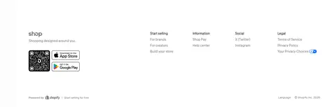
A quiet white footer groups selling, brand, help, social, and legal links, with app download and Shopify details.
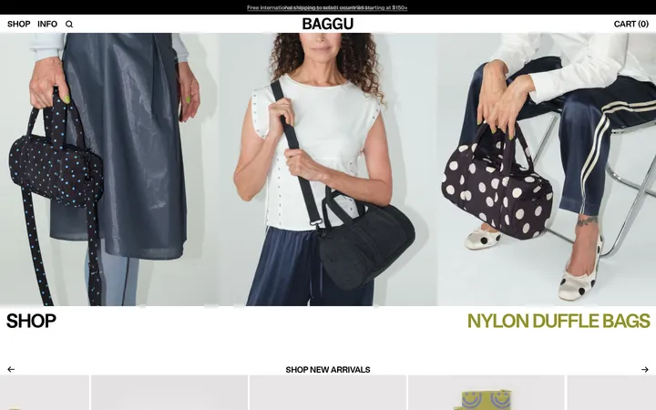
Imagery · Product photography and brand campaign imagery dominate: skincare bottles, apparel, accessories, and store collections appear in horizontal cards. The hero mixes product cutouts with app-screen mockups and small floating product tiles. Images are cleanly framed with rounded corners, soft shadows, and light backgrounds; color and texture mostly come from the merchandise itself.
Keep the primary page canvas white or softly off-white.
Use Shop Violet #5433eb for brand marks and primary actions.
Make major headlines bold, black, and visually prominent.
Let product imagery provide most of the color and texture.
Use rounded cards and restrained, soft shadows.
Keep shopping collections browsable in horizontal rows.
✕ 不该做
Do not turn warm offer colors into the main brand palette.
Do not use heavy borders or dense boxed layouts.
Do not make secondary copy compete with hero headlines.
Do not replace product photography with generic decorative gradients.
Do not crowd the search-led opening with excess controls.
Do not use violet as a background for every section.
给 AI 的提示词
想快速出一个同风格的新页面,把这段话连同 DESIGN.md 一起发给 AI。
Build a new shopping page in Shop’s bright, image-led visual style. Use Gallery White (#ffffff) as the main canvas, Shop Ink (#000000) for headlines and primary text, and Shop Violet (#5433eb) sparingly for the wordmark and key actions. Set typography in a GT Standard Web-like sans serif, using heavy display headlines and compact, readable catalog labels. Compose a clean search-led hero with rounded product imagery, then organize content into horizontal category and product carousels. Keep layout spacious at the top and denser through the shopping feed. Use subtle Cloud Line (#e2e5e9) separators and soft shadows; let real merchandise photography supply warmth. Treat browns and olives as content-specific offer colors, not global UI colors.