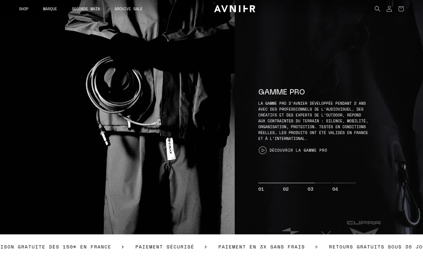
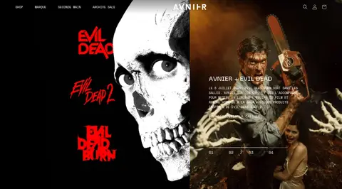
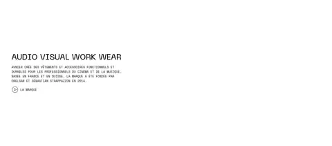
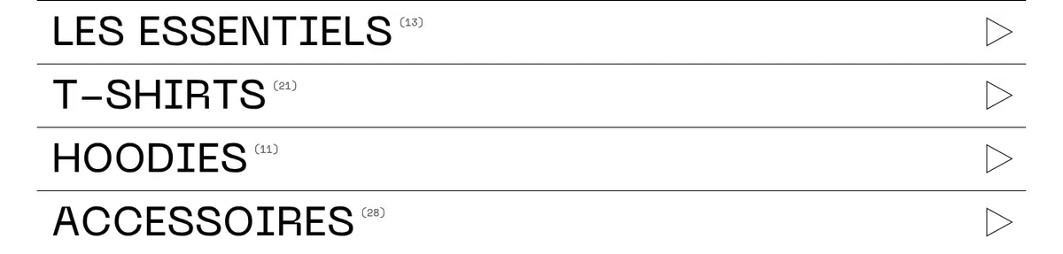
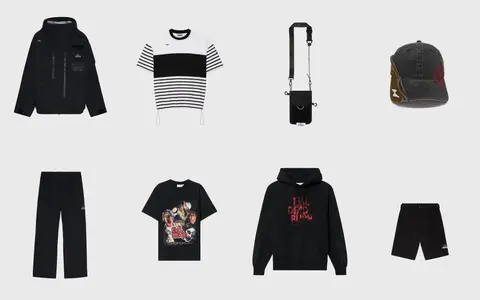
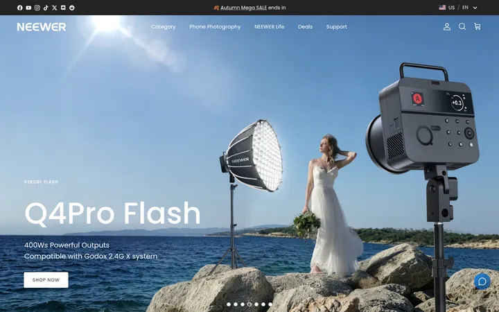
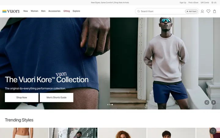
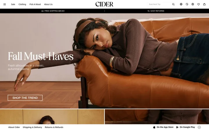
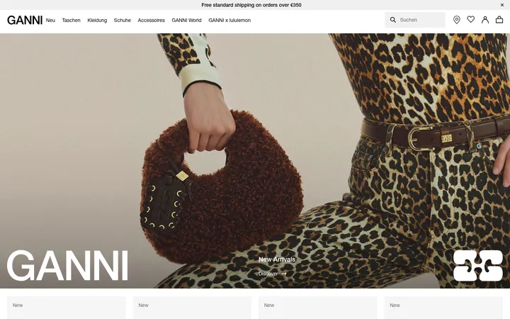
North star · Keep the interface monochrome and rigorously functional, letting product photography—not decorative UI color—supply the expression.
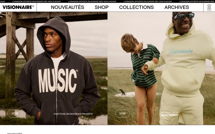
The visual strategy is built on a strict black-and-white interface, with pale gray reserved for a product-image field rather than used as a dominant brand color. The opening viewport is a dark, image-led hero: product photography fills the left side, while white navigation and compact copy sit over a shadowed black field. A white ticker strip then sharply resets the canvas. Space Mono carries most utility text, set in uppercase for navigation, labels, links, and button-like actions; the custom AVNIER face gives headings a more distinctive display voice. Content alternates between wide white editorial space, thinly ruled category rows, a light-gray product gallery, and dark photographic footer panels. Sections are separated by substantial vertical breathing room, while fine borders and icon-led links preserve a functional, workwear-oriented tone. Color inside campaign imagery—including purple product details—is photographic content, not a cue for interface accents.
Navigation, body copy, captions, links, labels, and utility controls.
Aa 设计
avnier-font
网络字体 · 字重 500 / 400 · 占比 5%
免费替代:Barlow Condensed
Display headings, including campaign and editorial titles.
角色
示例
字号
字重
行高
字距
一级标题
Primary campaign headline in the image-led hero.
AVNIER
55px
500
1.18
0
二级标题
Editorial and collection section headings.
AVNIER
33px
500
1.3
0
三级标题
Smaller feature or product-story titles.
The quick brown fox 敏捷的狐狸
25px
500
1.18
0
正文
Uppercase explanatory copy and brand description.
The quick brown fox 敏捷的狐狸
13px
400
normal
0
辅助文字
Compact product, image, and supporting labels.
The quick brown fox 敏捷的狐狸
12px
400
1.25
0
按钮
Uppercase, tracked action text and controls.
The quick brown fox 敏捷的狐狸
15px
400
1.2
0.067em
导航
Compact uppercase primary navigation.
The quick brown fox 敏捷的狐狸
13px
400
normal
0
链接
Tracked uppercase product and discovery links.
The quick brown fox 敏捷的狐狸
12px
400
1.4
0.083em
眉题
Spaced uppercase introductory labels.
The quick brown fox 敏捷的狐狸
16px
400
normal
0.125em
代码
Monospaced uppercase utility or metadata text.
const style = 1;
13px
400
normal
0
间距与布局
基准单位 2px · 密度:适中
80px版块间距
8px元素间距
—卡片内边距
1340px内容最大宽度
8px
10px
12px
13px
15px
19px
20px
22px
27px
30px
50px
60px
80px
The page uses a broad, centered content frame with a measured maximum width of 1340px, alongside full-width visual bands. The hero is split between large product imagery and a text-and-slide-control area; below it, the layout shifts into a spacious single-column brand statement, ruled category rows, a four-column product gallery, and paired editorial images. Keep section spacing generous, with a measured 80px section gap and compact 8px element rhythm. Alignment is mostly left-led, with occasional centered brand marks and evenly distributed product tiles.
圆角与层次
hairline · button
hairline · input
The interface is predominantly flat, with no measured radius scale and little visible card elevation. Separate content through black/white surface changes, thin rules, and generous whitespace. The measured button and input treatments use hairline outlines; avoid adding broad, soft shadows or rounded card styling.
组件
下面的预览按实测的按钮、输入框、徽标、卡片样式重建(字体用替代字体)。
Overlay navigation
Place compact uppercase Space Mono links over the dark hero, with the AVNIER wordmark centered and small utility icons aligned at the right.
Campaign hero
Pair prominent product photography with a dark text field, white heading and copy, a discovery link, and a thin multi-slide progress indicator.
Service ticker
Run a white full-width strip below the dark hero, using tracked uppercase service messages separated by small symbols.
Category list
Show large uppercase category names in stacked rows divided by thin rules, with small item counts and a right-side arrow.
Product gallery
Arrange isolated apparel and accessories in four columns on the pale gray #e5e5e5 surface.
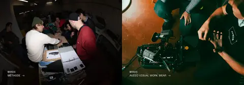
Editorial image links
Use side-by-side photography with concise white uppercase labels and directional links near the bottom of each image.
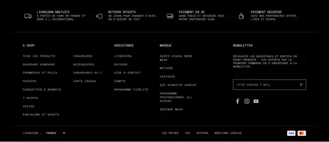
Footer
Finish on black with service assurances, compact multi-column navigation, a newsletter field, and social icons.
Imagery · Use high-contrast fashion and workwear photography as the primary visual content. The hero crops tightly around a featured bag against a nearly black scene; product listings isolate garments and accessories against a pale gray field. Editorial panels use candid production and workplace images. Keep image colors natural and allow vivid details, such as purple product fabric, to remain within photography rather than echoing them in interface controls.
Keep interface surfaces strictly black, white, or measured neutral gray.
Use Space Mono for compact uppercase utility content.
Let product and editorial photography carry the color.
Separate major page bands with generous whitespace.
Use fine rules to structure category and footer content.
Maintain strong contrast over every dark photographic surface.
✕ 不该做
Do not turn photographic colors into interface accent colors.
Do not add rounded cards or decorative radius treatments.
Do not replace the dense monospaced utility voice with generic sans-serif UI text.
Do not crowd the category rows or editorial transitions.
Do not add soft, prominent shadows to otherwise flat components.
Do not use a bright accent color for primary buttons or links.
给 AI 的提示词
想快速出一个同风格的新页面,把这段话连同 DESIGN.md 一起发给 AI。
Build a new AVNIER-style fashion storefront page with a strict monochrome interface. Use Workwear Black (#000000) for dark image-backed areas, footer surfaces, and primary text; use Gallery White (#ffffff) for the canvas and high-contrast copy; reserve Product Mist (#e5e5e5) for a product-image field. Use Space Mono for uppercase navigation, body copy, captions, and links, and a distinctive condensed display face for headings. Compose a large photo-led hero, a white service ticker, spacious editorial content, ruled category rows, and a four-column product gallery. Use photography for expressive color; do not introduce colored UI accents. Keep corners square, rely on hairline rules instead of shadows, and preserve generous section breathing room with compact internal utility spacing.