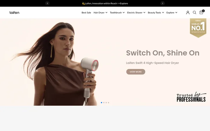
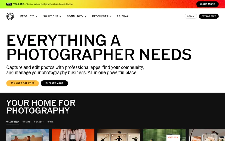
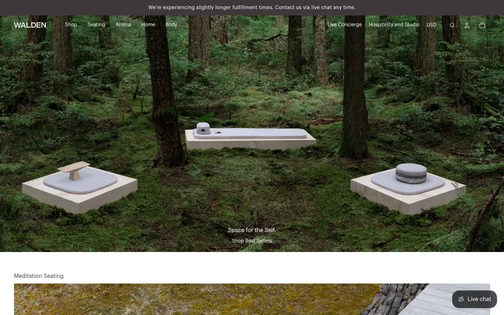
North star · Let quiet, warm space and honest whisky photography lead; use typography and rules only to organize the story.
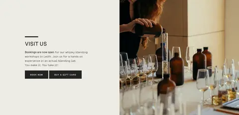
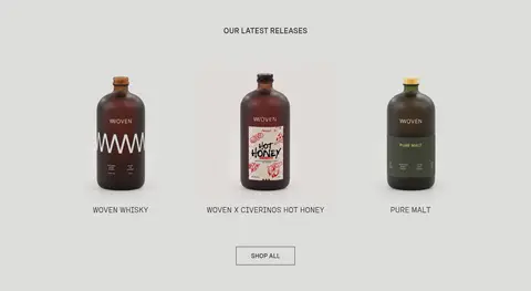
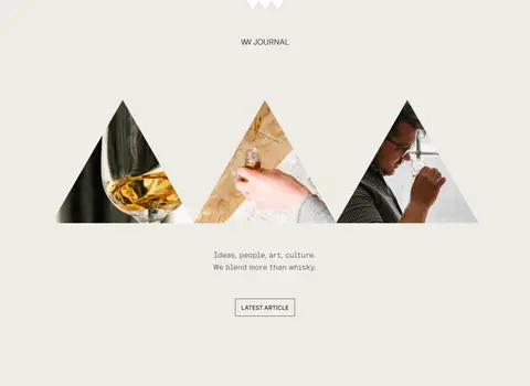
The page is built around a warm, muted canvas (#eeede5), with white reserved for the About block and product-card captions, and a soft grey (#ddddda) distinguishing the latest releases band. Dark charcoal (#232323) carries most navigation, headings and body copy; black appears in fine rules and button outlines. Bright blue (#0000ee) is measured but not a defining visual motif in the screenshots, so do not promote it as a primary brand colour. Spezia’s semi-mono and medium cuts give copy and headings a distinctive, quietly technical character, while uppercase labels and buttons provide small moments of structure. The composition alternates centered product displays with asymmetrical two-column image-and-copy sections. Bottle imagery, workshop scenes and editorial crops supply rich texture against otherwise flat, spacious surfaces. Sections feel deliberately paced, with generous blank areas and modest, square-cornered controls rather than cards, shadows or decorative effects.
配色
点色块复制色值。用途说明来自对页面的实测位置(背景、文字、描边、按钮)与截图判读。
品牌色
强调色
表层色
中性色
功能色
页面底色 · Woven Canvas表层 · Gallery White表层 2 · Release Grey主文字 · Charcoal Ink次要文字 · Soft Charcoal描边 · Pure Rule强调 · Link Blue
Body copy, navigation, links, and mono-leaning general text.
Aa 设计
Spezia Medium
网络字体 · 字重 400 / 500 · 占比 38%
免费替代:Space Grotesk
Main headings, button labels, and emphasized uppercase brand links.
Aa 设计
Spezia Semi-Mono Light
网络字体 · 字重 400 · 占比 15%
免费替代:IBM Plex Mono
Captions and light secondary text, including small supporting labels.
Aa 设计
Figtree
网络字体 · 字重 700 · 占比 1%
免费替代:Figtree
Small eyebrow labels.
角色
示例
字号
字重
行高
字距
一级标题
Primary page or section statement in Spezia Medium.
Woven
32px
400
1.13
0
二级标题
Section headings and prominent editorial statements.
The quick brown fox 敏捷的狐狸
24px
400
1.5
0
三级标题
Uppercase mono-style subheadings and product group labels.
The quick brown fox 敏捷的狐狸
20px
400
1.5
0
正文
Main descriptive copy and brand storytelling.
The quick brown fox 敏捷的狐狸
16px
400
1.63
0
辅助文字
Light product captions and compact supporting details.
The quick brown fox 敏捷的狐狸
14px
400
1.63
0
按钮
Uppercase action labels on booking and purchase controls.
The quick brown fox 敏捷的狐狸
16px
400
1
0
导航
Main site navigation and utility links.
The quick brown fox 敏捷的狐狸
15px
400
2.4
0
链接
Inline and product links, styled consistently with body copy.
The quick brown fox 敏捷的狐狸
16px
400
1.63
0
眉题
Small uppercase section kicker with expanded tracking.
The quick brown fox 敏捷的狐狸
12px
700
4.17
0.167em
代码
No visible code UI; use the measured body-like style if needed.
const style = 1;
16px
400
1.63
0
间距与布局
基准单位 2px · 密度:适中
70px版块间距
—元素间距
—卡片内边距
1160px内容最大宽度
5px
8px
10px
15px
20px
26px
30px
40px
60px
70px
Use a centered content area capped at the measured 1160px, with comfortable density and broad section breathing room. Alternate centered single-column product and editorial sections with two-column splits for workshop and maker stories. Align section headings centrally for discovery bands and left-align copy in image-led splits. Keep product tiles in a tidy grid with white caption strips; let imagery occupy substantial areas without adding decorative card chrome. Section rhythm is spacious, with the measured section gap of 70px.
圆角与层次
没有测到阴影:页面是扁平的,层次靠底色和描边区分。
The interface is mostly flat: no measured shadows, and cards use square corners rather than rounded containers. Use thin dark rules and button borders to define controls, with white caption panels separating product labels from image fields. Establish depth through photography and section contrast, not overlays or floating surfaces.
组件
下面的预览按实测的按钮、输入框、徽标、卡片样式重建(字体用替代字体)。
Primary booking button
Charcoal (#232323) fill with white text, a matching 2px border, square corners, and uppercase label; used for booking actions.
Experience CTA
Muted blue-grey (#bec7c7) fill, black 1px border, square corners, and a medium Spezia label; keep it visually quieter than primary checkout actions.
Product tile
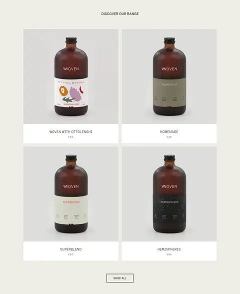
Bottle image on a pale field with a white caption surface below, centered product name and price, and no card shadow.
Main navigation
Minimal header navigation and utility controls in Spezia Semi-Mono Regular, with measured 15px nav text and restrained spacing.
Split story block
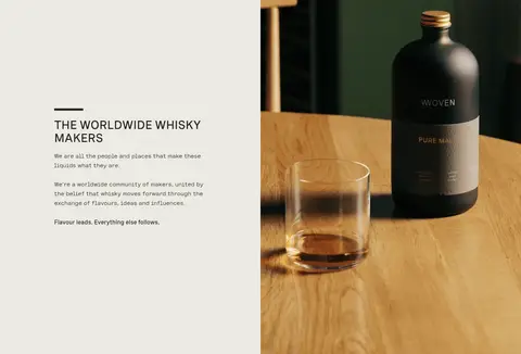
Pair concise copy and a small section heading with a large adjacent photograph; align copy to the start rather than centering it.
Shop all link
A compact, square-cornered outline control centered beneath product collections, using dark text and a thin border.
Community signup
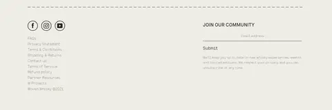
Footer email input and submit action organized alongside link groups, separated from the footer content by a fine horizontal rule.
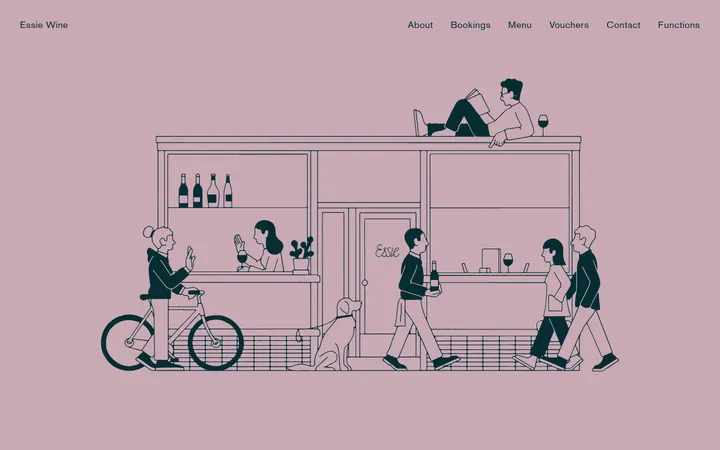
Imagery · Use authentic product and place photography: whisky bottles against quiet neutral backdrops, hands-on blending scenes, glassware, and editorial crops. Product images sit in orderly grids with clean pale backgrounds; lifestyle images are larger and paired with copy in split layouts. The screenshots show photographic media, not a dominant illustration system. Avoid heavy filters, badges, or overly glossy 3D treatments.
Use Woven Canvas (#eeede5) as the dominant page surface.
Reserve Release Grey (#ddddda) for a distinct product-release band.
Set headings and navigation in the supplied Spezia families or close mono-friendly substitutes.
Show bottle photography clearly and give product names and prices simple caption strips.
Use square controls with restrained dark outlines and no shadows.
Alternate centered discovery areas with image-and-copy story splits.
✕ 不该做
Do not make Link Blue (#0000ee) a dominant brand colour.
Do not add gradients, drop shadows, or rounded card treatments.
Do not crowd the page with dense text or tightly packed sections.
Do not use decorative badges over product photography.
Do not replace the warm canvas with a stark all-white layout.
Do not treat screenshot-only black hero rendering as the measured default canvas.
给 AI 的提示词
想快速出一个同风格的新页面,把这段话连同 DESIGN.md 一起发给 AI。
Build a new whisky brand page with Woven’s quiet editorial feel. Use Woven Canvas (#eeede5) as the main background, Charcoal Ink (#232323) for copy and controls, Gallery White (#ffffff) for clean caption and story surfaces, and Release Grey (#ddddda) for one differentiated product band. Keep Link Blue (#0000ee) rare. Use Spezia-style mono-friendly typography, restrained uppercase labels, square buttons, thin borders, and no shadows. Organize content into broad, calmly paced sections: centered product discovery, asymmetrical photography-and-copy stories, and an understated footer. Prioritize bottle and workshop photography with natural framing and pale backgrounds. Keep copy concise, align text deliberately, and let whitespace and imagery create hierarchy rather than extra decoration.