North star · Keep the article calm and spacious on white, using deep teal for identity and violet only for decisive action.
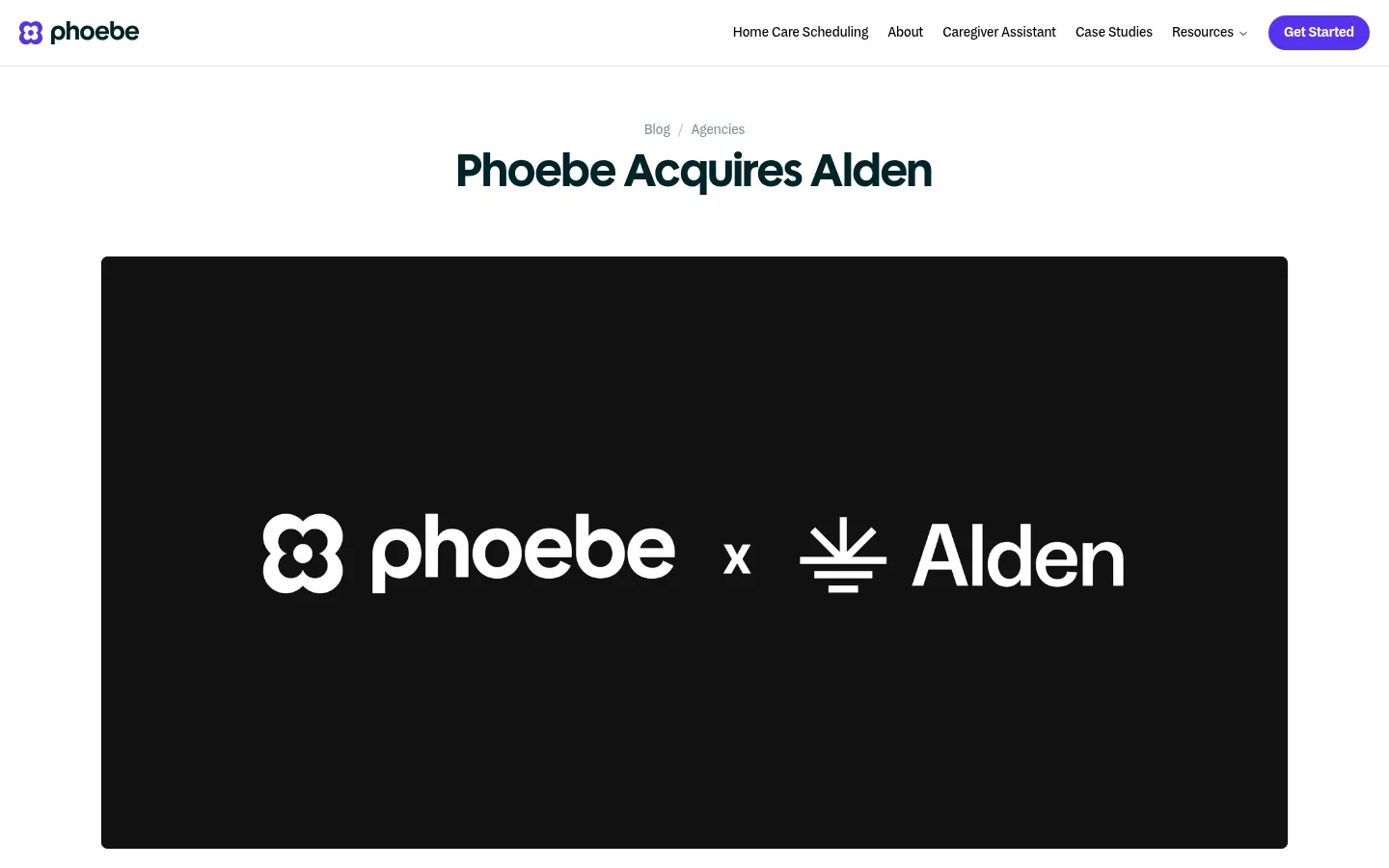
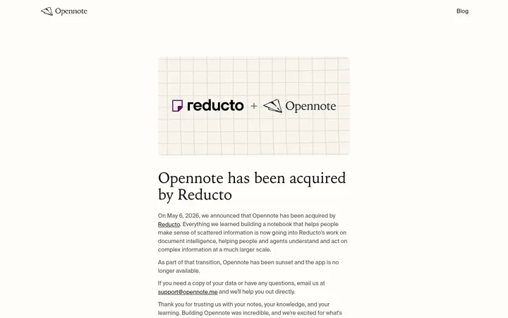
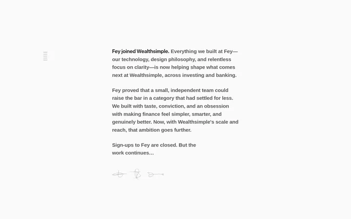
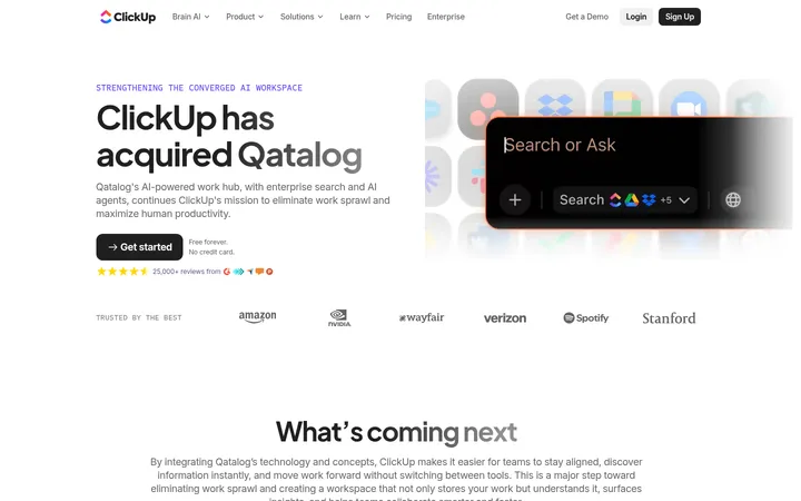
The page uses a white canvas to keep attention on the acquisition story, while deep teal (#002429) gives the headline and footer a distinctly branded anchor. Most copy is set in slate gray (#374151) with subdued gray-green secondary text; violet (#5533ee) is reserved for the primary pill CTA. The article opens with centered breadcrumb and display heading, then gives a wide, black-backed Phoebe-and-Alden graphic substantial breathing room. Below it, a narrow text column restores an editorial reading rhythm. A full-width cloud-image CTA introduces pale cyan (#71cff0) and mist gray (#dbe3e3) as atmospheric colors rather than core interface fills. MDSystem handles navigation, body text, and controls; PolymathDisplay distinguishes the headline. The layout stays flat and spacious, with thin neutral dividers and rounded controls rather than pronounced shadows or card framing.
Navigation, body copy, captions, buttons, and links.
Aa 设计
PolymathDisplay
网络字体 · 字重 600 / 700 · 占比 4%
免费替代:DM Sans
Main article headline and other display headings.
角色
示例
字号
字重
行高
字距
一级标题
Centered article title beneath the breadcrumb.
Phoebe
48px
600
1.25
0
正文
Article paragraphs in the narrow reading column.
The quick brown fox 敏捷的狐狸
18px
400
1.6
0.01em
辅助文字
Breadcrumb and small supporting labels.
The quick brown fox 敏捷的狐狸
14px
400
1.43
0
按钮
Primary and secondary CTA labels.
The quick brown fox 敏捷的狐狸
14px
500
1.43
0
导航
Header navigation and compact footer navigation.
The quick brown fox 敏捷的狐狸
14px
500
1.43
0
链接
Inline Alden references and demo or career links.
The quick brown fox 敏捷的狐狸
18px
500
1.6
0.01em
间距与布局
基准单位 8px · 密度:适中
64px版块间距
8px元素间距
—卡片内边距
1232px内容最大宽度
8px
12px
16px
20px
23px
24px
32px
36px
40px
48px
64px
A compact top navigation sits above a centered editorial hero. The content uses a measured 1232px page maximum, with the main article image spanning broadly and the reading copy kept in a much narrower single column. The article title and CTA heading are centered; the body remains left aligned for comfortable reading. Sections are separated by generous white space, followed by a broad CTA band and a three-column dark footer. Overall density is comfortable rather than card-heavy.
圆角与层次
按钮 · 9999px
导航 · 8px
hairline · text
The page is mostly flat: white sections sit directly on the canvas, with no meaningful shadow system. Hairline borders separate small interface details, while the CTA background and acquisition graphic provide contrast through media and color rather than layered cards. The header's divider remains subtle.
组件
下面的预览按实测的按钮、输入框、徽标、卡片样式重建(字体用替代字体)。
Header navigation
White horizontal header with Phoebe mark at left, compact dark navigation at right, and a violet pill-shaped Get Started CTA.
Article heading
Centered breadcrumb followed by a large semibold PolymathDisplay headline in deep teal.
Acquisition artwork
Wide, black-backed lead graphic with white Phoebe and Alden marks; keep this treatment confined to the image.
Article body
Short left-aligned paragraphs in a narrow column, using MDSystem at the measured 18px body size and slate text.
Scheduling CTA
Centered heading and supporting copy over cloud artwork, with a violet Book a Demo pill and a quieter secondary Careers link.
Footer
Deep-teal full-width band with brand and supporting details on the left, grouped link columns on the right, and subdued small text.
Imagery · The article lead is a wide black-backed brand graphic showing the Phoebe and Alden marks in white; it is a media asset, not a reusable black interface surface. The lower CTA uses a pale cloud image with cyan-to-mist tones and soft, pastel edges. There is no dominant photography or 3D treatment; preserve the calm framing and avoid adding decorative imagery to the article copy.
Reserve deep teal for branded headings and the footer.
Keep the article title centered above its lead graphic.
Set the article copy in a narrow, left-aligned column.
Use violet for the primary action, not general decoration.
Treat cloud cyan and mist gray as CTA artwork colors.
Maintain generous breathing room between content blocks.
✕ 不该做
Do not turn the black lead graphic into a page-wide background.
Do not add shadows to otherwise flat sections.
Do not use the CTA gradient as a general interface theme.
Do not center-align the article paragraphs.
Do not crowd the headline and lead media together.
Do not introduce extra bright accent colors.
Do not frame every section as a card.
给 AI 的提示词
想快速出一个同风格的新页面,把这段话连同 DESIGN.md 一起发给 AI。
Build a new Phoebe-style editorial page on a Gallery White (#ffffff) canvas. Use Deep Teal (#002429) for brand-forward headings and dark footer surfaces, Slate Ink (#374151) for readable copy, and Signal Violet (#5533ee) only for the primary rounded CTA. Set interface and body text in MDSystem or a close sans-serif substitute, with a distinct display face for the centered headline. Keep navigation compact, article content narrow and left aligned, and lead media wide with clear surrounding whitespace. If using a CTA banner, treat Cloud Cyan (#71cff0) and Mist Gray (#dbe3e3) as atmospheric image colors, not default UI fills. Keep sections flat, dividers subtle, and footer links grouped in a restrained multi-column layout.