North star · Keep the page calm and spacious, using strong dark typography and vivid product imagery as deliberate focal points.
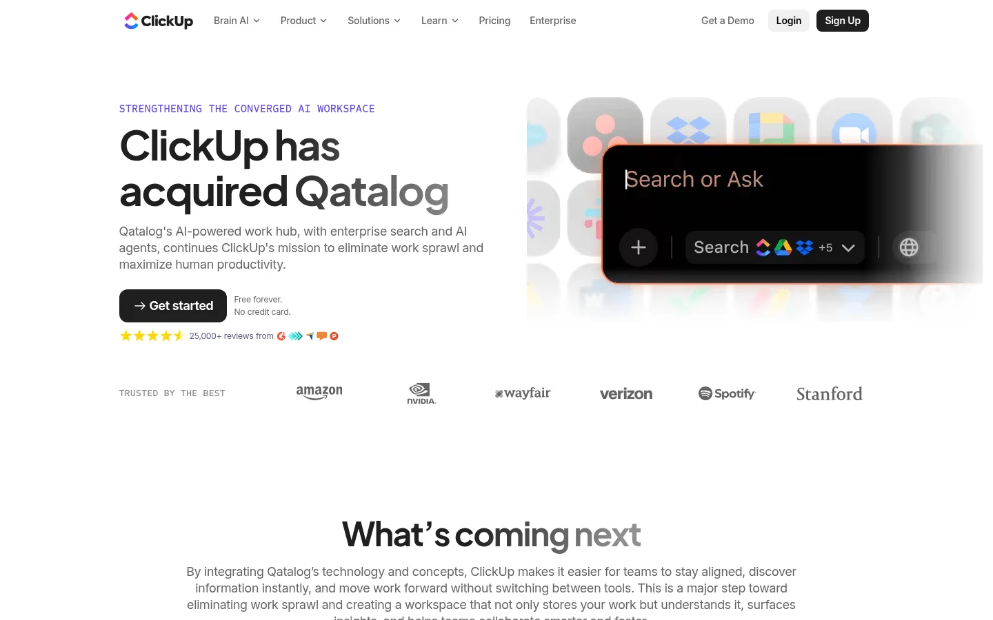
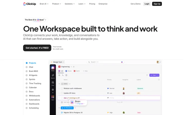
The page uses a white canvas throughout, with dark text and a restrained violet accent to keep the acquisition story readable and distinctly ClickUp. The hero is a balanced text-and-product-image split: a small uppercase mono eyebrow introduces a large, tightly tracked headline, followed by muted explanatory copy and a compact black CTA. A grayscale customer logo row adds credibility without competing with the message. Lower sections alternate centered editorial introduction, a two-column feature explanation, and vivid product imagery; a black-to-magenta promotional panel provides the strongest tonal contrast. Plus Jakarta Sans gives display headings a rounded, assertive character, while Inter handles navigation and body copy with practical clarity. Generous vertical gaps separate content groups, while fine pale hairlines and rounded media edges keep cards controlled. The footer returns to a dense, multi-column link structure.
Body copy, navigation, links, buttons, and compact labels.
Aa 设计
Plus Jakarta Sans
网络字体 · 字重 650 / 700 · 占比 6%
免费替代:DM Sans
Display, page headings, and selected navigation or card text.
Aa 设计
Sometype Mono
网络字体 · 字重 500 · 占比 3%
免费替代:Space Mono
Small uppercase hero eyebrow and code-like metadata.
角色
示例
字号
字重
行高
字距
特大标题
Large display treatment for major campaign or promotional headings.
ClickUp
60px
700
1.1
-0.035em
一级标题
Hero acquisition headline.
ClickUp
48px
700
1.15
-0.035em
二级标题
Primary section headings, including the centered next-steps introduction.
ClickUp
40px
650
1.2
-0.04em
三级标题
Feature and supporting subsection headings.
ClickUp
34px
650
1.2
-0.047em
正文
Hero summary and explanatory section copy.
The quick brown fox 敏捷的狐狸
18px
400
1.33
-0.014em
辅助文字
Compact supporting labels and small metadata.
The quick brown fox 敏捷的狐狸
14px
500
1
0
按钮
Primary and navigation CTA labels.
The quick brown fox 敏捷的狐狸
14px
600
1.5
0
导航
Header navigation links.
The quick brown fox 敏捷的狐狸
14px
500
1.43
-0.011em
链接
Inline links and footer link labels.
The quick brown fox 敏捷的狐狸
14px
500
1
0
代码
Uppercase mono hero eyebrow and short kicker labels.
const style = 1;
16px
500
1.25
0
间距与布局
基准单位 1px · 密度:宽松
140px版块间距
4px元素间距
—卡片内边距
—内容最大宽度
4px
5px
8px
9px
10px
12px
18px
20px
30px
40px
48px
50px
Use a centered, restrained content column with broad white margins rather than edge-to-edge text. The header runs horizontally across the top; the hero aligns copy left and product media right, then a horizontal customer logo row bridges into the centered next-steps section. Below, use a two-column feature split and a prominent campaign panel, followed by a multi-column footer. Preserve a spacious section rhythm and low content density, with tight groupings inside each section and clear vertical separation between them.
圆角与层次
按钮 · 8px
卡片 · 18px
图片 · 18px
导航 · 8px
链接 · 9px
没有测到阴影:页面是扁平的,层次靠底色和描边区分。
Keep the page predominantly flat: the white canvas and typography carry the hierarchy, not drop shadows. Separate content with generous whitespace and occasional pale hairlines. Use rounded media and button corners as measured, but reserve dark surfaces and gradient imagery for intentional focal panels rather than layering many cards.
组件
下面的预览按实测的按钮、输入框、徽标、卡片样式重建(字体用替代字体)。
Header navigation
Compact horizontal brand and link row with Inter navigation text, light login treatment, and a dark filled Sign Up button.
Acquisition hero
Left-aligned mono eyebrow, bold two-line heading, muted body copy, and black Get started button beside product-search imagery.
Customer logo row
A restrained trust strip of grayscale customer marks beneath the hero, aligned across the content width.
Feature split
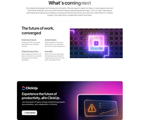
Editorial heading and short feature descriptions sit beside a wide, rounded AI product visual.
Promotional CTA panel
Black rounded panel with ClickUp mark, white heading and copy, light CTA, and gradient-backed product artwork.
Footer directory
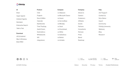
Dense multi-column link groups and small legal/social details on the same light canvas.
Imagery · Use crisp product-interface imagery as the hero counterweight to the headline, framed in a wide media area with softly rounded corners. Supporting feature visuals can use luminous purple and blue AI motifs, while the promotional panel uses a dark field and saturated gradient alongside interface artwork. Customer marks are small, muted, and treated as a quiet proof row; imagery is illustrative and product-led rather than lifestyle photography.
Set major headings in Plus Jakarta Sans with tight tracking.
Keep body copy and controls clear in Inter.
Place product imagery beside or below the message it supports.
Use dark buttons for the main action.
Reserve violet and multicolor gradients for small accents and media.
Separate sections with generous whitespace.
✕ 不该做
Do not fill the page with large colored section backgrounds.
Do not use gradients as the default canvas treatment.
Do not crowd the hero with extra decorative elements.
Do not make secondary copy compete with the heading.
Do not add heavy shadows to cards or media.
Do not turn the customer logo row into a high-contrast feature.
Do not use saturated accent colors as body text.
给 AI 的提示词
想快速出一个同风格的新页面,把这段话连同 DESIGN.md 一起发给 AI。
Build a new SaaS announcement page in ClickUp’s spacious editorial style. Use Gallery White (#ffffff) as the canvas, Carbon Ink (#202020) and True Black (#000000) for headings and primary actions, and Soft Graphite (#646464) for supporting text and links. Add ClickUp Violet (#6647f0) only as a restrained label accent; keep Electric Blue (#0091ff), Orchid Violet (#a43cb4), and Neon Magenta (#f100e3) mostly within product artwork or gradients. Set display headings in Plus Jakarta Sans with tight tracking and body, navigation, and buttons in Inter. Lead with a left-copy/right-product-visual hero, then a quiet customer-mark row and centered introduction. Use a feature split, a dark promotional panel, and a compact multi-column footer. Keep surfaces mostly flat, media rounded, and section spacing generous.