North star · Let the announcement read as a calm, carefully typeset note, with open space and muted contrast doing more than decoration.
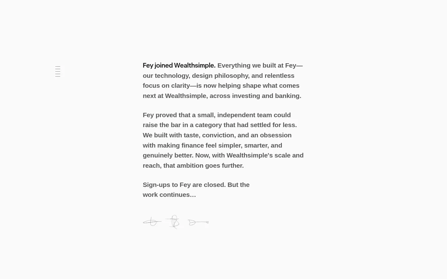
The page turns a brand transition into a quiet reading experience rather than a promotional landing page. A near-white canvas fills the viewport, while medium-gray copy carries almost all of the visual weight. Dark charcoal is reserved for the Wealthsimple link, creating a restrained emphasis rather than a colorful CTA. The system font gives the message a familiar, unvarnished voice; a display webfont appears only on the link. Body copy is set at the measured 21px size with a strong weight and generous line-height, helping the narrow text column remain readable. Layout is notably sparse: the copy sits to the right of a small, faint menu mark, surrounded by broad open space. Paragraph breaks create the primary rhythm. There are no cards, photographs, or prominent interface controls. A few delicate signature-like strokes near the closing line add a human note without competing with the announcement. Keep the page flat, quiet, and focused on the text.
配色
点色块复制色值。用途说明来自对页面的实测位置(背景、文字、描边、按钮)与截图判读。
品牌色
表层色
中性色
页面底色 · Gallery White主文字 · Soft Graphite次要文字 · Deep Ink
Use a single, narrow reading column placed off-center, with a small navigation mark positioned separately to its left. Keep the text left-aligned and surrounded by substantial open canvas. The page has one continuous section rather than stacked promotional bands; paragraph breaks provide its rhythm. Measured spacing is comfortable, with a 48px section gap and 8px element gap available as system references. Avoid inventing a fixed maximum width: preserve the screenshot’s compact text measure and expansive surrounding whitespace.
圆角与层次
没有测到阴影:页面是扁平的,层次靠底色和描边区分。
The page is flat, with no measured shadows, card treatments, or border system. Separation comes from whitespace and paragraph breaks, not layered surfaces. Avoid adding panels or elevation; any faint strokes belong to the small hand-drawn closing flourish rather than interface chrome.
组件
下面的预览按实测的按钮、输入框、徽标、卡片样式重建(字体用替代字体)。
Announcement copy
A left-aligned stack of medium-gray paragraphs, set in the system sans-serif at the measured 21px body size and 1.55 line-height.
Menu mark
A very small, faint three-line navigation mark sits apart from the main reading column; keep it visually quiet.
Inline brand link
The Wealthsimple link is the sole dark text accent, using the measured bold Wealthsimple Sans Display face.
Closing flourish
Light, delicate signature-like linework follows the closing note and remains secondary to the copy.
Imagery · There is no photography, product mockup, or prominent illustration. A few fine, pale signature-like strokes appear beneath the closing copy, functioning as a personal flourish rather than a branded illustration system. Keep these marks small, low-contrast, and secondary; do not introduce decorative imagery that changes the text-first character.
Set the announcement in a compact, readable text column.
Use #595959 for the main copy and subdued navigation.
Reserve #1c1c1c for restrained inline emphasis.
Create rhythm with paragraph breaks and generous whitespace.
Keep any signature-like linework faint and understated.
✕ 不该做
Do not add colorful CTA buttons or accent bands.
Do not turn the message into cards or a dashboard.
Do not add photography or product mockups.
Do not center the announcement text.
Do not add heavy borders, shadows, or decorative gradients.
Do not enlarge the menu mark into a dominant navigation bar.
给 AI 的提示词
想快速出一个同风格的新页面,把这段话连同 DESIGN.md 一起发给 AI。
Build a new page in Fey’s quiet editorial style. Use #fafafa (Gallery White) as a continuous canvas, #595959 (Soft Graphite) for primary copy, and #1c1c1c (Deep Ink) only for a restrained inline link or emphasis. Keep one left-aligned, compact reading column surrounded by generous open space; place any minimal navigation mark separately and keep it faint. Use a system sans-serif for body text, with the measured 21px, 600-weight, 1.55 line-height treatment as the reference for announcement copy. Use a bold display face sparingly for links. Let paragraph breaks establish rhythm. The page should remain flat: no cards, shadows, prominent borders, colorful buttons, or decorative photography. If a closing flourish suits the content, use delicate low-contrast linework and keep it secondary.