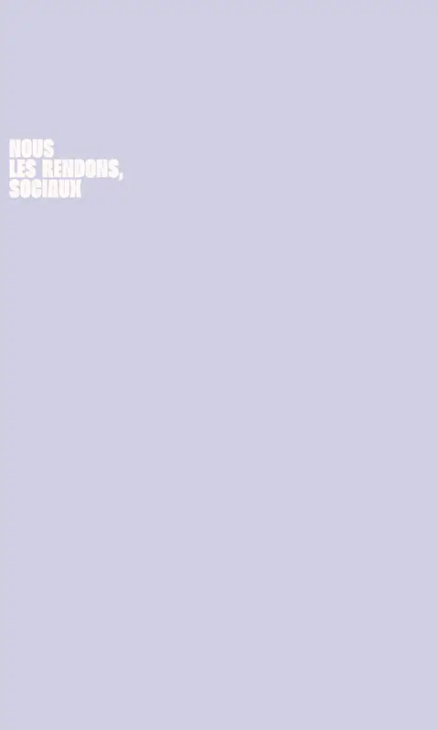
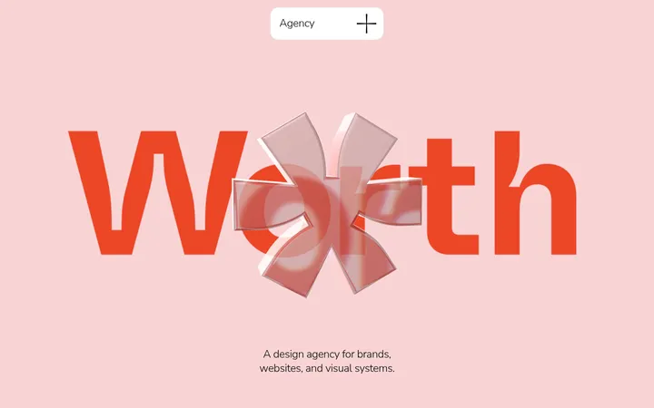
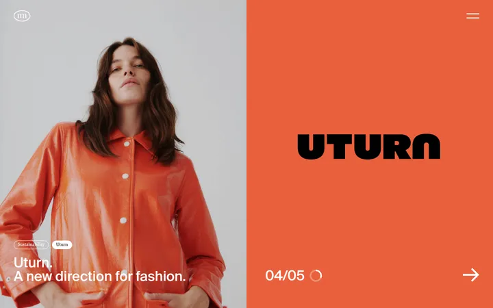
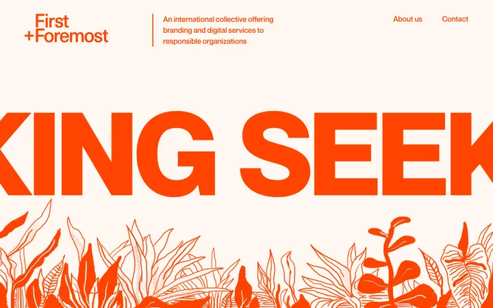
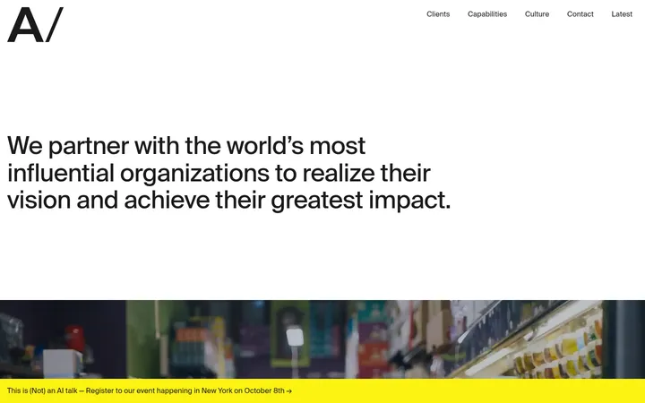
North star · Keep the lavender field spacious and let oversized pink or green display type create the page’s visual charge.
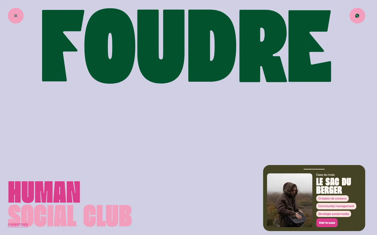
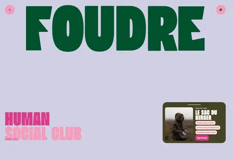
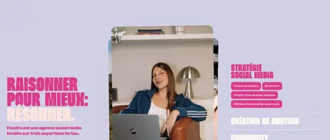
The page is built around a near-continuous lavender canvas (#d1cfe4), with few section changes so the composition reads as one expansive visual field. Pink (#db3c8a) supplies the main typographic energy: giant, tightly stacked display lettering, section headlines, badges, and the primary case-study action. Deep green (#00522d) appears as a strong counterpoint, most visibly in the enormous Foudre wordmark and small link accents. Beni’s very heavy, condensed display face creates compressed, poster-like headlines, while Clash Grotesk handles compact supporting copy, buttons, and labels. The opening is deliberately asymmetric: the wordmark dominates the top, secondary identity text sits low at left, and a small dark case card anchors the right. Large blank intervals separate content moments. Photography and video sit within modular case-study compositions, while cream and pale pink details soften the contrast. The overall effect is expressive and editorial, not a conventional boxed agency template.
配色
点色块复制色值。用途说明来自对页面的实测位置(背景、文字、描边、按钮)与截图判读。
品牌色
强调色
表层色
中性色
页面底色 · Soft Lavender主文字 · Electric Fuchsia次要文字 · Warm Porcelain弱文字 · Blush Cream描边 · Warm Porcelain强调 · Electric Fuchsia强调 2 · Petal Pink强调 3 · Forest Green
文字
背景
对比度
WCAG
#db3c8a Electric Fuchsia
#d1cfe4 Soft Lavender
2.74:1
不达标
#fff8f6 Warm Porcelain
#d1cfe4 Soft Lavender
1.45:1
不达标
#fce5df Blush Cream
#d1cfe4 Soft Lavender
1.27:1
不达标
#db3c8a Electric Fuchsia
#d1cfe4 Soft Lavender
2.74:1
不达标
字体
字号阶梯:Custom(比例约 1.688,正文 16px)。示例用免费替代字体渲染,数值为实测。
Aa 设计
Clash Grotesk
网络字体 · 字重 500 / 700 · 占比 74%
免费替代:DM Sans
Body copy, labels, buttons, captions, and smaller headings.
Aa 设计
Beni
网络字体 · 字重 900 · 占比 26%
免费替代:Oswald
Display wordmark and oversized editorial section headlines.
角色
示例
字号
字重
行高
字距
特大标题
Oversized Foudre wordmark and hero-scale identity lettering.
Agence Foudre
130px
900
0.7
0
一级标题
Primary hero and major editorial headlines.
Agence Foudre
94px
900
0.7
0
二级标题
Large section titles and case-study headings.
Agence Foudre
46px
900
0.7
0
三级标题
Service headings and smaller content titles.
The quick brown fox 敏捷的狐狸
20px
700
1.2
0
正文
Agency introduction and descriptive supporting copy.
The quick brown fox 敏捷的狐狸
16px
500
normal
0
辅助文字
Compact card labels and image details.
The quick brown fox 敏捷的狐狸
12px
500
0.85
0
按钮
Small, bold text inside rounded CTA buttons.
The quick brown fox 敏捷的狐狸
12px
700
0.85
0
链接
Tiny utility and inline link text.
The quick brown fox 敏捷的狐狸
10px
500
normal
0
间距与布局
基准单位 2px · 密度:宽松
140px版块间距
5px元素间距
11px卡片内边距
—内容最大宽度
5px
7px
8px
10px
12px
15px
20px
30px
78px
120px
140px
A full-width, single-column page sequence sits on a persistent canvas; measured maximum width is unspecified. The hero balances an oversized centered wordmark with lower-left identity copy and a compact case card at right. Later content shifts between left-aligned display headings, right-side copy, media, and multi-column service content. Preserve the exceptionally spacious section rhythm and low overall density rather than filling the long gaps with generic content. Alignment is intentionally asymmetric.
圆角与层次
按钮 · 50%
卡片 · 25px
徽标 · 10px
没有测到阴影:页面是扁平的,层次靠底色和描边区分。
The measured interface is predominantly flat, with no recorded shadow system or gradients. Use color blocks, spacing, and image placement to establish hierarchy. The case-study card is the main raised-looking element: a dark olive surface with rounded corners and inset image and text. Badges and buttons use measured rounded corners; avoid adding ornamental borders or heavy shadows.
组件
下面的预览按实测的按钮、输入框、徽标、卡片样式重建(字体用替代字体)。
Hero wordmark
Huge, heavy Beni lettering in Forest Green (#00522d), centered across the top against the uninterrupted lavender canvas.
Utility controls
Small circular Petal Pink (#f29ebd) buttons at the upper corners, carrying minimal dark icons.
Case-study card
A single Olive Charcoal (#444325) card with rounded corners, photo, compact cream text, blush service pills, and a Fuchsia CTA.
Compact rounded label in Blush Cream (#fce5df) with Fuchsia (#db3c8a) text; alternate badges use a Fuchsia fill and cream text.
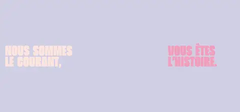
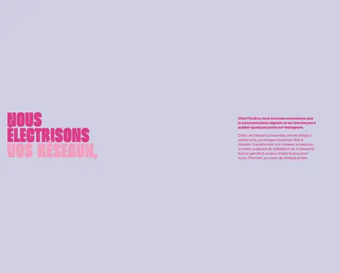
Display section heading
Very heavy, condensed Beni headline in vivid pink or light cream, arranged in short stacked lines.
Imagery · Use real campaign and client photography, plus video where the section calls for it. Frame assets as case-study material within compact cards or larger media-led compositions; avoid generic decorative illustration. The opening case card combines a photograph, olive-charcoal panel, small cream labels, pale service pills, and a pink action. Treat media as editorial proof of work, while leaving the lavender surroundings largely unobstructed.
Use Soft Lavender (#d1cfe4) as the dominant canvas.
Set major headlines in oversized, heavy condensed display type.
Use Electric Fuchsia (#db3c8a) for the main typographic emphasis.
Keep Forest Green (#00522d) as a bold, selective counterpoint.
Preserve wide empty intervals between major content moments.
Build case cards from real imagery and compact labeled details.
✕ 不该做
Do not divide every section with a new background color.
Do not center every heading or make the layout symmetrical.
Do not replace the oversized display type with generic sans-serif headings.
Do not add unmeasured shadows, gradients, or decorative borders.
Do not spread small copy across large empty areas.
Do not let illustration colors redefine the core brand palette.
给 AI 的提示词
想快速出一个同风格的新页面,把这段话连同 DESIGN.md 一起发给 AI。
Create a new page in Agence Foudre’s expressive social-agency style. Use Soft Lavender (#d1cfe4) as the near-continuous canvas, with Electric Fuchsia (#db3c8a) for oversized headings and key actions, and Forest Green (#00522d) as a selective typographic counterpoint. Set display copy in a heavy, condensed Beni-like face; use a clean Clash Grotesk-like sans serif for body text, labels, and buttons. Compose asymmetrically: pair large stacked headlines with compact supporting copy or real campaign imagery, and retain generous empty space between sections. Use Warm Porcelain (#fff8f6) and Blush Cream (#fce5df) for small text and badges. Reserve Olive Charcoal (#444325) for a case-study panel. Favor flat color, rounded compact controls, editorial media, and clear hierarchy; do not add unmeasured shadows or gradients.