Ana Cuna 首页以白色画布和纵向项目索引呈现丰富的创意作品。醒目的大写标题、纤细横线与小巧的客户标签形成清晰的编辑节奏,浅粉色则点缀品牌按钮。
North star · Let oversized uppercase project titles and fine black rules define the page, with pink used only as a restrained identity accent.
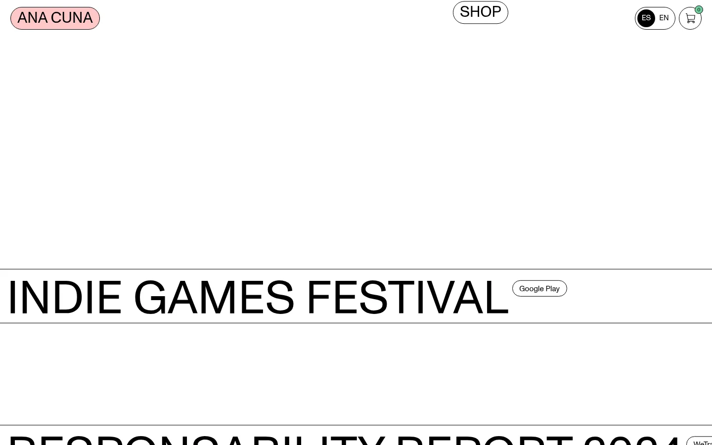
The page is built around a near-monochrome palette: white dominates the canvas, black carries almost all typography and outlines, and a soft pale pink marks the ANA CUNA identity pill. The layout is intentionally sparse at the top, then shifts into a dense vertical project index separated by thin black rules. Large uppercase titles act as the primary visual content, while compact, rounded client or platform labels sit alongside them as secondary metadata. A single regular-weight grotesk family keeps navigation, headlines, and small labels visually related; scale and case, rather than weight changes, establish hierarchy. The header distributes the identity, shop link, language selector, and cart across the page width. Project imagery exists across the full page, but the first viewport foregrounds whitespace and typography. Keep spacing generous around the header and section start, then let repeated ruled rows build momentum.
Shared family for display titles, navigation, project labels, and body copy.
角色
示例
字号
字重
行高
字距
特大标题
Oversized uppercase project titles in the portfolio index.
Ana Cuna
94.5px
400
1
0
一级标题
Uppercase primary page or section heading.
Ana Cuna
31px
400
1
0
正文
Supporting project descriptions and general copy.
The quick brown fox 敏捷的狐狸
15.5px
400
1.11
0
辅助文字
Compact client and platform labels beside project titles.
The quick brown fox 敏捷的狐狸
10.5px
400
1
0
按钮
Large uppercase text in pill-shaped calls to action.
Ana Cuna
31px
400
1
0
导航
Uppercase header navigation and language controls.
The quick brown fox 敏捷的狐狸
15.5px
400
1.11
0
间距与布局
基准单位 2px · 密度:适中
38px版块间距
—元素间距
—卡片内边距
—内容最大宽度
2px
4px
6px
8px
10px
12px
14px
21px
38px
74px
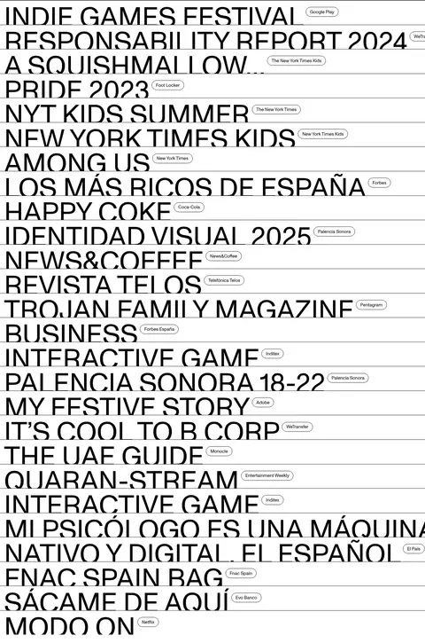
A full-width header anchors a largely open white canvas, with the work index beginning well below the top navigation. The portfolio is a single vertical column rather than a card grid: each project occupies a ruled row, with its large title aligned left and a small label positioned alongside. Headings remain left aligned, and the repeated horizontal separators establish the section rhythm. The list becomes visually dense through repetition, while the broad empty opening preserves a gallery-like pause.
圆角与层次
按钮 · 9999px
导航 · 50%
没有测到阴影:页面是扁平的,层次靠底色和描边区分。
The visual system is flat, without measured shadows or gradients. Thin black outlines define the pill controls and horizontal rules divide project rows. Use the white canvas as the only broad surface; rounded pills are the main contrasting shape, with no floating-card layering.
组件
下面的预览按实测的按钮、输入框、徽标、卡片样式重建(字体用替代字体)。
Identity pill
Uppercase ANA CUNA text in a pale pink (#ffc8c8) pill with a thin black outline and rounded ends.
Shop control
Large uppercase SHOP label inside a white pill with a fine black border.
Header utilities
Compact language selector and cart sit at the right edge; the active language appears as a black circular control with white text.
Project index row
One oversized, left-aligned uppercase project title sits between thin black horizontal rules.
Client label
Small outlined, rounded label placed beside a project title to identify a client or platform.
Project link
Text-led project links use black typography and a fine outline treatment where shown.
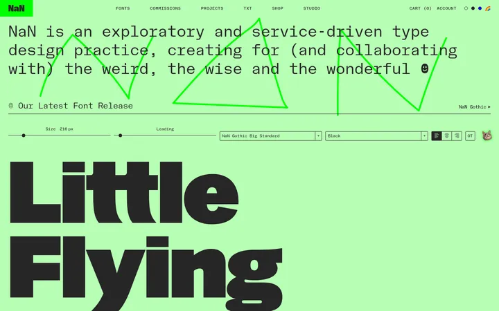
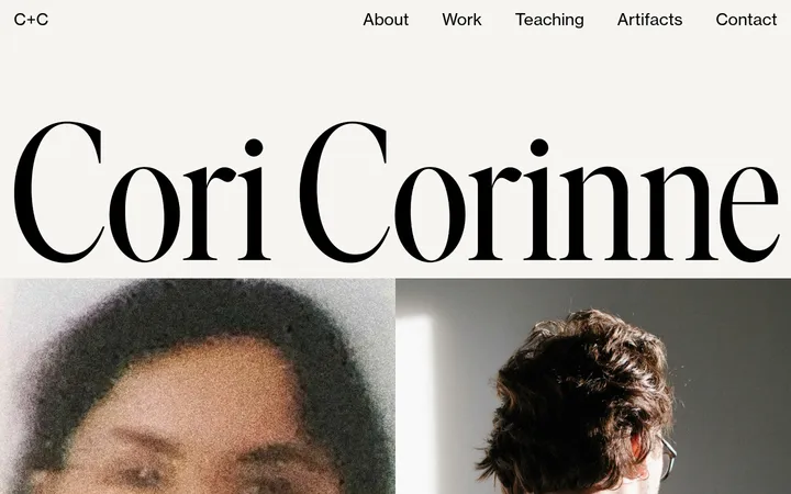
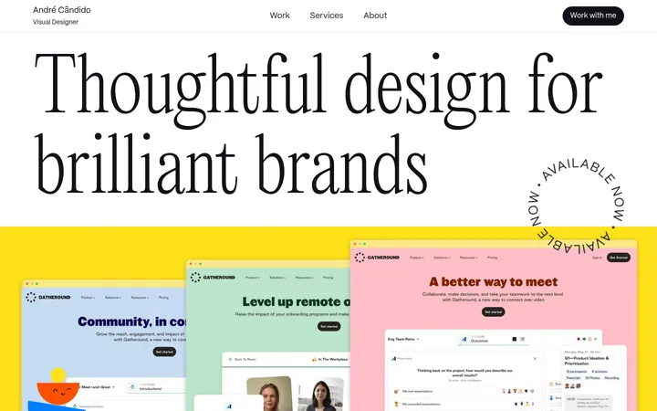
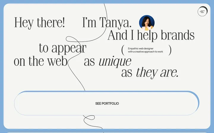
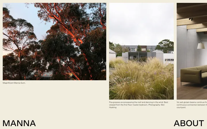
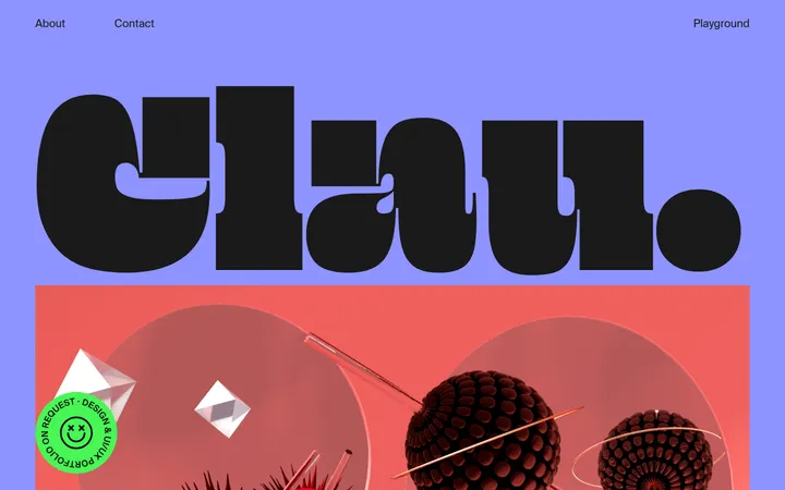
Imagery · The page includes many project images across its full length, but the supplied first viewport is defined by whitespace and typography rather than a prominent image. Treat imagery as project-specific content, not as a common color system: preserve each asset’s own palette and let the clean white canvas and black typography frame it. Avoid adding decorative illustration or image treatments unsupported by the reference.
Maintain a broad empty pause above the project list.
✕ 不该做
Do not introduce unmeasured palette colors.
Do not use gradients or drop shadows.
Do not turn the portfolio into a card grid.
Do not use bold weights to create hierarchy.
Do not crowd the header with decorative elements.
Do not let imagery overpower the typographic index.
给 AI 的提示词
想快速出一个同风格的新页面,把这段话连同 DESIGN.md 一起发给 AI。
Build a new page in Ana Cuna’s restrained editorial portfolio style. Use Gallery White (#ffffff) as the canvas and Ink (#000000) for type, outlines, and separators; reserve Blush Signal (#ffc8c8) for a small identity pill. Use a clean regular-weight grotesk, with uppercase display titles and navigation. Make the header span the page width, with identity at left, a pill-shaped shop control near the center, and language/cart utilities at right. Give the top of the page generous open space, then present content as a single-column index of large left-aligned titles, separated by fine horizontal rules. Place compact outlined client labels beside relevant titles. Keep the composition flat: no shadows, gradients, or decorative cards. Use project imagery only where it supports the content, allowing its own palette to remain secondary to the overall structure.