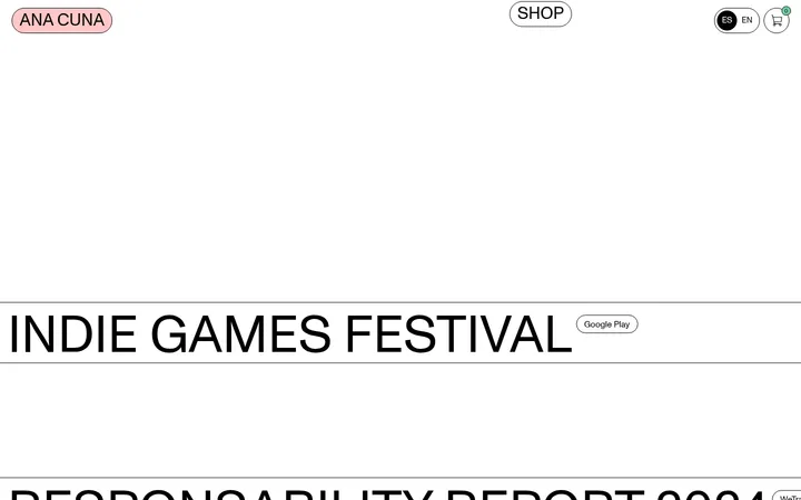
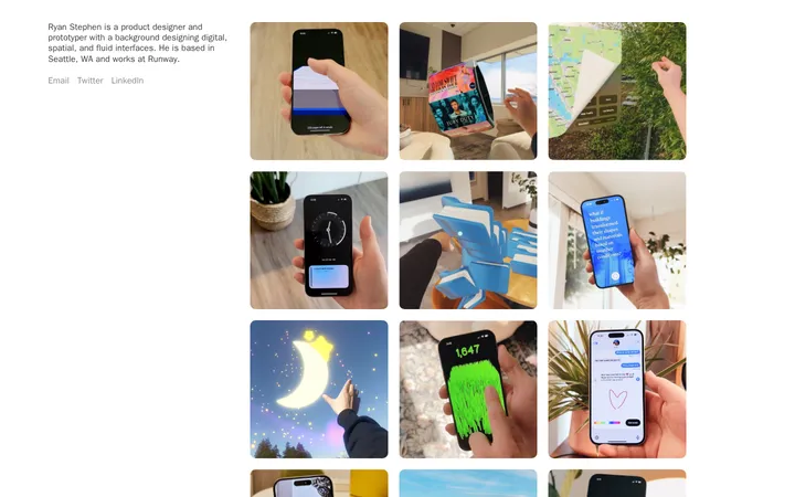
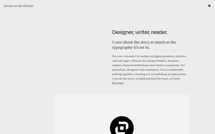
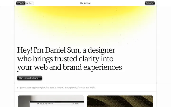
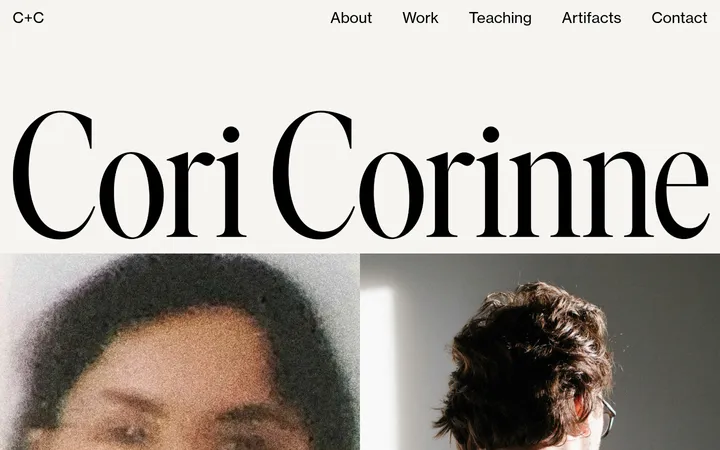
North star · Use a quiet warm canvas, expressive lightweight serif type, and blue-framed panels to make a personal portfolio feel both art-directed and approachable.
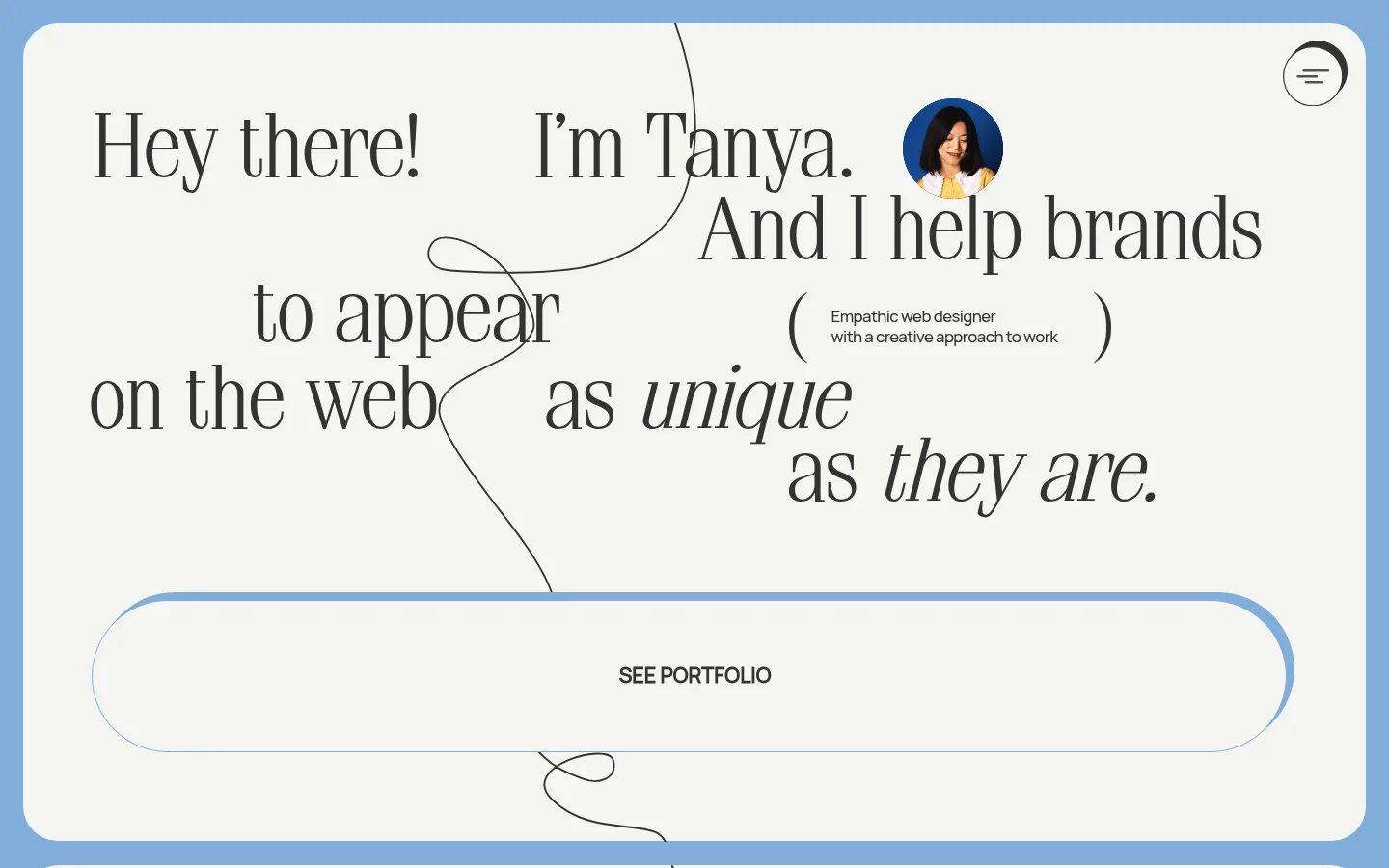
The visual system balances a warm, near-white canvas (#f5f5f3) with a recurring blue frame and large blue section bands (#81aed9). Dark charcoal (#333333) anchors text, fine outlines, and drawn paths; pure white appears in selected section surfaces and media areas. Oversized, lightweight Simeiz serif headlines create an editorial voice, while compact Manrope body copy keeps project descriptions and supporting details readable. The opening statement is composed as an asymmetrical typographic arrangement rather than a conventional centered hero. Across the long page, large rounded panels, offset project cards, and continuous looping linework connect otherwise distinct sections. Portraits and client-work imagery add personality and visual contrast; they should feel integrated into the layout, not treated as generic stock decoration. Keep generous negative space and a comfortable rhythm, using blue borders and occasional blue backgrounds as structural accents rather than adding unrelated color.
Body copy, captions, compact labels, and small navigation or identity text.
Aa 设计
Simeiz
网络字体 · 字重 300 · 占比 22%
免费替代:Bodoni Moda
Display statements, section headings, project titles, and oversized review links.
Aa 设计
Suisse Intl
系统字体 · 字重 450 · 占比 5%
免费替代:Inter
Small supporting interface or copy where the system falls back to the measured system face.
Aa 设计
Times New Roman
系统字体 · 字重 400 · 占比 1%
免费替代:Libre Baskerville
Fallback face detected in component styles; not a defining visual font in the screenshots.
角色
示例
字号
字重
行高
字距
特大标题
Large editorial statements and expressive hero typography.
Dyo Tanya
80px
300
1.55
0
一级标题
Primary introductory headline and major page statement.
Dyo Tanya
48px
300
1
0
二级标题
Section titles and prominent secondary statements.
Dyo Tanya
46px
300
1.54
0
三级标题
Project names and card-level headings.
Dyo Tanya
30px
300
1
0
四级标题
Compact card or supporting headings.
The quick brown fox 敏捷的狐狸
18px
300
normal
-0.139em
正文
Project descriptions and explanatory copy.
The quick brown fox 敏捷的狐狸
14px
400
1.45
-0.107em
辅助文字
Small labels, image notes, and attribution.
The quick brown fox 敏捷的狐狸
12px
400
1.33
0
链接
Large editorial links such as the reviews prompt.
Dyo Tanya
46px
300
1.54
0
间距与布局
基准单位 8px · 密度:适中
48px版块间距
—元素间距
48px卡片内边距
1392px内容最大宽度
10px
12px
22px
48px
The measured content max width is 1392px, with a comfortable density and a section rhythm built around a 48px section gap. The desktop composition is deliberately asymmetrical: the hero headline shifts across the canvas, project cards vary in size and position, and later sections alternate between broad panels and image-led blocks. Use the 8px base spacing unit and measured spacing scale for implementation; keep ample open canvas around titles and imagery. Blue outer framing makes the stacked sections feel like one continuous portfolio.
圆角与层次
按钮 · 50%
卡片 · 20px
图片 · 50%
链接 · 30px
hairline · card, other
md · other
hairline · other
The page is mostly flat, with structure supplied by blue outlines, dashed charcoal card borders, rounded surfaces, and drawn paths. Where cards lift, use the measured charcoal offset shadow treatment rather than a soft generic drop shadow. Preserve clear layer separation through surface contrast and overlapping linework, not heavy elevation.
组件
下面的预览按实测的按钮、输入框、徽标、卡片样式重建(字体用替代字体)。
Hero statement
An oversized lightweight serif message arranged asymmetrically across the warm canvas, paired with compact sans-serif supporting copy and a portrait.
Portfolio CTA
A broad capsule-outline link with a blue edge accent and centered charcoal label; maintain a restrained interface feel.
Project cards
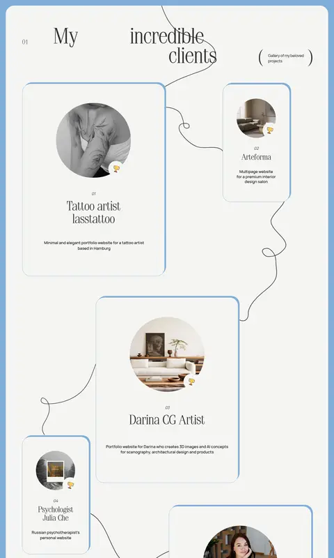
Rounded warm-surface cards with charcoal dashed outlines, measured 20px radius, generous 48px padding, project imagery, and compact descriptions.
Looping linework
Thin charcoal paths weave between panels and around content, giving the stacked sections a connected, hand-drawn quality.
Principle cards
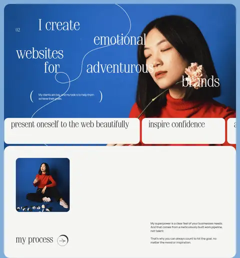
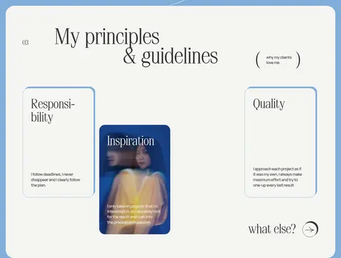
Small editorial panels introduce values through lightweight serif headings and concise sans-serif copy; one can use an image-led surface.
Review links
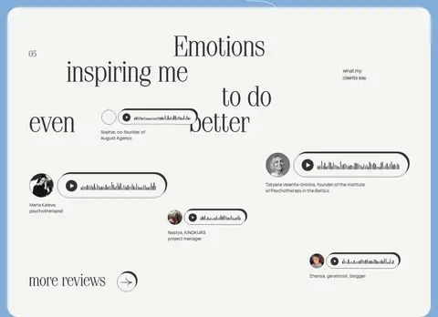
Large Simeiz link text introduces testimonial content, accompanied by compact reviewer details and audio-style controls.
Contact panel
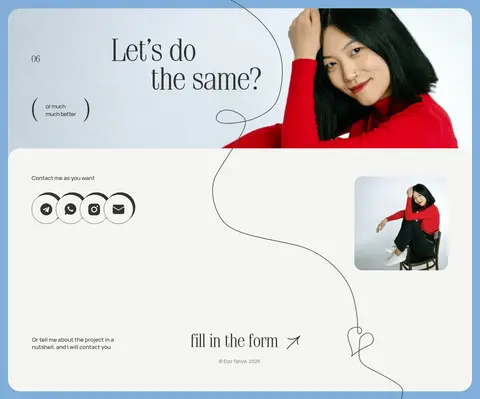
A portrait-led closing section pairs a large serif invitation with social links and a concise project-contact prompt.
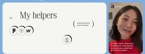
Imagery · Use personal portraits and client-project images as meaningful accents within the page, including circular crops on project cards and larger portrait-led moments in blue sections. Mix still photography with the measured video presence in the personal section. Keep imagery naturally framed and integrated into rounded cards; avoid filters or illustrative treatments that compete with the fine linework and typography.
Keep the warm off-white canvas central to the page.
Use Portfolio Blue (#81aed9) for structural frames and section accents.
Set display statements in a lightweight editorial serif.
Keep body copy compact, clear, and in Manrope.
Vary card positions and sizes to preserve the portfolio’s organic flow.
Use charcoal linework to connect panels and guide the eye.
✕ 不该做
Do not turn the layout into a uniform centered grid.
Do not replace the warm canvas with stark white everywhere.
Do not use heavy bold display typography.
Do not add unmeasured colors to the defining brand palette.
Do not apply large soft shadows to every card.
Do not let decorative lines obscure text or project imagery.
给 AI 的提示词
想快速出一个同风格的新页面,把这段话连同 DESIGN.md 一起发给 AI。
Build a new page in Dyo Tanya’s expressive portfolio style. Use Gallery Ivory (#f5f5f3) as the main canvas, Soft Graphite (#333333) for text and fine hand-drawn lines, and Portfolio Blue (#81aed9) for section bands, frames, and key outlines. Reserve Bright Link Blue (#55a1ea) for very small accents. Pair lightweight Simeiz-style editorial serif headlines with compact Manrope body copy. Arrange content asymmetrically with generous open space, rounded panels, staggered image cards, and looping charcoal paths that connect sections. Let personal or project photography add warmth without overwhelming the typography. Keep surfaces mostly flat, using measured outline and offset-shadow treatments selectively. The result should feel personal, calm, and art-directed—not like a generic agency template.