North star · Let one oversized editorial name and unframed personal photography carry the page, keeping navigation and interface details quiet.
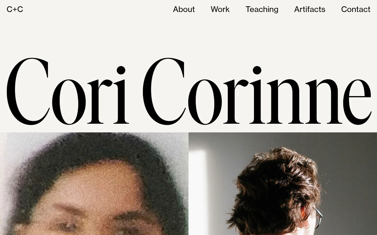
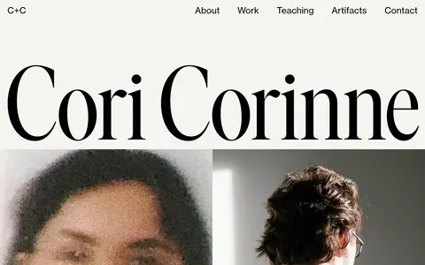
The page uses a quiet, warm off-white canvas (#f6f5f0) with black (#000000) as the strongest typographic contrast. The measured white surface (#ffffff) supports the page canvas, while muted charcoal (#292a2c) appears in navigation text; the screenshot’s brown and gray tones belong to the photographs, not the core interface palette. A small sans-serif navigation sits across the top, followed by an exceptionally large, high-contrast serif rendering of the creator’s name. This display treatment is distinct from the measured Neue Haas Grotesk Text body and navigation font, so do not force the measured sans-serif onto the oversized title. Two large photographs sit side by side beneath the title and dominate the lower viewport. The composition is edge-led and spacious, with little interface chrome, no visible card framing, and social links aligned along the bottom.
Measured body and navigation type; used for the compact brand mark and interface text.
角色
示例
字号
字重
行高
字距
正文
Supporting text and social links, set in a clean sans-serif style.
Cori Corinne
30px
400
1
0
导航
Top navigation and compact C+C brand mark.
Cori Corinne
30px
400
1
0
间距与布局
基准单位 2px · 密度:宽松
125px版块间距
—元素间距
—卡片内边距
—内容最大宽度
30px
70px
125px
A slim navigation row spans the top, with the C+C mark at the left and page links aligned to the right. The large name runs nearly edge to edge below it, acting as the hero heading rather than sitting in a constrained text column. A pair of adjacent, full-width photographic panels follows immediately. The measured page is spacious, with a large section gap scale and no measured max-width or component padding; preserve the open composition without inventing fixed dimensions.
圆角与层次
没有测到阴影:页面是扁平的,层次靠底色和描边区分。
The interface reads as flat and unboxed: measured data reports no shadows, gradients, or border system. Avoid cards, outlines, and raised controls. Let the canvas-to-image transition and the typography provide structure, with photographs placed directly into the page composition.
组件
下面的预览按实测的按钮、输入框、徽标、卡片样式重建(字体用替代字体)。
Brand mark
A small black C+C wordmark anchors the top-left of the navigation.
Primary navigation
A right-aligned row of About, Work, Teaching, Artifacts, and Contact links with muted charcoal text.
Display name
An oversized, high-contrast serif name dominates the warm canvas; reproduce its editorial contrast rather than styling it like body text.
Portrait gallery
Two large personal photographs sit adjacent beneath the name, with little or no visible framing.
Social links
Instagram, LinkedIn, and Behance appear as simple black text links along the lower edge.
Imagery · Use large photographic portraits rather than illustration or product mockups. The visible pair contrasts a softly focused, close portrait with a sharper rear-facing portrait in a reflective setting. Keep images prominent, side by side, and minimally treated; their warm browns and grays are photographic content, not UI palette colors.
Use the warm off-white canvas as the main backdrop.
Make the creator’s name the dominant typographic element.
Keep the C+C mark at the far left of the top navigation.
Align the primary page links across the top-right.
Use large, adjacent personal photographs as the main visual content.
Keep social links and copyright understated.
✕ 不该做
Do not introduce bright accent colors unsupported by the measured palette.
Do not put photographs inside elevated cards.
Do not add decorative borders or shadows.
Do not crowd the canvas with extra interface elements.
Do not treat photographic browns and grays as brand UI colors.
Do not force the measured sans-serif body font onto the display title.
给 AI 的提示词
想快速出一个同风格的新页面,把这段话连同 DESIGN.md 一起发给 AI。
Build a portfolio page in the style of Cori Corinne: an open, editorial composition with a Warm Paper canvas (#f6f5f0), Editorial Ink text (#000000), and restrained Soft Charcoal navigation (#292a2c). Place a compact C+C mark on the upper left and a quiet row of page links on the upper right. Give the creator’s name oversized, high-contrast serif display treatment; this title is visually distinct from the measured Neue Haas Grotesk Text interface font. Follow it with large, adjacent personal photographs, without card frames or decorative overlays. Keep social links and copyright small and unobtrusive. Use generous whitespace and flat surfaces; do not add shadows, borders, gradients, or invented accent colors. Preserve the photographs’ own color as image content rather than expanding the interface palette.