NaN 首页以鲜亮的绿色画布呈现超大字体样张与工作室项目,突出其字体设计实践。细线分隔、紧凑的等宽标签和渐变胶囊链接,让长页面更像一座可探索的字体实验场,而非传统作品集。
North star · Let expressive custom typography dominate the green canvas, while a restrained mono interface and fine rules keep every section legible.
The visual identity is built around a nearly uninterrupted pale-green canvas (#b7ffb4), with charcoal (#262626) carrying navigation, copy, rules, and monumental font previews. Electric green (#00ff00) appears as a sharp accent in the logo, occasional controls, and vivid project artwork; it should not replace the main canvas. Typography is the main spectacle: huge, heavy, custom display lettering sits beside finely set mono interface text, adjustable specimen controls, and varied font-family samples. A small pastel gradient—pink, lavender, and blue—marks repeated discovery links, while photography, videos, and embedded project imagery add contrast without disrupting the page’s green frame. The composition alternates broad demonstrations, compact font grids, and editorial case-study blocks, mostly aligned to thin horizontal rules. Borders stay light and corners are modest; the newsletter alone shifts to white. The result is playful and expressive, but disciplined by a consistent palette, repeated section labels, and generous breathing room around large type.
配色 点色块复制色值。用途说明来自对页面的实测位置(背景、文字、描边、按钮)与截图判读。
品牌色
Electric Pastel
#b7ffb4
The dominant page canvas and continuous background behind most sections and specimen controls.
强调色
Laser Green
#00ff00
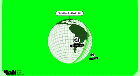
Bright logo and occasional CTA or control accent; also appears as a vivid project-art background.
Candy Pink
#ffa3b6
A stop in the pastel gradient used on discovery links and selected button treatments.
Lilac Haze
#dda9ff
Gradient stop in pastel discovery links; not a dominant section background.
Sky Tint
#a2d1ff
Gradient stop in pastel discovery links; use within the multicolour gradient rather than as a broad fill.
Pure Blue
#0000ff
A measured accent with minimal page-level presence; reserve for small interface or decorative details.
表层色
Paper White
#ffffff
The distinct newsletter section canvas at the bottom of the page.
中性色
Soft Charcoal
#262626
Primary text, navigation, giant type specimens, project headings, and the thin rules that divide content.
功能色
Control Gray
#767676
Measured input border color; keep confined to form-control detailing.
文字 背景 对比度 WCAG #262626 Soft Charcoal#b7ffb4 Electric Pastel12.95:1 AAA #00ff00 Laser Green#b7ffb4 Electric Pastel1.17:1 不达标 #00ff00 Laser Green#262626 Soft Charcoal11.03:1 AAA
字体 字号阶梯:Custom(比例约 1.716,正文 14.5px)。示例用免费替代字体渲染,数值为实测。
Aa 设计
NaN Holo Mono 网络字体 · 字重 400 / 300 / 900 / 500 / 800 / 700 · 占比 76%
免费替代:Space Mono
Navigation, labels, controls, body copy, links, captions, and code-like specimen UI.
Aa 设计
NaN Holo 网络字体 · 字重 300 / 400 · 占比 22%
免费替代:Space Grotesk
A secondary sans-serif voice used in some font release links and supporting text.
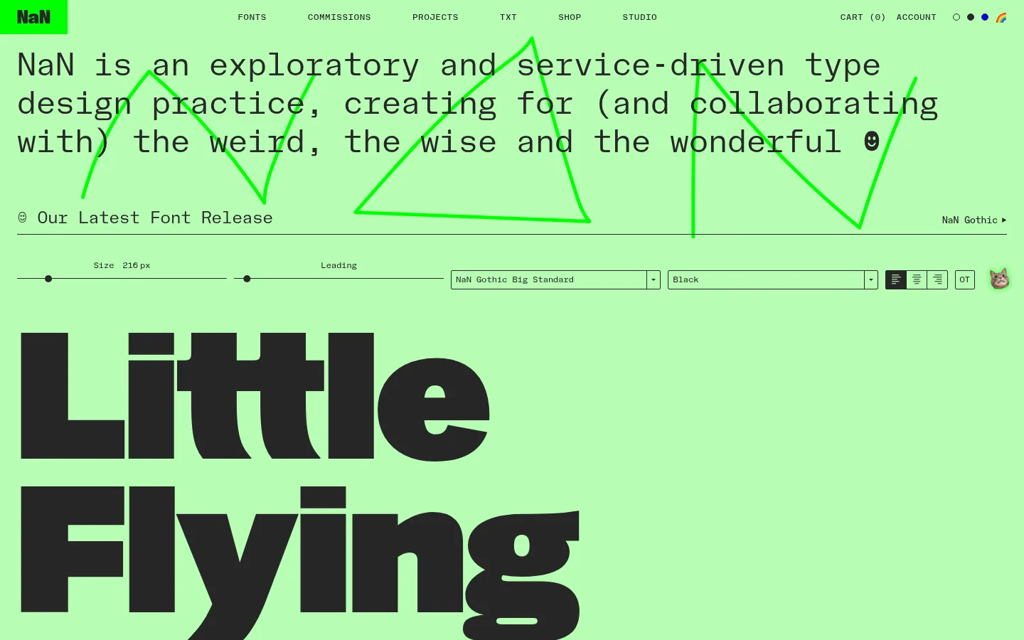
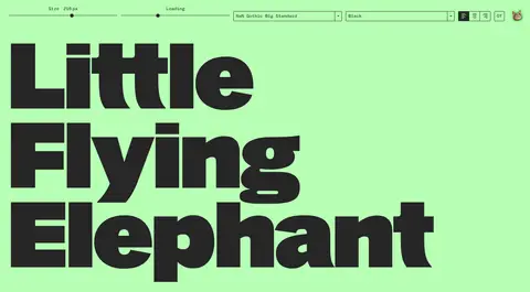
角色 示例 字号 字重 行高 字距 特大标题 Oversized, adjustable font specimen lettering such as Little Flying Elephant.
NaN
216px 400 1 0 一级标题 Large custom typeface titles and major page statements.
NaN
86.5px 400 1 0 二级标题 Prominent section or feature headings.
NaN
60.5px 400 1 0 三级标题 Editorial story titles and supporting feature headings.
NaN
45px 300 1.2 0 四级标题 Smaller project and content block headings.
NaN
32px 400 1.2 0 正文 Descriptions, editorial summaries, and explanatory copy.
The quick brown fox 敏捷的狐狸
14.5px 400 1.5 0 辅助文字 Small project labels, metadata, and specimen annotations.
The quick brown fox 敏捷的狐狸
13px 400 1.5 0 按钮 Compact labels on specimen and discovery controls.
The quick brown fox 敏捷的狐狸
12px 400 2 0 导航 Uppercase primary navigation and utility links.
The quick brown fox 敏捷的狐狸
12px 500 4 0.075em 链接 Bold uppercase discovery and action links.
The quick brown fox 敏捷的狐狸
14.5px 800 2.25 0 眉题 Section labels and small navigational introductions.
The quick brown fox 敏捷的狐狸
12px 500 4 0.075em 代码 Technical-looking specimen details and code-like text.
const style = 1;
14.5px 400 1.5 0
间距与布局 基准单位 2px · 密度:适中
32px 版块间距
— 元素间距
— 卡片内边距
1392px 内容最大宽度
1px
2px
3px
5px
6px
8px
10px
16px
20px
24px
29px
32px
40px
48px
80px
The page uses a broad, centered canvas with a measured maximum width of 1392px, but its strongest impression is full-width green bands and expansive specimens. Content shifts between two-column editorial or control layouts, three-across font tiles, and full-width media. Hairline rules introduce many sections, while recurring labels and small action links create a clear scan pattern. The measured section gap is 32px; spacing feels comfortable, with large open areas around oversized type and denser, compact controls grouped together.
圆角与层次 没有测到阴影:页面是扁平的,层次靠底色和描边区分。
The page is mostly flat: no measured shadows, little sense of stacked cards, and a consistent green ground. Fine charcoal rules and subtle tile outlines define sections and font cards rather than elevation. Rounded treatment is selective: font tiles and controls have modest curves, while links and subscribe elements use more rounded forms. Keep media panels visually distinct through their own imagery, not artificial shadows.
组件 下面的预览按实测的按钮、输入框、徽标、卡片样式重建(字体用替代字体)。
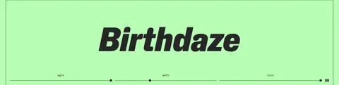
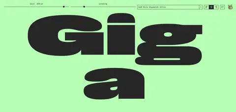
Specimen controls A horizontal tool row combines size and leading sliders, font and weight selectors, alignment controls, and compact buttons above oversized live type.
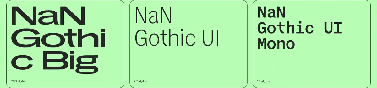
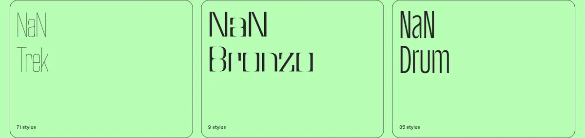
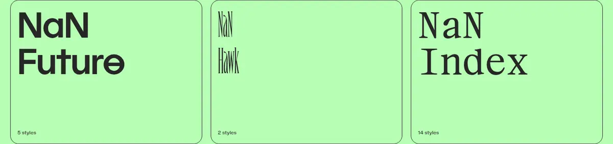
Font family tiles Outlined tiles present a family name in its own typeface with a small style-count caption; arrange them in tidy multi-column groups.
Section header rule Small mono section labels sit along a thin horizontal divider, often balanced by a compact action link at the opposite end.
Discovery link An uppercase mono action sits inside a short pastel pink-lilac-blue gradient pill, repeated between font collections and showcases.
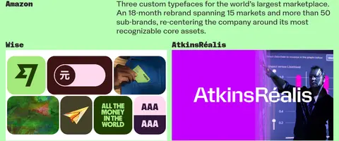
Editorial project feature A project title and concise description share the section with a large image or video panel, with alignment alternating across stories.
Newsletter form A white end-of-page band pairs a short invitation with an email field and a rounded Subscribe button.
Imagery · Typography is the primary image: oversized font previews, animated or adjustable specimens, and repeated type-family tiles. Project sections mix embedded video, interface mockups, and photography, including brand applications and editorial artwork. Media is generally presented as broad, prominent panels within the green page frame; some project imagery has its own dark or vivid background. Keep source imagery expressive and varied, but avoid adding decorative photography where the type sample is the focus.
页面版块 共 18 个版块,按页面从上到下排列,每个都标了类型、布局和交互套路。
首页
导航 顶部导航
A slim full-width bar with the logo at left, primary links centered, and utility controls at right.
首屏 字体试验场
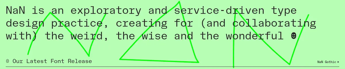
Introductory statement and specimen controls lead into a two-column interactive type demo.
商品网格 字体精选
A full-width row of three family tiles followed by one centered discovery action.
商品网格 更多字体
Three-column font tiles arranged across two rows with a centered action beneath.
产品展示 最新字体动态
A section label sits above a wide specimen panel, controls, and a centered discovery link.
产品展示 字体平台介绍
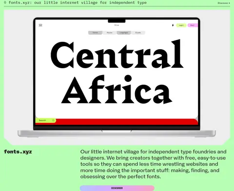
A two-column feature combines a broad video or interface preview with title and explanatory copy.
其他 合作项目入口
A wide, sparse transition band precedes the following case-study content.
图文交替 合作案例
A large featured media panel is followed by a title and description, with smaller projects in paired columns.
图集 合作案例续篇
Two project rows present titles and broad visual previews in a simple paired arrangement.
其他 字体定价介绍
A short full-width heading and paragraph lead into the pricing feature below.
图文交替 公平字体定价
A vivid, wide illustration panel is paired with a title, short description, and compact learn-more action.
产品展示 免费字体样张
A compact specimen toolbar sits above a huge two-column-like display treatment.
图集 字体应用展示
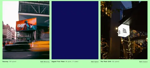
Three images sit in an aligned horizontal gallery with brief labels and a centered action.
内容列表 最新文章
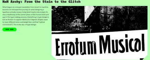
A two-column editorial block pairs a text summary and action with a large image.
内容列表 最新短文
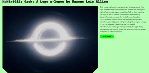
A wide image and a narrow copy column share the block beneath a prominent headline.
图文交替 开学字体优惠
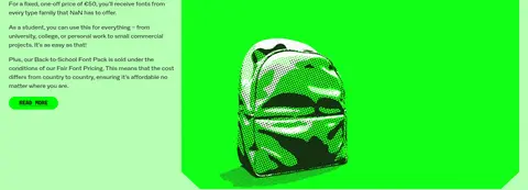
A text-led offer sits beside a large campaign illustration, with the action beneath the copy.
邮件订阅 订阅邮件
A contrasting white footer band places a short invitation beside an email field and rounded subscribe control.
其他 页尾留白
A short closing area completes the newsletter and page edge.
该做与不该做 ✓ 该做 Keep the pale-green canvas continuous across most sections. Treat font specimens as the primary visual content. Use charcoal for core text, navigation, and rules. Set interface labels in a compact mono style. Use the pastel gradient sparingly for discovery actions. Separate long-page blocks with thin rules and clear labels. ✕ 不该做 Do not turn the page into a generic white agency template. Do not use the electric green as the main page background. Do not replace the custom type-led hierarchy with stock illustrations. Do not add heavy shadows or layered card effects. Do not make every heading the same size or font style. Do not spread gradient color across large section backgrounds. 给 AI 的提示词 想快速出一个同风格的新页面,把这段话连同 DESIGN.md 一起发给 AI。
复制 Build a new page in NaN’s experimental type-studio style. Use Electric Pastel (#b7ffb4) as the main canvas and Soft Charcoal (#262626) for text, navigation, specimen lettering, and fine rules. Reserve Laser Green (#00ff00) for small emphatic accents, and use Candy Pink (#ffa3b6), Lilac Haze (#dda9ff), and Sky Tint (#a2d1ff) together in occasional discovery-link gradients. Make custom display typography the hero; pair it with compact mono controls, uppercase tracked labels, and readable mono body copy. Structure content as a long, clearly segmented page with font tiles, broad media panels, and alternating editorial project layouts. Keep the overall treatment flat and open, using borders rather than shadows. Include a contrasting Paper White (#ffffff) newsletter band only where useful; keep Control Gray (#767676) limited to form details.
DESIGN.md Tailwind v4 CSS 变量 Design Tokens
---
title: "NaN design system"
variant: extended
source: https://www.nan.xyz/
captured_at: 2026-10-12
theme: light
industry: design
generator: Design DNA (https://four.wiralomi.com/style/nan-xyz)
ai_generated: true
ai_label: "本文件由 AI 辅助生成:数值取自公开网页的实测样式,命名、用途说明与建议为模型解读。商标归原所有者。 / AI-assisted content"
---
# NaN · Design System
> Experimental type, drawn loud and set loose.
**Theme:** light · **Industry:** design · **Source:** https://www.nan.xyz/ · **Captured:** 2026-10-12 (1440×900 desktop)
_AI-assisted content: values are measured from the public page at capture time; names, roles and guidance are model-written interpretations. Trademarks belong to their owners._
NaN’s homepage pairs a vivid green canvas with oversized, changeable type specimens and a steady stream of studio work. Fine rules, compact mono labels, and bright pill-shaped links give the long page the feel of a working type playground rather than a conventional agency portfolio.
## North star
Let expressive custom typography dominate the green canvas, while a restrained mono interface and fine rules keep every section legible.
## Overview
The visual identity is built around a nearly uninterrupted pale-green canvas (## Colors
| Name | Hex | Token | Group | Role |
|---|---|---|---|---|
| Soft Charcoal | ` | `--color-soft-charcoal` | neutral | Primary text, navigation, giant type specimens, project headings, and the thin rules that divide content. |
| Electric Pastel | ` | `--color-electric-pastel` | brand | The dominant page canvas and continuous background behind most sections and specimen controls. |
| Laser Green | ` | `--color-laser-green` | accent | Bright logo and occasional CTA or control accent; also appears as a vivid project-art background. |
| Candy Pink | ` | `--color-candy-pink` | accent | A stop in the pastel gradient used on discovery links and selected button treatments. |
| Lilac Haze | ` | `--color-lilac-haze` | accent | Gradient stop in pastel discovery links; not a dominant section background. |
| Sky Tint | ` | `--color-sky-tint` | accent | Gradient stop in pastel discovery links; use within the multicolour gradient rather than as a broad fill. |
| Pure Blue | ` | `--color-pure-blue` | accent | A measured accent with minimal page-level presence; reserve for small interface or decorative details. |
| Paper White | ` | `--color-paper-white` | surface | The distinct newsletter section canvas at the bottom of the page. |
| Control Gray | ` | `--color-control-gray` | semantic | Measured input border color; keep confined to form-control detailing. |
### Semantic aliases
`--color-canvas` → ` (Electric Pastel) · `--color-surface` → ` (Soft Charcoal) · `--color-text` → ` (Soft Charcoal) · `--color-border` → ` (Control Gray) · `--color-accent` → ` (Laser Green) · `--color-accent-2` → ` (Candy Pink) · `--color-accent-3` → ` (Pure Blue) · `--color-on-accent` → ` (Soft Charcoal)
### Contrast (WCAG 2.x)
| Text | Background | Ratio | Level |
|---|---|---|---|
| ` | ` | 12.95:1 | AAA |
| ` | ` | 1.17:1 | fail |
| ` | ` | 11.03:1 | AAA |
### Gradients
- `linear-gradient(270deg, rgb(255, 163, 182), rgb(221, 169, 255) 33%, rgb(162, 209, 255) 66%, rgb(255, 163, 182))`
- `linear-gradient(rgb(183, 255, 180) 80%, rgba(183, 255, 180, 0) 100%)`
## Typography
| Family | Token | Source | Weights | Role | Free substitute |
|---|---|---|---|---|---|
| NaN Holo Mono | `--font-mono` | webfont | 400, 300, 900, 500, 800, 700 | Navigation, labels, controls, body copy, links, captions, and code-like specimen UI. | Space Mono |
| NaN Holo | `--font-nan-holo` | webfont | 300, 400 | A secondary sans-serif voice used in some font release links and supporting text. | Space Grotesk |
- **NaN Holo Mono:** Use a mono voice for interface text; navigation and eyebrow labels are uppercase with loose tracking, while body copy stays compact and readable.
- **NaN Holo:** Keep this cleaner sans distinct from the mono interface; use selectively rather than as the dominant display face.
### Type scale — Custom (ratio ≈ 1.716, base 14.5px)
| Role | Size | Weight | Line height | Letter spacing | Case | Family | Used for |
|---|---|---|---|---|---|---|---|
| display | 216px | 400 | 1 | 0 | — | NaNGothicBigStandardBlackPREVIEW | Oversized, adjustable font specimen lettering such as Little Flying Elephant. |
| h1 | 86.5px | 400 | 1 | 0 | — | NaNGothicBigUltraWideMediumPREVIEW | Large custom typeface titles and major page statements. |
| h2 | 60.5px | 400 | 1 | 0 | — | NaNGothicUIMonoSemiboldPREVIEW | Prominent section or feature headings. |
| h3 | 45px | 300 | 1.2 | 0 | — | NaN Holo Mono | Editorial story titles and supporting feature headings. |
| h4 | 32px | 400 | 1.2 | 0 | — | NaN Holo Mono | Smaller project and content block headings. |
| body | 14.5px | 400 | 1.5 | 0 | — | NaN Holo Mono | Descriptions, editorial summaries, and explanatory copy. |
| caption | 13px | 400 | 1.5 | 0 | — | NaN Holo Mono | Small project labels, metadata, and specimen annotations. |
| button | 12px | 400 | 2 | 0 | — | NaN Holo Mono | Compact labels on specimen and discovery controls. |
| nav | 12px | 500 | 4 | 0.075em | uppercase | NaN Holo Mono | Uppercase primary navigation and utility links. |
| link | 14.5px | 800 | 2.25 | 0 | uppercase | NaN Holo Mono | Bold uppercase discovery and action links. |
| eyebrow | 12px | 500 | 4 | 0.075em | uppercase | NaN Holo Mono | Section labels and small navigational introductions. |
| code | 14.5px | 400 | 1.5 | 0 | — | NaN Holo Mono | Technical-looking specimen details and code-like text. |
OpenType features in use: `"dlig" 0, "liga" 0` , `"dlig" 0, "frac" 0, "ss01" 0, "ss02" 0, "ss03" 0, "ss04" 0, "ss05" 0, "ss06" 0, "ss07" 0, "ss08" 0, "ss09" 0, "ss10" 0, "ss11" 0, "ss12" 0, "ss13" 0, "ss14" 0, "ss15" 0, "tnum" 0` , `"ss01" 0, "ss02" 0, "ss03" 0, "ss04" 0, "ss05" 0, "ss06" 0, "ss07" 0, "ss08" 0, "ss09" 0, "ss10" 0` .
## Spacing & layout
- Base unit **2px**, density **comfortable**.
- Scale (most used values): 1, 2, 3, 5, 6, 8, 10, 16, 20, 24, 29, 32, 40, 48, 80 px.
- Section rhythm 32px · element gap — · card padding — · max content width 1392px.
The page uses a broad, centered canvas with a measured maximum width of 1392px, but its strongest impression is full-width green bands and expansive specimens. Content shifts between two-column editorial or control layouts, three-across font tiles, and full-width media. Hairline rules introduce many sections, while recurring labels and small action links create a clear scan pattern. The measured section gap is 32px; spacing feels comfortable, with large open areas around oversized type and denser, compact controls grouped together.
## Shape & elevation
- Radius: button `2px` · link `20px` · xs `2px` · sm `20px` · pill `9999px`
- No box shadows measured: the page is flat.
- Motion: standard transition `0.2s ease-out` on interactive elements.
The page is mostly flat: no measured shadows, little sense of stacked cards, and a consistent green ground. Fine charcoal rules and subtle tile outlines define sections and font cards rather than elevation. Rounded treatment is selective: font tiles and controls have modest curves, while links and subscribe elements use more rounded forms. Keep media panels visually distinct through their own imagery, not artificial shadows.
## Imagery
Typography is the primary image: oversized font previews, animated or adjustable specimens, and repeated type-family tiles. Project sections mix embedded video, interface mockups, and photography, including brand applications and editorial artwork. Media is generally presented as broad, prominent panels within the green page frame; some project imagery has its own dark or vivid background. Keep source imagery expressive and varied, but avoid adding decorative photography where the type sample is the focus.
## Components
### Specimen controls
A horizontal tool row combines size and leading sliders, font and weight selectors, alignment controls, and compact buttons above oversized live type.
### Font family tiles
Outlined tiles present a family name in its own typeface with a small style-count caption; arrange them in tidy multi-column groups.
### Section header rule
Small mono section labels sit along a thin horizontal divider, often balanced by a compact action link at the opposite end.
### Discovery link
An uppercase mono action sits inside a short pastel pink-lilac-blue gradient pill, repeated between font collections and showcases.
### Editorial project feature
A project title and concise description share the section with a large image or video panel, with alignment alternating across stories.
### Newsletter form
A white end-of-page band pairs a short invitation with an email field and a rounded Subscribe button.
### Measured component styles
- **Primary button** (“NaN”): background ## Do
- Keep the pale-green canvas continuous across most sections.
- Treat font specimens as the primary visual content.
- Use charcoal for core text, navigation, and rules.
- Set interface labels in a compact mono style.
- Use the pastel gradient sparingly for discovery actions.
- Separate long-page blocks with thin rules and clear labels.
## Don't
- Do not turn the page into a generic white agency template.
- Do not use the electric green as the main page background.
- Do not replace the custom type-led hierarchy with stock illustrations.
- Do not add heavy shadows or layered card effects.
- Do not make every heading the same size or font style.
- Do not spread gradient color across large section backgrounds.
## Agent prompt
Build a new page in NaN’s experimental type-studio style. Use Electric Pastel (## Page sections (top to bottom)
| # | Type | Layout | UX patterns | UI patterns |
|---|---|---|---|---|
| 1 | navigation | A slim full-width bar with the logo at left, primary links centered, and utility controls at right. | Persistent site navigation, Cart and account shortcuts | Green logo block, Uppercase mono links, Compact utility icons |
| 2 | hero | Introductory statement and specimen controls lead into a two-column interactive type demo. | Adjustable font size, Font and weight selectors, Alignment controls | Oversized display type, Hairline section rule, Mono control labels |
| 3 | product-grid | A full-width row of three family tiles followed by one centered discovery action. | Browse font families, Open family details | Outlined type tiles, Small style-count captions, Pastel gradient action |
| 4 | product-grid | Three-column font tiles arranged across two rows with a centered action beneath. | Scan font names, Browse full catalogue | Thin outlined tiles, Mixed type samples, Gradient catalogue link |
| 5 | product-showcase | A section label sits above a wide specimen panel, controls, and a centered discovery link. | Explore a new release, Adjust variable axes | Large variable-font sample, Fine control rules, Gradient action pill |
| 6 | product-showcase | A two-column feature combines a broad video or interface preview with title and explanatory copy. | Explore the platform, View a product demonstration | Large framed media, Bold feature title, Short supporting paragraph |
| 7 | other | A wide, sparse transition band precedes the following case-study content. | Transition between showcases | Green canvas, Generous open space |
| 8 | feature-split | A large featured media panel is followed by a title and description, with smaller projects in paired columns. | Browse collaboration work, Open project detail | Large video feature, Paired project previews, Compact project labels |
| 9 | gallery | Two project rows present titles and broad visual previews in a simple paired arrangement. | Browse case studies, View project media | Paired media panels, Small bold titles, Green separators |
| 10 | other | A short full-width heading and paragraph lead into the pricing feature below. | Understand licensing approach | Editorial heading, Brief explanatory copy |
| 11 | feature-split | A vivid, wide illustration panel is paired with a title, short description, and compact learn-more action. | Learn about regional pricing | Bright green artwork, Editorial text block, Gradient action |
| 12 | product-showcase | A compact specimen toolbar sits above a huge two-column-like display treatment. | Adjust specimen settings, Get a font for free | Oversized custom lettering, Mono controls, Green canvas |
| 13 | gallery | Three images sit in an aligned horizontal gallery with brief labels and a centered action. | Browse real-world applications, View more examples | Three media panels, Small captions, Gradient gallery link |
| 14 | content-feed | A two-column editorial block pairs a text summary and action with a large image. | Read the latest story | Bold article headline, Compact excerpt, Large editorial image |
| 15 | content-feed | A wide image and a narrow copy column share the block beneath a prominent headline. | Read a short article | Headline across the block, Dark media image, Compact read-more button |
| 16 | feature-split | A text-led offer sits beside a large campaign illustration, with the action beneath the copy. | Review student offer, Read licensing terms | Bold offer headline, Vivid green artwork, Compact action button |
| 17 | newsletter | A contrasting white footer band places a short invitation beside an email field and rounded subscribe control. | Enter an email address, Subscribe to updates | White background, Rounded input and button, Small decorative marks |
| 18 | other | A short closing area completes the newsletter and page edge. | Finish the page | Open white space, Minimal closing details |
## Source CSS custom properties (selected)
```css
--PhoneInput-color--focus: