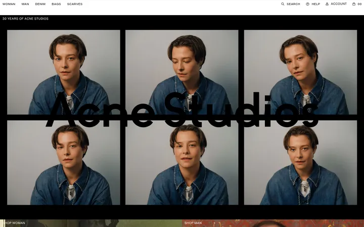
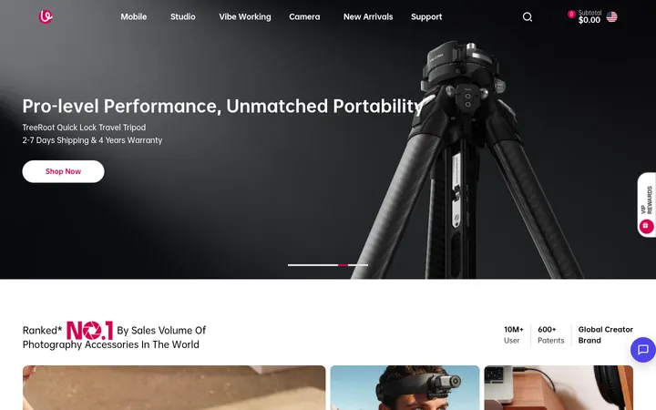
North star · Let vivid, tactile beauty photography lead, while warm neutrals and quiet, lightweight UI keep shopping effortless.
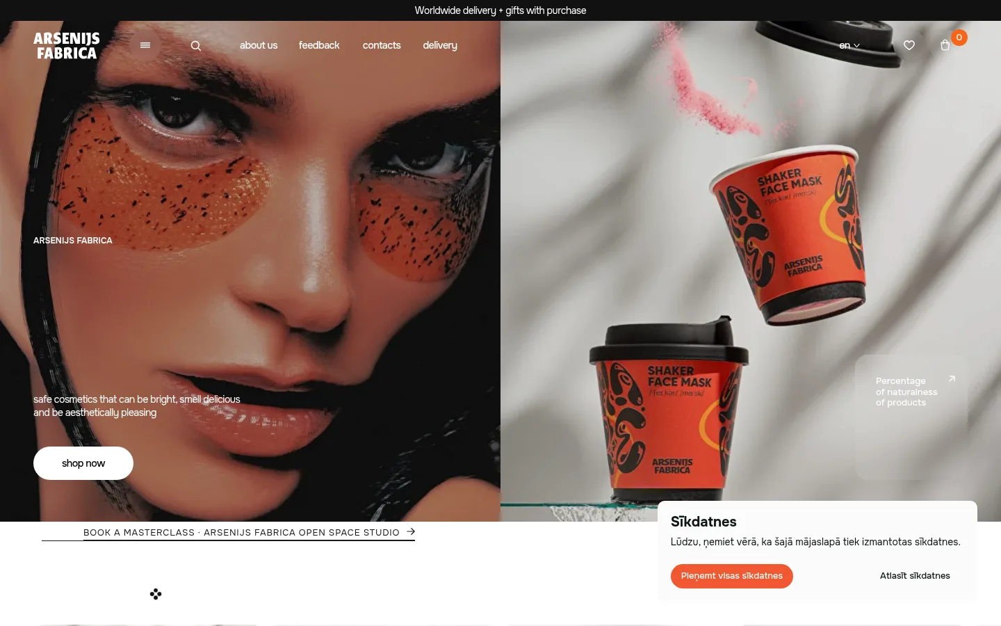
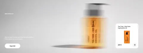
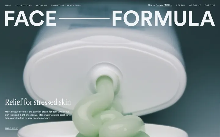
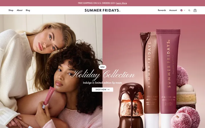
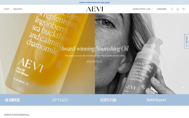
The visual system balances an overwhelmingly white canvas with soft cream booking surfaces, fine beige borders, and compact dark typography. Warm brown accents connect navigation, badges, and booking details, while vivid orange is reserved for standout actions such as the cookie consent and product-grid load-more buttons. On the first screen, a full-width campaign photograph dominates: close-up beauty imagery sits beside oversized product packaging, with small white captions and a simple pill CTA overlaid directly on the image. Onest is used throughout, favoring light body copy and restrained, tightly tracked headlines; the large nav labels visible in measured data are not representative of the whole page. After the immersive hero, the page shifts to clean category tiles and evenly spaced product grids, then a cream-colored workshop booking section with structured controls and cards. Generous section breaks and mostly flat surfaces let photography carry the visual impact; subtle borders and soft shadows organize functional UI without making the storefront feel dense.
Site-wide interface, headings, body copy, navigation, captions, and buttons
角色
示例
字号
字重
行高
字距
一级标题
Primary campaign or section headline, set large and compact.
Arsenijs Fabrica
48px
500
1.04
-0.042em
二级标题
Secondary section headings, including workshop booking.
The quick brown fox 敏捷的狐狸
23px
500
1.57
-0.052em
三级标题
Product and content card titles.
The quick brown fox 敏捷的狐狸
21px
600
normal
0
正文
Product descriptions, editorial copy, and booking instructions.
The quick brown fox 敏捷的狐狸
15px
300
1.55
0
辅助文字
Small labels, metadata, and understated image captions.
The quick brown fox 敏捷的狐狸
12px
500
1.55
-0.042em
按钮
Compact action labels across shopping and booking controls.
The quick brown fox 敏捷的狐狸
13px
500
normal
0
导航
Prominent navigation links and category labels.
The quick brown fox 敏捷的狐狸
21px
600
normal
0
间距与布局
基准单位 2px · 密度:适中
90px版块间距
6px元素间距
14px卡片内边距
1180px内容最大宽度
2px
4px
6px
8px
9px
10px
12px
14px
15px
16px
18px
20px
22px
24px
30px
32px
The measured content max width is 1180px, while the opening campaign and several image bands use the full viewport. The homepage alternates wide photographic moments with orderly category tiles and four-column product grids. Sections have pronounced breathing room, including a notably long cream workshop-booking block. Most content is left-aligned or arranged in simple rows; the booking heading is centered above a detailed, multi-column form. Overall density is comfortable, with compact product metadata and ample space between content groups.
圆角与层次
按钮 · 8px
输入框 · 8px
卡片 · 14px
图片 · 14px
徽标 · 4px
链接 · 9999px
md · other, card
lg · other
sm · other
hairline · card
Most sections are flat and separated by white or cream backgrounds rather than heavy shadow. Cards and inputs use fine warm beige borders; selected cards may receive a restrained bronze outline. Soft, low-contrast shadows appear on a few cards or floating elements, while the consent panel layers over the hero transition.
组件
下面的预览按实测的按钮、输入框、徽标、卡片样式重建(字体用替代字体)。
Campaign hero
Full-width photographic campaign with small overlaid brand copy, supporting text, and a white pill-shaped shop action.
Category tiles
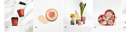
Horizontal image-led category cards with concise labels and small directional cues.
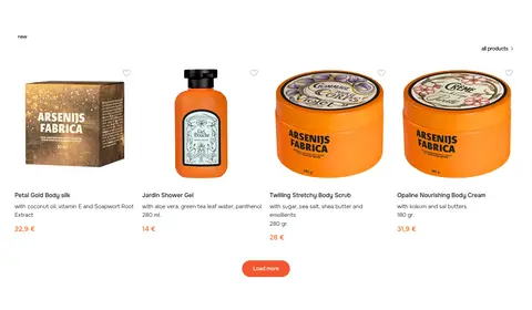
Product grid
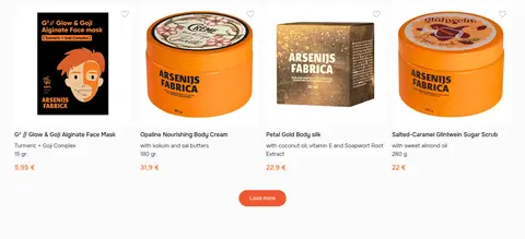
Four-column product presentation with large imagery, compact names and descriptions, warm price accents, and a vivid orange load-more action.
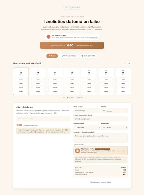
Workshop booking
Cream-background booking experience combining date and time selection, attendee and workshop controls, customer fields, payment details, and a summary.
Cookie consent
White floating consent panel with explanatory copy and a bright orange accept action, overlapping the transition below the hero.
Review videos
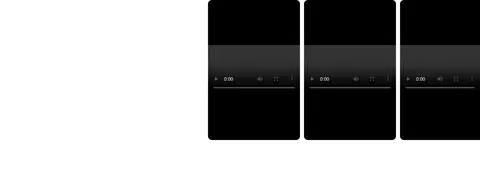
Three dark video player cards arranged in a horizontal row beneath review navigation.
Imagery · Product photography is the main visual voice: close-up beauty portraits, vivid orange packaging, creams, soaps, and ingredient-led compositions. The hero is a full-bleed split campaign image with embedded white copy and product containers; category tiles and product grids use clean, isolated product shots. Later sections include social imagery and a row of video-review cards. Keep imagery crisp and large, with minimal decorative overlays.
Use the full-bleed campaign image as the first visual anchor.
Keep primary page surfaces white and booking surfaces warm cream.
Reserve vivid orange for clearly actionable controls.
Use Onest or a close sans-serif substitute throughout the interface.
Keep product descriptions and prices visually compact.
Separate major content groups with generous whitespace.
✕ 不该做
Do not make every section a bordered card.
Do not use bright orange as a broad background color.
Do not crowd product imagery with decorative copy.
Do not replace the warm border tone with stark heavy dividers.
Do not force the campaign hero into a narrow container.
Do not make secondary text compete with product photography.
给 AI 的提示词
想快速出一个同风格的新页面,把这段话连同 DESIGN.md 一起发给 AI。
Build a new beauty-commerce page in the Arsenijs Fabrica visual style. Use Gallery White (#ffffff) as the dominant canvas, with Oat Cream (#fbf6ef) for a warm featured or booking section and Sandstone Line (#e8dcc6) for quiet control borders. Set interface typography in Onest, using light body copy, medium headings, and compact metadata. Make one large, vivid beauty campaign image the visual anchor; follow it with clean category tiles and an orderly product grid. Use Tangerine Signal (#f15730) sparingly for primary actions, and Cinnamon Bronze (#c98a5b) or Amber Leather (#a06d42) for restrained warm details. Preserve generous section breathing room, simple alignment, and image-led storytelling. Keep cards mostly flat, with subtle outlines and only occasional soft shadows. Make any booking flow structured and calm rather than visually dense.