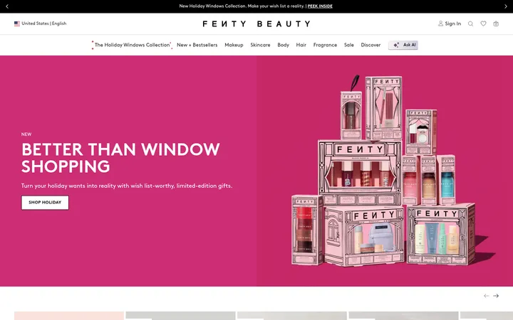
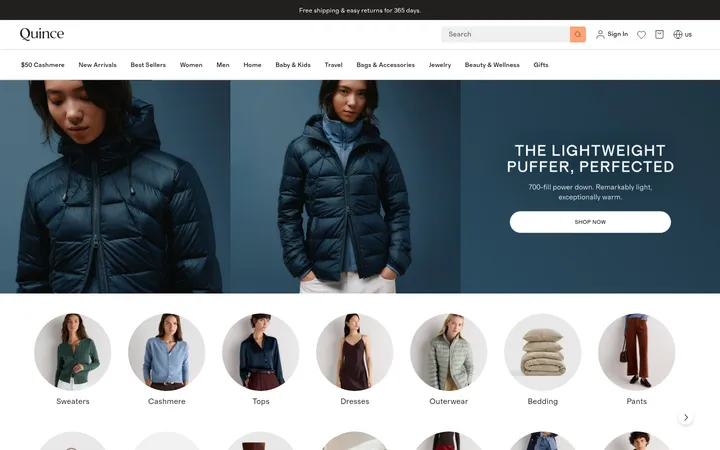
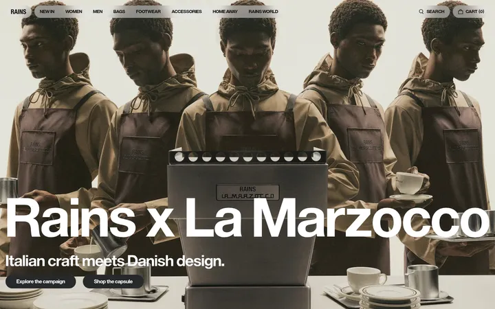
North star · Keep the storefront quiet and legible, then let campaign photography and clearly bounded color-field sections carry the emotional impact.
The homepage balances a white, low-chrome shopping interface with expressive campaign imagery. White is the canvas for navigation, product listings, and informational content; deep near-black ink carries most text, links, and controls. Muted rose and warm clay appear as broad, distinct color fields behind lip-product showcases, while dusty blue marks the social gallery and footer. These are measured section colors, not a reason to recolor product photography. Futura PT supplies the practical voice across navigation, product details, and uppercase actions; Pinyon Script adds a selective, high-contrast editorial flourish to display headings. Layout alternates dense product carousels and three-column image links with spacious, centered collection features and a two-column rewards panel. Photography leads: models, product close-ups, and styled product imagery set each section’s tone. Borders stay fine and shadows are nearly absent, so image crops and colored bands provide the page’s hierarchy.
Navigation, body copy, product information, links, labels, and buttons.
Aa 设计
Pinyon Script
网络字体 · 字重 400 · 占比 1%
免费替代:Pinyon Script
Display and hero collection headings, used sparingly for an editorial contrast.
角色
示例
字号
字重
行高
字距
特大标题
Oversized script treatment for campaign or collection display headings.
Summer Fridays
70px
400
1
-0.011em
一级标题
Hero campaign title and primary editorial heading.
Summer Fridays
45px
400
1
0.003em
二级标题
Section headings, including collection and product-feature titles.
The quick brown fox 敏捷的狐狸
26px
450
1.15
-0.02em
三级标题
Product names and subordinate content headings.
The quick brown fox 敏捷的狐狸
20px
450
normal
0.007em
正文
Product descriptions, rewards copy, and general page text.
The quick brown fox 敏捷的狐狸
16px
450
1.25
0.008em
辅助文字
Compact product metadata and supporting labels.
The quick brown fox 敏捷的狐狸
12px
450
1.25
0.011em
按钮
Uppercase, widely tracked shopping and call-to-action labels.
The quick brown fox 敏捷的狐狸
13px
450
1.38
0.085em
导航
Main storefront navigation and account links.
The quick brown fox 敏捷的狐狸
16px
450
1.25
0.008em
链接
Product names and inline navigation or learn-more links.
The quick brown fox 敏捷的狐狸
16px
450
1.19
-0.009em
眉题
Short uppercase collection and promotional labels.
The quick brown fox 敏捷的狐狸
13px
450
1.31
0.085em
间距与布局
基准单位 4px · 密度:适中
42px版块间距
12px元素间距
—卡片内边距
1320px内容最大宽度
2px
3px
4px
6px
8px
12px
18px
24px
30px
60px
The measured content max width is 1320px, with a comfortable overall density and a 12-column basis for product-led sections. The first viewport is a two-part, full-bleed campaign hero; below it, the page alternates horizontal product rails, centered full-width collection showcases, three-column category imagery, and split content. Product and feature headings commonly align to the left, while the two collection showcases center their content. Section gaps are measured at 42px, with a 12px element gap and a 4px spacing base. Preserve generous white space between these contrasting blocks.
圆角与层次
按钮 · 3px
输入框 · 3px
徽标 · 3px
导航 · 50%
链接 · 3px
hairline · other
The interface is mostly flat: section background color, whitespace, and image placement establish hierarchy instead of cards with deep shadows. Controls use restrained borders, with measured stone outlines on selectors and small corner rounding. A subtle focus treatment is measured, but prominent drop shadows are not a defining visual feature.
组件
下面的预览按实测的按钮、输入框、徽标、卡片样式重建(字体用替代字体)。
Announcement strip
A narrow rose-toned shipping message sits above the white navigation; its text and learn-more link are centered.
Store navigation
White horizontal header with left-aligned Shop, About, and Blog links, centered wordmark, and right-side rewards and account utilities.
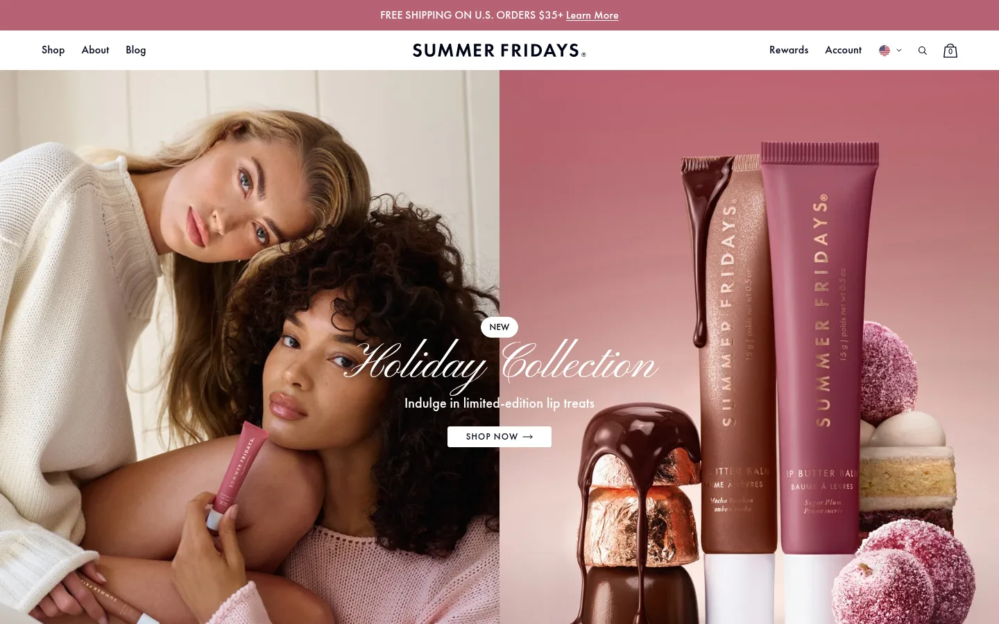
Campaign hero
Full-bleed, two-part seasonal photography supports a centered script title, concise copy, a small NEW badge, and a light shopping CTA.
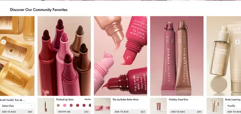
Product rail
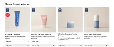
Horizontal product browsing combines image cards, product names, selector or variant controls, and compact uppercase Add to Bag actions.
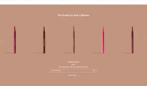
Collection showcase
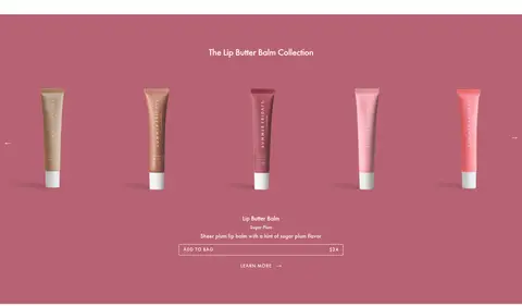
Centered product lineup sits on a solid warm clay or rose section, with collection heading, short product copy, outlined action, and learn-more link.
Category image tiles
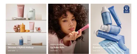
Three photographic category panels place uppercase eyebrow labels, short headings, and shopping links over the images.
Rewards split
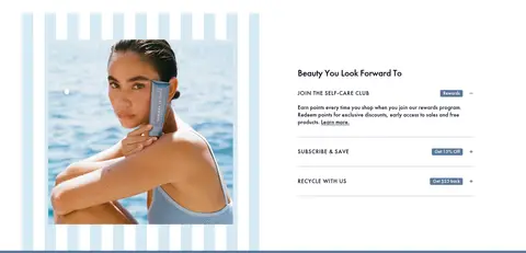
A large lifestyle image sits beside a two-column content panel with a headline and stacked rewards, subscription, and recycling information.
Social footer
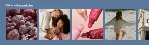
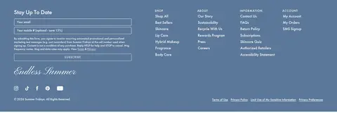
Dusty blue footer zone combines a horizontal social image strip, signup form, grouped text links, script wordmark, and social icons.
Imagery · Lifestyle and product photography dominate; the hero places models beside a product still life, while collection panels isolate product lines against solid rose and clay fields. Smaller product cards use close crops and repeatable image frames. The rewards panel pairs a large model photograph with concise copy. Social imagery forms a compact, varied feed. No illustration style defines the page.
Reserve dusty blue, rose, and clay for clear section bands or small badges.
Let campaign and product photography lead each feature.
Use Futura-style sans serif for navigation and commerce details.
Save script display lettering for a small number of prominent headings.
Keep product actions compact, uppercase, and clearly legible.
Separate page modules with whitespace rather than heavy card shadows.
✕ 不该做
Do not make every section a colored panel.
Do not apply measured section colors as a filter over photography.
Do not use script type for navigation or product descriptions.
Do not add prominent shadows or thick decorative borders.
Do not crowd product cards with oversized controls.
Do not let promotional overlays obscure the product or model imagery.
给 AI 的提示词
想快速出一个同风格的新页面,把这段话连同 DESIGN.md 一起发给 AI。
Build a beauty ecommerce page in Summer Fridays’ restrained editorial style. Use Gallery White (#ffffff) for the principal canvas and Midnight Ink (#000418) for navigation, headings, and product copy. Add Dusty Blue (#5c7899), Rose Mauve (#b86373), and Warm Clay (#c1947f) only as deliberate section fields or small accents. Keep the header clean, with a centered wordmark and balanced side navigation. Pair large lifestyle photography with product-led rails, concise descriptions, and compact uppercase purchase actions. Use a Futura-like sans serif for functional text and reserve graceful script typography for prominent collection headings. Favor full-bleed campaign imagery, centered product showcases, image category tiles, and generous white breaks. Keep controls finely outlined, corners subtly rounded, and elevation nearly flat. Make the page feel calm and shoppable, not crowded or overly decorative.