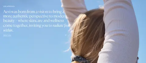
North star · Keep the interface quiet and product-led: use white space, light editorial type and pale blue accents to frame compelling skincare imagery.
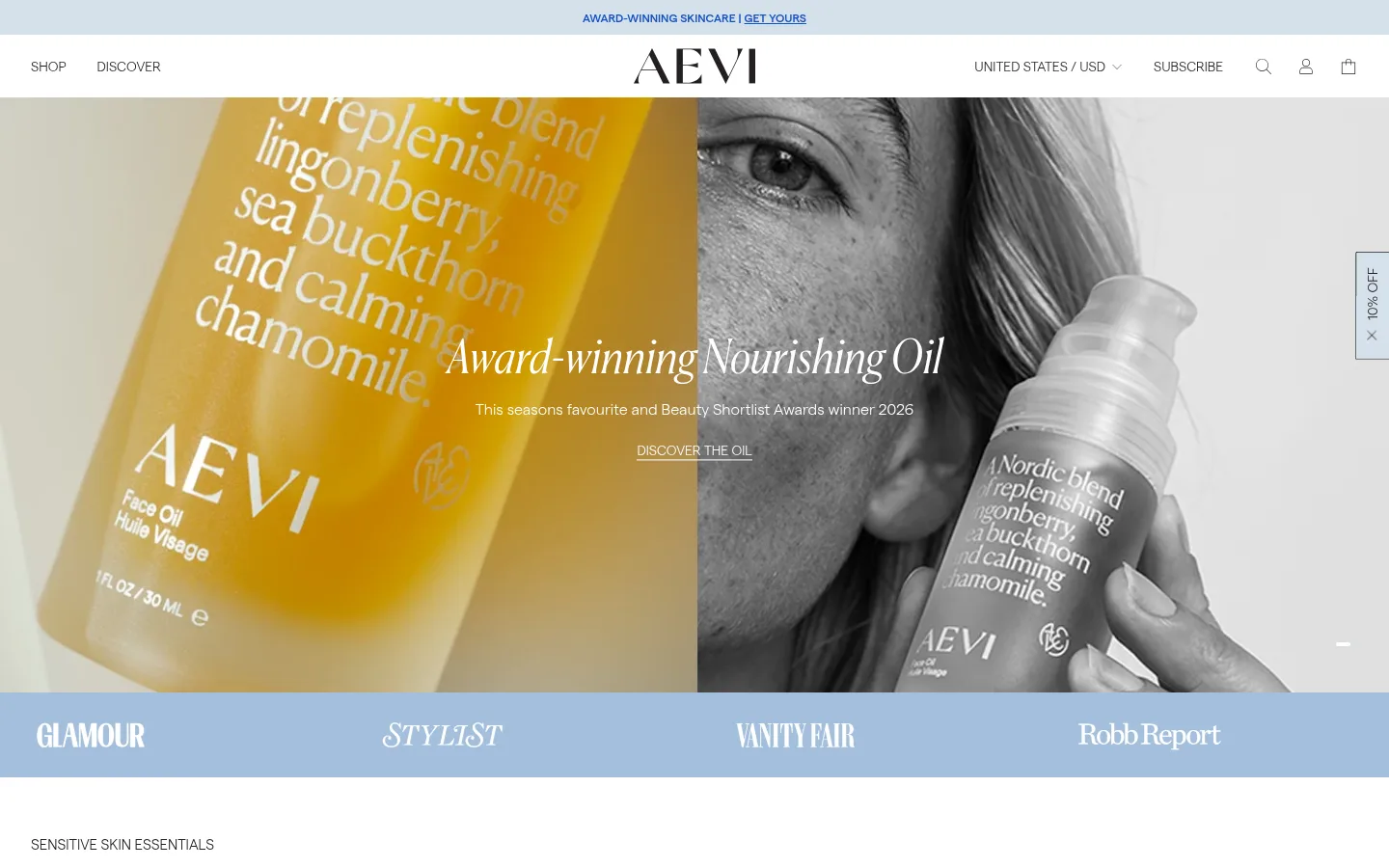
The page uses a white canvas and near-black text as its quiet foundation, with pale blue section bands and powder-blue buttons providing the main branded color. A vivid blue is reserved for small links and low-stock labels; it does not compete with the warm amber and neutral tones that appear in product photography. Typography is light and editorial: delicate serif-like display headings contrast with clean, low-weight sans-serif body copy and compact utility labels. The homepage moves between a full-width photographic hero, product rows, editorial split sections, testimonials and a video strip. White backgrounds let these blocks breathe, while a pale-blue press and review band creates a clear visual pause. Images are central and varied, from monochrome portrait campaigns to product still lifes and candid customer videos. Borders define selected controls and product details; the overall page avoids decorative shadow and relies on whitespace, alignment and imagery for hierarchy.
Body copy, product descriptions, navigation and most buttons.
Aa 设计
Tertiary Font
网络字体 · 字重 500 · 占比 15%
免费替代:Montserrat
Small captions and selected compact promotional links.
Aa 设计
Heading Font
网络字体 · 字重 300 · 占比 14%
免费替代:Lora
H3 and H4 headings across product and editorial sections.
Aa 设计
Secondary Font
网络字体 · 字重 300 · 占比 4%
免费替代:Cormorant Garamond
Large H1 and H2 campaign and section headings.
Aa 设计
Button Font
网络字体 · 字重 500 · 占比 3%
免费替代:Lato
Measured button label font family.
角色
示例
字号
字重
行高
字距
一级标题
Large campaign headline over hero imagery.
Aevi
48.5px
300
1.14
0
二级标题
Prominent editorial and section headings.
Aevi
41px
300
1.07
0
三级标题
Product feature and supporting section headings.
The quick brown fox 敏捷的狐狸
26px
300
1.23
0
四级标题
Smaller product and content subheadings.
The quick brown fox 敏捷的狐狸
20px
300
1.2
0
正文
Product details, brand narrative and descriptive copy.
The quick brown fox 敏捷的狐狸
16px
300
1.31
0
辅助文字
Compact labels and supporting metadata.
The quick brown fox 敏捷的狐狸
14px
500
1.29
0
链接
Navigation, product actions and small text links.
The quick brown fox 敏捷的狐狸
14px
300
1.29
0
间距与布局
基准单位 8px · 密度:适中
60px版块间距
4px元素间距
—卡片内边距
1376px内容最大宽度
2px
4px
6px
8px
16px
24px
32px
48px
Use a centered, wide desktop layout with a measured maximum width of 1376px, opening with a full-bleed campaign image and slim navigation. Follow with product grids, two-column editorial features, review bands, a compact video gallery and curated product sets. Sections are predominantly white and switch to pale blue where social proof or footer content needs separation. Keep alignment calm and whitespace generous; the measured density is comfortable, with an 8px base unit, a 60px section gap and small element gaps. Adapt grids responsively without changing the editorial hierarchy.
圆角与层次
按钮 · 9999px
徽标 · 2px
没有测到阴影:页面是扁平的,层次靠底色和描边区分。
The interface is predominantly flat: no measured box shadows. Use hairline borders to define product choices and selected controls, and pale-blue fills for badges, press bands and buttons. The hero gradient is a subtle black-to-transparent overlay for image legibility. Build hierarchy through spacing, color blocks and image layering rather than raised cards.
组件
下面的预览按实测的按钮、输入框、徽标、卡片样式重建(字体用替代字体)。
Header and announcement
Compact white navigation with centered Aevi wordmark, small utility links and icons; place a narrow blue-toned announcement strip above it.
Campaign hero
Full-width photographic campaign with centered light display headline, short supporting line and understated text CTA over the image.
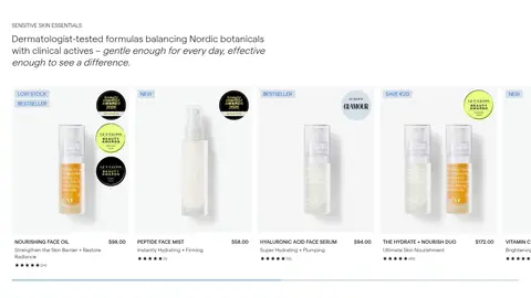
Product card
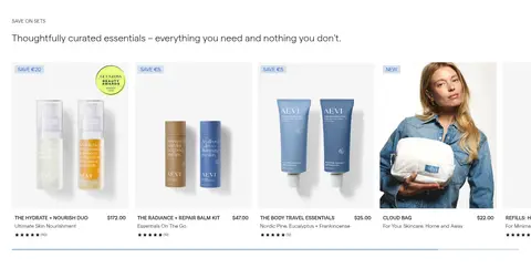
Clean product image with concise title, price and rating; small Mist Blue badges use Nordic Signal text for stock or sale status.
Add to bag button
Powder Blue pill with Soft Ink text and a thin Soft Ink outline; keep the label light and centered.
Press strip
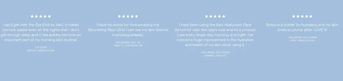
Horizontal Powder Blue band featuring white publication wordmarks, providing a clear pause after product imagery.
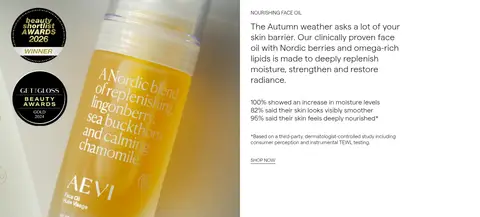
Editorial split feature
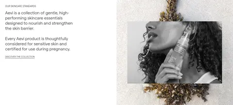
Pair a large product or lifestyle photograph with a restrained heading, short copy and a small Nordic Signal text link.
Newsletter footer
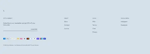
Mist Blue footer surface with a concise email signup and separated link groups for company, legal and social destinations.
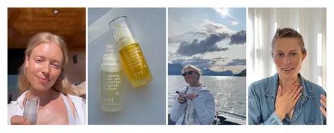
Imagery · Use polished skincare product still lifes, close-up packaging and natural-light portraits. Mix monochrome campaign photography with warm amber product imagery, while keeping image crops large and immersive in the hero and split features. Product grids use clean individual pack shots; customer and lifestyle video tiles introduce candid, human moments. No illustration or 3D style defines the page.
Use Powder Blue for selected buttons and press bands.
Reserve Nordic Signal for small links and badge text.
Let product and portrait photography carry the emotional tone.
Use light editorial display headings above restrained body copy.
Separate major content blocks with generous whitespace.
✕ 不该做
Do not turn the measured black gradient into a large flat section color.
Do not use vivid blue as a dominant background.
Do not add heavy shadows or raised-card styling.
Do not crowd product photography with extra decorative UI.
Do not make headings bold, uppercase display lettering by default.
Do not treat warm colors inside product images as interface palette colors.
给 AI 的提示词
想快速出一个同风格的新页面,把这段话连同 DESIGN.md 一起发给 AI。
Build a new Aevi-style skincare storefront page with a quiet Nordic editorial character. Use Gallery White (#ffffff) as the primary canvas and Soft Ink (#231f20) for most text. Apply Mist Blue (#d5e0ea) to soft section bands, footer surfaces and badges; use Powder Blue (#a3bfdb) for select filled CTAs and press strips. Keep Nordic Signal (#134fc2) limited to small links and badge text. Set light display headings against clean, low-weight sans-serif body copy. Compose a photographic campaign hero, spacious product grids, editorial image-and-copy splits, social proof and a restrained newsletter footer. Favor large, natural-looking skincare and portrait photography, with occasional monochrome treatment. Use thin borders and image overlays only where useful; avoid shadows, clutter and invented color accents.