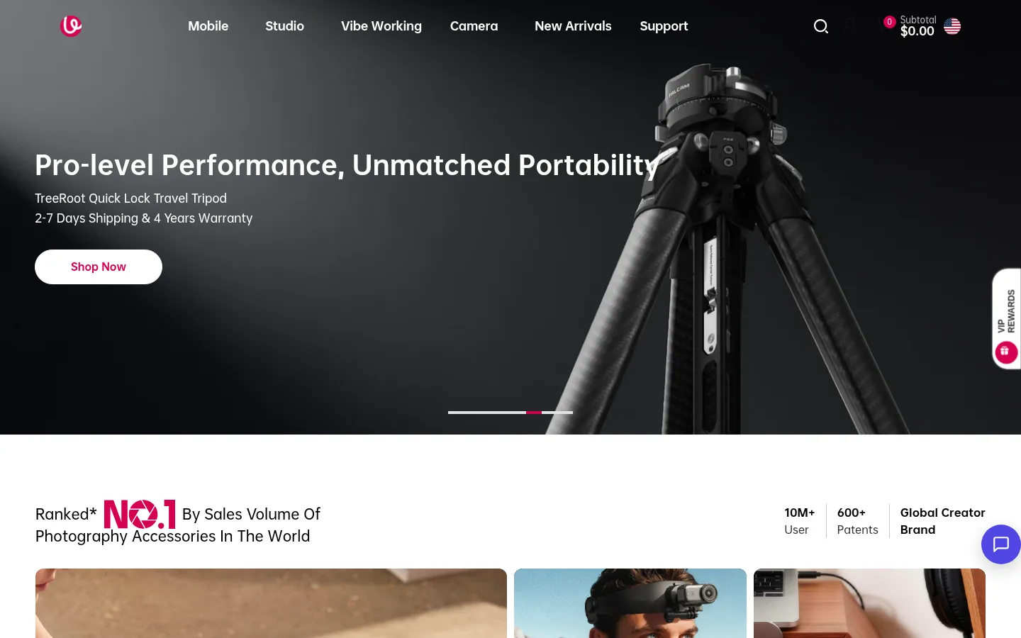
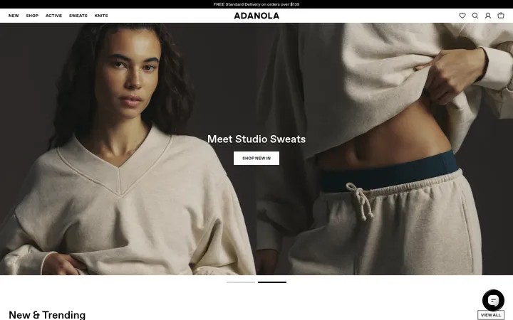
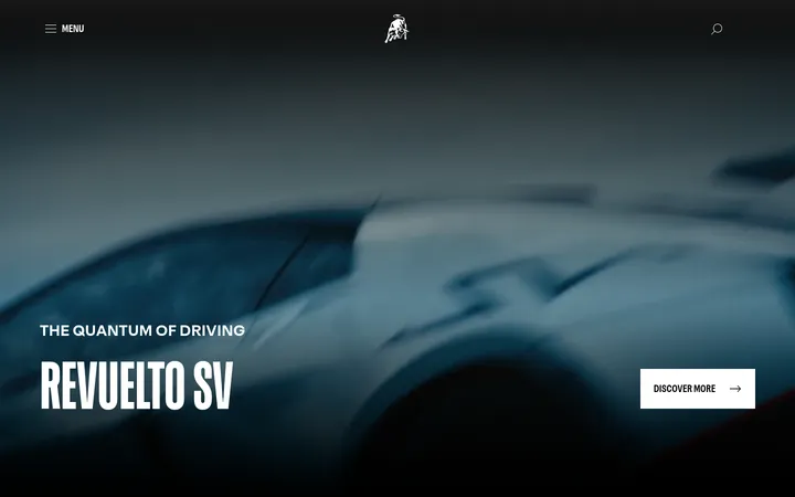
North star · Keep the storefront clean and product-led, using white space for browsing and a dark photographic hero for impact.
The page uses a white canvas for most of its shopping and editorial content, interrupted by a full-bleed charcoal hero with white navigation and copy. Black and near-black text keeps product information crisp, while saturated raspberry marks the brand’s purchase actions, small promotional cues, and occasional graphic accents. OPPO Sans supplies compact, bold headings and readable interface text; navigation uses Basis Grotesque Pro. The layout moves between broad campaign imagery, a three-column brand-stat band, dense horizontal product merchandising, and calmer editorial and testimonial blocks. Generous blank intervals separate the main content groups, while cards and controls stay compact. Photography does most of the visual work: close product shots, creator scenes, and dark campaign images establish variety without introducing decorative illustration. Rounded pill buttons contrast with restrained, fine card borders.
Headings, body copy, buttons, product cards, links and most interface text.
Aa 设计
Basis Grotesque Pro
系统字体 · 字重 500 / 600 · 占比 7%
免费替代:DM Sans
Navigation text, with a small measured share.
角色
示例
字号
字重
行高
字距
一级标题
Campaign hero headline and primary page-level title.
ULANZI
35px
700
1.14
0
二级标题
Major section headings, including category and testimonial sections.
ULANZI
30px
800
1.3
0
三级标题
Subsection headings and editorial or service-feature titles.
The quick brown fox 敏捷的狐狸
25px
600
1.2
0
四级标题
Smaller feature, product, or supporting section headings.
The quick brown fox 敏捷的狐狸
22px
600
1.3
0
正文
Prominent short descriptions, product details, and emphasized copy.
The quick brown fox 敏捷的狐狸
14px
800
1.3
0
辅助文字
Secondary labels, supporting descriptions, and compact annotations.
The quick brown fox 敏捷的狐狸
13px
500
1.6
0
按钮
Primary calls to action and prominent shopping controls.
The quick brown fox 敏捷的狐狸
16px
600
1.6
0
导航
Main category navigation across the header.
The quick brown fox 敏捷的狐狸
16px
500
1.25
0
链接
Product links, footer destinations, and supporting actions.
The quick brown fox 敏捷的狐狸
13px
500
1.6
0
间距与布局
基准单位 2px · 密度:适中
50px版块间距
10px元素间距
—卡片内边距
1340px内容最大宽度
1px
5px
6px
10px
12px
15px
16px
17px
18px
20px
24px
28px
30px
50px
The page follows a centered storefront structure with a measured maximum width of 1340px, while the campaign hero and media can run full bleed. A three-column statistics band leads into a 12-column product area and compact multi-column editorial content. Text is mostly left aligned, and product rows prioritize scanability. The overall density is comfortable: shopping content is compact, but large white intervals create deliberate pauses between categories, features, testimonials, and footer. The measured spacing system is based on a 2px unit.
圆角与层次
按钮 · 9999px
输入框 · 8px
卡片 · 10px
导航 · 8px
链接 · 12px
sm · nav, other
inset · card
hairline · button
hairline · button
Most product cards are flat, with thin #f3f3f3 borders and 10px measured corners. Buttons use subtle hairline shadows rather than strong elevation. A soft shadow appears around select navigation or cards, while dark image overlays and inverse surfaces create depth through contrast instead of layered panels.
组件
下面的预览按实测的按钮、输入框、徽标、卡片样式重建(字体用替代字体)。
Campaign hero
Full-bleed dark product image with white navigation and copy; a white pill CTA uses raspberry text.
Primary CTA
Rounded pill button; the measured raspberry treatment is #d60051 with white text, while hero purchase buttons may reverse to white with raspberry text.
Category tiles
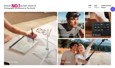
Large photographic links in a three-column band, with white labels over image edges.
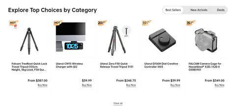
Product cards
Compact shopping cards with product imagery, #121212 names, fine #f3f3f3 borders, and price and purchase links.
Press features
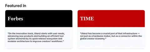
Two-column quote cards using recognizable publication wordmarks and distinct black or red header panels.
Creator testimonials
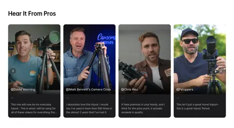
Portrait-led cards with dark image treatment and compact white attribution and review copy.
Newsletter and footer
Email signup transitions into a charcoal footer with grouped navigation and muted details.
Imagery · Photography is the main expressive material: the hero uses dramatic low-key imagery of camera equipment, while category tiles show creators at work and product cards isolate accessories against light backgrounds. Editorial cards pair press branding with short quotations; testimonial cards use creator portraits over darkened images. Image crops and full-bleed treatments provide contrast without relying on decorative illustration.
Use a clean white canvas for most shopping sections.
Reserve deep charcoal for campaign imagery and inverse panels.
Use #d60051 as the clearest purchase and promotional accent.
Keep product names and prices easy to scan.
Use photography to explain products and creator use cases.
Separate major content groups with generous breathing room.
✕ 不该做
Do not make every section dark or heavily boxed.
Do not use multiple vivid accents as equal primary colors.
Do not add decorative illustrations that compete with gear photography.
Do not turn compact product cards into oversized editorial panels.
Do not apply strong shadows to every card and control.
Do not replace the white storefront canvas with a tinted page background.
给 AI 的提示词
想快速出一个同风格的新页面,把这段话连同 DESIGN.md 一起发给 AI。
Build a new ULANZI-style storefront page with a bright #ffffff canvas and a strong, full-bleed dark photographic hero. Use Studio Black (#000000) and Soft Ink (#121212) for crisp text, and reserve Ulanzi Raspberry (#d60051) for primary shopping actions and small promotional emphasis. Use OPPO Sans or a close sans-serif substitute such as Inter for compact, confident headings, product details, and controls; keep navigation understated. Structure content in a centered storefront grid with clear left alignment, dense but scannable product merchandising, and generous pauses between major sections. Lead with real camera and creator photography rather than decorative graphics. Keep cards mostly flat with fine #f3f3f3 borders and restrained rounding. Make buttons pill-shaped and use subtle shadows only where needed. End with a charcoal footer and subdued text.