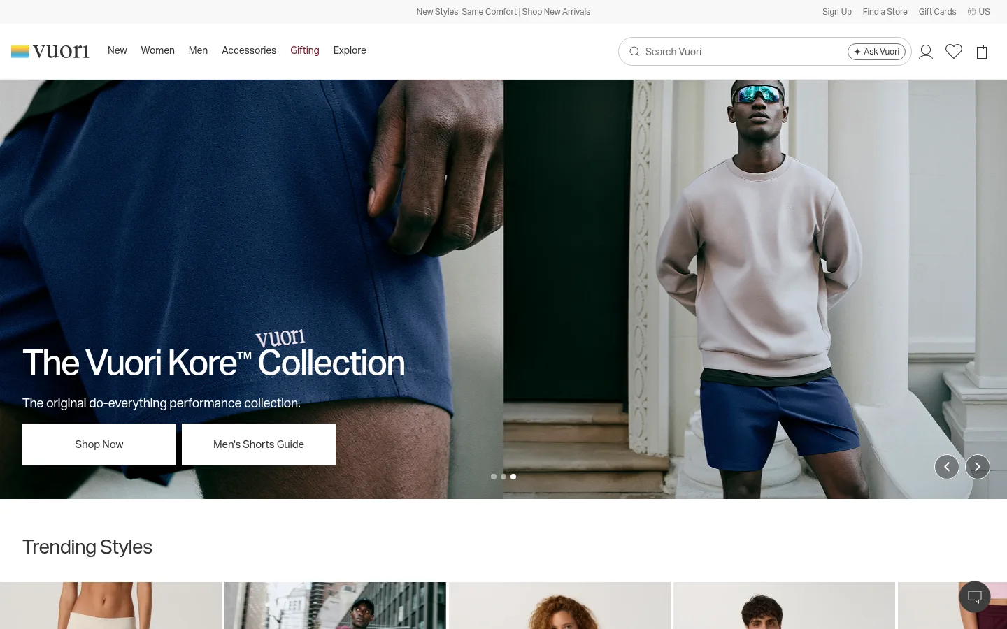
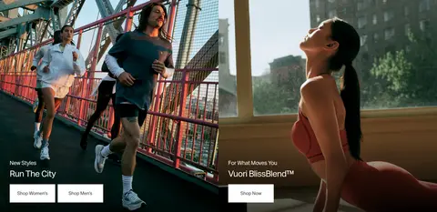
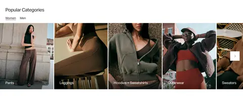
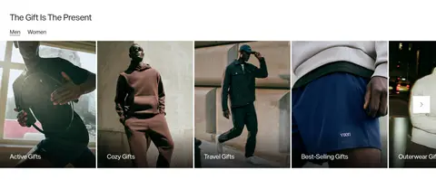
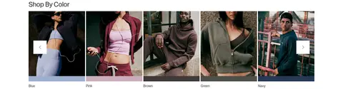
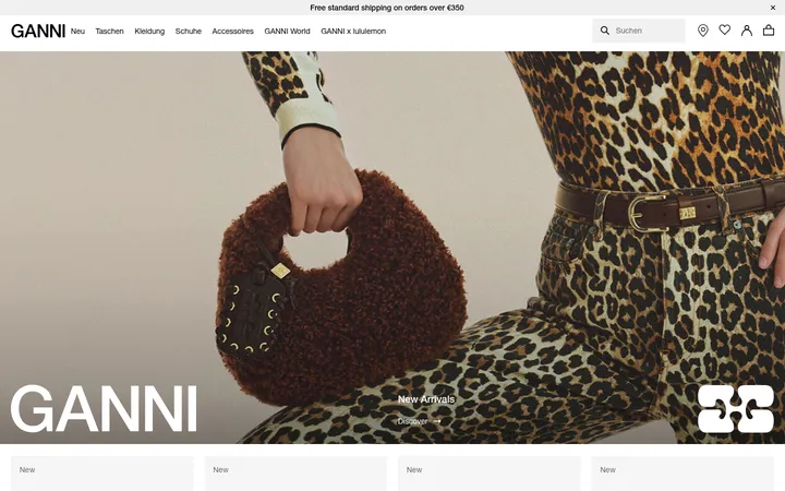
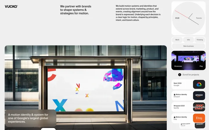
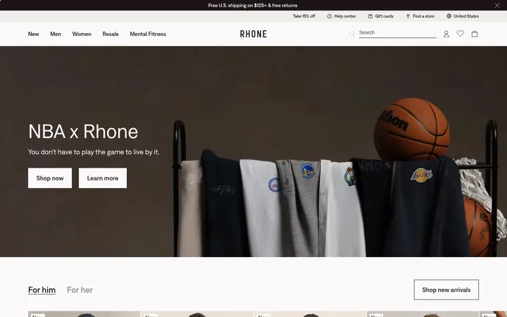
North star · Keep the interface quiet and monochrome so expansive, authentic lifestyle photography carries the brand’s energy.
The visual identity is built on a white canvas and near-monochrome interface rather than a strong decorative brand colour. White (#ffffff) carries the page and keeps the photography prominent; pale grays (#f8f8f8 and #ededed) distinguish cards and fine boundaries without creating heavy panels. Text moves from deep charcoal (#212121) to softer gray (#333333 and #727272), while #c6c6c6 and #e0e0e0 appear as subtle interface hairlines. Aktiv Grotesk is used throughout: compact navigation and product details sit beside large, lightly tracked campaign headings, all in sentence case. Layout alternates edge-to-edge photographic campaigns with horizontal product and category strips, giving the page a clear browsing rhythm. Images supply most of the color and emotional contrast: natural settings, active models, and neutral or richly colored apparel are treated as campaign content, not as interface palette. The result is polished, calm, and commerce-focused.
Site-wide typeface for navigation, headings, body copy, product labels, links, and buttons.
角色
示例
字号
字重
行高
字距
一级标题
Large campaign headline over hero imagery.
Vuori
50px
500
1.2
-0.05em
二级标题
Primary section titles and major campaign headings.
Vuori
40px
400
1.14
-0.03em
三级标题
Secondary campaign or feature headings.
Vuori
28px
400
1.33
-0.03em
四级标题
Smaller subheadings within supporting content.
The quick brown fox 敏捷的狐狸
21px
400
1.31
-0.03em
正文
Descriptions, explanatory copy, and newsletter text.
The quick brown fox 敏捷的狐狸
14px
300
1.71
-0.01em
辅助文字
Compact product details, labels, and legal notes.
The quick brown fox 敏捷的狐狸
12px
400
1.5
-0.01em
按钮
Shop actions and other prominent button labels.
The quick brown fox 敏捷的狐狸
18px
400
1.5
-0.01em
导航
Main navigation and compact utility links.
The quick brown fox 敏捷的狐狸
14px
400
1.71
-0.01em
链接
Product titles and category or editorial links.
The quick brown fox 敏捷的狐狸
15px
400
1.75
-0.009em
间距与布局
基准单位 8px · 密度:紧凑
32px版块间距
4px元素间距
—卡片内边距
1376px内容最大宽度
4px
6px
8px
16px
20px
22px
24px
28px
32px
40px
120px
Use a broad, centered desktop canvas capped at the measured 1376px maximum width, with campaign media allowed to run edge to edge. The page alternates full-bleed hero panels, a dense multi-item product rail, split campaign imagery, and horizontally browsable category strips. Align section headings to the left and keep text overlays close to the lower or left edges of campaign images. The measured spacing scale spans 4–120px, with a compact overall density and 32px section gap; use larger pauses between major image-led bands.
圆角与层次
按钮 · 50%
导航 · 9999px
没有测到阴影:页面是扁平的,层次靠底色和描边区分。
The interface is largely flat, with no measured shadows. Separate content through whitespace, image boundaries, and pale gray hairlines or card surfaces rather than floating panels. Navigation and cards stay crisp and square-edged; only specified controls use fully rounded shapes. Image overlays and carousel arrows sit directly on top of photography as lightweight controls.
组件
下面的预览按实测的按钮、输入框、徽标、卡片样式重建(字体用替代字体)。
Utility and primary navigation
A slim utility row sits above a white main navigation bar. Use 14px Aktiv Grotesk navigation text in charcoal and preserve the spacious, uncluttered header arrangement.
Campaign hero
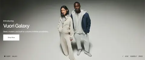
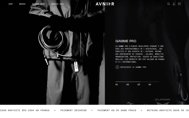
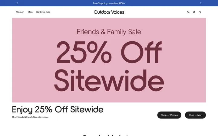
Full-bleed lifestyle image with a large, left-aligned heading, short supporting line, and white rectangular shop buttons. Keep the text legible over the photograph.
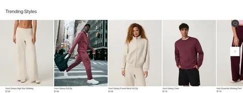
Product carousel
Horizontal rail of tall product photographs with compact 14px names and prices beneath; use light #ededed or #f8f8f8 card surfaces where needed.
Campaign split
Two adjacent photographic promotions with short overlaid labels, titles, and shop links or buttons. Keep the imagery dominant and copy concise.
Category and gifting rails
Image-led horizontal cards with concise white labels over the lower image area, paired with simple carousel arrows and category or audience selectors.
Newsletter and footer
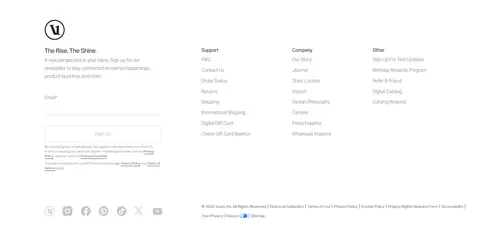
Email sign-up sits alongside three link columns. Use subtle gray borders and muted copy, then finish with compact legal text and social icons.
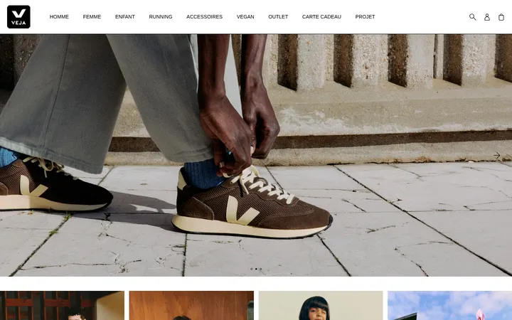
Imagery · Photography defines the experience: use full-width or paired lifestyle campaign images featuring people in activewear, natural light, and recognizable urban or home settings. Product and category rails crop portraits into vertical cards, with products visible in context rather than isolated against a blank studio field. Keep image color and contrast natural; the measured dominant navy and earth tones belong primarily to photography, not interface chrome.
Let campaign photography span the full content width.
Keep interface text and separators neutral and understated.
Use Aktiv Grotesk or a close, clean sans-serif substitute.
Keep product labels compact and directly attached to imagery.
Use whitespace to distinguish major campaign bands.
✕ 不该做
Do not introduce a bright interface accent absent from the measured palette.
Do not add decorative gradients or prominent drop shadows.
Do not place campaign photography inside rounded floating cards.
Do not make headings shouty with routine all-caps.
Do not mistake colors inside apparel photography for UI palette colors.
Do not overcrowd image overlays with long blocks of copy.
给 AI 的提示词
想快速出一个同风格的新页面,把这段话连同 DESIGN.md 一起发给 AI。
Build a new Vuori-style commerce page with a white #ffffff canvas and restrained gray interface colors. Use #333333 for navigation and ordinary links, #212121 for stronger headings, #727272 for muted details, and #ededed or #f8f8f8 only for quiet card surfaces. Use #c6c6c6 and #e0e0e0 as subtle borders, not decorative accents. Set type in Aktiv Grotesk or Inter, with compact navigation and product details, light body copy, and large sentence-case campaign headings. Organize the page as broad photographic campaign bands alternating with horizontal product or category rails. Make lifestyle imagery the main source of color, and overlay concise copy and simple white shop buttons directly on campaign photography. Keep components flat, spacing deliberate, and the footer compact and practical.