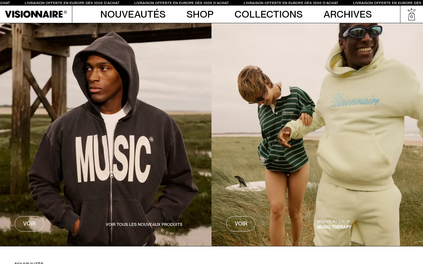
North star · Keep the interface nearly monochrome and let large, authentic fashion photography carry the colour and editorial character.
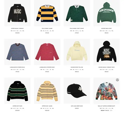
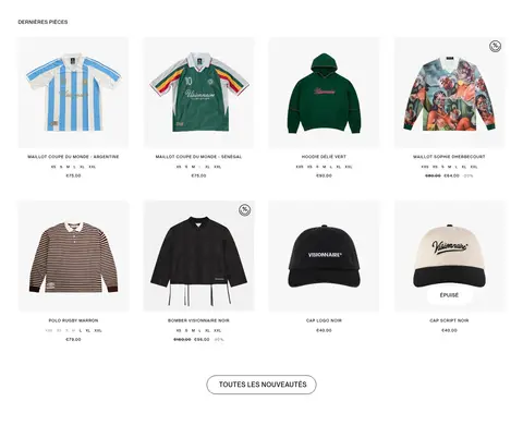
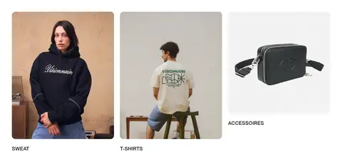
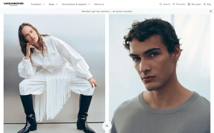
The visual system is built around a white canvas (#ffffff), black typography and fine black rules; the measured palette is intentionally spare. The pale cream (#f7f5e8) appears in measured text, while warm earth and garment colours belong primarily to the campaign photography rather than the interface palette. PP Neue Montreal carries everything, from oversized uppercase navigation to small, widely tracked product labels. The page alternates full-width, two-column campaign imagery with airy product grids, category cards, and a broad editorial image band. Product tiles keep their presentation quiet so the garment photography and names lead. Generous white gaps separate these different image densities, while fine borders and outlined pill-shaped “VOIR” links provide restrained interaction cues. The result feels like a fashion lookbook organized as a direct storefront: editorial imagery sets the mood, and minimal interface chrome keeps shopping legible.
Site-wide typeface for navigation, headings, product details, links, and forms.
角色
示例
字号
字重
行高
字距
一级标题
Primary campaign or page title, set in uppercase.
VISIONNAIRE
45px
500
1.15
0.016em
二级标题
Section headings such as latest pieces.
VISIONNAIRE
33px
500
1.5
0.021em
三级标题
Secondary editorial or category headings.
The quick brown fox 敏捷的狐狸
24px
500
1.2
0.029em
四级标题
Smaller supporting section headings.
The quick brown fox 敏捷的狐狸
21px
500
1.5
0.033em
正文
Product names, descriptions, and standard page copy.
The quick brown fox 敏捷的狐狸
14px
500
1.3
0.03em
辅助文字
Compact product and campaign captions.
The quick brown fox 敏捷的狐狸
11px
500
1.5
0.1em
导航
Large uppercase primary navigation labels.
VISIONNAIRE
33px
500
1.5
0.021em
链接
Small utility and product links.
The quick brown fox 敏捷的狐狸
11px
500
1.5
0.1em
眉题
Uppercase introductory labels above content.
The quick brown fox 敏捷的狐狸
12px
500
1.5
0.058em
间距与布局
基准单位 2px · 密度:宽松
50px版块间距
40px元素间距
30px卡片内边距
1340px内容最大宽度
1px
2px
4px
10px
15px
18px
20px
25px
35px
40px
50px
70px
A spacious, full-width storefront uses a measured page max width of 1340px, with the first campaign and later editorial imagery arranged in two columns. Product showcases use four columns, while the category band uses three. Sections alternate between dense image or product areas and generous white breathing room. Left-aligned section headings and compact labels keep the grid easy to scan; the newsletter and footer return to a simple single-column flow.
圆角与层次
图片 · 15px
链接 · 9999px
没有测到阴影:页面是扁平的,层次靠底色和描边区分。
The interface is predominantly flat: white sections meet without shadows, and product tiles rely on spacing rather than raised cards. Use thin black rules for structural separation and fine black outlines on controls. Campaign images sit flush in their grid; outlined pill links overlay photos as the main layered element.
组件
下面的预览按实测的按钮、输入框、徽标、卡片样式重建(字体用替代字体)。
Announcement strip
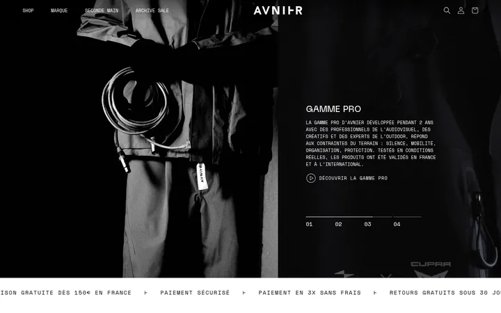
A narrow black bar at the very top repeats a compact white European free-shipping message.
Primary navigation
White horizontal header with a bold wordmark, large uppercase links, thin black dividers, and a compact bag icon.
Campaign tile
Large fashion photo in a two-column grid, with a white outlined pill link and small caption placed over the image.
Product card
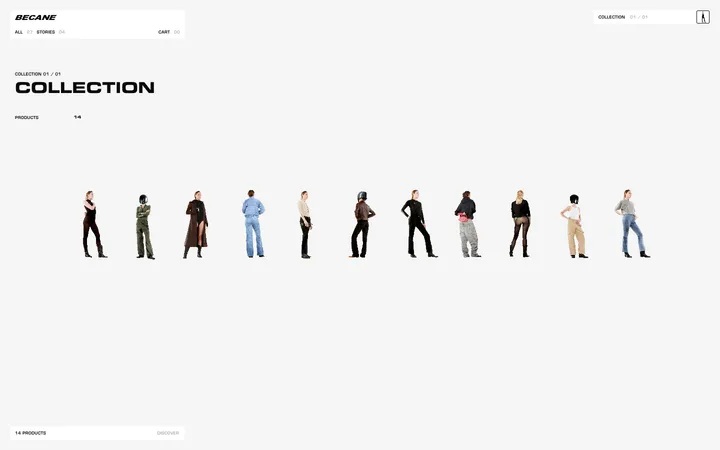
Centered garment image with compact uppercase name, size options, and price beneath; keep card chrome minimal.
Outlined action link
“VOIR” appears in uppercase white on photography inside a thin white outlined pill; other grid actions use restrained black outlines.
Newsletter form
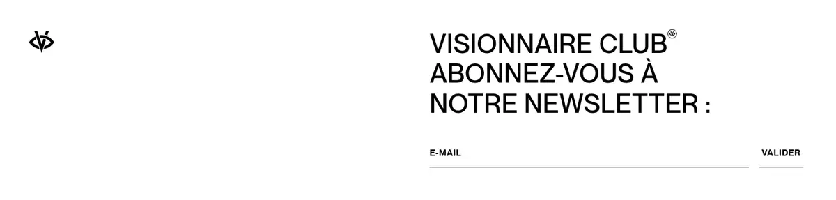
A white signup area pairs an uppercase multi-line heading with an email input underlined in black and a small validation action.
Footer links
A compact list of customer service, social, and legal links in small black type, with copyright aligned separately.
Imagery · Photography is the main expressive element: fashion models, styled campaign scenes, and product cutouts on pale backgrounds. Campaign imagery often fills its panel and is cropped to emphasize people, garments, and setting; product imagery stays centered and clean. The page’s warmer browns, greens, and creams come from photos and products, not additional interface colours. No illustrative or 3D style defines the page.
Let campaign photography occupy large, clean grid panels.
Keep product details compact and directly beneath images.
Use thin rules and outlined pills instead of filled UI chrome.
Leave broad white gaps between major storefront sections.
✕ 不该做
Do not add unmeasured interface colours.
Do not place shadows behind product cards.
Do not let decorative UI compete with garment photography.
Do not turn the product grid into heavy boxed cards.
Do not use dense paragraphs where short labels suffice.
Do not treat photo colours as brand-palette colours.
给 AI 的提示词
想快速出一个同风格的新页面,把这段话连同 DESIGN.md 一起发给 AI。
Build a fashion storefront page in the VISIONNAIRE visual style. Use Gallery White (#ffffff) as the canvas and Graphic Ink (#000000) for the wordmark, navigation, product details, rules, and footer; reserve Soft Ivory (#f7f5e8) for subtle muted text only. Use a clean sans-serif close to PP Neue Montreal, with medium-weight uppercase display and navigation text and widely tracked compact labels. Organize content into broad campaign-photo panels, a four-column product grid, and image-led category links, separated by generous white space. Keep imagery authentic and editorial, allowing its natural garment and setting colours to supply warmth. Use thin borders, outlined pill actions, flush image grids, and no shadows. Include a minimal newsletter form and compact utility footer. Prioritize clear shopping labels and a quiet interface around the photography.