Avoice以纯白画布和经典衬线标题呈现面向建筑事务所的AI工作空间。产品界面、客户评价和功能叙事构成页面的视觉内容,鲜明蓝色链接则点缀整体克制的黑白基调。
North star · Keep the page a white, editorial canvas; let product UI and restrained blue links provide the visual punctuation.
The page is built on an overwhelmingly white canvas, with black text and headings providing its main contrast. Classic Times New Roman carries most visible navigation, body copy, and headings, giving the page a distinctly editorial, browser-native character; Aspekta is used for compact uppercase labels and parts of the product interface. Links use vivid blue, while gray surfaces and fine pale borders gently distinguish interface panels without creating heavy section bands. The layout is exceptionally spacious and vertically long: navigation and hero copy lead into a large product-media frame, followed by testimonials and a sequence of workflow features. Product imagery does much of the visual work, introducing muted color, status badges, and occasional gradients inside mockups. Keep the overall presentation quiet and document-like; do not promote incidental mockup colors into the site's main brand palette.
配色 点色块复制色值。用途说明来自对页面的实测位置(背景、文字、描边、按钮)与截图判读。
强调色
Browser Blue
#0000ee
Links and selected navigation accents; the clearest chromatic brand signal.
Signal Lime
#cdfe00
High-contrast status badge in an interface mockup; use sparingly.
表层色
Soft Gray
#efefef
Subtle controls and light card or media surfaces.
Border Mist
#e9eaea
Thin card outlines and quiet separators around interface panels.
Panel Gray
#e1e2e3
Light section or card boundary detail in the interface visuals.
中性色
Gallery White
#ffffff
Dominant page canvas and open space around sections and product media.
Editorial Ink
#000000
Primary headings, body copy, navigation text, and dark interface details.
Deep Charcoal
#0a1217
Secondary interface copy, card text, and dark product badges.
功能色
Pale Lime
#eeffa6
Small badge detail inside product UI, not a page-wide surface color.
Plum Shadow
#3d2d35
Gradient color appearing within product imagery rather than the main page canvas.
Slate Fade
#6c7174
Gradient detail in product media, not a defining page color.
Ochre Label
#9a5f0e
Small text or badge detail inside illustrated product UI.
Workflow Green
#1a7f55
Minor status or badge color within product mockups.
Muted Amber
#9a6700
Small interface badge accent, not a primary CTA color.
UI Violet
#5b4678
Occasional badge color within product imagery.
Muted Lavender Gray
#85899b
Low-emphasis text detail, chiefly within product UI.
文字 背景 对比度 WCAG #000000 Editorial Ink#ffffff Gallery White21:1 AAA #000000 Editorial Ink#efefef Soft Gray18.26:1 AAA #0000ee Browser Blue#ffffff Gallery White9.4:1 AAA #0000ee Browser Blue#efefef Soft Gray8.17:1 AAA
字体 字号阶梯:Augmented Fourth(比例约 1.414,正文 16px)。示例用免费替代字体渲染,数值为实测。
Aa 设计
Times New Roman 系统字体 · 字重 400 / 700 · 占比 68%
免费替代:Tinos
Main headings, body copy, navigation, and links
Aa 设计
aspekta 系统字体 · 字重 400 / 450 / 600 / 500 / 700 · 占比 29%
免费替代:Inter
Product interface text, captions, and uppercase eyebrow labels
Aa 设计
Arial 系统字体 · 字重 400 · 占比 2%
免费替代:Arial
Button labels
Aa 设计
ui-monospace 系统字体 · 字重 400 / 700 · 占比 1%
免费替代:IBM Plex Mono
Code-like or technical labels
角色 示例 字号 字重 行高 字距 一级标题 Primary hero headline introducing the AI workspace.
Avoice
32px 700 normal 0 二级标题 Feature and section headings throughout the page.
The quick brown fox 敏捷的狐狸
24px 700 normal 0 正文 Default explanatory copy and testimonial text.
The quick brown fox 敏捷的狐狸
16px 400 normal 0 辅助文字 Compact supporting copy and product interface labels.
The quick brown fox 敏捷的狐狸
12.5px 400 1.5 -0.005em 按钮 Short labels on demo and navigation controls.
The quick brown fox 敏捷的狐狸
13.5px 400 normal 0 导航 Header links and navigation items.
The quick brown fox 敏捷的狐狸
16px 400 normal 0 链接 Inline navigation and feature links.
The quick brown fox 敏捷的狐狸
16px 400 normal 0 眉题 Small uppercase section or category labels.
The quick brown fox 敏捷的狐狸
9px 700 normal 0.12em 代码 Technical, code-like labels inside product demonstrations.
const style = 1;
10px 400 normal 0.11em
间距与布局 基准单位 2px · 密度:宽松
314px 版块间距
10px 元素间距
16px 卡片内边距
1424px 内容最大宽度
1px
2px
3px
4px
5px
6px
8px
9px
10px
11px
12px
14px
16px
19px
20px
The measured page uses a spacious single-column narrative with a measured maximum width of 1424px. The opening combines a compact announcement and navigation with a two-column hero and full-bleed product media. Testimonials and product capabilities continue as widely separated blocks, with occasional multi-column groupings. The measured section gap is 314px, so preserve strong vertical pauses rather than compressing the long page. Most section backgrounds remain white; use alignment and media placement, not colored bands, to distinguish content.
圆角与层次 hairline · media
hairline · other
The interface is mostly flat, with fine pale borders defining cards and media frames. A measured card radius of 12px appears on product panels; badges are pill-shaped. Shadows are minimal and limited to subtle media separation. Avoid layered shadows, dramatic depth, and heavy background blocks.
组件 下面的预览按实测的按钮、输入框、徽标、卡片样式重建(字体用替代字体)。
Announcement link A concise update appears as a vivid blue inline link near the top of the white canvas.
Header navigation Simple text navigation, language and account links, dropdown-style controls, and a demo action.
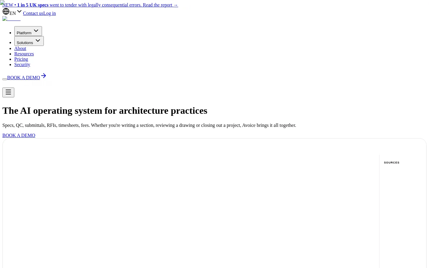
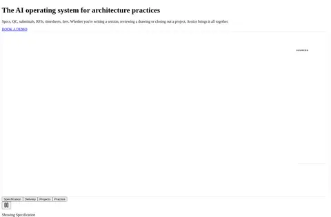
Hero and media frame Editorial serif headline and supporting copy introduce the product, followed by a large outlined product-media area.
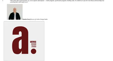
Testimonial blocks Long customer quotations are paired with attribution and customer imagery, separated by generous white space.
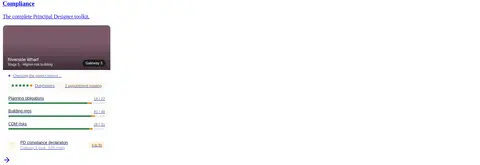
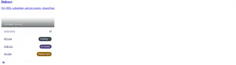
Workflow feature panels Specifications, compliance, delivery, project, practice, and knowledge are introduced with concise copy and interface previews.
Product UI cards Light interface panels use subtle outlines, occasional 12px card corners, and small rounded status badges.
Imagery · Product interface mockups are the central visual material, showing architectural workflows, records, and status details in pale panels. Testimonials include people or company imagery, but it is secondary to the software demonstrations. Frame large media with restrained rounded outlines and ample white surroundings. Let gradients, saturated badges, and green or purple details remain contained within mockups rather than spreading them across the page.
页面版块 共 15 个版块,按页面从上到下排列,每个都标了类型、布局和交互套路。
该做与不该做 ✓ 该做 Use white as the dominant canvas. Set main editorial headings in a serif face. Use blue for links and restrained accents. Keep generous vertical separation between content blocks. Use pale hairlines to define product panels. Keep bright badge colors inside mockups. Let product imagery carry most visual detail. ✕ 不该做 Do not introduce broad colored section bands. Do not replace the editorial serif character with all-sans typography. Do not apply mockup badge colors to the whole page. Do not use heavy shadows or layered cards. Do not compress the long-form vertical rhythm. Do not turn understated controls into oversized decorative CTAs. 给 AI 的提示词 想快速出一个同风格的新页面,把这段话连同 DESIGN.md 一起发给 AI。
复制 Build a new Avoice-style page as a quiet editorial canvas for architecture software. Use Gallery White (#ffffff) for most backgrounds, Editorial Ink (#000000) for primary copy, and Browser Blue (#0000ee) for links. Pair serif headings and body copy with compact sans-serif interface labels; keep button text plain. Organize the page as a long, spacious narrative with a clear announcement and navigation, a copy-led hero, broad product media, and distinct feature and testimonial blocks. Use Soft Gray (#efefef) for occasional surfaces and Border Mist (#e9eaea) for fine panel outlines. Let Lime and other saturated colors appear only inside product UI mockups. Keep cards mostly flat, with restrained corners, minimal shadow, and ample white space.
DESIGN.md Tailwind v4 CSS 变量 Design Tokens
---
title: "Avoice design system"
variant: extended
source: https://www.avoice.co/
captured_at: 2026-10-12
theme: light
industry: ai
generator: Design DNA (https://four.wiralomi.com/style/avoice-co)
ai_generated: true
ai_label: "本文件由 AI 辅助生成:数值取自公开网页的实测样式,命名、用途说明与建议为模型解读。商标归原所有者。 / AI-assisted content"
---
# Avoice · Design System
> A quiet editorial canvas for architectural software
**Theme:** light · **Industry:** ai · **Source:** https://www.avoice.co/ · **Captured:** 2026-10-12 (1440×900 desktop)
_AI-assisted content: values are measured from the public page at capture time; names, roles and guidance are model-written interpretations. Trademarks belong to their owners._
Avoice pairs a stark white canvas and classic serif headings with restrained interface details to present an AI workspace for architecture practices. Product screens, testimonials, and feature narratives provide the colour and texture, while vivid blue links punctuate the otherwise monochrome page.
## North star
Keep the page a white, editorial canvas; let product UI and restrained blue links provide the visual punctuation.
## Overview
The page is built on an overwhelmingly white canvas, with black text and headings providing its main contrast. Classic Times New Roman carries most visible navigation, body copy, and headings, giving the page a distinctly editorial, browser-native character; Aspekta is used for compact uppercase labels and parts of the product interface. Links use vivid blue, while gray surfaces and fine pale borders gently distinguish interface panels without creating heavy section bands. The layout is exceptionally spacious and vertically long: navigation and hero copy lead into a large product-media frame, followed by testimonials and a sequence of workflow features. Product imagery does much of the visual work, introducing muted color, status badges, and occasional gradients inside mockups. Keep the overall presentation quiet and document-like; do not promote incidental mockup colors into the site's main brand palette.
## Colors
| Name | Hex | Token | Group | Role |
|---|---|---|---|---|
| Gallery White | ` | `--color-gallery-white` | neutral | Dominant page canvas and open space around sections and product media. |
| Editorial Ink | ` | `--color-editorial-ink` | neutral | Primary headings, body copy, navigation text, and dark interface details. |
| Browser Blue | ` | `--color-browser-blue` | accent | Links and selected navigation accents; the clearest chromatic brand signal. |
| Pale Lime | ` | `--color-pale-lime` | semantic | Small badge detail inside product UI, not a page-wide surface color. |
| Soft Gray | ` | `--color-soft-gray` | surface | Subtle controls and light card or media surfaces. |
| Plum Shadow | ` | `--color-plum-shadow` | semantic | Gradient color appearing within product imagery rather than the main page canvas. |
| Signal Lime | ` | `--color-signal-lime` | accent | High-contrast status badge in an interface mockup; use sparingly. |
| Slate Fade | ` | `--color-slate-fade` | semantic | Gradient detail in product media, not a defining page color. |
| Ochre Label | ` | `--color-ochre-label` | semantic | Small text or badge detail inside illustrated product UI. |
| Border Mist | ` | `--color-border-mist` | surface | Thin card outlines and quiet separators around interface panels. |
| Workflow Green | ` | `--color-workflow-green` | semantic | Minor status or badge color within product mockups. |
| Muted Amber | ` | `--color-muted-amber` | semantic | Small interface badge accent, not a primary CTA color. |
| UI Violet | ` | `--color-ui-violet` | semantic | Occasional badge color within product imagery. |
| Panel Gray | ` | `--color-panel-gray` | surface | Light section or card boundary detail in the interface visuals. |
| Deep Charcoal | ` | `--color-deep-charcoal` | neutral | Secondary interface copy, card text, and dark product badges. |
| Muted Lavender Gray | ` | `--color-muted-lavender-gray` | semantic | Low-emphasis text detail, chiefly within product UI. |
### Semantic aliases
`--color-canvas` → ` (Gallery White) · `--color-surface` → ` (Soft Gray) · `--color-text` → ` (Editorial Ink) · `--color-border` → ` (Border Mist) · `--color-accent` → ` (Browser Blue)
### Contrast (WCAG 2.x)
| Text | Background | Ratio | Level |
|---|---|---|---|
| ` | ` | 21:1 | AAA |
| ` | ` | 18.26:1 | AAA |
| ` | ` | 9.4:1 | AAA |
| ` | ` | 8.17:1 | AAA |
### Gradients
- `linear-gradient(rgba(0, 0, 0, 0) 40%, rgba(0, 0, 0, 0.5))`
- `linear-gradient(rgba(10, 18, 23, 0) 35%, rgba(10, 18, 23, 0.6))`
## Typography
| Family | Token | Source | Weights | Role | Free substitute |
|---|---|---|---|---|---|
| Times New Roman | `--font-body` | system | 400, 700 | Main headings, body copy, navigation, and links | Tinos |
| aspekta | `--font-aspekta` | system | 400, 450, 600, 500, 700 | Product interface text, captions, and uppercase eyebrow labels | Inter |
| Arial | `--font-arial` | system | 400 | Button labels | Arial |
| ui-monospace | `--font-mono` | system | 400, 700 | Code-like or technical labels | IBM Plex Mono |
- **Times New Roman:** Classic editorial serif; measured headings are bold, while navigation and body text are regular.
- **aspekta:** Use compact sans-serif labels and interface copy; eyebrow treatment is uppercase with generous tracking.
- **Arial:** Plain, regular-weight button text; keep controls understated.
- **ui-monospace:** Small technical text with conspicuously tracked characters.
### Type scale — Augmented Fourth (ratio ≈ 1.414, base 16px)
| Role | Size | Weight | Line height | Letter spacing | Case | Family | Used for |
|---|---|---|---|---|---|---|---|
| h1 | 32px | 700 | normal | 0 | — | Times New Roman | Primary hero headline introducing the AI workspace. |
| h2 | 24px | 700 | normal | 0 | — | Times New Roman | Feature and section headings throughout the page. |
| body | 16px | 400 | normal | 0 | — | Times New Roman | Default explanatory copy and testimonial text. |
| caption | 12.5px | 400 | 1.5 | -0.005em | — | aspekta | Compact supporting copy and product interface labels. |
| button | 13.5px | 400 | normal | 0 | — | Arial | Short labels on demo and navigation controls. |
| nav | 16px | 400 | normal | 0 | — | Times New Roman | Header links and navigation items. |
| link | 16px | 400 | normal | 0 | — | Times New Roman | Inline navigation and feature links. |
| eyebrow | 9px | 700 | normal | 0.12em | uppercase | aspekta | Small uppercase section or category labels. |
| code | 10px | 400 | normal | 0.11em | — | ui-monospace | Technical, code-like labels inside product demonstrations. |
## Spacing & layout
- Base unit **2px**, density **spacious**.
- Scale (most used values): 1, 2, 3, 4, 5, 6, 8, 9, 10, 11, 12, 14, 16, 19, 20 px.
- Section rhythm 314px · element gap 10px · card padding 16px · max content width 1424px.
The measured page uses a spacious single-column narrative with a measured maximum width of 1424px. The opening combines a compact announcement and navigation with a two-column hero and full-bleed product media. Testimonials and product capabilities continue as widely separated blocks, with occasional multi-column groupings. The measured section gap is 314px, so preserve strong vertical pauses rather than compressing the long page. Most section backgrounds remain white; use alignment and media placement, not colored bands, to distinguish content.
## Shape & elevation
- Radius: card `12px` · media `50%` · badge `9999px` · xs `3px` · sm `6px` · md `7px` · lg `10px` · xl `12px` · pill `9999px`
- Shadow `hairline` (media): `rgba(10, 18, 23, 0.15) 0px 1px 2px 0px`
- Shadow `hairline-2` (other): `rgb(236, 236, 234) 0px 0px 0px 1px`
The interface is mostly flat, with fine pale borders defining cards and media frames. A measured card radius of 12px appears on product panels; badges are pill-shaped. Shadows are minimal and limited to subtle media separation. Avoid layered shadows, dramatic depth, and heavy background blocks.
## Imagery
Product interface mockups are the central visual material, showing architectural workflows, records, and status details in pale panels. Testimonials include people or company imagery, but it is secondary to the software demonstrations. Frame large media with restrained rounded outlines and ample white surroundings. Let gradients, saturated badges, and green or purple details remain contained within mockups rather than spreading them across the page.
## Components
### Announcement link
A concise update appears as a vivid blue inline link near the top of the white canvas.
### Header navigation
Simple text navigation, language and account links, dropdown-style controls, and a demo action.
### Hero and media frame
Editorial serif headline and supporting copy introduce the product, followed by a large outlined product-media area.
### Testimonial blocks
Long customer quotations are paired with attribution and customer imagery, separated by generous white space.
### Workflow feature panels
Specifications, compliance, delivery, project, practice, and knowledge are introduced with concise copy and interface previews.
### Product UI cards
Light interface panels use subtle outlines, occasional 12px card corners, and small rounded status badges.
### Measured component styles
- **Primary button** (“Platform”): background ## Do
- Use white as the dominant canvas.
- Set main editorial headings in a serif face.
- Use blue for links and restrained accents.
- Keep generous vertical separation between content blocks.
- Use pale hairlines to define product panels.
- Keep bright badge colors inside mockups.
- Let product imagery carry most visual detail.
## Don't
- Do not introduce broad colored section bands.
- Do not replace the editorial serif character with all-sans typography.
- Do not apply mockup badge colors to the whole page.
- Do not use heavy shadows or layered cards.
- Do not compress the long-form vertical rhythm.
- Do not turn understated controls into oversized decorative CTAs.
## Agent prompt
Build a new Avoice-style page as a quiet editorial canvas for architecture software. Use Gallery White (## Page sections (top to bottom)
| # | Type | Layout | UX patterns | UI patterns |
|---|---|---|---|---|
| 1 | navigation | Compact announcement and account links above a vertically arranged primary navigation in the captured viewport. | Announcement link, Language selector, Dropdown navigation, Demo action | Blue inline link, Plain black text, Simple controls |
| 2 | hero | Two-column introductory area followed by a wide product-media frame. | Product introduction, Demo CTA | Serif headline, Large outlined media area |
| 3 | testimonials | A broad testimonial band with customer quote and supporting imagery. | Customer proof, Quote and attribution | Editorial quotation, Customer image |
| 4 | testimonials | Single testimonial block with company imagery and substantial whitespace. | Customer proof, Attributed quote | Quote text, Logo or media panel |
| 5 | testimonials | Single customer quote presented as a spacious standalone block. | Customer proof, Named attribution | Editorial copy, Supporting image |
| 6 | testimonials | Full-bleed media-led testimonial section. | Customer proof, Service feedback | Large media area, Quote attribution |
| 7 | other | Feature title and concise promise paired with a product interface preview. | Feature discovery, Product demonstration | Specification UI, Status badge |
| 8 | other | Feature copy with a dense compliance interface preview. | Feature discovery, Compliance overview | Project record, Checklist and status indicators |
| 9 | other | Feature copy with a compact list-based workflow preview. | Issue tracking, Workflow status | Task list, Colored status badges |
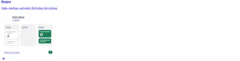
| 10 | feature-grid | Three-column feature grouping with project task interface previews. | Task organization, Project overview | Kanban-style interface, Compact previews |
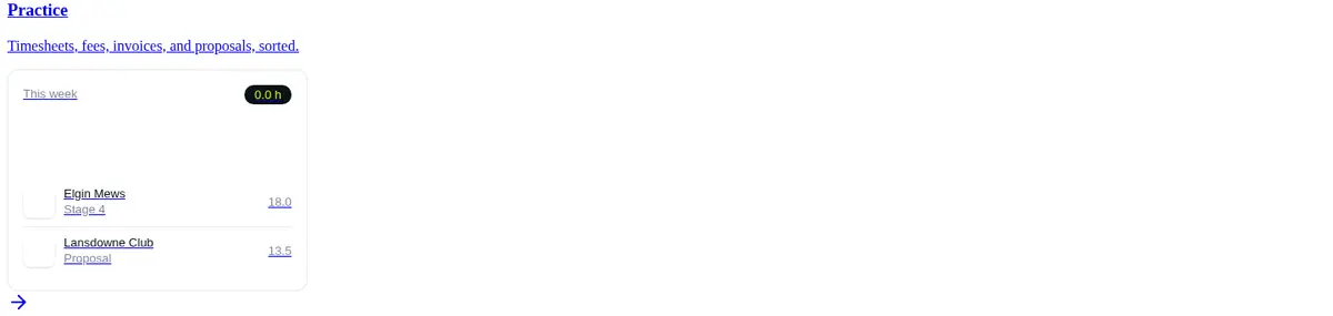
| 11 | other | Single feature block with a timesheet and fee-management preview. | Practice operations, Time tracking | Hours indicator, Project rows |
| 12 | other | Feature introduction followed by a knowledge-focused interface visual. | Knowledge discovery, Practice context | AI knowledge interface, Sparse product panel |
| 13 | product-showcase | Long product narrative with supporting specification workflow visuals. | Feature explanation, Explore link | Document workflow, Interface diagrams |
| 14 | product-showcase | Two related product narratives with supporting diagrams and links. | QA/QC discovery, Agent mode | Drawing review visuals, Feature links |
| 15 | product-showcase | Contract-administration feature story with supporting product diagrams. | Submittal review, Explore link | Connected review workflow, Traceable decisions |
---
本文件由 AI 辅助生成:数值取自公开网页的实测样式,命名、用途说明与建议为模型解读。商标归原所有者。
Generated by Design DNA · https://four.wiralomi.com/style/avoice-co