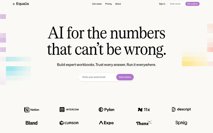
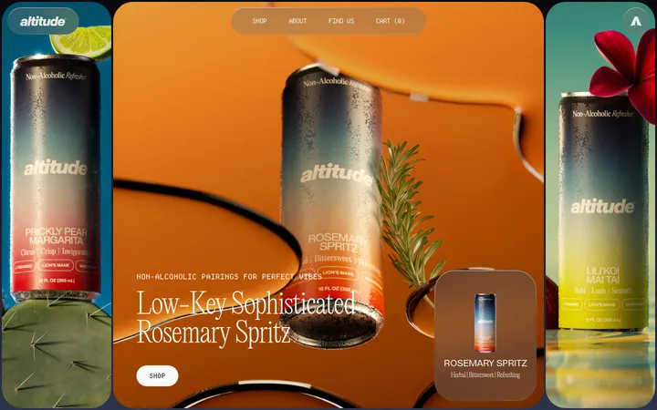
North star · Keep the page calm and spacious, letting real product interfaces and precise neutral typography carry the story.
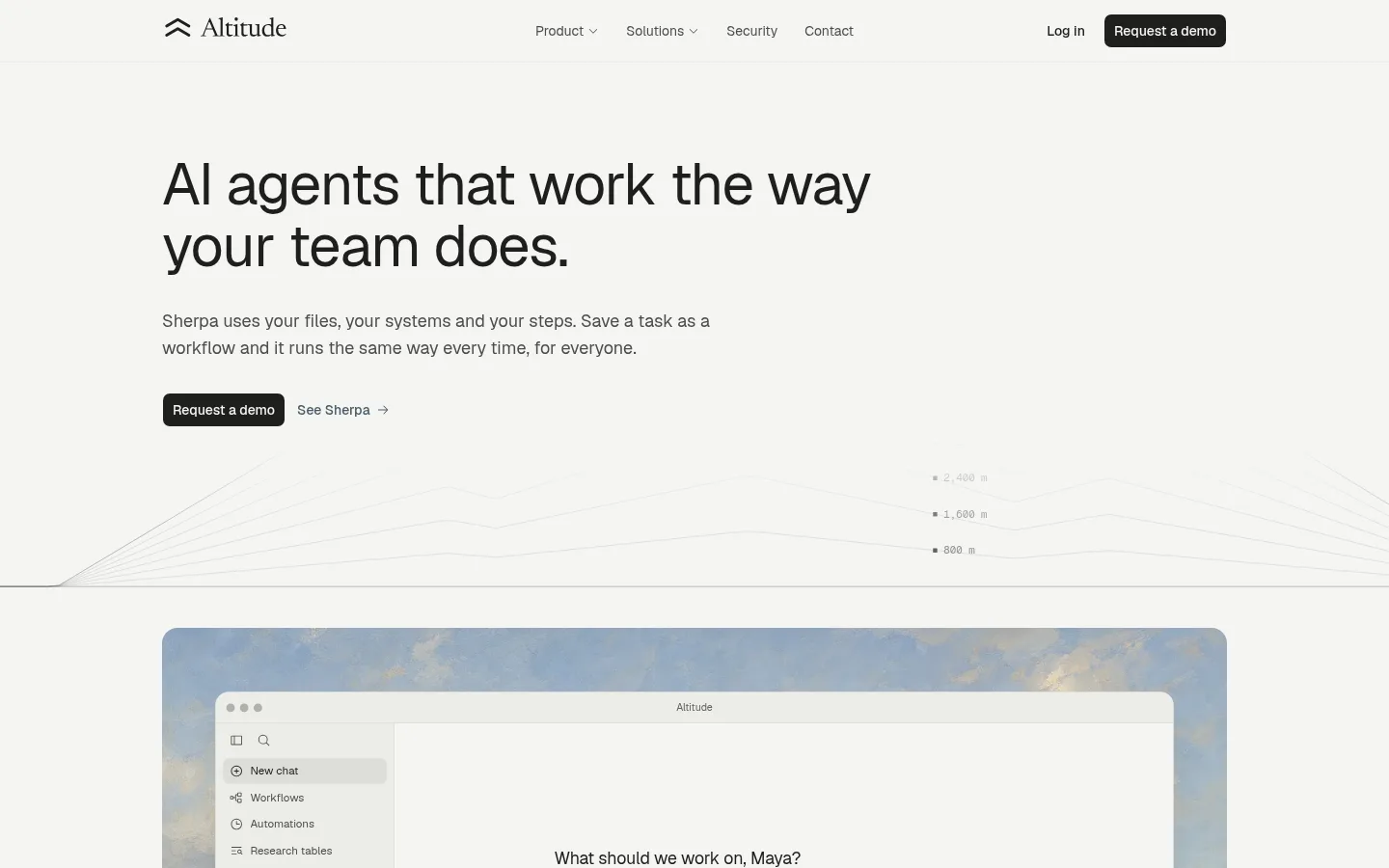
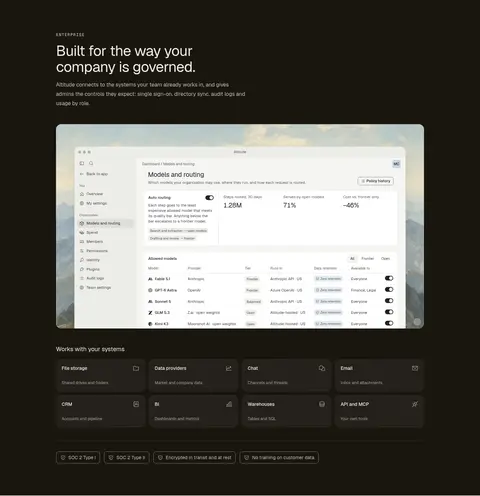
The visual strategy is quiet and product-led: a warm off-white canvas carries most of the page, with charcoal typography, pale neutral surfaces, and fine gray hairlines doing the structural work. Black CTA buttons provide the clearest high-contrast action, while a nearly black enterprise band creates a deliberate tonal pause late in the page. Typography uses Geist Variable for clear, contemporary sans-serif headlines, navigation, and compact body copy; an uppercase Geist Mono eyebrow adds a restrained technical cue. The layout is centered within a measured 1104px maximum width, with left-aligned copy and broad gaps between sections. Repeated product screenshots sit in softly rounded frames, often against muted landscape backdrops, making interface details the primary imagery. Cards and workflow examples remain understated: white or pale fills, thin borders, and selective subtle shadow rather than decorative effects.
配色
点色块复制色值。用途说明来自对页面的实测位置(背景、文字、描边、按钮)与截图判读。
品牌色
强调色
表层色
中性色
功能色
页面底色 · Warm Canvas表层 · Stone Surface表层 2 · Paper White表层 3 · Night Umber主文字 · Charcoal Ink次要文字 · Soft Graphite弱文字 · Ash Text描边 · Quiet Hairline强调 · Bronze Accent
文字
背景
对比度
WCAG
#1f1f1d Charcoal Ink
#f5f5f2 Warm Canvas
15.11:1
AAA
#1f1f1d Charcoal Ink
#edede9 Stone Surface
14.07:1
AAA
#1f1f1d Charcoal Ink
#ffffff Paper White
16.51:1
AAA
#1f1f1d Charcoal Ink
#19160f Night Umber
1.09:1
不达标
#4d4d4a Soft Graphite
#f5f5f2 Warm Canvas
7.76:1
AAA
#4d4d4a Soft Graphite
#edede9 Stone Surface
7.23:1
AAA
字体
字号阶梯:Custom(比例约 1.84,正文 13px)。示例用免费替代字体渲染,数值为实测。
Aa 设计
Geist Variable
网络字体 · 字重 400 / 500 / 600 · 占比 93%
免费替代:Inter
Headings, body copy, navigation, links, buttons, and product interface text.
Aa 设计
Geist Mono Variable
网络字体 · 字重 400 / 500 · 占比 7%
免费替代:IBM Plex Mono
Uppercase eyebrow labels and compact code-like details.
角色
示例
字号
字重
行高
字距
一级标题
Large, regular-weight hero headline with tight tracking.
Altitude
44px
400
1.1
-0.02em
二级标题
Section headings and supporting display copy.
The quick brown fox 敏捷的狐狸
18px
400
1.56
0
正文
Compact descriptive copy, feature explanations, and interface text.
The quick brown fox 敏捷的狐狸
13px
400
1.38
0
辅助文字
Small labels and supporting details within product examples.
The quick brown fox 敏捷的狐狸
12px
400
1.33
0
按钮
CTA and compact control labels.
The quick brown fox 敏捷的狐狸
12px
400
1.83
0
导航
Top navigation labels and footer navigation.
The quick brown fox 敏捷的狐狸
14px
400
1.43
0
链接
Inline actions and text links, slightly emphasized over body.
The quick brown fox 敏捷的狐狸
14px
500
1.43
0
眉题
Uppercase monospace section labels and category markers.
The quick brown fox 敏捷的狐狸
12px
500
1.33
0.12em
代码
Small monospace technical or code-style interface details.
const style = 1;
11px
400
1.33
0
间距与布局
基准单位 4px · 密度:宽松
96px版块间距
8px元素间距
—卡片内边距
1104px内容最大宽度
1px
2px
4px
6px
8px
10px
12px
16px
20px
24px
A centered page shell uses the measured 1104px maximum width, with left-aligned editorial copy and two-column arrangements where product previews accompany text. The hero has generous open space before a broad interface image. Below, feature narratives alternate between concise copy, small cards, and wide product frames. Sections are separated by spacious vertical gaps, keeping the long page airy rather than dense. A full-width dark enterprise band provides the principal rhythm change; FAQ, CTA, and footer return to the light canvas.
圆角与层次
按钮 · 8px
输入框 · 8px
卡片 · 12px
图片 · 3px
徽标 · 6px
导航 · 4px
链接 · 12px
lg · card
hairline · button, other, card
md · other, card, button
sm · card
The page favors flat surfaces and thin borders over pronounced depth. Pale and white cards are separated with #dededa hairlines; selected product windows use subtle, soft shadows for separation. Rounded image and card frames organize layers without glossy effects. Keep shadows understated and reserve stronger visual contrast for the dark section and CTA buttons.
组件
下面的预览按实测的按钮、输入框、徽标、卡片样式重建(字体用替代字体)。
Primary CTA
Compact dark button using #1f1f1d against #f5f5f2, with an 8px measured radius and medium Geist text.
Text action
Unfilled inline action beside the main CTA; muted slate-blue link color and a small directional arrow.
Product preview frame
Large application screenshots sit in rounded frames with restrained borders and occasional soft window shadow.
Workflow card
White or pale card with a thin neutral border, compact copy, and functional interface details rather than ornament.
Eyebrow label
Small uppercase Geist Mono label with expanded tracking, introducing sections such as enterprise or workflow features.
Status badge
Compact rounded status pill, using pale blue-gray background and slate text for interface state.
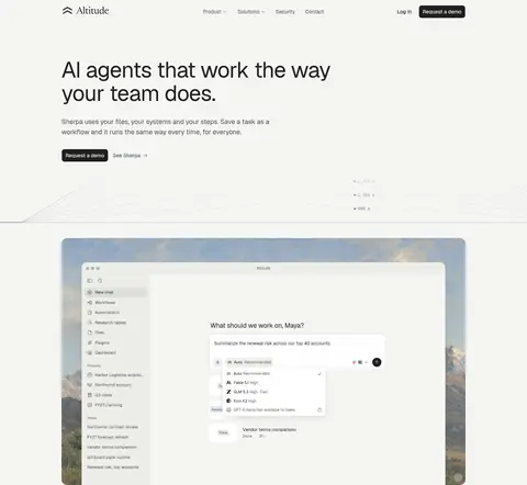
Imagery · Product UI screenshots are the dominant imagery: wide application windows, document previews, tables, workflow cards, and mobile or chat examples. Many are framed by rounded panels over muted landscape imagery, while some card grids show interface snippets directly. The hero includes fine, low-contrast chart-like linework. Treat screenshots as product evidence, not decoration; preserve their crisp details and keep surrounding colors restrained.
Set headings in large, regular-weight Geist-style sans-serif.
Keep copy and navigation aligned to a centered page shell.
Use #dededa for quiet card and control borders.
Show product interfaces in broad, softly rounded frames.
Reserve #19160f for the enterprise contrast section.
Keep warm accent colors rare and subordinate.
✕ 不该做
Do not introduce saturated gradients or vivid decorative color.
Do not crowd sections with dense, edge-to-edge copy.
Do not add heavy shadows to every card.
Do not make the interface screenshots look like generic illustrations.
Do not use the dark section treatment across the whole page.
Do not replace the restrained text hierarchy with bold display styling.
给 AI 的提示词
想快速出一个同风格的新页面,把这段话连同 DESIGN.md 一起发给 AI。
Build a new AI product page in Altitude’s quiet, product-led style. Use Warm Canvas (#f5f5f2) for the main page, Charcoal Ink (#1f1f1d) for headings and dark CTA buttons, and Quiet Hairline (#dededa) for restrained borders. Use Paper White (#ffffff) and Stone Surface (#edede9) for interface cards. Set a spacious centered content shell, left-aligned editorial copy, compact navigation, and large product screenshots in softly rounded frames. Use regular-weight Geist-like sans-serif typography, with small uppercase monospace eyebrow labels. Make one full-width Night Umber (#19160f) section a deliberate contrast point. Keep the overall treatment flat, with subtle shadows only where a product frame needs separation; avoid decorative gradients and excessive accent color.