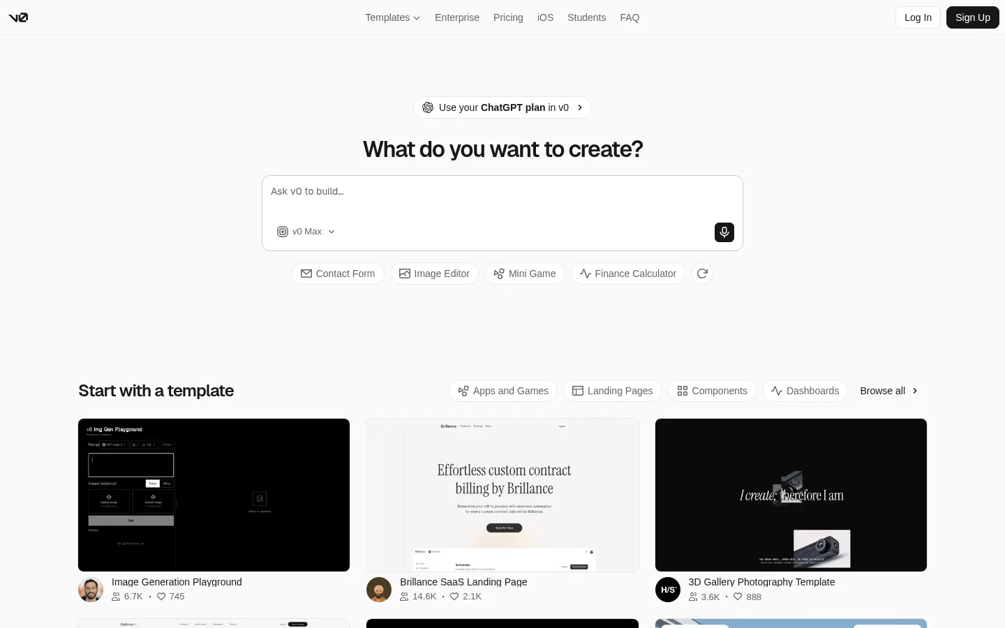
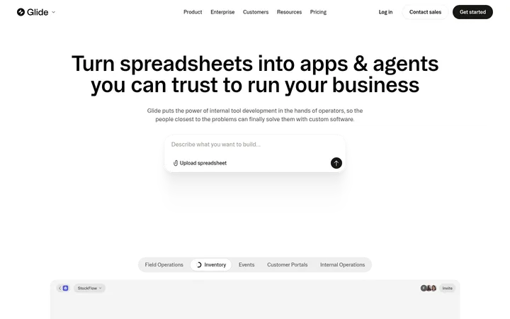
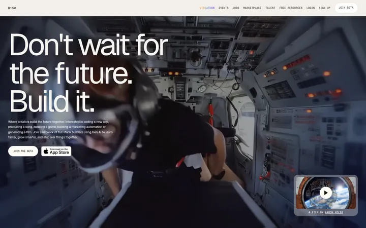
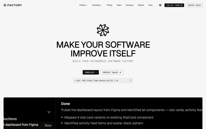
v0 以克制的黑白灰界面呈现 AI 应用构建体验,页面核心是居中的提示输入框。下方模板画廊结合清晰的浏览控件与风格各异的项目预览。
North star · Keep the interface quiet and monochrome so the creation prompt and template previews carry the visual attention.
The page uses a near-white canvas and a tight monochrome palette to keep attention on the prompt and the work users can create. Near-black headings and primary actions supply contrast; muted gray supports navigation, secondary labels, and compact metadata, while pale gray borders outline controls and cards without heavy framing. GeistSans gives display headings a firm, slightly condensed feel through negative tracking, while Inter handles navigation, body copy, and buttons with a practical, even rhythm. A narrow, centered creation area leads into a wider three-column template gallery, where the previews provide the strongest visual variation: dark interfaces, editorial landing pages, and photographic compositions. Generous vertical separation makes the page feel open despite its dense gallery content. Rounded pills, input surfaces, and card corners soften the otherwise crisp, utilitarian system. Keep color and decoration subordinate to readable controls and vivid template previews.
Navigation, body copy, buttons, captions, and template labels.
Aa 设计
GeistSans
网络字体 · 字重 600 / 500 · 占比 15%
免费替代:Inter
Primary and secondary display headings.
角色
示例
字号
字重
行高
字距
一级标题
Centered primary creation question above the prompt.
v0
32px
600
1.25
-0.04em
二级标题
Template gallery section heading.
The quick brown fox 敏捷的狐狸
24px
600
1.33
-0.04em
正文
Prompt labels, navigation, and template metadata.
The quick brown fox 敏捷的狐狸
14px
500
1
0
辅助文字
Small supporting labels and compact gallery details.
The quick brown fox 敏捷的狐狸
13px
400
1
0
按钮
Pill actions, account controls, and prompt suggestions.
The quick brown fox 敏捷的狐狸
14px
500
1.43
0
导航
Top navigation links and category browsing controls.
The quick brown fox 敏捷的狐狸
14px
500
1.43
0
间距与布局
基准单位 4px · 密度:宽松
192px版块间距
6px元素间距
—卡片内边距
690px内容最大宽度
4px
6px
8px
12px
16px
24px
A slim top navigation spans the viewport, with the brand at left, links centered, and account actions at right. The hero is centered around a narrow prompt area, while the template gallery expands into a three-column grid within a wider page container. Strong vertical separation distinguishes creation from browsing. Headings and prompt content are center-aligned; gallery titles and cards align to the grid. Overall density is spacious above the fold, then becomes more information-rich around the template previews.
圆角与层次
按钮 · 9999px
卡片 · 8px
导航 · 6px
hairline · card
lg · button
hairline · card
The interface is mostly flat, using pale hairline borders to separate controls and cards from the canvas. Rounded card edges and the prompt outline define layers more than shadows do. Reserve subtle elevation for interactive emphasis; avoid heavy shadows or stacked decorative panels.
组件
下面的预览按实测的按钮、输入框、徽标、卡片样式重建(字体用替代字体)。
Top navigation
Brand mark at left, centered text links, and right-aligned Log In and dark Sign Up controls.
Creation prompt
Centered prompt area with a question heading, white rounded input surface, muted placeholder, model selector, and dark action icon.
Prompt suggestions
Compact rounded suggestion controls with small line icons and muted labels beneath the main prompt.
Template category filters
Small pill-like category controls sit beside the gallery heading, followed by a Browse all link.
Template cards
Three-column gallery cards pair wide rounded previews with a title and compact creator or engagement metadata.
Account actions
Log In uses a light surface and border; Sign Up uses a near-black fill with light text.
Imagery · Template cards contain the page’s main visual variety: dark product interfaces, light editorial layouts, and photographic or image-led compositions. Keep previews in consistent, wide card frames with softly rounded corners; do not recolor or over-style their contents. The gallery imagery is product work, not a cue to introduce additional brand colors into the surrounding interface.
Keep the main canvas near-white and the interface monochrome.
Use a centered, prominent creation prompt.
Separate the hero and gallery with generous whitespace.
Use GeistSans for display headings and Inter for interface text.
Frame template previews consistently with rounded corners.
Use muted gray for secondary copy and navigation.
✕ 不该做
Do not add bright accent colors to the surrounding UI.
Do not crowd the creation prompt with extra panels.
Do not use heavy shadows as a default card treatment.
Do not make navigation or metadata compete with the main heading.
Do not flatten the varied template artwork into one visual style.
Do not add unmeasured spacing, sizing, or color values.
给 AI 的提示词
想快速出一个同风格的新页面,把这段话连同 DESIGN.md 一起发给 AI。
Build a new v0-style page with a quiet, near-white Canvas White (#fafafa) foundation and a restrained monochrome interface. Use Carbon Ink (#171717) for strong headings and primary actions, Soft Graphite (#666666) for secondary labels, and Mist Border (#e7e7e7) for subtle outlines; reserve Silver Edge (#c9c9c9) for prompt framing and Fog Wash (#f2f2f2) for a faint navigation tint. Set display headings in GeistSans-like semibold with tight tracking, and interface copy in Inter. Center the main task area, then transition into a wider, aligned card gallery with varied project previews. Keep the top navigation low-profile, controls rounded, borders light, and shadows nearly absent. Preserve generous whitespace and make functional hierarchy clearer than decoration.