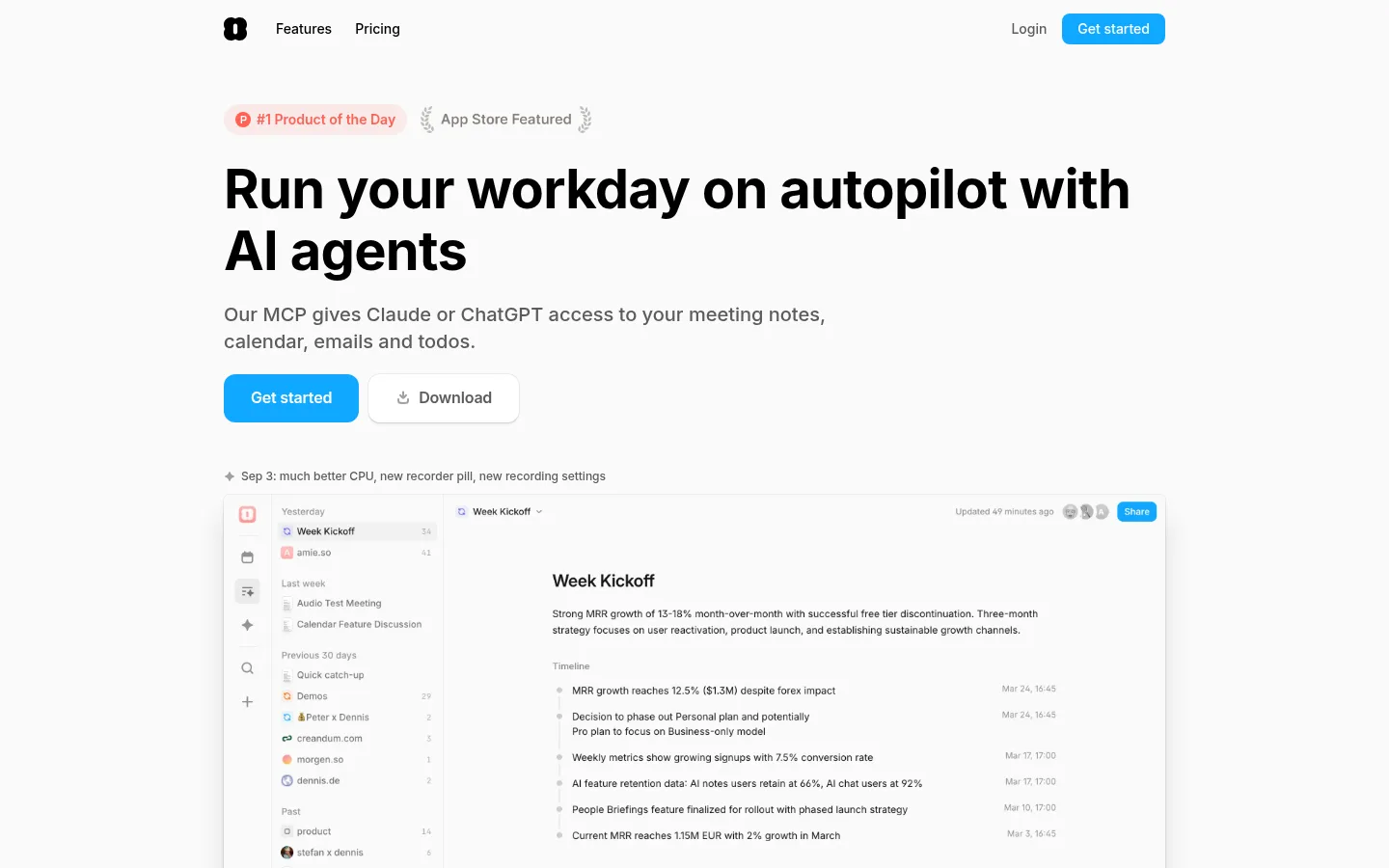
Amie 首页以近白背景和醒目的黑色标题为主,用明亮蓝色按钮突出关键操作。页面通过宽松的长篇产品叙事、界面截图和工作流示例,呈现实用且易上手的 AI 助手。
North star · Keep the page calm and near-white, using bold black typography and vivid blue only to direct attention to actions and product moments.
The visual system is led by a near-white canvas (#fafafa), black headings, and subdued gray body copy, creating a quiet workspace-like backdrop for a product story that spans many sections. Inter is used throughout: large, heavy display headings carry the message, while regular-weight body text stays compact and readable. Bright blue (#11a8ff) marks the primary “Get started” actions and selected interface details; related pale and mid blues appear mainly in gradients and product visuals rather than as broad page bands. The layout centers content in a measured maximum width, with generous vertical breathing room between sections and tighter spacing within explanatory text and feature groups. Product screenshots do much of the visual storytelling, showing real interface structures inside lightly elevated, rounded panels. Fine gray borders and soft shadows separate those panels without making the page feel boxed in. Small green, pink, and multicolor details are largely confined to badges, partner marks, and product imagery.
All page typography, from navigation and body copy to display headings and buttons.
角色
示例
字号
字重
行高
字距
特大标题
Oversized hero and prominent section headline moments.
Amie
56px
700
1.14
-0.012em
一级标题
Main page headline and major feature section titles.
Amie
40px
700
1.36
-0.012em
二级标题
Subsection headings and compact feature-group titles.
The quick brown fox 敏捷的狐狸
20px
600
1.4
-0.025em
正文
Explanatory paragraphs, product details, and supporting descriptions.
The quick brown fox 敏捷的狐狸
16px
400
1.75
0
辅助文字
Metadata, testimonial details, and small supporting labels.
The quick brown fox 敏捷的狐狸
14px
400
1.5
0
按钮
Primary and secondary action labels.
The quick brown fox 敏捷的狐狸
16px
600
1.6
-0.012em
间距与布局
基准单位 4px · 密度:适中
48px版块间距
8px元素间距
—卡片内边距
976px内容最大宽度
2px
4px
6px
8px
10px
12px
16px
20px
24px
28px
32px
40px
48px
192px
The page uses a centered content column with a measured maximum width of 976px, with the hero and product examples aligned to that shared frame. Headings and content are mostly left-aligned, while selected milestone or timeline messaging is centered. A comfortable density and generous section gaps create a long, editorial scroll; related copy and controls stay grouped closely. Product screenshots can span much of the content width, while text blocks and feature columns remain more compact.
圆角与层次
按钮 · 12px
卡片 · 12px
图片 · 8px
导航 · 8px
链接 · 9999px
inset · other
sm · card, button
inset · other
sm · card
Most of the page stays visually flat against the near-white canvas. Product cards and screenshots gain separation from soft, low-opacity shadows and fine light borders, with rounded corners. Keep elevation restrained; do not add heavy outlines or deep dramatic shadows.
组件
下面的预览按实测的按钮、输入框、徽标、卡片样式重建(字体用替代字体)。
Primary CTA
Bright #11a8ff fill with white semibold Inter text and rounded corners; the main Get started action is visually prominent.
Secondary download button
White button with muted gray label, rounded corners, and a delicate shadow that distinguishes it from the canvas.
Top navigation
Compact logo and simple text links sit on the shared centered frame; Login is muted and Get started is a small blue button.
Product showcase
Wide app screenshots sit within rounded, lightly elevated frames, allowing realistic product UI to carry feature explanations.
Feature narrative
Short section labels and bold headings introduce concise explanatory paragraphs, followed by interface examples or supporting details.
Social proof
Partner marks, review snippets, and testimonials appear as understated supporting evidence rather than high-contrast standalone cards.
Imagery · Product interface captures are the primary imagery: meeting summaries, email workflows, calendars, and integrations are framed as clean desktop app views. They sit in rounded panels with subtle borders or shadows, often with blue or multicolor gradient accents inside the artwork. Small partner logos and illustrative interface details support the narrative; imagery is product-led rather than photographic.
Set headlines in bold black Inter with compact tracking.
Reserve #11a8ff for primary actions and focused highlights.
Let product screenshots demonstrate the workflow.
Use muted gray for supporting copy and metadata.
Separate sections with generous whitespace.
Keep card shadows and borders soft and restrained.
✕ 不该做
Do not introduce large saturated color bands.
Do not use gradients as the main page background.
Do not turn every feature into a boxed card.
Do not make secondary copy compete with headlines.
Do not add heavy borders or dramatic shadows.
Do not treat colors inside screenshots as page-wide brand colors.
给 AI 的提示词
想快速出一个同风格的新页面,把这段话连同 DESIGN.md 一起发给 AI。
Build a new Amie-style AI productivity page with a quiet, product-led visual system. Use Gallery White (#fafafa) for the canvas, True Ink (#000000) for strong Inter headings, and Soft Graphite (#5c5c5c) for supporting copy. Make Action Blue (#11a8ff) the clear primary-action color, with Ice Wash (#cfeeff) and Sky Current (#41baff) reserved for product artwork or restrained gradients. Keep content centered within the measured 976px maximum width and use generous section spacing. Pair bold, tightly tracked headlines with readable regular-weight paragraphs. Show the product through rounded app screenshots with subtle borders and soft shadows, not decorative photography. Maintain simple navigation, crisp controls, and a calm overall hierarchy.