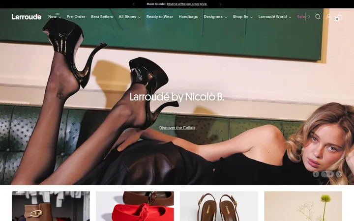
North star · Keep the interface quiet and legible so editorial shoe photography—not decorative UI—provides the page’s color and character.
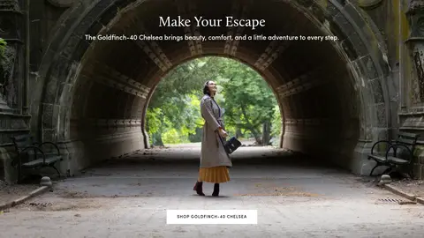
The visual strategy is deliberately restrained: white is the main canvas, black carries navigation and strong text, and pale gray quietly separates product areas and footer content. The measured palette contains no dedicated accent; color comes primarily from photography, where shoes, foliage, stone, and wardrobe styling create rich seasonal contrast. Typography mixes polished editorial moments with practical shopping labels: a Calluna serif hero headline contrasts with uppercase, tracked Sofia Pro navigation and calls to action, while Nunito handles compact body copy. Full-width campaign imagery alternates with clean product and category grids, giving shoppers both mood and clear routes into the catalog. The page uses a comfortable rhythm, generous white space, and a broad content frame rather than dense decoration. Thin gray rules and subtle button shadows provide just enough structure. Keep interface chrome quiet so campaign imagery and footwear remain the visual focus.
Main body and caption text, with some measured link and navigation instances.
Aa 设计
Sofia Pro Regular
网络字体 · 字重 400 · 占比 19%
免费替代:Montserrat
Button labels and measured navigation labels.
Aa 设计
Tangerine
网络字体 · 字重 400 · 占比 10%
免费替代:Tangerine
Decorative display heading role in the measured type system.
Aa 设计
Sofia Pro
网络字体 · 字重 400 / 700 · 占比 8%
免费替代:Montserrat
Headings, links, and uppercase eyebrow labels.
Aa 设计
Instrument Sans
网络字体 · 字重 400 / 700 · 占比 3%
免费替代:Instrument Sans
Small measured navigation labels and heading-family custom property.
Aa 设计
calluna
网络字体 · 字重 400 / 300 · 占比 1%
免费替代:Cormorant Garamond
Large editorial hero heading, including campaign titles.
角色
示例
字号
字重
行高
字距
一级标题
Editorial campaign headline over hero photography.
Birdies
48px
400
1
0
二级标题
Expressive display heading for campaign or feature sections.
Birdies
40px
400
1.5
0.05em
三级标题
Secondary campaign and content headings.
Birdies
32px
400
0.78
0
四级标题
Compact section or card headings.
The quick brown fox 敏捷的狐狸
22px
400
1.2
0
正文
Product, promotional, and supporting page copy.
The quick brown fox 敏捷的狐狸
14px
400
1.5
0
辅助文字
Small supporting labels and footnotes.
The quick brown fox 敏捷的狐狸
13px
400
1.5
0
按钮
Shopping calls to action and form submission.
The quick brown fox 敏捷的狐狸
15px
400
1.5
0
导航
Primary product-category navigation.
The quick brown fox 敏捷的狐狸
15px
400
1.5
0
链接
Compact uppercase shopping and utility links.
The quick brown fox 敏捷的狐狸
14px
400
1
0.088em
眉题
Tracked uppercase section labels and editorial markers.
The quick brown fox 敏捷的狐狸
14px
400
1
0.088em
间距与布局
基准单位 4px · 密度:适中
68px版块间距
8px元素间距
—卡片内边距
1344px内容最大宽度
4px
8px
10px
12px
16px
20px
24px
32px
40px
48px
A broad, centered commerce frame supports a full-bleed campaign hero, followed by a product grid, paired editorial panels, another image-led campaign, category tiles, and a three-panel feature. The measured page max width is 1344px, with a comfortable density and a 4px base spacing unit. Product discovery uses a 12-column section; campaign pairs and category groups shift to two- and four-column layouts. White space separates content bands, while the footer balances a signup area against company and help links.
圆角与层次
按钮 · 50%
导航 · 9999px
inset · nav
md · button
The page is predominantly flat, with white canvas areas and pale gray product surfaces doing most of the grouping. Borders are quiet and limited to hairlines around form or navigation details. Measured buttons have a subtle shadow, while restrained image overlays help text sit legibly on campaign photography. Avoid card-like elevation as a default.
组件
下面的预览按实测的按钮、输入框、徽标、卡片样式重建(字体用替代字体)。
Announcement and navigation
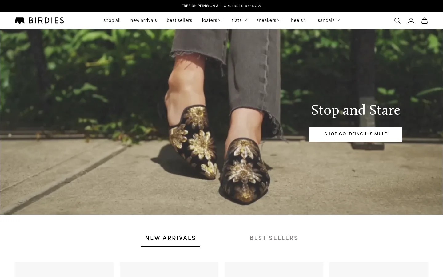
A black shipping message band sits above a white header with the Birdies mark, uppercase category links, and compact utility icons.
Campaign hero
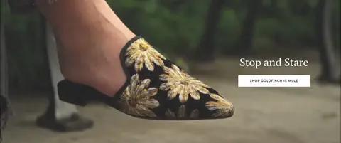
Full-bleed lifestyle imagery pairs a refined serif headline with a simple contrasting shopping button.
Product discovery grid
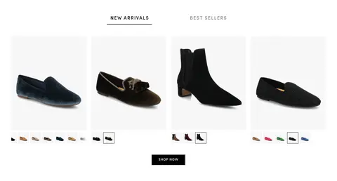
A new-arrivals and best-sellers switcher leads into a multi-column shoe grid with product variants and a centered shop action.
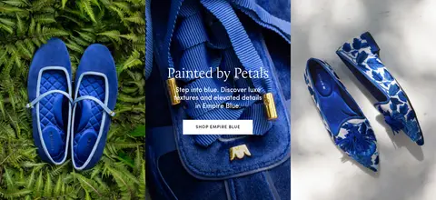
Editorial image pair
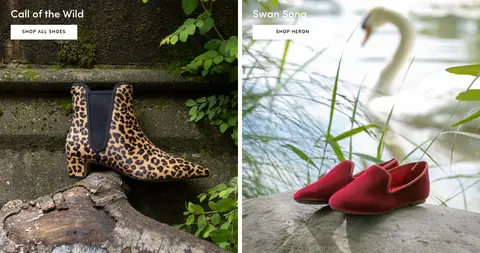
Two side-by-side campaign tiles use short white titles and light shopping buttons over distinct shoe photography.
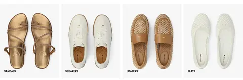
Category tiles
A four-column image-led category row labels sandals, sneakers, loafers, and flats directly on the visuals.
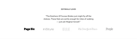
Press and testimonial
A centered editorial quote is supported by a row of publication marks, presented with generous white space.
Newsletter footer
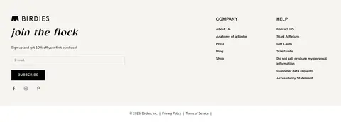
Signup copy and a simple email field share the footer with company and help link groups, social links, and legal details.
Imagery · Photography is the defining color source: shoes are shown in clean product views as well as styled outdoor and editorial scenes. Campaigns use full-width frames, with concise white or dark text and simple buttons placed over or beside the image. The footwear remains easy to identify; there are no prominent illustrations or 3D renderings. One hero is video-led, reinforcing the fashion-campaign feel.
Use white and black for the interface’s dominant contrast.
Let shoe and campaign photography supply most of the color.
Keep navigation and shopping labels concise and easy to scan.
Pair editorial serif headlines with clean sans-serif commerce text.
Use full-bleed photography for major campaign moments.
Separate product discovery from campaigns with generous white space.
✕ 不该做
Do not introduce a bright interface accent absent from the measured palette.
Do not decorate product grids with heavy borders or shadows.
Do not place dense copy over busy campaign photography.
Do not make the interface more visually prominent than the footwear.
Do not use playful display typography for routine controls.
Do not compress the page into one continuous, crowded content block.
给 AI 的提示词
想快速出一个同风格的新页面,把这段话连同 DESIGN.md 一起发给 AI。
Build a fashion-commerce page in Birdies’ restrained editorial style. Use Gallery White (#ffffff) as the primary canvas, Birdies Ink (#000000) for navigation and strong text, and Soft Display Gray (#f7f7f7) for quiet product or footer surfaces. Reserve Quiet Divider (#cccccc) and Nav Hairline (#d9d9d9) for subtle rules. Let polished shoe photography introduce the page’s richer colors. Combine refined serif campaign headlines with practical sans-serif body copy and compact uppercase shopping labels. Structure the page as spacious image-led campaigns alternating with product and category grids, followed by editorial proof and a newsletter footer. Keep controls simple, borders faint, and shadows minimal. Match the measured 1344px maximum content width and comfortable spacing rhythm; do not invent decorative colors or dense card treatments.