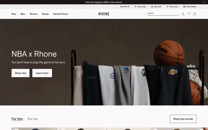
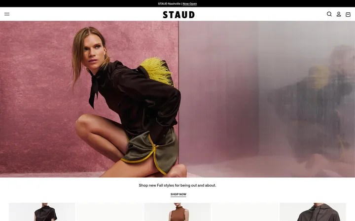
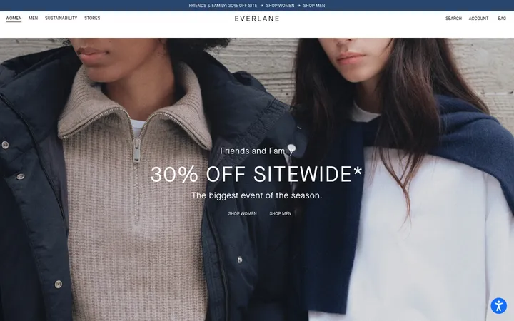
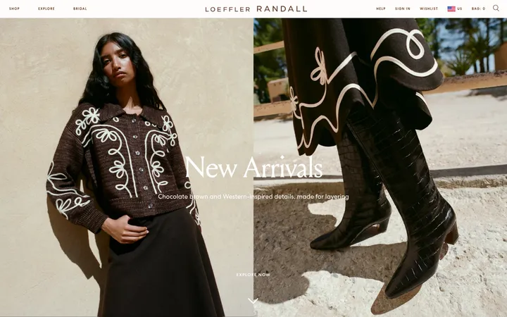
North star · Keep the interface quiet and the product photography dominant, using clean white space and restrained black typography to frame each image.
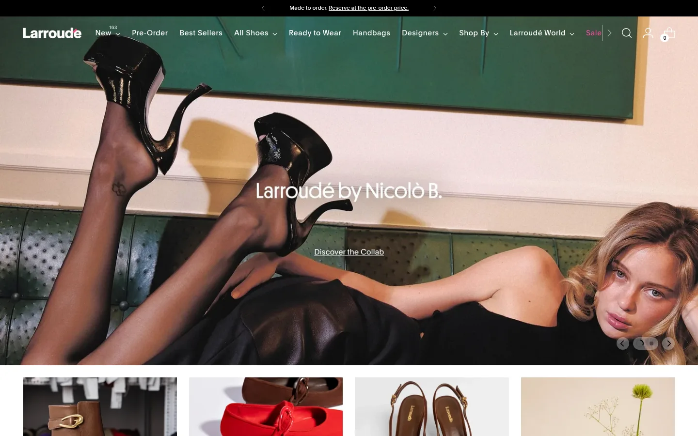
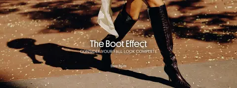
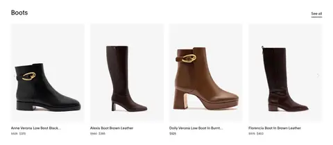
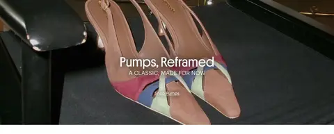
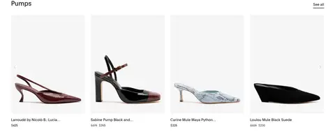
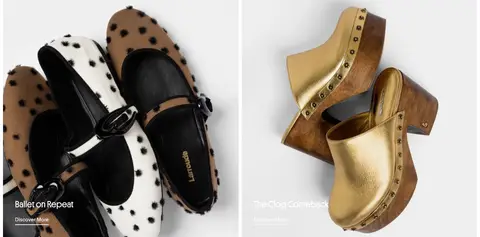
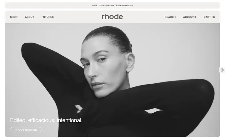
The visual system keeps the storefront itself quiet: white sections, near-black text, and restrained hairlines make product browsing feel clean and editorial. Large campaign images interrupt the repeated catalog rhythm, bringing in rich greens, warm browns, and blush tones from the photography rather than from a prominent interface palette. Plain is the workhorse sans for navigation, product details, and links; Platform gives headings and uppercase labels a more distinctive editorial voice. Product grids use consistent columns and open white space, with names and prices directly below each image. Category tiles and two-up campaign panels create clear shifts in pace without introducing colored section bands. The first viewport overlays navigation and promotional messaging on a full-bleed image, while the footer reverses to a solid black field with white text. The result is fashion-led commerce: polished, image-first, and easy to scan.
Main interface sans for navigation, body copy, product names, prices, and links.
Aa 设计
Platform
网络字体 · 字重 400 / 500 · 占比 6%
免费替代:DM Sans
Editorial headings, button labels, and eyebrow labels.
角色
示例
字号
字重
行高
字距
一级标题
Campaign headline over the homepage hero.
Larroudé
30px
400
1.5
0
二级标题
Editorial titles and product-section headings.
The quick brown fox 敏捷的狐狸
27px
400
1.1
0
正文
General supporting copy and descriptions.
The quick brown fox 敏捷的狐狸
15px
400
1.4
0.009em
辅助文字
Compact secondary labels and product details.
The quick brown fox 敏捷的狐狸
12px
400
1.5
0
按钮
Uppercase calls to action and control labels.
The quick brown fox 敏捷的狐狸
13px
500
1.5
0.092em
导航
Primary navigation and menu links.
The quick brown fox 敏捷的狐狸
15px
400
1.5
0.04em
链接
Product names, prices, and text links.
The quick brown fox 敏捷的狐狸
15px
400
1.4
0.009em
眉题
Short uppercase campaign or section labels.
The quick brown fox 敏捷的狐狸
13px
500
1.5
0.092em
间距与布局
基准单位 4px · 密度:适中
40px版块间距
16px元素间距
—卡片内边距
1345px内容最大宽度
1px
2px
3px
4px
5px
6px
7px
8px
10px
12px
16px
25px
28px
36px
40px
48px
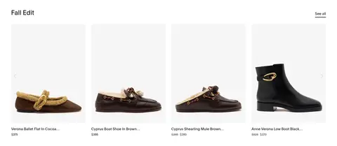
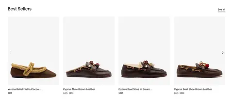
The page uses a wide, centered storefront with a measured maximum width of 1345px and comfortable density. Most product rows are four columns, while the Best Sellers strip expands to eight items. Sections align to a consistent content edge; product headings sit at the start and See all links at the opposite edge. Full-bleed campaign media breaks up the repeated white catalog sections. Two-up editorial panels add variation, and the black footer closes the sequence. Preserve the measured 40px section rhythm and 16px element rhythm where applicable.
圆角与层次
按钮 · 50%
导航 · 50%
inset · nav
The interface is largely flat: white sections meet without pronounced shadows, and product cards have no visible rounded corners. Borders are restrained, with measured dark hairlines most evident in the footer and small outlined product badges. Campaign imagery creates depth through the photography itself, while text overlays sit directly on the image rather than inside elevated containers.
组件
下面的预览按实测的按钮、输入框、徽标、卡片样式重建(字体用替代字体)。
Overlay navigation
White wordmark and navigation links sit over the full-bleed hero image; the menu uses Plain at the measured 15px nav size.
Announcement strip
A narrow black band above the main navigation carries centered white promotional copy and small directional controls.
Category tiles
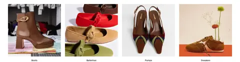
Four image-led categories—Boots, Ballerinas, Pumps, Sneakers—form a compact row with short labels beneath.
Product grid
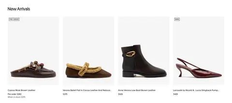
White product sections pair a left-aligned heading and See all link with columns of footwear images, names, and prices.
Campaign banner
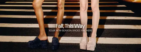
Full-width lifestyle imagery carries centered white editorial copy and a simple text link.
Editorial pair
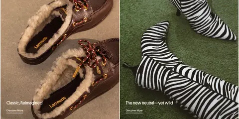
Two side-by-side image panels use lower-left white titles and Discover More links over the photography.
Footer
A black four-column footer groups contact details, company links, and shop links in compact white and muted text.
Product badge
Small uppercase PRE-ORDER or NEW labels use black text and a square-cornered 1px black outline.
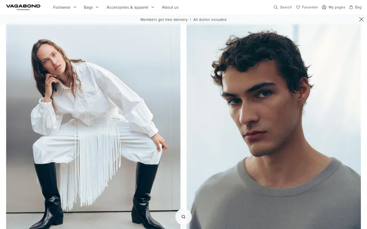
Imagery · Large fashion photographs lead the experience, with campaign scenes spanning the viewport and text layered over the image. Product imagery is cleanly isolated in pale or white rectangular fields, presented in evenly aligned rows. Category tiles use lifestyle product photos. The imagery supplies the dominant greens, blushes, browns, and black tones; these belong to photography, not the core interface palette.
Let campaign photography occupy large, uninterrupted areas.
Keep product names and prices directly under their images.
Use black and near-black text for clear contrast.
Repeat consistent product columns within each row.
Keep buttons and labels understated and uppercase.
Finish with a solid black footer and compact link columns.
✕ 不该做
Do not turn photography colors into interface accent colors.
Do not add gradients or decorative shadows to product cards.
Do not use rounded card containers or heavy borders.
Do not crowd product images with extra copy.
Do not introduce colorful section backgrounds across the catalog.
Do not make navigation visually heavier than the hero.
给 AI 的提示词
想快速出一个同风格的新页面,把这段话连同 DESIGN.md 一起发给 AI。
Build a fashion-commerce page in Larroudé’s editorial style. Use Gallery White (#ffffff) for the main canvas, Soft Ink (#111111) for product copy, and Runway Black (#000000) for inverse surfaces and restrained accents. Set Plain or a close sans substitute such as Inter for navigation, details, and links; use Platform or DM Sans for editorial headings and widely tracked uppercase labels. Create a clean, wide product catalog with consistent image columns, compact names and prices, and clear section headings. Break up the grid with full-bleed campaign photography and a small number of two-panel editorial images. Keep corners square, borders rare, and elevation nearly absent. Let colors in the lifestyle imagery provide warmth; do not apply them as interface decoration. End with a black multi-column footer.