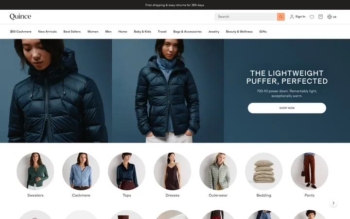
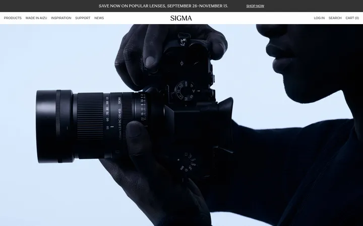
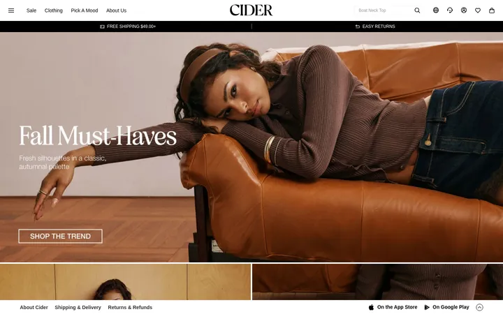
North star · Let large, art-directed fashion photography lead, while typography and commerce controls stay crisp, restrained, and easy to scan.
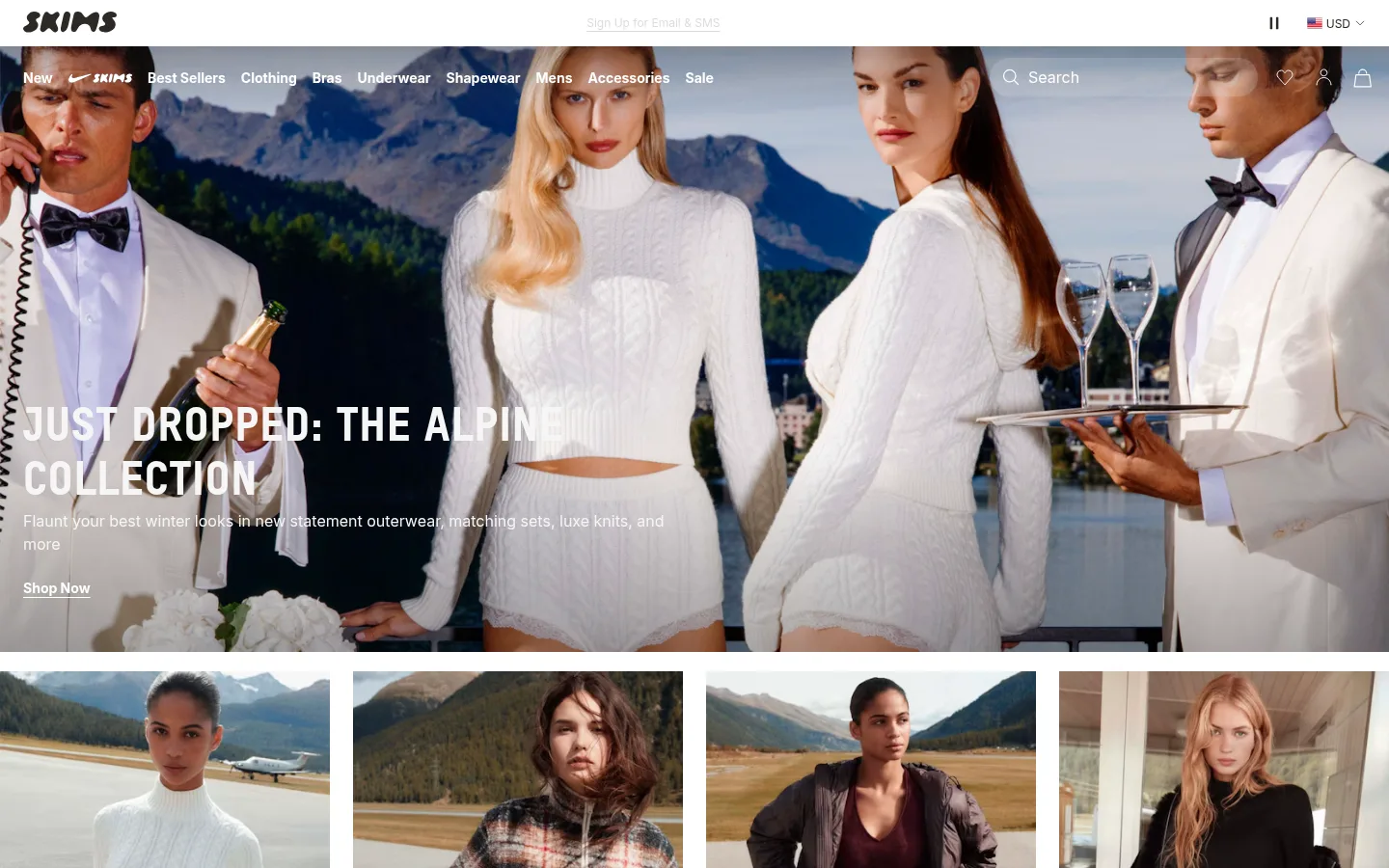
The visual system is built around a white canvas (#ffffff) and warm, deep brown-black text (#2d2a26), with pale gray (#f6f6f6) reserved for subtle rules and quiet secondary details. The measured palette is intentionally restrained; the muted taupe (#e8e5df) and pure black (#000000) appear sparingly, so treat them as supporting tones rather than broad brand surfaces. Inter handles navigation, body copy, and utility information, while heavy, uppercase T-Star headlines give campaign sections a distinct fashion-editorial voice. Large, edge-to-edge photographs carry most of the visual color and emotional impact. Text overlays sit directly on the imagery, with white headings and links chosen for contrast. The page alternates immersive single-image campaigns with a four-column category row and paired promotional tiles, then opens into a spacious centered brand statement and a three-column footer. Keep surfaces flat, align content cleanly, and use generous section separation without introducing decorative effects.
Navigation, body copy, captions, links, forms, and footer details.
Aa 设计
T-Star
网络字体 · 字重 900 · 占比 15%
免费替代:Barlow Condensed
Large campaign and section headings.
角色
示例
字号
字重
行高
字距
一级标题
Primary campaign headline over the hero photograph.
SKIMS
48px
900
1.17
0.025em
二级标题
Major promotional and brand-statement headings.
SKIMS
36px
900
1.33
0.025em
三级标题
Secondary campaign or section headings.
SKIMS
30px
900
1.2
0.025em
四级标题
Compact editorial headings and smaller content titles.
The quick brown fox 敏捷的狐狸
24px
900
1.25
0.025em
正文
Supporting campaign descriptions and standard page copy.
The quick brown fox 敏捷的狐狸
16px
400
1.5
0
辅助文字
Small utility, category, and footer details.
The quick brown fox 敏捷的狐狸
12px
400
1.33
0
导航
Header navigation and compact utility navigation.
The quick brown fox 敏捷的狐狸
14px
700
1.43
0
链接
Calls to action and prominent text links.
The quick brown fox 敏捷的狐狸
14px
700
1.43
0
间距与布局
基准单位 8px · 密度:适中
56px版块间距
8px元素间距
—卡片内边距
1344px内容最大宽度
3px
4px
8px
12px
16px
20px
24px
28px
40px
44px
48px
50px
56px
80px
Use a full-width page canvas with a measured maximum content width of 1344px where content is constrained. The homepage alternates full-bleed, single-column campaign imagery with four-column category cards and a two-column underwear/bras feature. Keep the brand statement centered and the footer in three columns. The measured spacing system has an 8px base unit, a 56px section gap, and comfortable density; preserve generous breathing room while keeping category labels and footer links compact.
圆角与层次
导航 · 9999px
没有测到阴影:页面是扁平的,层次靠底色和描边区分。
The measured page has no defining shadow system and is predominantly flat. Separate content through image boundaries, white space, and subtle hairlines rather than raised cards. Keep navigation visually light; its measured pill-like radius should not be generalized to unrelated components. Maintain clear text contrast over photographs without adding ornamental effects.
组件
下面的预览按实测的按钮、输入框、徽标、卡片样式重建(字体用替代字体)。
Utility header
A narrow white top strip pairs the SKIMS wordmark with centered signup utility text and compact currency controls.
Overlay navigation
Place compact Inter navigation over the hero image, with shopping links and search/account icons rendered for contrast.
Campaign hero
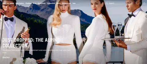
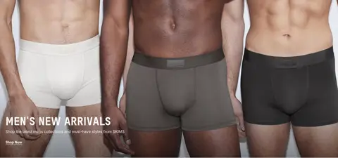
Use a full-bleed fashion image with a left-aligned uppercase T-Star headline, short supporting copy, and a simple Shop Now link.
Category image grid
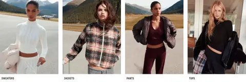
Show four adjacent apparel photographs with short uppercase category labels beneath each image.
Promotional feature
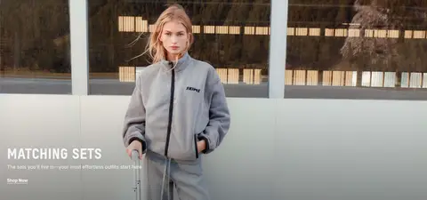
Combine broad campaign photography and overlay copy for matching sets or men's arrivals; use paired image tiles for underwear and bras.
Brand statement
Center the uppercase brand message on white space, using bold display type without additional decorative treatment.
Information footer
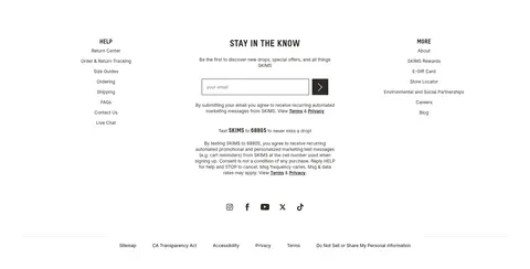
Organize help, newsletter signup, and more links into three columns, followed by social links and a compact legal row.
Imagery · Use polished, realistic fashion photography as the primary visual material; the supplied page features seasonal styling, models, and apparel in lifestyle settings. Campaign images fill broad horizontal sections, while category photography is cropped into a four-card row. Keep photographic color and texture natural, and place concise, high-contrast copy directly over campaign imagery where shown. Illustration and 3D are not defining elements.
Make category photography easy to scan in a clear grid.
Keep calls to action concise and high contrast.
✕ 不该做
Do not add gradients or decorative shadows.
Do not introduce unmeasured colors as brand colors.
Do not use rounded cards as the default container style.
Do not let utility text compete with campaign headlines.
Do not replace the photography-led layout with illustration.
Do not crowd the brand statement or footer columns.
给 AI 的提示词
想快速出一个同风格的新页面,把这段话连同 DESIGN.md 一起发给 AI。
Build a new SKIMS-style fashion commerce page with a predominantly white canvas (#ffffff) and warm dark text (#2d2a26). Let large, carefully art-directed fashion photographs lead each major section, using short white overlay copy when needed for contrast. Set campaign headings in a heavy, uppercase display face similar to T-Star; use Inter for navigation, body copy, links, and footer details. Favor full-width campaign sections, crisp category image grids, restrained text links, and a centered brand statement. Use #f6f6f6 only for quiet separators, with #e8e5df and #000000 remaining sparse supporting tones. Keep surfaces flat and avoid decorative shadows or gradients. Give content comfortable breathing room, then make category labels, newsletter controls, and footer links compact and easy to scan.