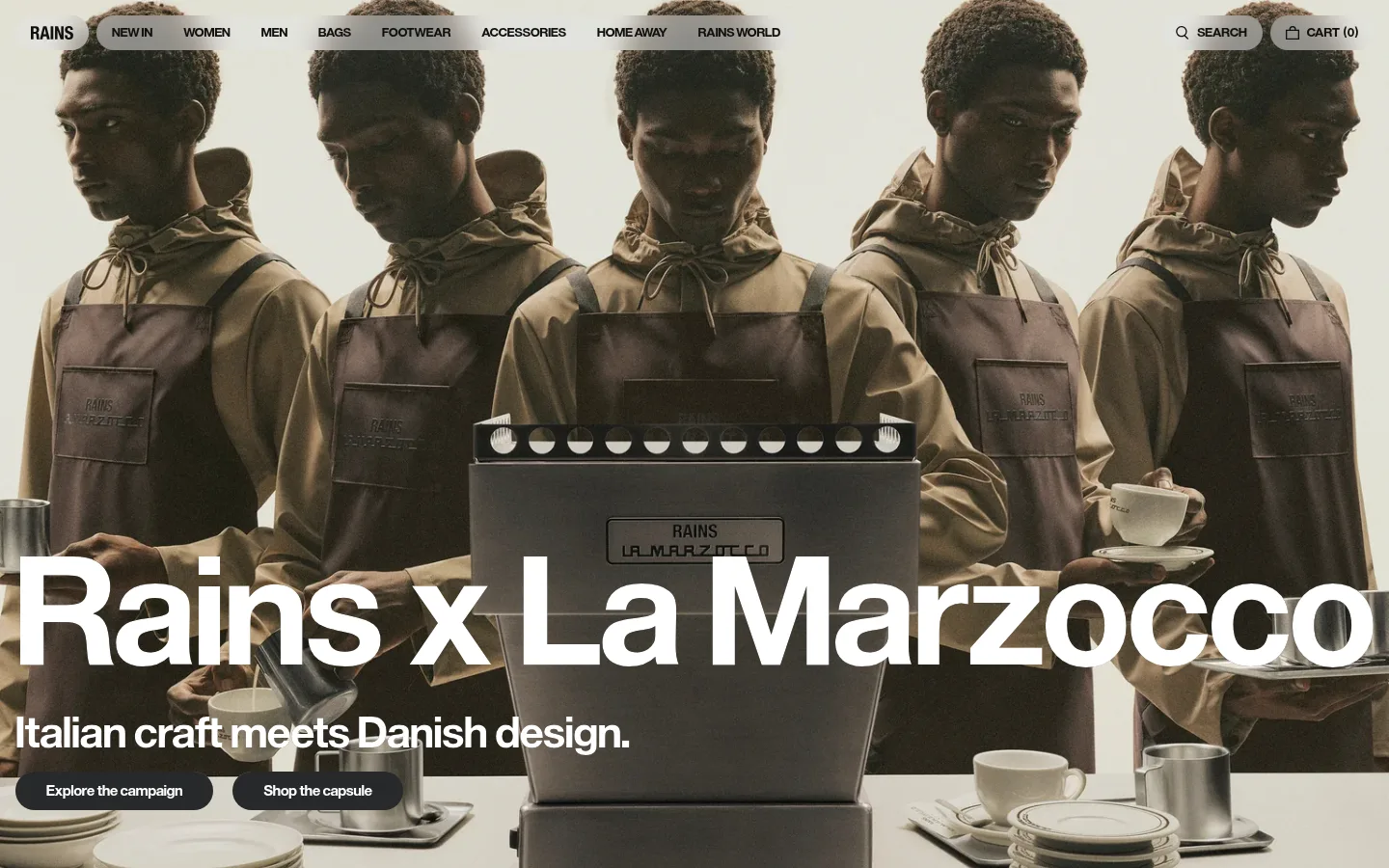
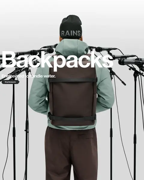
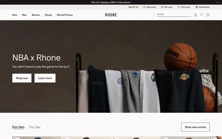
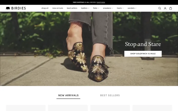
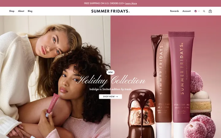
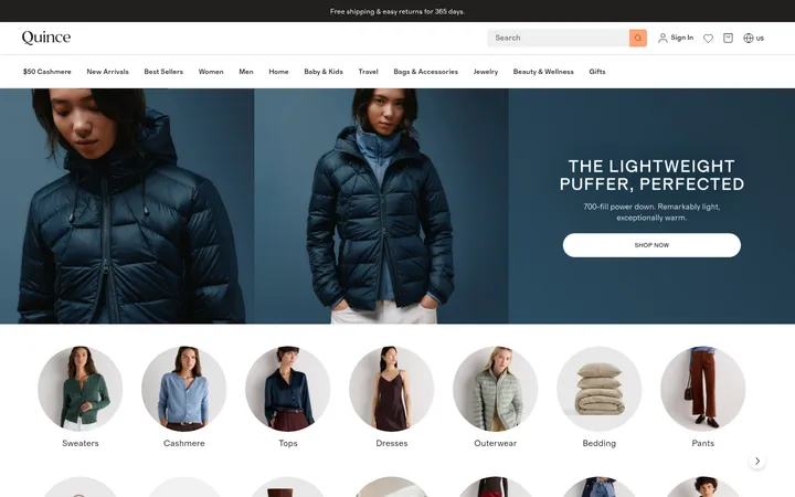
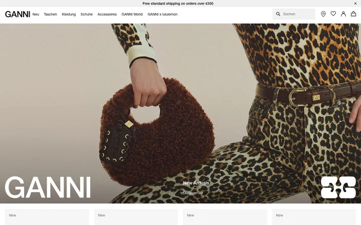
North star · Let cinematic campaign photography dominate, while keeping the shopping interface monochrome, compact, and unmistakably legible.
The page uses a white canvas as a quiet frame for large campaign images, with product collections and category panels returning to open, light backgrounds. Its measured interface palette is deliberately spare: near-black text and pale gray surfaces and borders; the warm browns, greens, and blues visible in screenshots belong to campaign photography, not additional UI colors. EuropaGroNr2SH carries the heavy visual work through oversized, tightly composed headlines, while navigation and controls stay small, bold, and uppercase where appropriate. Full-bleed hero panels alternate with four-column product rows and paired category imagery, creating a clear rhythm between storytelling and shopping. Generous section spacing lets each campaign image feel like its own editorial spread. Rounded capsule controls provide the main UI softness; otherwise, the page favors flat surfaces, minimal borders, and little visible elevation.
Display headlines, headings, body copy, navigation, buttons, captions, and prominent links.
Aa 设计
EuropaGroNr2SB
网络字体 · 字重 400 · 占比 2%
免费替代:Inter
Regular-weight navigation and utility controls, including search.
角色
示例
字号
字重
行高
字距
特大标题
Oversized campaign titles laid over full-bleed photography.
Rains
245px
600
1.02
0
一级标题
Primary page and campaign headlines.
Rains
216.5px
600
1.02
0
二级标题
Large editorial headings introducing campaign or category sections.
Rains
167.5px
600
1.02
0
三级标题
Secondary campaign titles and prominent collection headings.
Rains
156.5px
600
1.02
0
四级标题
Product and supporting section headings.
Rains
48px
600
1
0
正文
Campaign subtitles, descriptions, and primary supporting copy.
The quick brown fox 敏捷的狐狸
20px
700
0.9
0
辅助文字
Compact product labels and supporting details.
The quick brown fox 敏捷的狐狸
16px
700
1
0
按钮
Short, bold labels inside capsule calls to action.
The quick brown fox 敏捷的狐狸
16px
700
1
0
导航
Small uppercase category and utility navigation labels.
The quick brown fox 敏捷的狐狸
14px
700
1
0
链接
Prominent product names and category links.
The quick brown fox 敏捷的狐狸
20px
700
0.9
0
间距与布局
基准单位 8px · 密度:适中
56px版块间距
8px元素间距
—卡片内边距
1408px内容最大宽度
8px
12px
16px
20px
24px
32px
56px
The page is built from a wide, centered content system measured at a 1408px maximum width, with campaign media often spanning the full viewport. Large image-led sections alternate with four-column product grids and two-column category panels. Hero copy aligns left over the imagery; product names and details remain compact beneath images. Section spacing is generous, using a measured 56px section gap and an 8px base spacing rhythm. The overall density is comfortable: expansive campaign moments balanced by efficient shopping rows.
圆角与层次
按钮 · 9999px
导航 · 9999px
链接 · 50%
hairline · link
The interface is predominantly flat, with white canvas areas and understated pale-gray separators. No prominent card shadows are measured. Rounded controls sit cleanly over both image and light backgrounds; a subtle measured hairline shadow is associated with a link interaction state, not general elevation.
组件
下面的预览按实测的按钮、输入框、徽标、卡片样式重建(字体用替代字体)。
Campaign hero
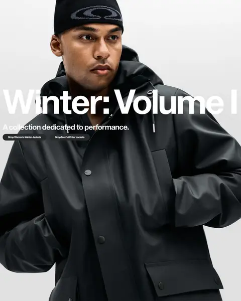
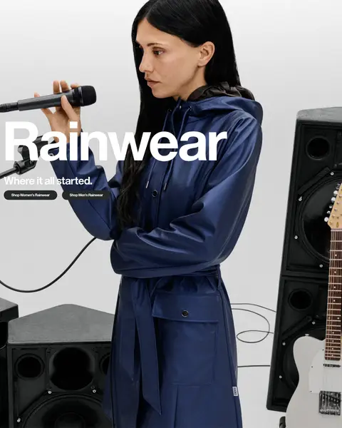
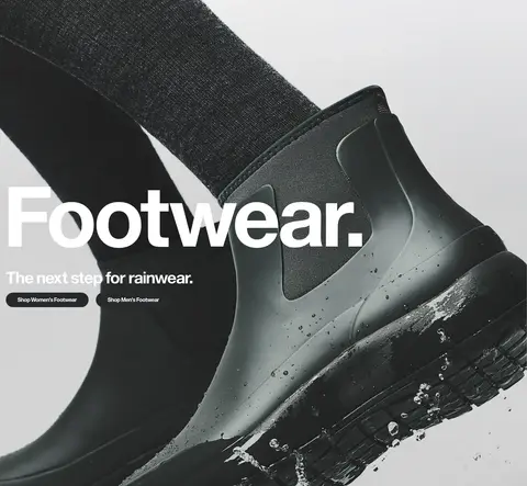
Full-width campaign photography with large white, left-aligned headline, supporting copy, and compact pill calls to action.
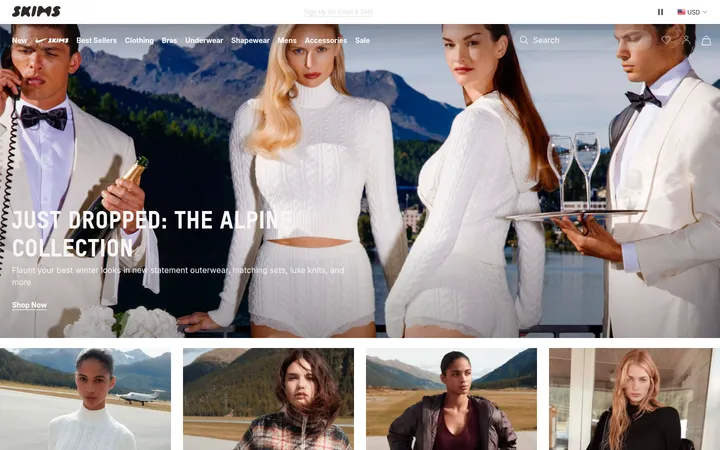
Header navigation
Small bold uppercase category labels over the hero, with brand mark at left and search and cart utilities at right.
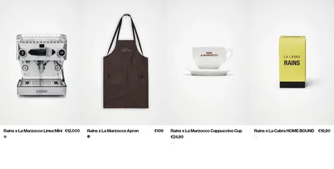
Product grid
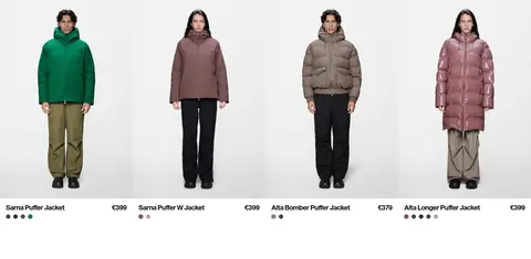
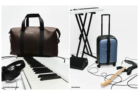
Four-column product rows with isolated product imagery, bold product names, prices, and small color indicators.
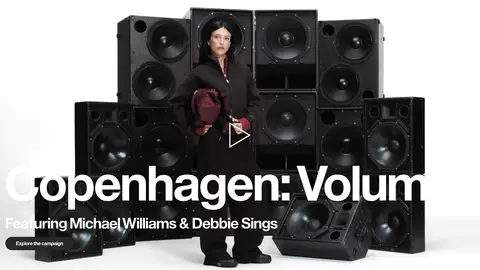
Campaign video
Image-led video feature with a centered play affordance and oversized white headline over the media.
Category image pair
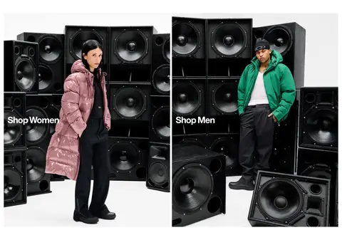
Two adjacent fashion images link to women’s and men’s shopping, with compact white labels placed over the imagery.
Capsule CTA
Pill-shaped action button; measured campaign button uses #26292a fill, white bold text, and 9999px radius.
Utility search
Compact pale-gray pill control with near-black search label and icon.
Imagery · Photography defines the page: fashion campaigns, editorial collaborations, and product still lifes. Images are large, sharply framed, and often full-bleed, with headlines and small calls to action layered over quieter areas. Product grids use isolated items on light backgrounds. A campaign video appears as an image-led feature; there are no defining decorative illustrations or 3D motifs.
Use white space as the interface’s default canvas.
Keep UI text in the measured monochrome palette.
Give campaign photography the dominant visual area.
Use oversized bold headlines over editorial imagery.
Keep product rows orderly and easy to scan.
Use compact pill controls for key actions.
✕ 不该做
Do not add unmeasured interface accent colors.
Do not turn campaign images into small decorative thumbnails.
Do not crowd the page with extra borders or card shadows.
Do not use decorative display type or exaggerated tracking.
Do not confuse colors inside campaign photos with UI palette colors.
Do not make navigation larger or more prominent than the campaign.
给 AI 的提示词
想快速出一个同风格的新页面,把这段话连同 DESIGN.md 一起发给 AI。
Build a new fashion-commerce page in the Rains visual style. Use Gallery White (#ffffff) as the canvas, Mist Gray (#ececec) only for quiet surfaces and hairlines, and Soft Ink (#10100f) for interface text and links; Deep Black (#000000) is only a minor muted text tone. Keep the UI monochrome and let the photography supply seasonal color. Use a clean, heavy sans-serif close to Europa Grotesk, with very large campaign headlines, compact uppercase navigation, and bold product labels. Structure the page as full-bleed editorial campaigns alternating with tidy product grids and paired category imagery. Align hero copy left, maintain spacious section breaks, and use restrained capsule CTAs. Keep surfaces flat and borders subtle; do not invent decorative accents, gradients, or prominent shadows.