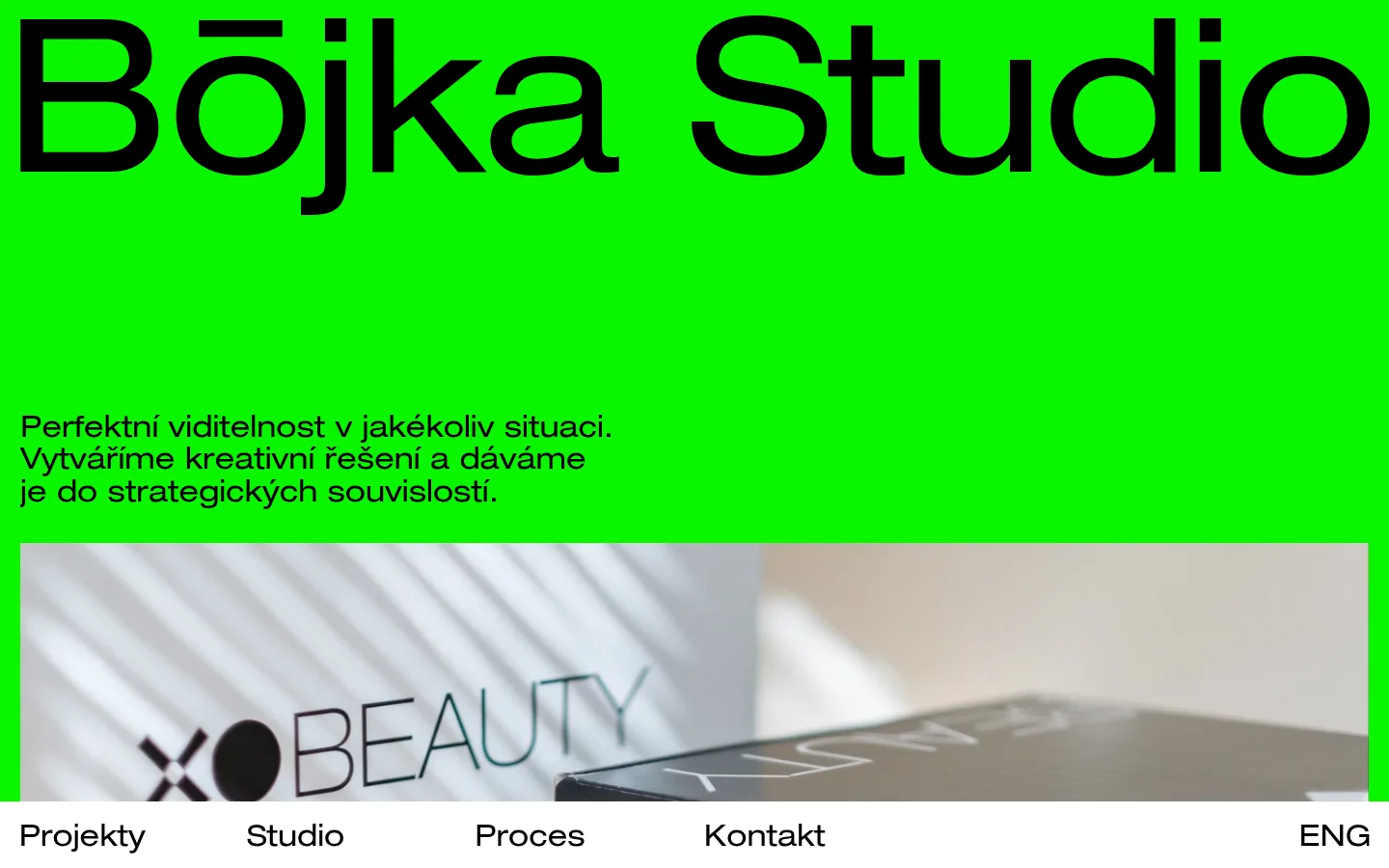
Bōjka Studio 首页以鲜亮绿底、超大黑字和精选作品图构成鲜明视觉。简短的捷克语介绍与固定白色导航,让首屏大胆醒目又便于浏览。
North star · Let one uninterrupted electric-green field and oversized black type dominate, with imagery and navigation kept disciplined.
The opening is built around a striking, flat green canvas (#0af500), with black (#000000) carrying the oversized studio name and supporting copy. White (#ffffff) is reserved for the persistent bottom navigation strip, creating a crisp boundary against the vivid page field. A single custom sans-serif family supplies both the monumental wordmark-like heading and smaller Czech introduction; the display is regular weight with subtly tight tracking, not a decorative type treatment. The layout is deliberately sparse: the studio name spans nearly the full viewport width, while the short introduction sits left-aligned above a broad, inset portfolio photograph. The image brings muted, natural tones into an otherwise highly controlled palette. Navigation labels are evenly distributed along the white bar, with the language switch aligned to the far edge. Keep surfaces flat and let the unusually saturated green, strong scale contrast, and one carefully framed image provide the visual impact.
配色
点色块复制色值。用途说明来自对页面的实测位置(背景、文字、描边、按钮)与截图判读。
品牌色
表层色
页面底色 · Electric Green表层 · Gallery White表层 2 · Studio Ink主文字 · Studio Ink强调 · Electric Green
文字
背景
对比度
WCAG
#000000 Studio Ink
#0af500 Electric Green
14.07:1
AAA
#000000 Studio Ink
#ffffff Gallery White
21:1
AAA
#0af500 Electric Green
#ffffff Gallery White
1.49:1
不达标
#0af500 Electric Green
#000000 Studio Ink
14.07:1
AAA
字体
字号阶梯:Custom(比例约 7.136,正文 22px)。示例用免费替代字体渲染,数值为实测。
Aa 设计
custom_15364
网络字体 · 字重 400 · 占比 100%
免费替代:Manrope
Used throughout for the oversized studio name, introduction, and navigation links.
角色
示例
字号
字重
行高
字距
特大标题
Oversized Bōjka Studio name across the top of the hero.
Bōjka Studio
157px
400
normal
-0.008em
正文
Short Czech studio introduction below the heading.
The quick brown fox 敏捷的狐狸
22px
400
normal
0
链接
Navigation labels and language switch in the bottom bar.
The quick brown fox 敏捷的狐狸
22px
400
normal
0
间距与布局
基准单位 1px · 密度:适中
—版块间距
—元素间距
—卡片内边距
—内容最大宽度
The first viewport uses a nearly edge-to-edge green canvas, with the oversized studio name aligned to the upper left and spanning almost the full width. A short, left-aligned introduction sits below a generous open interval; a wide portfolio image follows, inset slightly from the page edges. The bottom white navigation bar stays fixed and runs across the viewport, with four links spaced along it and the language control pushed to the far right. The result is comfortable and intentionally sparse rather than card-dense.
圆角与层次
没有测到阴影:页面是扁平的,层次靠底色和描边区分。
The design is mostly flat: the green canvas, image, and white navigation read as simple neighboring planes. Measured card styling shows no shadow and a zero-radius treatment; the screenshot likewise emphasizes clean, squared edges. Use the photo itself for depth and texture rather than adding elevation, borders, or layered cards.
组件
下面的预览按实测的按钮、输入框、徽标、卡片样式重建(字体用替代字体)。
Oversized studio title
A very large, regular-weight black studio name sits at the top of the green canvas and nearly fills the viewport width.
Introductory copy
A compact, left-aligned Czech paragraph in the same custom sans-serif sits between the title and project image.
Portfolio image
A broad inset photograph presents a studio project, adding muted product and environmental tones to the bright page.
Fixed navigation
A full-width white bottom strip carries Projekty, Studio, Proces, Kontakt, and a right-aligned ENG language link.
Text links
Navigation and process links use the page’s regular-weight custom sans-serif and black text, with no measured decoration.
Imagery · A wide, rectangular photograph introduces a real studio project beneath the introductory copy. It is framed as a large horizontal panel with a small inset from the green page edges; its soft, neutral scene and visible packaging contrast with the saturated canvas. Keep imagery photographic and project-led, with no decorative illustration or added color effects.
该做与不该做
✓ 该做
Use #0af500 as the dominant canvas color.
Set primary text in #000000.
Keep the studio title exceptionally prominent.
Align the introduction and project image to the left.
Use #ffffff for the fixed bottom navigation surface.
Let one authentic project photograph provide tonal contrast.
✕ 不该做
Do not introduce unmeasured palette colors as interface chrome.
Do not add gradients, shadows, or rounded-card styling.
Do not crowd the large areas of green negative space.
Do not compete with the studio title using secondary display treatments.
Do not turn project imagery into decorative illustration.
Do not replace the restrained bottom navigation with a large menu.
给 AI 的提示词
想快速出一个同风格的新页面,把这段话连同 DESIGN.md 一起发给 AI。
Create a new page in the Bōjka Studio visual style. Use Electric Green (#0af500) as the expansive page canvas, Studio Ink (#000000) for all prominent typography, and Gallery White (#ffffff) for a crisp persistent navigation surface. Use one clean regular-weight sans-serif throughout; make the main title extremely large and nearly full-width, with subtly tight tracking. Keep supporting copy short, left-aligned, and separated from the title by generous open space. Introduce a single broad, inset project photograph as the main visual content. Keep the composition flat, with squared edges, no shadows, and no ornamental cards. Make navigation concise and evenly arranged, reserving a far-edge position for a language switch. Preserve strong contrast and generous breathing room.